
Saturday, October 20, 2007
A SPUMCO ARTIST HITS THE BIG TIME
A couple of days ago I watched Tarantino's "Grindhouse" on disc and nearly fell out of my chair when the end credits came up. The song over the credits was "Chick Habit" by April March! April was a layout artist on the second season of Ren & Stimpy! Check out this YouTube version of the song (above).
We all thought April had talent but most of us weren't familiar with the French Yay-Yay (spelled right?) style that she worked in. Now I feel stupid for not having paid more attention. I'm really happy for her. Here's (above) a video of another of her songs, "Mignonette."
Here's a fan favorite (above): "Cet Air-La."
I assume everyone here is familiar with the Yay Yay style, but in case you're not here's (above) a sample by Sylvie Vartan.
Friday, October 19, 2007
MOST PAINTERS DON'T USE ENOUGH DARKS

Thanks to a link on Michael Sporn's site I discovered a terrific blog devoted entirely to animation backgrounds.
Michael's blog: http://www.michaelspornanimation.com/splog/
Rob Richard's background blog: http://animationbackgrounds.blogspot.com/
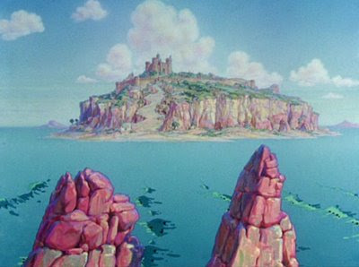
The one at the top (above) is one of my favorites, maybe from "Saludos Amigos." Man, I'd give a lot to own that! One of these days I'll copy it just to see what I can learn from it! I've learned something already, namely the primal graphic appeal of the dog penis (the red-tipped mountain on the upper right).
 Here's (above) another example of that, from a Popeye film. It does seem to add something.
 Looking at the Disney backgrounds I'm struck by how often the artists used very dark colors. I envy audiences who saw these films in technicolor. Technicolor reproduced rich, saturated darks without losing the details.
 Is this background (above) from "Alice" or "Peter Pan?" It doesn't look like much when shown small like this, so be sure to click to enlarge.
 Here the darks aren't just an an accent, they completely dominate the picture. In spite of that, the picture comes off as colorful. I'll bet characters read beautifully on top of this. I'm guessing that this is inspired by Mary Blair, who in turn might have been inspired by 17th century Dutch flower paintings.
 Speaking of Mary, here's her head made into a cottage for Alice in Wonderland.
 Rob provides us with a picture (above) for comparison.
 Even Pinocchio BGs (above) had lots of darks.
 TVs used to be bad at reproducing darks. Maybe the Trinitron was the first to do it successfully. A whole generation of artists saw films like Alice only on inferior TV monitors and probably couldn't understand why the backgrounds were so well-regarded.
 Sometimes Disney took the dark thing too far, as with this downshot of Goofy's home (above). The garish orange house looks like it was pickled in formaldehyde. The darks seem menacing and inappropriate to the subject. Even so, it's an interesting experiment.
LOOK THE PART
 I just blew an interview with an executive who might have helped me to get a directing gig I was interested in. I could kick myself because I could so easily have aced the interview. I was just in a quirky mood and I rambled on and dressed funny. Ah, well...
It occurred to me as I was leaving the building, feeling dejected and sorry for myself, that I might have done a lot better if I had just looked the part. Directors wear baseball caps and jeans...or, in another era, riding pants and a crop. I was just too "against type."
You can't blame executives for having stereotypes in mind. We all do. If you were hiring an accountant, which man would you pick: the man with the glasses halfway down his nose like the guy pictured above...
 ...or the guy in the disco outfit above? The disco guy might be the better accountant, but who cares?
 If you were hiring a cowboy, who would you hire? The guy above...
 ...or the emo (above) with a copy of "Brothers Karamazov" in his back pocket? Be honest. You'd go for the stereotype and so would I.
When you think about it, stereotypes convey a lot of useful information. When someone on the street says, "You work in animation? Wow! You must have a terrific imagination!", they're conveying something important. They're telling you that they value and even crave imagination and are willing to dish out money for media that delivers it.
I've often thought that we should be the industry the public wants us to be. They imagine that an animation studio is a wonderland full of wild, zany, talented visionaries...and that's exactly what it should be.
Most professions would do well to live up to the image the public has of them. Rock musicians should be wild, talented guys surrounded by groupies and young writers should peck out great novels under a 25 watt bulb in ratty Manhattan apartments. Engineers should be bright and earnest and poets should be temperamental and wear velvet suits. We all should strive to be what the public wants us to be, what gives people pleasure to think about.
Wednesday, October 17, 2007
COMPUTER CARICATURES VS. HAND-DRAWN
 These computer caricatures are way too depressing and grotesque for my taste but they do prompt an interesting question: how long will it be before we start seeing computer caricatures in theme parks? I mean caricatures done by an artist sitting at a computer.


 Aargh! I couldn't bear to end this without something hand-drawn. Here's a portrait (above) by caricature genius, Grigor Eftimov.
 Here's Grigor at work.
Tuesday, October 16, 2007
YOU WOULDN'T WANT TO BE SUPERMAN!
 Being Superman means you can't trust your own friends! Here's Jimmy wearing his "Helmet of Hate" again.
 Everybody's envious! You can't even trust your own parents!
 Superman once had an affair with a fish woman and they had kids together. Knowing that society would frown on such things he moved his fish family to an asteroid. That should have been the end of it but his pesky girlfriend, Lois Lane, found out about it.
 There's always some other super hero trying to muscle in.
 Boy, that Lois is a real player!
 When you fly people are always trying to shoot you down with fruit juice weapons.
 Fortunately Superman's friend Jimmy, who gets coffee for people during the day, performs brain surgery at night.
 Superman doesn't always share the tastes of his friends...
 ...particularly Robin.
 No, Superman's a normal guy. It's amazing that even Superman doesn't score every time.
All these pictures were stolen from a terrific site: http://www.superdickery.com/
Sunday, October 14, 2007
MY FAVORITE JOHN K. T-SHIRT!

 Here it is, fresh from the washing machine! Sorry I don't have time to put up a more elaborate post. I'm so busy that I shouldn't even be taking time to do this. I'll be back with something more thought-out on Wednesday.
 You have to admit, though...it is a nifty shirt.
Saturday, October 13, 2007
THE AMAZING MARLO MEEKINS

 It's probably bad form to steal pictures from some one's blog while the pictures are still current. I just couldn't help myself! These are so good that they demand to be seen. Run, don't walk, to Marlo's site and take a look!
http://www.marlomeekins.blogspot.com/
 The problem with buck teeth, well pesented. I have buck teeth and I'm always tasting food from meals I had two days before.
 Here's the look that caricaturists get when they're intent on nailing you. This photo of Marlo is the only picture I've ever seen that captures that.
 It's fun to see highly dramatic color caricatured and applied to cartoons.
 Marlo's done lots of parties. You can only envy the lucky kids.

 Boy, you can't accuse her of getting in a rut. How are these (above) for a change of pace?
 The recipient of this (above) is crazy if he doesn't have it professionally mounted and hung over the mantlepiece.
 I don't know this woman (above) but I'm willing to believe that Marlo captured her very soul!

A terrific picture of Kali! Man, I'd love to see the rest of the pictures in this sketchbook!
 The problem with buck teeth, well pesented. I have buck teeth and I'm always tasting food from meals I had two days before.
  Here's the look that caricaturists get when they're intent on nailing you. This photo of Marlo is the only picture I've ever seen that captures that.
 It's fun to see highly dramatic color caricatured and applied to cartoons.
 Marlo's done lots of parties. You can only envy the lucky kids.
 Boy, you can't accuse her of getting in a rut. How are these (above) for a change of pace?
 The recipient of this (above) is crazy if he doesn't have it professionally mounted and hung over the mantlepiece. I don't know this woman (above) but I'm willing to believe that Marlo captured her very soul!
A terrific picture of Kali! Man, I'd love to see the rest of the pictures in this sketchbook!
Subscribe to:
Comments (Atom)