Tuesday, May 08, 2012

NEW YORK: PARADISE FOR PAINTERS

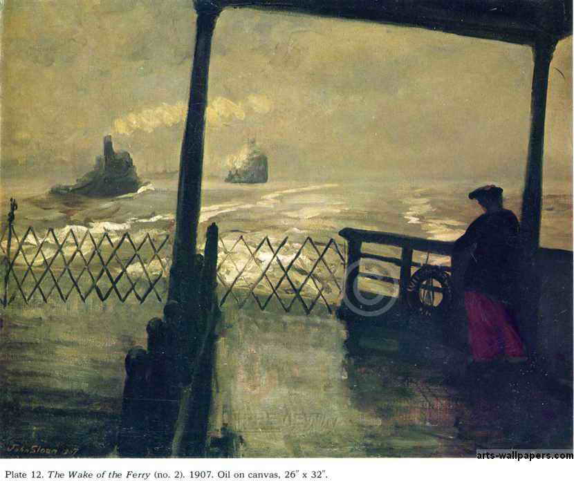
I came across this painting (above) when I was a kid. It was a cover illustration on a book of short stories by Jack London, which included his famous story about ferries and The Hudson River called, "Fog."

I'm guessing this picture is by John Sloan. It seems odd that the ship should be so low, almost at sea level. You'd think the water would spill in and sink the ship. I imagine that ferries have big, heavy keels to stabilize them. It also seems odd that such a dirty, gritty, big-city boat could venture out into raw nature. Of course, nature itself seems pretty dirty and soupy here. 


Here's (above) a famous painting by Reginal Marsh. He seems to be equally repelled and attracted by the people he paints. 


Here's (above) one of Red Grooms' city scenes. Grooms has fallen out of favor lately, but  I still like the guy. Few modern painters capture the dirty, crazy, wonderful intensity of New York the way he can. In film, I'd say that Bakshi captured that in Fritz and Heavy Traffic.

hmmmm. Grooms pictures would make great "pop-out" greeting cards.


Above, a Grooms newstand. I don't know why, but buying a newspaper or magazine from a stand like this was a lot more fun than buying the same item from a bookstore. Maybe it's because you get to enter the dingy, 16-watt world of the news troll. Maybe it's because the magazines seem so current and exciting in this format, as if they were just snatched off the printing press.


Lots of New York artists did subway themes, but none as successfully as Grooms (above). It's hard to imagine that all those different kinds of people managed to co-exist, even for the short time it takes to ride a train.


Glackins took this fascinating photo of a real New York subway interior. Parisians especially are always lamenting how cold and impersonal people appear when riding the Metro but, really, all big city mass transit is like that. I kinda like it that way.


Here (above) Glackins captures a girl having her hair dyed while the public watches. I wish all architects had a print of this in their offices. We need to have buildings that are designed for people watching. People like to watch other people at work, which is one of the reasons McDonald's is such a success.


Is this picture by Sloan? I can't tell. The arching bridge is a great idea, one which we should duplicate today.


I think this picture of a small indoor theater is by Glackins. I imagine the same theater hosted boxing and equestrian shows. I like the fact that it's somewhat upscale and elegant. We need small modern theaters like this.


Here's (above) a picture by the man I consider America's most wrongly neglected artist, Cecil Bell.


For a long time I couldn't figure out why Bell (above) was so neglected by the critics, but now I think I know. It's because only a small number of his pictures are so stylistically sophisticated that they can be said to stand alone. You only get an idea of the great soul of the man when you have a chance to see a whole book of his pictures.


Unlike Reginald Marsh, Bell had a great deal of affection for his subjects (above). He knew there was nobility in the city dwellers he saw all around him, that the unique quality of the city wouldn't last forever, and that the future would have need to be reminded of it.


What a keen observer Bell was! Your first impression of the scenario he paints (above) is how seedy it is, but if you look at it long enough the wider context becomes apparent. You see the technology, the feel for how much work must have gone into making it, the way that humans divide themselves into vocations, the idea that people...even when pursuing raw basics like sex...never stop being thinking creatures, and can still be regarded as possessing destinies and interesting life stories.


I envy art students who are able to study in New York City. The teachers are among the best the country has to offer and the environment is stimulating. Look at the interesting and unorthodox model and the beautiful backdrop behind her. Look at the intensity of the teacher.


Here's (above) a student's homework assignment from The School of Visual Arts. I've often thought that one of the best things a student can do to learn color and composition is to do lots of rough, vague color thumnails of classic paintings. I was suprised to see that a teacher at SVA agreed with me. Now that's a class worth taking!

Sunday, May 06, 2012

ADDICTIVE ANIMATION

John Kricfaluci's working on a Bobby Bigloaf commercial, and he's doing most of the animation himself. I recently saw some of the latest scenes. How do they look? Well, they're funny, beautifully drawn and animated, wildly innovative, ahead of their time, will probably sell a ton of product, and will still be watched 200 years from now....in other words, they're examples of typical John greatness...or are they?

In the last 6 months John's done a lot of animation experiments, and they've really paid off. You should see what the man is capable of now! I credit him with coming up with a new animation technique...for lack of a better term, I call it addictive animation. That's animation that you want to see over and over again, and when it stops...well, you get mad at the animator for not giving you more.

By "mad," I mean really mad. When it's over your only emotions are anguish and anger. You find yourself self saying, "MORE!!!!," not as a request but as a command. You want to chain the guy who drew it to his desk and make him turn out another scene. Sure he has human rights, sure you have no right to make him do that ...but who cares!!!???  Like a true addict, YOU MUST HAVE MORE!!!!!!! You're beyond reason or compassion.


That's what I felt when saw the latest Bigloaf scenes. I felt that I had a right to the remainder of the scenes, which weren't even animated yet, and that the artist was maliciously withholding them.  I found myself saying, "Is that it??? You mean, that's all there is???? For God's sake,why did you invite me here if you weren't going to show me the whole thing???" I wanted to shake the computer in case more scenes were hiding in there. Geez. I probably had madness in my eyes. The animation was that good.


This revises my thoughts about the purpose of animation. Sure it has to be entertaining, and plausible and appealing and all that......but surely it should also be addictive. It should reduce the audience to nervous wrecks who unwillingly go home and yell at their children and kick their dog just to release the nervous energy. After the scenes are shown there should be a groundswell of increasingly urgent audience foot stomping and a hue and cry of "More! More! MORE!" John's the only currently practicing animator I know whose work has the potential to provoke emotions like that.


I probably shouldn't write about John's work this way. I mean, nobody can live up to that kind of hype, and I'm sure this will embarrass him. But I have to do it...just because it's the truth.

BTW: I'm sick as a dog right now and haven't been able to obtain stills from the film. I'm illustrating this with old John legal pad drawings gleaned from his blog.

http://johnkstuff.blogspot.com/

Thursday, May 03, 2012

AURALYNN RANTS ABOUT SHEETS


INT. MALL: 

AURALYNN: "Alright, you're wondering what I wanted you to see in this department store. I'll give you a hint: it has to do with something you said on your blog."

EDDIE: "My blog? Really?" 

AURALYNN: "Yeah. Follow me!"


EDDIE: "Auralynn, wait a minute! Let me try out this sofa. Ooooooh, man! This feels good! The problem is, if I allowed myself to be this comfortable in front of a TV, I'd turn into a couch potato."


AURALYNN: "How 'bout a shot for Roberto?"


AURALYNN: "Cheekster panties or cotton hipster? What do you think I should get, Eddie?"

EDDIE: "Er...what I think is that somebody I know is going to come along and I'll have to dive under the counter."


AURALYNN: "Okay, down to business! What we want is riiiiiiight around this corner......"


AURALYNN: "Okay, here we are! This is what I wanted to show you. This...THIS...is what a real bed looks like! You see how inviting this is? This is what I tried to tell you about the other day. THIS is the kind of thing girls like: quality white sheets, double pillows for each person, and a big old white comforter."


AURALYNN: "I can't believe how many men expect their girlfriends to get all worked up about jumping into a bed that looks like like an army cot. Girls hate that! On your blog you mentioned clean white sheets. That's not anywhere near enough! Tell the Theory Corner people that we're girls! We like beautiful things! Tell the guys to get a real bed with real sheets!"


AURALYNN: "(Sigh!) I love to let myself fall backward onto something big and fluffy (*Sigh*) It's like...falling...into.......a cloud."


EDDIE (VO): "It looks great, but what if a guy's strapped for cash?"


AURALYNN: "It doesn't cost much. Now here's what you need: 700 or 800 thread white cotton sheets, probably Queen size. Queen is the smallest bed that'll hold two people."


AURALYNN: "This looks like a good set: one fitted sheet, one flat sheet, and two pillow cases; 700 threads. It's on sale for $109...$90 if you have the newspaper coupon. That's a good price."


LATER, AT THE FOOD COURT:

AURALYNN: "So, did you like the sheets?"

EDDIE: "Yeah, they're great. Right now my whole family sleeps under sheets with pictures of animals and fire engines on them. That's what happens when you have kids. But you're right about the sheets."


Wednesday, May 02, 2012

DOES EXISTENTIALISM SUCK?

STEVE: "Hi Auralynn! I'm on Skype. Can you see me?"


AURALYNN: "Hi Steve! I see you fine!"

STEVE (VO): "Just a sec. I'm gonna switch to the laptop in the kitchen."


STEVE: "Okay, Here I am in the kitchen. Jo jo's with me." 


STEVE: "So, Jo Jo....Tell Auralynn what you told me about why existentialism sucks.  I don't know what I think about it myself. We should let Auralynn decide which of us right. "


JO JO: "Good idea! That's fine with me.

Okay, here's the argument. Existentialism  attempts to demolish morality without replacing it with anything of equal value. Sartre says that being a moral person is a symptom of bad faith...a sign that a man is surrendering to group think, and not being true to his own nature. But that's silly."


JO JO: "Is it a good thing if dictators and murderers like Mao and Stalin are true to their own natures? You don't want to blindly embrace traditional morality, but you don't want to reject it out of hand either. Morality creates a wall that shields us from barbarism and allows civilization to flourish."


JO JO: "I guess I believe in Cicero's notion of "Right Reason." We should accept as truth the fundamental moral principals that are common to all men and all nations in every time. Using those fundamental truths as a foundation, we should use reason to deduce a  specific morality.  We don't need Sartre's philosophy....."


JO JO: ".....or Camu's either. I mean, that line from Camu's 'The Stranger: 'I shot him because the sun was in my eyes'....that sounds fun and avante garde and all that, but if you actually knew someone who did that, you'd think he was crazy. You can't base a morality on silly stuff like that."


AURALYNN: "True, but in Cicero's time humanity may have been united in believing that slavery was natural and moral. You wouldn't want to base a morality on an idea like that, eith...mmf...blorf."

AURALYNN: "Oh, sorry...my lips are dry and I had to....I'd offer you some lip balm, but......"

JO JO: "LIP BALM!!! THAT SUMS IT UP EXACTLY!!!!!"


JO JO: "Okay, traditional morality has some flaws, and all of us aren't going to agree on what the basics are, but there is a consensus about most things, and what there is no agreement on....well, we apply a sort of lip balm to it. In lieu of a permanent solution...we discuss it. It'll work out eventually."


JO JO: "Alright, I rest my case."


STEVE: "i don't know, Jo Jo. You're not giving the Existentialists the benefit of patching up their inconsistencies with lip balm. Aaaaargh....it's all so confusing."


STEVE: "Auralynn, You're the tie breaker. Who won this discussion? Does Existentialism suck?"


AURALYNN: "Well...yes, of course it sucks."


AURALYNN: "I mean, Aristotle said that you can tell if an idea is a good one because a good idea is always beneficial to both the individual and to the community. What's beneficial to anyone about killing someone because the sun was in your eyes?"


JO JO: ""Thank you, Auralynn! You have earned yourself a doughnut and a YooHoo when next we meet."


Sunday, April 29, 2012

PHOTO SHOOTS THAT GO AWRY (REVISED)


Gee, it's scary to think about photo shoots that go awry, that just don't have any juice. Maybe it's especially scary in adult media which is supposed to be about passion and lack of inhibition. 


What if a model has a bad day? What if the photographer has a bad day? What if they both have a bad day at the same time?


I'm guessing that's what happened here (above). The shoot wasn't working out so the photographer decided to make a joke out of it. 


Fortunately this model had a knack for comedy.


The horrible truth is that not every model is photogenic. This girl (above) probably got the job because she looks good in real life, but the truth is that she doesn't photograph. The camera doesn't love her. What do you do when you get a subject like that? Do photographers have a Plan B that enables them to save the shoot?


It's a strange but true fact that some women with good bodies (above) just aren't that interesting when naked, at least not in pictures. Here's (above) a girl taking her clothes off and there's no emotional impact. It's just information.

Apparently nudity is a state of mind. In order to read as naked a model has to feel naked. She has to project a feeling of vulnerability or of being in a special state where ordinary rules don't apply.


Or maybe I'm wrong. This girl (above) seems vulnerable enough, but the nakedness only barely reads. Why is that?

 The use of flat lighting and awkward composition seems deliberate. I wish I knew the story behind this.


Once again, the same model (above). Now this is a really scary picture. This girl's good looking, but she's completely devoid of sex appeal. That's unusual. Almost every human being and even some department store mannequins exude some degree of sexuality. Whatever subtle cues make up that quality are completely missing here. I can only imagine the panic the photographer felt when he realized that he had a rogue model on his hands.

I suppose the poor guy continued to shoot anyway, in the hope that some unusual truth
would come out of it. It does sometimes. Women like Veronica Lake can be sexy even when they're cold but, really, how often does that happen?


My guess is that lots of otherwise unsuccessful shoots were saved by alcohol, which has the ability to reset emotions in some people.


It's risky, though. 


Sometimes weird pictures (above) can save a shoot. Actually, this shoot didn't need saving. The model succeeds in being sexy in an odd way.


Well, that's it. So far as I can tell, the human body is still the most popular subject in the visual arts.

My apology to the model I called sexless, if it turns out that I was wrong. Sometimes the camera adds or subtracts in unpredictable ways.