Thursday, April 07, 2016

WONDERFUL PORTLAND OREGON

I just returned from a week in Oregon where I stayed with family and friends in the hipster section of East Portland. Wooooowwww!!!!!!! What a week! What a city!!!!! 

Unfortunately my family still doesn't want to appear anywhere on my blog, so I'll have to leave out a lot of events that related to my son, his amazing and generous girlfriend and their terrific friends. Too bad! 


The biggest asset of Portland is its people and, more significantly, its hipsters. That's a big subject that'll require an entire post to cover. I'll come back to that. 


I'll start instead with a description of some of the old wooden homes that Portland's famous for. Some have been expensively altered and updated like the one above.


And others (above) haven't been kept up much at all, but they still succeed in being beautiful.


Craftsman homes (above) dating from the 1920s abound in East Portland. Has there ever been a more pleasing home style?


Even churches benefit from the Craftsman look. Here's (above) a Craftsman reading room attached to a Presbyterian church I visited.


Of course Wi-Fi was provided.


Even the sidewalks in suburban East Portland are worth seeing.


The plant growth there is a controlled wild...it's the look that you see in paintings of old English cottages. Compare that to towns where a lawn is usually a neat, flat field of plain grass punctuated by an occasional rose bush.


People have discovered how to tame and shape small trees so they form a canopy over the sidewalk. No doubt trees like this can be found in lots of places but only in Portland have I seen such a such a profusion of them in urban settings.


That's because it's a Portland custom to plant trees on the lawn right up to the sidewalk.


I'm guessing that the curbside forest is Portland's way of presenting the concept of verdant nature to passers-by. Or maybe they're just taking advantage of the frequent rainfall in that city. I'm told that rainfall there is unique. Umbrellas don't really protect you from it because it's a kind of mist that comes at you from all sides.


I saw a number of Craftsman homes which were made into shops. If I had a Craftsman I'd try to be faithful to the original builder's intent; even so, I admit that some of the commercial changes (above) have been beautiful.

It strikes me that some of the best ideas for modern houses can be found in shops and restaurants. Maybe home architects should pay more attention to what's happening in those fields.


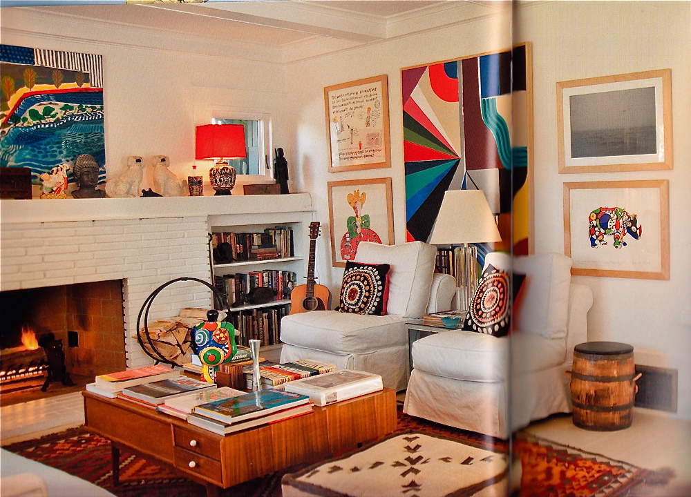
Furnishing a Craftsman is easy. Original period furniture is pricey, but comfortable, oversized, thrift store furniture works very well in rooms like the one above.


On the other hand, if you can afford original arts and crafts furniture...well...look what's available (above)! I wouldn't be surprised if that table was made of teak.


That's enough about houses. I want to hit another Portland highlight, namely Powell's Book Store (above). It's the biggest book store in the U.S.A. and possibly the world, and the staff is super efficient and helpful.  It's a whole lot bigger than it looks in the photo.


There's so much to say about Portland that I've had to leave out for lack of space: The hipster scene, the employment prospects, Mount Hood and the amazing Timberline Ski Lodge, the Steampunk bridges, the nature hikes, the incredible local beers, the hippie food, Cascadia....I'll have to cover some of these in another post.


Monday, March 28, 2016

ITALIAN HILLTOP TOWNS

I'm told that all over the mountainous parts of Italy you can find hilltop towns like the one above. Boy, they're beautiful...but you have to wonder: how do people make a living up there? The only good farmland is in the flatland below. Do workers really climb up and down the steep hill every day?


So far as I can tell, the answer is yes...or at least it used to be yes.


I guess you just developed good cardio if you lived there.


One good thing about living on a slope is that drainage is never a problem. Gravity pulls everything down to the mountain bottom. Garbage, human and animal waste...you name it, everything rolls down to some gully or other at the base.


As you can imagine, all that climbing and waste avoidance is no fun. So why did people choose to live up there? Well, they didn't choose it. They were forced to do it. In the Middle Ages barons wanted castles and fortress towns built up there and peasants were coerced into living there so they could build everything.

People had no choice. Besides, the lowlands were full of bandits and marauders. At least the mountains were safe.


Since they were stuck there, people did their best to beautify the towns. Some dirt poor places still had ornate staircases (above) or piazzas.


And , whatever the inconveniences, they still had the comfort of living in beautiful spaces (above).


After a point, though, the nobility moved out and the people who were left didn't see the point in keeping the place up. 


Things fell into disrepair. People never liked living up there and when they had a chance they bailed to the flatlands and to America. A few hilltowns on the tourist routes made out alright but most of them became near ghost towns.


Here's (above) a village in Southern Italy that's been completely abandoned. Living there would be kind of spooky but...hey, maybe it's free.

*********

BTW: I'm going to take a vacation for a week. I'll be back soon!!!!!!!!! 


Sunday, March 27, 2016

MARY BLAIR SECRETS

 It's always fun to run familiar pictures through Photoshop filters to see what happens. Sometimes the simplified color and shapes make it easier to see how the artist organized his ideas. I'll try that here with a couple of pictures, starting with a Mary Blair concept sketch for the nursery in Disney's "Peter Pan."

BTW: I like the granular light coming from the green lamp.


Wow! The filter shows a monochrome brown picture with color accents...no surprise there...but the shapes are revealed to be dominated by linear horizontals punctuated by spaces, like some kind of I Ching diagram. The red and white shapes are more organic and attention-getting.


As I said, most of the picture is brown but what colors there are seem to be double complementaries, like the kind in the diagram above. Some artists avoid this color strategy because it's unappealing when a picture has only those kind of colors. That all improves when the colors are used as accents within an otherwise monochrome scheme.


Here's (above) a terrific Boucher. Maybe it's a detail from one of his allegory paintings, I'm not sure. 


Put a filter on it and the structure is revealed.  The two cupids and the bust form an obvious triangle, but...Yikes!...there's a strong, dark horizontal about 2/3 of the way down from the top, and a blue/black focal point under the cupid's art paper.

The colors appear to be basic red, yellow and blue primaries modified by tints and shades and co-habiting with neutrals.


Last but not least...here's (above) the George Herriman caricature I put up recently. Let's take one more look at it, this time filtered.


Holy Cow!!!!! Boy, am I glad I did that! The blacks form spots all over his shape. That means the points of black were an important design unifier, and not just borders around the colors.

Interesting, eh?


Friday, March 25, 2016

OLD EUROPEAN COTTAGES

Cozy houses are on my mind lately, so I thought I'd write about cottages. Here's a nice contemporary one (above), done in the old style, but it's a bit too...I don't know...too perfect. I'll bet a Beverly Hills lawyer lives here. Let's see if I can rustle up something more authentic...


....something a little more rural...like this (above) one.
  

Inside it's a bit cramped, and the ceiling's kind of low, but it's cozy and the low top no doubt makes it easier to heat.

What I like most about this room is the large kitchen table. I imagine that friends who came to visit sat at the table and chatted with the owners while they cooked and cleaned.


That's the way it is today in Steve Worth's kitchen (above). On entering the house, guests ignore the living room and instead take a seat at the kitchen table. This is a cottage-style kitchen with comfortable chairs and a big table you can walk around.


I concede that a cozy living room is a thing of beauty. Even so, the kitchen is a more natural gathering spot.


I don't know anything about the history of cottages. To judge from pictures I've seen, old European cottages frequently consisted of one large room containing a hearth, a table, and cabinet beds. Other rooms were for additional beds and storage. Lots of cottages contained a fire pit (above) in the middle of the floor.

Having a fire pit rather than a stove or a hearth strikes me as odd since the room must fill with smoke sometimes, even if there was ventilation. Maybe the smoke was welcome because it drove vermin out of the thatched roofs. Maybe smoke was rare because the only thing that was ever cooked was soup and that only required enough flame to simmer.


Maybe families with a big hearth and lots of iron kettles were thought of as upper crust.


Maybe an interior oven was a status item, even if the oven was only a mound of mud or clay like the one above. This wasn't a poor folks' cottage. It had a carved door, a cabinet for china, formal chairs rather than a bench, and a separate bedroom.

I can't tell what the floors in this photo were made of but I'll guess that they were dirt floors. I'll also guess that dirt floors were doctored somehow to make them more solid than you'd expect dirt to be.


Here's (above) a Russian cottage with thick, wooden walls and inexplicably high ceilings. Boy, that bedspread looks great! Every room, even in modern houses, should have one key item that's special, something fussed over, like the blanket.


Here's a cottage that's packed with cabinets that look like they once belonged in more affluent homes.  There's a story here...I wish I knew what it was.

My guess is that modest cottages, where generations of the same family lived for years, frequently had a high-end item or two on display. Over time families accumulate unusual things.


Monday, March 21, 2016

A TERRIFIC SMALL LIVING ROOM

I'm still looking for ideas I can use when I find a new house. I'm on a budget so I'll have to make a Devil's Choice: a small house with complex and interesting shapes, or a larger house with boring rooms but decent square-footage. I'd gladly take the small place if I could find something like this (above), but what are the chances of that? 

Is this living room practical? I'm not sure. The open staircase means that sound from the living room goes unimpeded up to the rooms above, and that could cause arguments. On the other hand, it's soooo cozy and artsy. I like the level changes on the floors between rooms, too.
  

I wouldn't have picked some of this furniture (above) myself but I like the color contrast. 


If I were to have a large, simplified color graphic on the wall I might choose something like this (above).


Here's (above) another room in the same house.  Once again the color and dark textures read great against white. 


Maybe I'll get lucky and find something big and cheap (above)...but I doubt it.


That's all I have to say for now. I'll end with this infinitely cool coffee table that dominates the room. I wonder where you'd find something like that? I'd probably have to make it myself.