Showing posts with label houses. Show all posts

Monday, February 13, 2017

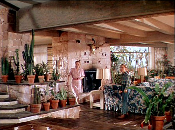
THE HOUSE FROM "LEAVE HER TO HEAVEN"


Architecture is on my mind these days, and I thought I'd talk about another favorite film house...this one from the 1945 thriller, "Leave Her to Heaven."  The stars: Gene Tierney and Cornel Wilde.  The director: John M. Stahl.  The location: Arizona.  Gee, I wish I knew the art director's name because this post is really about his work. 


This (above) is the best view of the exterior I could find, but it doesn't quite match the log cabin look of the picture at the top. I think the film presented these as different views of the same house, though. Anyway, this view kinda' makes you want to take a dip, doesn't it?


And here's an indoor shot highlighting one of the best staircases in all of film. It's only rival...in my opinion... is the Czar's staircase in Von Sternberg's "Catherine the Great."


This interior was built on a set in L.A. If I understand right
it was inspired by a real house in Arizona, but lots of alterations were made by the set designer.  Not bad, eh?


Above, a slightly different angle.


This house (above) is cozy as well as modern. That's a trademark of architect Cliff May. You don't suppose he had a hand in this film, do you?


The dining area (above) is raised two or three steps above the living room. Nice.


Of course, it helps to have Gene Tierney serving up the meal.


Above, the area in front of the dining table.


Here's (above) the set of another house in the film.


How do you like the Dutch door and the large windows that go all the way down to the floor?

BTW: Most of these pictures were found on a site called "Hooked on Houses."

Wednesday, January 04, 2017

WHAT KIND OF HOUSE?


I don't know what kind of house I'll end up with. I'm hoping that I can find something the town eccentric used to live in, or a house made from a barn or an old workshop. If so, I can have a living room like the one above, which is a place to work as well as relax.

I love the way the loft creates a dark shadow space which makes for a great contrast with the white light in the rest of the room.


 In my fantasies the town eccentric also left behind a large, cozy, old-fashion kitchen like the one above.


 Of course there's some nice modern kitchens, too.


I have a lot of books and papers so a hallway like this one (above) would be much appreciated.


It would be nice to have a lawn with old-growth trees in front. I'm a big believer in front gardens rather than front lawns.

But what am I talking about? I can't afford the kind of architecturally sophisticated house you see above. The likelihood is that I'll end up in a tract house that simply has more square footage than the place I'm living in now. *Sigh.*


Well, the one thing I can afford to control is the lighting. Wherever I end up rest assured that it'll be lit like a Hollywood set. It'll be a place to park the lamps I've been accumulating over the years.

How do you like the hanging lamp above? It's a one-of-a-kind item I got from a library book.


Thursday, December 29, 2016

THINKING ABOUT HOUSES

Now that Christmas is over my thoughts turn once again to what kind of house I can expect to live in when I move out of L.A. (Sigh!) I'll miss the California ranch style (above).


If I end up with a small house maybe I can convert it into something nice. I like the simple, open-plan living room, above. The blue sofa makes a nice contrast with the varnished wood.


Here's (above) a light and airy living room furnished by Ikea. The curtains unexpectedly turn out to be a potent unifying element.


I like wide living rooms with low ceilings. This room (above) is by Frank Lloyd Wright. 

In California you hear of people converting outdoor pre-fab tool sheds into tiny offices. It would be a place to get work done if the house were too noisy. I wonder what the zoning laws say about this.

Here's (above) another outdoor office. Gee, all that glass would make it hard to heat. It looks great, though.


Wow! I love the way this dark, woody bedroom looks! It would be like sleeping in a cabin in the Klondike.

This unusually dark room raises a question: would it be wise to allow each bedroom to have its own unique look and feel? Would a house with wildly different rooms be a platypus?


Monday, March 21, 2016

A TERRIFIC SMALL LIVING ROOM

I'm still looking for ideas I can use when I find a new house. I'm on a budget so I'll have to make a Devil's Choice: a small house with complex and interesting shapes, or a larger house with boring rooms but decent square-footage. I'd gladly take the small place if I could find something like this (above), but what are the chances of that? 

Is this living room practical? I'm not sure. The open staircase means that sound from the living room goes unimpeded up to the rooms above, and that could cause arguments. On the other hand, it's soooo cozy and artsy. I like the level changes on the floors between rooms, too.
  

I wouldn't have picked some of this furniture (above) myself but I like the color contrast. 


If I were to have a large, simplified color graphic on the wall I might choose something like this (above).


Here's (above) another room in the same house.  Once again the color and dark textures read great against white. 


Maybe I'll get lucky and find something big and cheap (above)...but I doubt it.


That's all I have to say for now. I'll end with this infinitely cool coffee table that dominates the room. I wonder where you'd find something like that? I'd probably have to make it myself.


Tuesday, December 08, 2015

HOME DESIGN

I'll probably be moving in February or March. We haven't started to look for a new house yet, but I'm hoping for something like the one above: a nice old gabled house on a cliff overlooking a valley...servants quarters...a stable in back.


Haw! That's what I want, but what I'll get will likely be something like this, above. That's okay...even modest new houses have improvements that would have been unheard of when I was a kid: big kitchens, unusual room shapes, the home office, lots of daylight, etc., etc. 


I've been reading about the history of home design and I'm amazed to see how many ideas that we take for granted are fairly recent. Believe it or not, comfortable chairs are a fairly recent idea, and even corridors...corridors!... are recent. Until the last 100 years or so you accessed your room by passing through other rooms to get there. Even Versailles (above) was built like that...well, mostly.


What I really want, and I'm afraid I may not get, is a nice, old fashioned front porch. I spent half my childhood on porches like that and I got some of my best kid ideas there. Who invented porches, anyway? I mean raised, front porches...the deep, spacious kind with a permanent roof. I think of them as an American invention, but maybe I'm wrong.


Pity the British poor. They had not only had no porch; they had no roof of any kind over their front doors.


Wait a minute, what am I saying? Pity the British rich, too! They had the same problem. With all their money the rich still had to stand out in the rain while they fished for their keys just like everybody else. Britains just don't believe in a sheltering roof over the front door.


Even the prime minister is expected to stand out in the rain while he waits to be admitted. How odd. Why not a porch? Why not recess the door inside the building?


But maybe I'm too quick to criticize. In the part of the U.S. I'm moving to there's very few porches, and very few foyers either.  The front door (above) just lets into the living room. No transition area, no greeting spot. A person coming in the door in the cold of winter lets in a gust of wind that probably sends every paper in the room flying. Yikes!


Friday, May 29, 2015

THE EVOLUTION OF THE MODERN HOUSE

Here's (above) a 1950s-type Cliff May-influenced ranch house. They're not uncommon in Los Angeles, in fact they're so common here that they hardly raise an eyebrow. That's a pity because this city's ranch homes are much underrated. They so effortlessly combine modernism and tradition that we forget how hard won that synthesis was.

A little history is in order: 

  
Europeans created modernism but they couldn't make it work. Look at this bleak design (above) for a reconstructed Paris by Le Corbusier. Parisians can thank their lucky stars that he was prevented from putting this into effect. 

Here's a factory-style house by ex-Bauhaus teacher Walter Gropius. What was he thinking of? Who wants to live in a factory?


The public liked the modern look but only for business buildings. They didn't want to live in it. The race was on to tame modernism and make the new style fit for homes, and affordable. The first American efforts (above) were hideous.


Haw! So were the second efforts (above).


Sure, Frank Lloyd Wright (above) could make it work but he built for the well off. How do you make this sort of thing available to the common man?


Eventually a potentially low cost Wright-influenced look was achieved (above) but the look required a house that was big enough to spread out a bit, sympathetic building codes and readily available pre-fab parts. I'm also guessing that the designs, as good as they were, were perceived by the public as too drastic. 
  

During this period faux modernism proliferated. In the kind of small houses most people could afford it sometimes looked shoddy and tacky...something built for the convenience of the contractor rather than for aesthetic reasons.


The guy who finally made it work was Cliff May (above). His smaller houses weren't exactly cheap and they still required a certain amount of square footage, but they were simultaneously modern and traditional, conceptually simple, and they left the door open for further simplification.


Here (above) there's a gap in my knowledge. Some genius...was it May or one of his disciples?...created the synthesis known to Southern Californians as "The Yellow Ranch House." It's affordable, Cliff May savy, modern, comfortable, compressible, can be built on a small lot...and it's low priced! No reliance on esoteric materials; every component is made of parts that can be had at any large lumber store.

It's the perfect realization of the maxim: "it doesn't have to look modern to be modern."

Boy, Cliff came through for us! He was the Bob Clampett of modern housing!


I'm amazed by the versatility in the interior design of these yellow ranch houses. You can furnish them almost as modern as you like without contradicting the house's design.


A less modern decor (above) works okay, too.


In fact, I'll bet even funky furniture like the kind in this TV set would work in those yellow ranch houses.

Thanks, Cliff! You 'da man!!!!