Monday, April 23, 2007

FACES TOO SPECIFIC

One problem with a lot of modern portrait paintings is that they're too specific. Even a realistic portrait should be somewhat iconic. The picture above isn't a picture of of eternal beauty, it's too specifically a painting of Beulah J. Kratz (or whatever her name is). The same problem holds for the other three Lovis Corinth pictures immediately below.


Actually, this one of the nude holding the hairbrush isn't half bad.


I don't mean to say that all potraits should be sanitized and idealized. Not at all. But the more specific the picture is the more the style should be iconic, cartoony or deliberately mannered. The picture above by Otto Dix is a good example. It's very specific but it's cartoony and it works.


More realistic portraits are better off idealized somewhat like the pictures immediately above and below. They're by Raphael (above) and Rubens (below). You accept them as realistic but they're subtley stylized as well.


Do you agree?


Sunday, April 22, 2007

THE RIGHT ARCHITECTURE FOR LOS ANGELES

Of course Los Angeles should retain its deco architecture, it's craftsman houses, it's Googie's restaurants and hot-dog stands shaped like cartoon characters, nobody disputes that. But what about the rest? What should be the norm? What building style reflects the real soul of the city? That's easy...traditional Mexican style!


Well we are in the Southwest, after all. And it's about time that we made a radical re-assessment of Mexican style and how it compares to other styles. Mexican architectute isn't just one more quaint variation of the New World Spanish style, it's the very best variation. It's easily the most beautiful style anywhere in the Americas. It's probably more beautiful than what you'd find in Spain. It's world class, fully comparable to middle-European and Japanese styles.
It certainly is full of fun and color. Maybe that's because it's a synthesis of Spanish and native indian styles. Aztecs used to love those colorfull, complex jigsaw puzzle shapes and every indian seems to have inherited a taste for bright-colored handicrafts. Other South American cultures are colorfull too. I'm thinking of the Panamanian and Peruvian indians. The difference is that they colored only their textiles. Mexicans colored almost everything.

I know what you're thinking, what about the Haitians (not portrayed in pictures here)? They REALLY color everything! But they don't have the Mexicans' taste. Sorry. Haiti overdoes it.


These pillars are the natural, uncarved forms taken by a palm tree that grows in Mexico. Are the tendrils part of the palm or are they the kind of parasitic wooden vine that strangles trees? I don't know, but they sure are pretty. Try not to look at the ugly, modernist wall behind the pillars. I guess even Mexico has its share of bad architects.


Los Angeles isn't that far from Mexico. What could be more natural than a Mexican influence on what we do here? Why are we impoting East Coast and Bauhaus styles when one of the world's most pleasing styles exists right in our own backyard?
The red brick house above is from England. It's the house that was just in the news for being trashed by English MySpace readers. It's pretty ugly, isn't it? Why does modern England insist on building so many ugly houses? The amazing thing is that they're right next to France where tourists flock to see the traditional architecture. I guess the English are just too proud to be influenced by foreigners. And so are we. We in the Southwest U.S. are just too proud to be influenced by the beauty next door.


Saturday, April 21, 2007

MAGIC FOR KIDS


Kids are great! One of their many assets is that they're a great audience for magic. Their jaws drop when you wave your hands and the supermarket door opens. When I did that for my son for the first time I thought he'd faint. He was positively awe-stricken. I was expecting him to kneel down and worship me as a white god. My favorite trick of all though, was the disappearing nickel.


It's almost too easy. You put a nickel in your palm and tell your kid (my daughter in this case) that you're going to make it disappear right infront of her eyes. Now kids aren't stupid, and they're likely to say something like, "Piff! Piff! C'mon Dad, nobody can really do that! I wasn't born yesterday!" It's important to little kids that you know they're worldly and not to be trifled with.

So you say to the kid, "No, I mean it! It's real magic! Just watch the nickel closely and it'll vanish right infront of your eyes. " The kid gives a skeptical look. "Here it goes...keeeeep watching...!" The kid's face gets closer to your palm. "I feel it starting to disappear...It's starting to ...yes, there it goes...Oh my God, it's...it's...!" Then sudden;y, "HOLY COW! WHAT'S THAT BEHIND YOU!?" Huh? She turns to see what you were pointing at and you pocket the nickel! When she looks back again the palm is empty. Klong! The kid is flabbergasted! Nothing to do now but sit back and receive waves of awe and adulation.

Gee, I miss that. Kids have a way of making you feel like a king. BTW, the kids in the pictures aren't mine, I got them off the net.

Friday, April 20, 2007

A BIT OF "A BIT OF FRY AND LAURIE"


A couple of clips form "A Bit of Fry and Laurie." These guys are great!


Thursday, April 19, 2007

TENNESSEE WILLIAMS: CARTOONIST


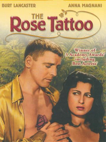
I don't know if Tennessee Williams ever drew anything but I regard him as a cartoonist. You could say that he's a cartoonist with a typewriter, rather than a pencil. His stories are over-the-top and funny, and his characters are fun to draw. Here's a drawing I did (below) of Anna Magnani from the William's film, "The Rose Tattoo." Magnani was brilliant in this film. What an under-rated actress!
Williams comes from the Ibsen-Chekhov-Strindberg school of writing. These guys liked character conflict, even when it didn't make any sense. It was really drama for the sake of drama with the then-fashionable nihilism added to justify it. Actors liked the plays because they were full of dramatic fireworks but the public was slow to warm to them. I think people were put off by the unrelenting seriousness. These were pretty depressing plays.
The writer who saved the movement from oblivion was Tennessee Williams and he did it by making the new style funny. Oh, his work was still serious on some level but it was serious the way cartoonists like to be serious, which is really a caricature of seriousness. In a Williams play you never knew whether to laugh or cry.

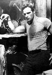
Maybe Williams' best-known play was "A Street Car Named Desire." Brando was great in the film version! Even John K who hates Brando in other films, likes him in this one! I read that Brando had a whole closet of tee-shirts for this film, each one stretched and bunched up to a different side to make it seem tight from a different camera angle. Here's (above) a half-minute clip from the film.


When I was a kid I'd see these Williams movies and wonder what the heck was going on in the adult world. Was I going to have to live in a mansion with a Big Daddy? Was I supposed to hang around with alcoholics and sleazy women in slips? Would I be expected to break mirrors with my whiskey glass? They go through a lot of mirrors in Tennessee Williams films.


Wednesday, April 18, 2007

BLOGGER WON"T LET ME PUT UP PICTURES!

Or maybe my computer's on the Fritz. I don't know. I can't figure it out. Whatever it is, it'll probably be better tomorrow. Anyway here's something that'll probably look good in print. It's the opening title for an old 30s radio show called...


GRAND CENTRAL STATION


ANNOUNCER: (SLOW BUILD) As a bullet seeks its target , shining rails in every part of our great country are aimed at GRAND CENTRAL STATION, heart of the nation's greatest city.

Drawn by the magnetic force of the fantastic metropolis, great trains rush toward the Hudson River... (FASTER BUILD) ...SWEEP down its eastern bank for 140 miles...FLASH briefly by the long, red row of tenement houses south of 125th Street!

SFX: RACING ENGINE. TRAIN'S BELL.

ANNOUNCER: DIVE with a roar into the two and one half mile tunnel which burrows beneath the glitter and swank of Park Avenue! AND THEN...

SFX: ENGINE CHUGGING SLOWS. TRAIN'S BELL. HISS OF AIR BRAKES.

ANNOUNCER: ...GRAND CENTRAL STATION!


Nifty, huh? That's what a REAL writer does! Why can't we have writing like that in our industry!?

IS IT A GOOD IDEA TO DRAW AT THE ZOO?


No it's not, not unless you have a special reason. If you're a realistic animator working on a sequel to "The Lion King" then by all means go and enjoy yourself, but if you're a cartoonist you might find yourself wondering if the trip was really necessary. Artist-friendly zoos are a myth.


Zoos used to be a great places to draw. Older zoos like the one above kept exciting animals like lions in horizontal cages where the lions used to pace up and down for half the day (the other half was spent outside). It was hard on the lion but great for artists who got to see repeated side views of dynamic walks only a few feet infront of their sketchbooks. The cages were indoors and the lighting was perfect for drawing. Best of all, there was no wind to blow your paper and you got to hear the lions roar at each other with the sound echoing off the walls.


Modern zoos put the lions into enormous outdoor habitats. It always takes visitors a minute or two to locate the lion who's usually sleeping behind a rock. No roars, no pacing, just...sleep. If you try to draw the parts of the lion that are visible then you encounter the other problem, namely the difficulty of drawing on reflective, snow-white paper under a blazing sun. Contemporary zoos are not really artist-friendly.


Another myth that artists have is that it's fun to draw at baseball games. Is it? From the grandstands the players are tiny figures that seem to be miles away. If you can see to draw those guys then you've got better sight than I have. It might be fun to draw the fans if they'd only turn around but they won't, unless it's to give you a dirty look for drawing them.