Tuesday, June 05, 2007

BEFORE THEY WERE FAMOUS

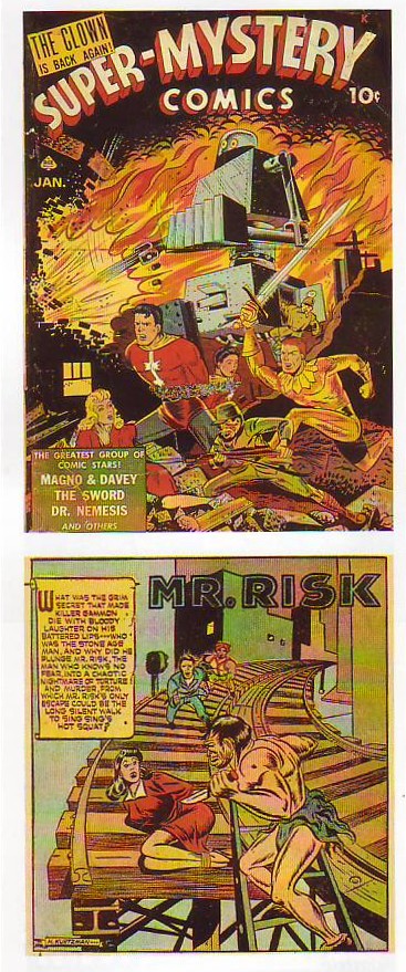
Every comics fan is familiar with Krigstein's subway story (excerpt above).
Not many have seen his earlier work done in the 40s "Classics Illustrated" style (above). I used to hate this style when I saw it later in reprints. If someone told me the artist would transcend this awkward style and go on to become a significant EC artist I wouldn't have believed him.
Every body's familiar with Kutrzman's 50s work (sample above)...

...but how many have seen his earlier work (above) from 1942 and 43? Looking at the early pages who would have guessed that Kurtzman would have become the legendary stylist and creator of Mad Magazine?
BTW, isn't the "Mr. Risk" page interesting? The anatomy's off but it has guts and appeal. The background figures look like the kind of thing Kirby would draw years later. Is that a coincidence or did one of the artists influence the other?


Here's (above) some Wood from the early 60s. It's the style we're all familiar with.

Here's (above and below) Wood from the period around 1949 - 50. It's a style that none of us are familiar with. I find these pages shocking! There's not a trace of Wood's later style here! The man completely re-invented himself in the subsequent years.


The reason I posted these is to make the point that none of us should ever get discouraged if our work isn't as far along as we'd like it to be. People learn and people change. Nothing's carved in stone.


Monday, June 04, 2007

BOOK REVIEW: "THE MANIPULATED MAN"

I have a small but treasured collection of books which I call my "weird collection." they're one-of-a-kind books, sometimes from a small publishers, which contain unpopular opinions which the rest of society has never seriously considered.


One such book is "You May Smoke" which argues that cigarettes are good for you. Another is called "Hollow Earth" which claims that mastadons live in a hollow earth lit by an interior sun. Another claims to have a photograph of God and still another claims that since men cause most of the world's crimes that men should killed off in enormous numbers so that women can feel safe again. I don't agree with these opinions but I sure am glad that I bought the books. If readers are interested I'll share some of these in the coming months.


My first "weird" book is Esther Vilar's "The Manipulated Man." I bought the book in a used book store a long time ago but I think it's still in print, maybe from a small publisher. Vilar was a German doctor, and a severe critic of the feminism of her time (1972). Here's (above) a sample of her writing style.

If Vilars could see into this era she'd see a mountain of indepedent research papers by women.


After fifty women (above) turn into "indifferent heaps of human cells."


Vilars lived in the era when most women were housewives. She considered these wives (discussed above) to be contemptable parasites on their husbands. She was particularly mad about make-up and fashion which she considered childish and manipulative.


In the world of Vilars, men don't matter except as providers. We're just background to the real show which is women competing with women.


Women are only interested in other women (above) but not in a lesbian way.


According to Vilars men are socialized at an early age to be slaves to women.


As you can see (above) , Vilars' women are far from having penis envy. Actually I agree with her on this point. Where did Freud get that from anyway?


Vilars' women yawn through sex.
Speaking for myself most of the women in my life have been very interesting and also very supportive of the things I wanted to do. I wonder if Vilars modified these opinions over the years? I wonder what she's doing now?


Sunday, June 03, 2007

A NIFTY ARCHITECTURE BOOK


Here are some pictures from an old architecture book that I found in the library. Sorry, I
forgot to scan the title page so I don't know the name.
Anyway I like what this guy is saying. This high-density residential street (above) is terrific. Amazingly streets like this sometimes contain a few small and unexpected shops. I guess the owners live upstairs or behind the store. The author's right; tourists love streets like this and zoning laws that prevent them from being built are silly.
I used to think commercial plazas like this (above) were a good idea. The parking lot has convenient access from the street and the "U" shaped plaza seems to invite people in.


I shed the plaza notion completely the instant I saw this picture (above) showing the way commercial properties used to look. The caption explains it all. I love the idea that people live above the shops. City dwellers should always live near shops. Shops are exciting in their own way and they remind us that we're intelligent creatures who make things and trade for things.


Thankfully this arrangement (above) is pretty common but it's worth taking a moment to appreciate it. Sidewalks on residential streets need a buffer to keep the parked cars at a distance. A strip of grass and trees does the job perfectly. I've seen a lot of new streets that don't have this and this someday we might wake up and find this kind of street has become rare.
BTW, I like trees that are moody and distinctive and which form a sort of stippled canopy over the sidewalk.


Here's another picture that caused me to change my mind the instant I saw it. I used to believe that even small town public buildings should be a showcase for new and exciting architecture. I still would like to see that if the right architect could be found, but barring the discovery of a genius I think we could do worse than build traditional structures like the one above.
Let's face it, small town bureaucrats aren't likely to pick exciting young architects like Howard Roark to build their public buildings. If they decide to build modern they'll usually end up building soulless post-modern wind traps. I choose the Greek facade (or something else traditional) as the lesser of two evils.

Friday, June 01, 2007

PHOTOS BY THE YOUNG HALSMAN

I know what you're thinking: "Why did he put up this picture of Monroe (above)? It's well done but everybody's familiar with it already!" Well yes it is familiar and that's exactly why it's worth writing about.

The picture is by Philipe Halsman. Halsman took the classic, most seen pictures of dozens of Hollywood celebrities. He knew how to flatter the subject, how to distill the essence of what they want to project to the public, and get it on film. For comparison here's a picture of Marilyn taken by somebody else (below).

What a difference! The color picture is sultry, pure and simple. The black & white Halsman begins with sultry but adds innocent, feminine and makes Monroe look young. Boy, Halsman gave his clients their money's worth! Plain old sultry just wasn't good enough!


Here (above) is Halsman's Jimmy Durante. Compare it to the picture done by someone else, below. Again, a big difference! Halsman gets across the idea that Jimmy is an entertainer, that he has a big nose and that he's a nice guy. He looks old but it doesn't seem to matter. You find yourself thinking that it's amazing that he can project so much energy at his age.


Here (above) is the other guy's picture of Durante. The smile is forced and the impression you get is of that of an old man who's to be pitied for his age.
The lesson I draw from this is that planning means everything when you take a picture. You have to know what it is that you want to emphasize and, equally important, know what you want to de-emphasize. Of course Halsman is a genius and it never hurts to have a genius behind the lens.
I thought you might like to see some of the pictures Halsman took when he was young. In those days he was interested in making bold, expressionist statements. These are great pictures and if Halsman had never done anything else he'd still be worth remembering. The amazing thing is that he went on to even greater achievement with the celebrity portraits.


Who'd have thought that a back could be so interesting? The back BTW, belongs to Winston Churchill.


I wonder who this (above) is? The picture has a great expressionist quality.


These (above) are almost surreal! Ahh! refreshed at the fountain of Halsman!


Thursday, May 31, 2007

AM I JOHN'S TOADY??


No, I'm not a toady but it's funny that someone on the net called me that. What is a toady anyway? As a toady I assume it would be my job to defend the opinions of the Toady Master (John), even if I believe they're wrong, but do I do that? Not that I'm aware of.

And to whom am I supposed to defend those opinions? Can I talk directly to John's adversaries or am I supposed to talk only to the adversaries' toadies, you know...toady to toady. I don't know, it's way too complicated. Anyway, I'm not a toady. John and I disagree about too many things for that.


For one thing we disagree about Wally Wood (above). How can John not like the guy? Maybe he's down on the later Wood who was forced to draw all those Marvel comics.


And what's this about Jack Davis (above) being over-rated? By way of evidence John says Davis uses fish scales to denote ground. What's wrong with that?


John is also completely unmoved by John Sibley, the Disney animator who did the best scenes in the Goofy sports cartoons. He calls Sibley "wacky," which is Johnspeak for the silly, pointless things that clowns do. Believe me, it's not a compliment. Me, I love Sibley. (Sigh!) I don't think we'll ever agree about this.

John and I disagree about a whole bunch of things but one of the things we do agree about is that cartoons need to be funny. They need to be written funny, drawn funny and animated funny. That doesn't sound like much to ask for but you'd be amazed how difficult it is to pull off.

To do it John had to figure out a whole new way of writing stories, a new way of organizing a studio, a whole new drawing style, and when he encountered a problem getting it on TV he worked with others to co-invent Flash animation so he could put it on the net. Later on he tried to teach that drawing style to potential employees on the net and in the process created a blog that was unparalleled in the industry. You don't have to be a sycophant to admire that.

Oops! There I go sounding like a toady again! I think I'll wrap this up now so I can hunt for some flies.

REPLY TO MARLO MEEKINS

About six months ago Marlo wrote in to say that she'd identified definite differences in the male and female face. Well of course there must be differences but did she get them right? None of my anatomy books mentioned it so I had to postpone comment. Well thanks to an old, German anatomy book from the 1920s I think I'm finally ready to make an answer.


Marlo said that men have sloping foreheads more frequently than women. Compare what the book calls normal foreheads on the two subjects above. I'd say her belief is confirmed!


Marlo also said that men have deeper-set eyes. Compare the two sets of eyes immediately above. Once again, Marlo's belief is confirmed!


She also claimed that men were more likely to have downward-facing noses. Hmmm...I'd say suspicion confirmed!


Marlo also said that men were more likely to have weak chins than women. Unfortunately I don't have pictures that address this so for the time being I'll have to mark this one unconfirmed!
It's off-topic but I couldn't resist scanning a few extra pictures showing different kinds of male chin. Here (above and below) are both bold and weak examples.


Here's (above) a "Swingblade" chin.


Good Grief! I don't know what these eyes (above and below) are supposed to show but they certainly look psychopathic!


Sheeesh! If someone ever stares at you like this (above) turn the other way and run!


This book is terrific! It's even better than Everard's, though it wasn't intended for artists and isn't as comprehensive. It really demonstrates that there's another , more fun way to present human anatomy.


Tuesday, May 29, 2007

THE LATEST ART COMIC ANTHOLOGY

Remember when comics used to be fun? Kids used to devour the stuff! Not anymore. They've abandoned them and who can blame them? Now comics are for adults.
Boy, adults really messed up. Here's some samples from a new, hardcover comics anthology that's in the bookstores now. (click to enlarge). It's called "An Anthology of Graphic Fiction, Cartoons and True Stories." In an effort to explain the title the editor tells us:
"In comics words and pictures are not a mixture but an emulsion. Perhaps calligraphy might be a more apt, if still incomplete, metaphor. the cartoonist uses his own set of marks (or 'visual handwriting') to establish a consistent visual vocabulary in which to communicate experience, memory, and imagination..."
Translated into English that reads, "Expect nothing heroic, manly or interesting. Let us introduce you to characters you'd never want to meet, doing things you'd never want to do. This is the end of Western civilization and perhaps you'd like a comic to read while you're contemplating suicide!"

The character in the last panel (above) says, "...there are worse things than being in prison. Just being alive is worse. Maybe if we're really lucky someone will strangle us in our sleep!"


Here's (above) a rousing story.


Sorry for the slanted frame (above). Maybe the slant will add a little interest to the obsessive horizontals and verticals.
What is this modern obsession with sterility? The whole second half of the 20th century is full of it: shoebox architecture, abstract bebop, Heiddeger, Derrida, giant canvases containing just one color, political correctness, emos, museum shows that are just a bunch of sand and broken glass on the floor, boring novels, ...well, it would be a long list. What's going on?
Gee, art comics are a pretty depressing subject. I'm going to scroll back to the naked girls!

Monday, May 28, 2007

PETER SELLERS, JONATHAN WINTERS AND STAN FREBERG


Gee, that was a pretty steamy post last time! Well, that's the nature of theories. They can get pretty intense sometimes! Maybe we need a change of pace. Whaddaya think of the video above? It's Peter Sellers doing Richard III doing "Hard Days Night."


How about a half minute commercial (above) of a vegetable Jonathan Winters being scraped off a plate?


How about a prune commercial by Stan Freberg? Freberg is an amazingly effective salesman. His commercials always leave you chomping at the bit to buy the product.


Last but not least, Here's (above) a talk show host who's unable to stp laughing at the affliction of his guest.

Saturday, May 26, 2007

MATISSE vs. PICASSO


I don't expect readers to like these pictures. They're not really the best work of these artists. Even so, they're useful for illustrating one of the most intense rivalries in the history of art and for showing how competition stimulates artistic growth.

Usually the back and forth started with Matisse. He'd paint something and Picasso would try to top it. Matisse had a reputation for being drastic and cutting edge and and that's the way Picasso wanted to be regarded. What better way than to take whatever the most drastic artist did and do something similar that's even more drastic?


Here (above) Picasso takes the Matisse picture of the woman surrounded by pattern (topmost) and does his own, even more stylized version of the same subject. It's not one of Picasso's best, in fact, it's kitsch in my opinion. The picture has no conviction. It's drastic for the sake of being drastic.

I imagine that Matisse must have been mad when he saw it. How irritating to have someone following you up, repainting your pictures in their own shallow "look-at-me" style.


Or maybe Matisse wasn't mad. He's on record as having exchanged pictures with Picasso and he was always enquiring about his health. Maybe Matisse valued the stimulus of the competition.


Eventually Picasso's knock-offs became more and more confidant, so much so that Matisse would sometimes copy Picasso. Compare the Matisse (black and white above) with Picasso (immediately above). Somehow Picasso made the knock-offs into a coherent style. Well, whatever works.


In an effort to out-do his imitator Matisse sometimes went to far. In the picture above Matisse tries to be mathematical and cold like Picasso and succeeds too well in a sense. This picture has none of the warmth we normally associate with Matisse.


Picasso (the picture above), on the other hand, for once succeeds in being more warm and appealing than Matisse. Amazing!

The reason I put these pictures up was to suggest that we can learn something from their painters' rivalry. Maybe it's a good idea to pick an illustrious target and try to beat him at his own game. The idea isn't to steal another person's ideas but to use them as a springboard to create your own ideas. Sometimes new ideas have to form around the nucleus of an old idea.

I hope I don't create monster copiests by talking like this. I used the word "copy" to describe what Picasso did but as you can see from the examples, Picasso did a lot more than copy. The man was heavily influenced but he didn't steal.

Friday, May 25, 2007

WOOD'S DISNEY PARODY


Here's a parody of Disney's characters from a 1960s satire magazine called "The Realist." Wood was actually a big fan of Disney. Maybe that's why the quality of the artwork is so good. Click to enlarge.