Friday, May 07, 2010

MORE MAPS (PART 1)

I hadn't intended to put up more maps, but I just came across a treasure trove of interesting cartography, and I couldn't resist putting up some examples here.  The map above is Japanese, from the time of World War l.

Above, a detail showing Western Europe. Note the arrows in Germany, including an arrow labled "Japan." What does that refer to?

I did all this research in an attempt to answer Katie's request for the address of the guy selling posters of Keith Thompson's "The Great War 1914," shown in a post below. I finally found it: 


http://www.keiththompsonart.com/pages/grandmap.html


The price seems steep considering the size of the poster, which is only 13" X 19." On the other hand, if the poster is half as beautiful as the reproduction on this site, it'll be worth it. 

MORE MAPS (PART 2)

Impressive, eh?  Now I feel bad about praising the Hockney-style map in one of the previous posts.  Sure it was pretty, but as the illustration above demonstrates,  for tasks like this you just can't beat draftsmanship.


Of course the best draftsmen are cartoonists (example above). It's hard to resist the conclusion that cartoonists should rule the world, but alas, the world is unconvinced.


Wednesday, May 05, 2010

MAPS & GLOBES (PART 1)

Globes of the Earth are fascinating to look at, but they're seldom done right.  Most people who make them seem to think that globes are just round maps. They're not. Globes are meant to awe. They should be big enough to firm up the idea of planetary volume and the wonders of physics on a grand scale. They're meant to evoke mystery and to provoke philosophical questions.  

Globes should never contain writing or be brightly colored, or contain distracting details like clouds.  They should be dark (but not black) and brooding like the one above. They should be understated.


Maps are different. They're for telling you the location and relative distance of places. A good map contains something startling, something that forces you to wake up and see the subject in a different light, like the raised map above. My favorite maps are of distant places that I'll probably never see.


A good size for a kids globe is the one above. It's big enough so you can't take in all the details in one glance, even of the side facing you. Even on a globe this size, there should be no writing and no bright colors. Mountains should only be raised very slightly and there should be no color coding for elevation.

MAPS & GLOBES (PART 2)

This (above) is a map that you can buy (click to enlarge). I think it's about 40 bucks. If anyone's interested I'll try to dig up the address.


Map people tend to like other pictures on adventure themes.  Here's (above) an interesting one.

MAPS & GLOBES (PART 3)


All this reminds me of grade school projects where I had to paint watercolor maps then draw pictures of the country's exports all around the edges. Here's (above) a professional's take on the same thing.


Here's (above) a David Hockney-style map. Very pretty, and it actually does make me think about all the
dirt and stones and trees in those places. It's odd how purely graphic depictions of things sometimes capture their essense almost as well as realism.


Above, my favorite kind of map.

Monday, May 03, 2010

THREE CARICATURES OF ME!


Here's some caricatures of myself that I just did in Photoshop. I was trying to do them the way John K used to draw me, with a shovel nose, big teeth and Ubangi earlobes.  I did several but Beta Blogger will only accept one photo per post today, so I'll spread out the pictures over three posts.  The largest pictures will overlap the sidebar, but that's intentional. I actually like the way it looks. Wait, there was something else.....oh, yes! The background on the third picture (below) is by DeKooning!

THE SECOND ONE....

Me again! I LOVE the sidebar overlap!!!!!

ONE MORE....


The last one! I printed it normal size, and it works just fine. I want to emphasize that the overlap on the pictures above was deliberate! I just liked the way it looked!

Saturday, May 01, 2010

MAURICE KISH, PAINTER

Writing about Raplh's pictures (previous post) got me to thinking about other favorite painters of New York City, including the much-neglected Maurice Kish. That's Kish's masterpiece above, the unromantically named "East Waterfront." It's a dark and moody picture, so you might have turn up the brightness to see it.

The beta Blogger program cut off the rest of this article, which you might be able to read by clicking "Read More" below. The new Blogger templates are great, but putting up posts


Wednesday, April 28, 2010

NEW PAINTINGS BY RALPH!

Ralph has a new show at the Animazing Gallery in New York and it's pretty impressive. The man can paint, no doubt about it. 


Some of the pictures seem to be representational, like this one (above) of New York City rooftops. How do you like the opalescent colors, and the weird, horizontal stick construction of everything? They lend a feeling of frenetic movement to what must have been a fairly placid scene in real life. It's true to New York, though. That city is all about explosive energy lying just below the surface.
Here's (above) a more abstract piece. The impression you get from a distance is of fluffy, cottony clouds tainted by gritty opalescence. Closer up it's decaying building materials with everything  moving, clinging, cascading, oozing, blocking, shooting, and scrunching. You expect this picture to jump out the window and run away down the street.

A couple of people said this picture (above) was their favorite. It's probably a stripped wall showing fiberglass insulation...or is it asbestos? I like to think of it more abstractly as turbulent, buttery, energetic essence of color seeping through the walls to consume our world. 

I like the Cezanne-like color and texture of the wall surrounding the door on the right.


Holy Cow! It's the world of the theater (above) abstracted. I love stuff like this. It's a celebration of show business, with it's artifice and it's blend of the silly and the profound.


BTW: Somebody asked me recently if the picture in Ralph's book (the book ably put together by Jon Gibson and Chris McDonnell) that looks like me, really is me. The answer is...yes, even though I thought differently when I first saw it. The reason I didn't recognize it right away is that it was taken on a live shoot for one of Ralph's films, and the hairdresser who did that to my hair didn't let me look at it for fear that I'd try to mess it up. 


For an interesting article about what Ralph is doing lately:

http://bombsite.com/issues/999/articles/3491


THEORY CORNER'S NEW LOOK (ALMOST)

Wow!!!! Thanks to the folks at Blogger we have new toys to play with! Here's a preview (above) of the new Theory Corner format. I'd intended use this only on the Weekend Edition, but it's so appealing and colorful, that I think I'll redo the whole blog like this. It's not finished yet, but it'll be up soon. What do you think!?

BTW: If you're curious to see what this new beta version of Blogger can do, try the link to it in the Settings>Basics tabs.

Tuesday, April 27, 2010

"THEORY CORNER WEEKEND EDITION" BANNER


Here it is, a tentative title banner for the Weekend Edition. Better click to enlarge. You can't get a feel for it when it's small.

Sunday, April 25, 2010

SOME MORE INTERESTING FACES


Hepburn (above) of course.


Every teenager (above) thinks they look good with hair that oozes down over one sise of their forehead. You can't talk them out of it.


Willie Dixon (above) and his famous gold tooth.


A fascinating example (above) of a face that has different characteristics in each hemisphere. The head is robust above the cheeks, and flat and receding below the cheeks. Still nice to look at though.


An uncommonly slanted forehead and large nose (above), but they don't detract from her looks. It's amazing how many deviations from the ideal there are that still look good.


The comedian, Terry Thomas (above). The gap in the teeth works beautifully, and so does the upturned mustache, eyebrows and hairline. He wanted to be a dramatic actor but his head had different ideas.


Sammy Davis (above), the caricaturist's dream. Those grief lines on his forehead are terrific!


Dietrich: did the photographers create her or did she create them? What a sculptured look!


Wow! Many thanks to Katie for the link to these these heads! Click to enlarge.

http://www.flickr.com/photos/tamedblossom/sets/72157622826526302/


Saturday, April 24, 2010

BLOGGER: MANY THANKS FOR FIXING MY ARCHIVE PROBLEM!


SECRETS OF ADVERTISING (PART 2): JOHN CAPLES


Since my last post put me on the subject of advertising, I thought I'd talk about the book that most influenced my thoughts about that subject. It was "They Laughed When I sat down" by John Caples. It's the same name as the famous ad (above). He influenced my ideas about animation and cartooning, and even influenced how I write this blog.

Caples bucked the system by advocating ads with lots of copy, where the readers learned something and were influenced by the personality of the writer. He respected the intelligence of his audience. Not only that but he believed that people respect ads that don't pretend to be something else. People actually like to be pitched to. I know I do.

Why? Because the world really is an interesting place, and a pitchman makes you realize how wonderful even the small details of life are. In that sense he's like a poet.


I think of Vince doing the ShamWow commercial (above). He made wiping up stains seem almost sacramental! For the price of a simple cloth you got to enjoy picking up all the spills you'll ever have to pick up for the rest of your life. What an incredible bargain! But the thing is, if it's going to work, the cloth really does have to be something special. An ordinary cloth won't do.

If I were a professional ad man I'd much rather sell soup and gum than cars or Viagra or pianos. That's because most people can afford to chew the best gum or eat the best canned soup. They can afford to try different brands and figure out what the best one is. They know you're right on the money when you talk about how great Campbell's Chicken Broth is. BUT...

...but you're not really selling the broth. You're selling the opening of the can, you're selling the wonder of pouring liquid and of fire igniting on a stove. You're even selling the feeling of a warm spoon in the mouth. In other words, you're a poet selling the joy of having senses and being alive. The product is just an excuse.

if you're hired to sell a product you believe in then you're free to explore the really deep essence of it and show what you've discovered to others. That's a wonderful thing.


BTW: which of the ads above do you think sold a lot of soup? It's a cheater question because the right answer in my opinion is neither. Can you guess what's wrong with both of these? The answer's on the comments page.

Also BTW: Vince recently got in a lot of trouble for beating up a prostitute who bit his tongue and wouldn't let go. The pictures are on Smoking Gun. They're pretty gruesome.


Wednesday, April 21, 2010

SECRETS OF ADVERTISING (PART 1)


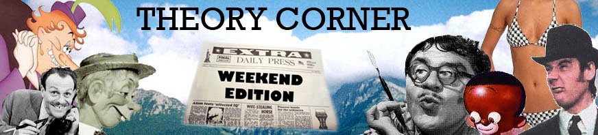
I know what you're thinking: "Why did Eddie put up a picture of a homeless man to illustrate an article about advertising? The answer is that I didn't...nope, I didn't...because he may not be a homeless man. He could be an ad guy, in fact he could be one of the biggest ad guys, and he, or someone who looks just like him, could be the guy who came up with the famous "Where's the Beef?" campaign for Wendy's. Let me explain.


In the early 50s ad men looked like this (above). They sold soup, soap, and chicklets, cigarettes and cars. They were great at coming up with jingles.


By the end of the 50s advertising was really big business. Ad men worked in skyscrapers and had college degrees. A young executive who worked hard could hope to own a fancy house in the suburbs and even get...dare I say it...the (gasp!) key to the Executive Men's Room!!!!! They sold cereal, coffee, soda, shaving creme, beer, cigarettes, men's cologne, and cars.


Yes, those were heady days for young advertising men. But times were about to change.


Advertising, along with everything else in the 60s and after distorted and warped. The agencies still attracted bright people, but a lot of them weren't really comfortable with capitalism and selling things. You got the feeling they'd all have been happier making ads against consumption.

In this period expensive, heavily art-directed ads evolved. They were ads that didn't feel like ads. They were more like showpieces. It was hard to tell what they were advertising. Traditional products like gum and soap were given the short shrift. These advertisers were selling the social responsibility of their clients, along with drugs, and insurance plans.

The problem for these gentle, socially responsible agencies was that they still had to sell a certain amount of tooth paste and foot powder, and nobody working for them had a feeling for it. A crisis developed. What to do!????????

The answer was something utterly bizarre that nobody could have predicted.


The answer was this bedraggled man (above). It turns out that number of talented ad writers from the 5os and 60s were living like beach bums in shacks and trailers on surfer spots like Laguna and Hermossa Beach. They just sat around drinking beer and ogling girls, living the good life off the money they'd put away when they were younger. Maybe, thought the agencies, THEY could figure out how to sell the foot powder!

Pilgrimages were mounted, money was offered, but these salty old men were not easily wooed. Years of neglect, real and imagined, had left them bitter and eccentric. They demanded and got the freedom to work at home or in their favorite bars. They got motorcycles and escort girls and expensive hip replacements. Nothing was too much to ask for. They got all that, and we got "Got Milk?" and "Where's the Beef?"


BTW: I just learned that Mike Pataki, the voice of George Liquor, just died. That's horrible news. Mike was a one-of-kind genius, and the voice he did for GL was among the greatest voices ever done for a cartoon character. For more information see John K's blog and Cartoon Brew, links in the sidebar.


Sunday, April 18, 2010

TWO HEROES: SCIPIO AFRICANUS AND EINSTEIN


Some people reading this have probably never heard of Scipio before, and I envy them because they have the pleasure of discovering a first rate human being awaiting them. Go to the library and get "Scipio Africanus: A Greater than Napoleon" by B. H. Liddal Hart.


Scipio was the young Roman general who defeated Hannibal and saved Rome from Carthage in the Second Punic War. According to Hart he never lost a battle, a record that even Napoleon couldn't match. Only Marlborough and Alexander could measure up to him, but Marlborough had material advantages and Alexander fought inferior generals. Scipio had to fight other geniuses like himself.


Poor Scipio. We have a good likeness of him (above) in the form of a surviving black marble bust, but the white eyes make him look like a zombie. If you can overlook that, then check out the face which is intelligent and and kind and fully human in the best sense of the word.


Roman historians Polybius (who I mistakenly identified as Procopius in another post) and Livy fall over themselves with praise for Scipio. When he was 17 or 18 he had his first leadership role when his father, who was a general, put him in charge of a reserve unit of cavalry and solemnly ordered him not to enter the fight without explicit orders. Scipio's dad expected to win and just wanted to give his son a glimpse of real battle.

Well, the enemy turned out to be much stronger than expected and the father was surrounded by hostiles bent on killing him. Never once did the father signal for help from Scipio. He was determined to die without bringing his son into it.


Seeing the situation the young Scipio ordered the cavalry to charge, but his men wouldn't do it. The odds against them were enormous, they had contrary orders, and Scipio was young and inexperienced. Scipio again shouted the order then with sword drawn charged down the hill alone. His men looked at each other in disbelief. Not knowing what to do they followed him and amazingly the enemy misunderstood it as a major cavalry attack and scattered. His father was saved.


Another time found Scipio, still a young officer, at the battle of Cannae...one of the ancient world's biggest battles and a massive defeat of the Romans by Hannibal. Surviving officers met at a farm house and talked about what to do. They all wanted to scatter to the four winds and offer their men and services  to foreign kings. All agreed to abandon Rome. Theirs was the only army that could have stopped Hannibal, and the fall of that city was now a certainty.


Into this came the young Scipio and friend who with swords drawn ordered their superiors back to Rome under pain of immediate death if they hesitated.

As the years went by Scipio took command and won battle after battle against brilliantly led Carthaginian forces. Scipio won by attacking Carthage itself, rather than the armies of that city in Italy. He won by pioneering aspects of modern strategy, and by persuading potential allies of his own heartfelt conviction that Rome was the greatest force for civilization in the ancient world...a thought in the minds of the gods.

Here (below) are a couple of YouTube videos showing Romans in battle. Not entirely relevant to this discussion, but cool all the same.

http://www.youtube.com/watch?v=ppNaeek_qCA&feature=related

http://www.youtube.com/watch?v=CzRnrV5ptgM


This post is already too long, but I can't resist mentioning another hero: Albert Einstein. What an imagination!

When he heard that the speed of light was a constant he became obsessed with understanding what made it a constant, what obstacle prevented travel at light speed, and what we could deduce about the universe from this. Reasoning backward from one bizarre but rock solid fact about light led him to deduce time relativity, energy/mass equivalence, and even other dimensions.

Is relativity true? Maybe not. The conclusions it leads to are so shocking that maybe it's easier to believe that the confirming experiments were flawed, but people who know more than I do say they were on the level, so I simply bow my head in admiration.