|
Here's another view of the tiny forest. The trees are made to snake along the ground in undulating ribbons separated by grass and narrow pathways. The artist had a great landscaping idea here, and someone should make it happen for real, right away. |
 |
It looks like the artist means to depict hedges here, but I prefer to imagine that the plants are more of the same small trees that we saw in the pictures above. It's fun to think of irregular rows of orange trees punctuated by quiet little meadows. The foreground boulders are a nice contrast, and so are the tall cucumber-like trees. So is the little creek. Creeks are naturally much more common than we suppose. Almost every big city used to be criss-crossed with them, but nowadays they're paved over, diverted, and pumped out. Maybe we should bring some of them back. |
 | |
Let me digress from the book to talk about real Southern California orange trees. Those are European olive trees above, but I chose them because they're similar in appearance to the unusual type of orange tree that I used to see on a college campus near where I live. I liked to imagine that the trees were planted by David Fairchild, a locally famous botanist who is reputed to have been the man who introduced the Eucalyptus tree to this city. Anyway, this campus grove was an incredibly magical and quiet place. You could easily imagine trolls and witches living there. That's amazing when you consider that there was always a hurly burly of students about fifty yards away. The grove was accessible, and much loved, but few people wondered into it because the ground was soft and inconvenient to sandals and tennis shoes. I never saw orange throwers in there, never graffiti, and I never saw any homeless people. Most importantly, the trees were small enough that you could pack a whole magical forest into a small space. That last point is why I'm writing this. A tiny forest is the perfect solution for urban parks and backyards, and yet you never hear orange groves spoken about in that context. What it amounts to is that an important landscaping tool has been overlooked. That's why I was so glad to see this kids book. It's all about the fun you can have in a miniature forest.
|
 |
| Above, the momentum of the hedgerows (trees) suddenly stops at the base of the steep little hills. Nothing to do but climb over them, something kids would be only too happy to do. Of course the hills would have to appear more natural than they do here. |
 |
Here (above) we see monkeys running across the treetops like they were paved roads. Hmmmm, that's interesting. I guess if you had planks up there, you really could run along the tops of this kind of tree. At least if you were a kid you could. BTW, check out the shapes and spaces in this picture. Small, densely-packed trees stand like grazing cattle on closely mowed grass. Narrow little paths wind around the scene, giving scale to everything, and the ground is only an inch higher than the creek. I've never seen flat look so appealing. Notice the two trees at the top that form an entrance way to the scene, and another appearance of those steep little hills in the background. Could a real landscape be made to look like this? |
 |
I hear you saying, "'Not a very handsome page," and you're right...but wait, what's that in the top of the tree? Monkeys...and they're sitting on the top of the palm tree! It never occurred to me til now that you could fasten a chair to the top of a palm tree and sit in it, just watching life go by on the ground. Of course you'd have to share the space with rats and spiders. I'll bet the spiders get as big as crabs up there. |
 |
'Just an experiment to see if I could "glue" two halves of a picture together in a single post.
|
 |
| This is my favorite Mad cover ever. Buyers must have felt that they got their money's worth just for the cover, and everything inside was free. I can't wait to see how this will interfere with the right sidebar. Don't blame Blogger. It's my fault...I want to watch the collision. |
 |
| I hadn't intended to put up more maps, but I just came across a treasure trove of interesting cartography, and I couldn't resist putting up some examples here. The map above is Japanese, from the time of World War l. |
 |
| Above, a detail showing Western Europe. Note the arrows in Germany, including an arrow labled "Japan." What does that refer to? I did all this research in an attempt to answer Katie's request for the address of the guy selling posters of Keith Thompson's "The Great War 1914," shown in a post below. I finally found it: http://www.keiththompsonart.com/pages/grandmap.html The price seems steep considering the size of the poster, which is only 13" X 19." On the other hand, if the poster is half as beautiful as the reproduction on this site, it'll be worth it. |
 |
| Impressive, eh? Now I feel bad about praising the Hockney-style map in one of the previous posts. Sure it was pretty, but as the illustration above demonstrates, for tasks like this you just can't beat draftsmanship. |
 |
| Of course the best draftsmen are cartoonists (example above). It's hard to resist the conclusion that cartoonists should rule the world, but alas, the world is unconvinced. |
 |
Globes of the Earth are fascinating to look at, but they're seldom done right. Most people who make them seem to think that globes are just round maps. They're not. Globes are meant to awe. They should be big enough to firm up the idea of planetary volume and the wonders of physics on a grand scale. They're meant to evoke mystery and to provoke philosophical questions. Globes should never contain writing or be brightly colored, or contain distracting details like clouds. They should be dark (but not black) and brooding like the one above. They should be understated. |
 |
Maps are different. They're for telling you the location and relative distance of places. A good map contains something startling, something that forces you to wake up and see the subject in a different light, like the raised map above. My favorite maps are of distant places that I'll probably never see. |

 |
| This (above) is a map that you can buy (click to enlarge). I think it's about 40 bucks. If anyone's interested I'll try to dig up the address. |
 |
| Map people tend to like other pictures on adventure themes. Here's (above) an interesting one. |


 |
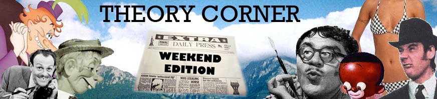
Here's some caricatures of myself that I just did in Photoshop. I was trying to do them the way John K used to draw me, with a shovel nose, big teeth and Ubangi earlobes. I did several but Beta Blogger will only accept one photo per post today, so I'll spread out the pictures over three posts. The largest pictures will overlap the sidebar, but that's intentional. I actually like the way it looks. Wait, there was something else.....oh, yes! The background on the third picture (below) is by DeKooning! |
 |
| Writing about Raplh's pictures (previous post) got me to thinking about other favorite painters of New York City, including the much-neglected Maurice Kish. That's Kish's masterpiece above, the unromantically named "East Waterfront." It's a dark and moody picture, so you might have turn up the brightness to see it. The beta Blogger program cut off the rest of this article, which you might be able to read by clicking "Read More" below. The new Blogger templates are great, but putting up posts |
 | |||
| Ralph has a new show at the Animazing Gallery in New York and it's pretty impressive. The man can paint, no doubt about it. |
 |
| Some of the pictures seem to be representational, like this one (above) of New York City rooftops. How do you like the opalescent colors, and the weird, horizontal stick construction of everything? They lend a feeling of frenetic movement to what must have been a fairly placid scene in real life. It's true to New York, though. That city is all about explosive energy lying just below the surface. |
 |
| Here's (above) a more abstract piece. The impression you get from a distance is of fluffy, cottony clouds tainted by gritty opalescence. Closer up it's decaying building materials with everything moving, clinging, cascading, oozing, blocking, shooting, and scrunching. You expect this picture to jump out the window and run away down the street. |
 | ||
| A couple of people said this picture (above) was their favorite. It's probably a stripped wall showing fiberglass insulation...or is it asbestos? I like to think of it more abstractly as turbulent, buttery, energetic essence of color seeping through the walls to consume our world. I like the Cezanne-like color and texture of the wall surrounding the door on the right. |
 |
| Holy Cow! It's the world of the theater (above) abstracted. I love stuff like this. It's a celebration of show business, with it's artifice and it's blend of the silly and the profound. |
 |
BTW: Somebody asked me recently if the picture in Ralph's book (the book ably put together by Jon Gibson and Chris McDonnell) that looks like me, really is me. The answer is...yes, even though I thought differently when I first saw it. The reason I didn't recognize it right away is that it was taken on a live shoot for one of Ralph's films, and the hairdresser who did that to my hair didn't let me look at it for fear that I'd try to mess it up. For an interesting article about what Ralph is doing lately: http://bombsite.com/issues/999/articles/3491 |