
Tuesday, July 29, 2014
NAKED POETRY READING
Greetingth again, poetry loverth!!!!!! Here's a reprise of "Naked Poetry Corner" from 2010.
To get the effect you have to WATCH BOTH VIDEOS AT THE SAME TIME, so keep them both in frame.
Turn on the bottom (B&W) video, then wait three seconds and turn on the top (color) video!
Many, many thanks to Lalalizabeth, who made her video completely independently and whose videos can be viewed on YouTube.
Sunday, July 27, 2014
DO ARTISTS HAVE TO WORK IN A CONTEMPORARY STYLE?

Gee, I like Milt Gross. The picture he did above is so typical of his approach. It's cartoony, earthy, intellectually challenging, skillful, and it radiates happiness and good vibes.

For comparison here's (above) a frame grab from one of the better Post Modern cartoons. Cartoons with a PM look aren't exactly to my taste, even when they're as fun and creative as this show. Gross's work seems to be the product of a noble soul who's seen the dark side of life and managed to find humor in it. Post-Modern styles seem to be the product of artists who's aim is simply to be "nice" and entertaining. That's the feeling I get, anyway.
Maybe it's just me but I'd feel strange showing a "nice" cartoon to someone who's been unemployed for a year, or to a G.I. in Afghanistan, or to someone who's been disappointed in love. Nice is fine but it seems like a narrow focus.
On the other hand, what's wrong with being nice? I have a friend who uses nice to capture elusive qualities like charm and youth and femininity and I'd be horrified if something I said made her stop. Maybe I'm just out of sync with my time...a toothless fogey who angrily shakes his cane at passing airplanes.

In my own defense I'll digress to a bit of history. I'm guessing that if you asked the average person living in 1968 which contemporary artist exemplified that era, the answer you'd get would be Peter Max (above). Even the Beatles favored that style. His was "The 60s Style."


Ditto John K. John defines the modern funny style yet two of his biggest early influences were Bob Clampett and Hanna Barbera, people who did their best work in the 40s. late 50s and early 60s. Once again, the subject matter was contemporary but the influences were older. I hasten to add that Both Crumb and John developed startlingly original styles...I'm only talking about their early influences here.
So, is it necessary to draw in a "nice" Post Modern style in order to be a mirror to your time in 2014? No, that's not what John and Crumb did. Of course, there's always room for something good, no matter what the style...even if it's Post Modern.
BTW: Thinking about Peter Max reminds me of what I like about the man. That blue picture of the Earth above is beautiful and deserves to be remembered. Most people aren't aware that after his psychedelic period he took up abstract painting, and some of the canvases aren't half bad.


[Thanks to a commenter who identified the Yellow Submarine designer as Heinz Edelmann. I just looked him up on google and was much impressed.]
Friday, July 25, 2014
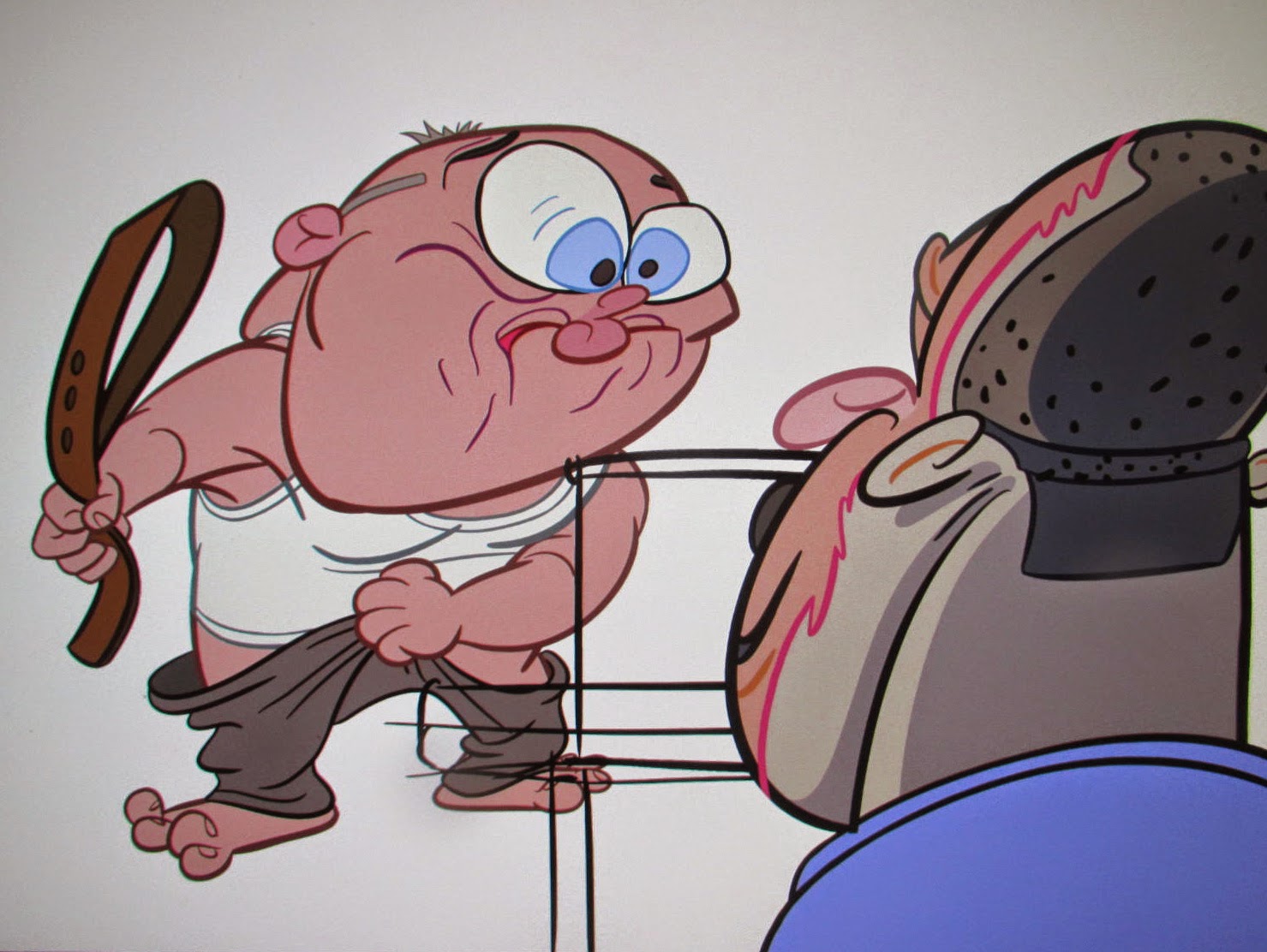
WHY ISN'T THIS PICTURE FUNNY?

Let me rephrase that. It is funny...Milt Gross did it and he's incapable of drawing anything that's not funny...let me ask instead, "How could this picture have been even more funny?"

Interesting, eh?
Thursday, July 24, 2014
I9TH CENTURY STAGE DESIGN

I confess to liking the old-fashioned theatrical backdrops (above) of the 19th Century.

I think it was the sets in the old Melies films (above) that won me over. Look at the one above...bathing beauties, military men and a scientific space canon all sharing the same scene with the intriguing rooftop world of the big city. All those aspects of reality within one frame...what an interesting idea!

I also like the 19th Century style long shots in some of the old Fleischer cartoons. I like the idea that at odd times we're catapulted into a larger reality that gives us a different perspective on the story. Using ultra long shots only to establish a scene is a waste of a powerful tool.


Here's (above) a home design by Wally Wood that follows the same principal.
Tuesday, July 22, 2014
PRETTY GIRLS/UGLY FACES


Friday, July 18, 2014
"CANS WITHOUT LABELS"
I haven't seen the final cut of "Cans Without Labels." Nobody has. There's still some unfinished scenes. What I have seen is a medley of finished scenes with the sound and effects cut in, and they're an absolute stunner. The film is a game changer, a pirate broadside into the hulls of the lumbering dreadnoughts that dominate the animation industry. Fans who supported this film on Kickstarter won't be disappointed.
Unfortunately I hit a computer glitch on my end and won't be able to show the beautiful frame grabs that I promised. It's frustrating, but maybe this is for the best because it may provoke John to make a much better presentation on his own site.
The man continues to evolve. The animation experiments we saw on the recent Kirk Douglas film and on The Simpsons title are now improved and incorporated into character intensive storytelling. No, it's not too wonky or too stretchy...it's juuuuuuuust right. This'll be a much studied film and If you're a cartoonist you'll find yourself drawing compulsively after seeing it.
'Nuff said.
I have eye surgery coming up on Monday morning so I might be out of action for a few days. On the other hand I might blog continuously 'cause I'll have nothing else to do while I'm forced to hang around the house. See you soon!
Tuesday, July 15, 2014
WOMEN WHO COULD HAVE HAD STAGE CAREERS

This woman could be Natasha in a live action "Rocky and Bullwinkle." I wish more people who are lucky enough to have character faces would take acting lessons and create a stage persona for themselves. Hollywood desperately needs funny character actors. So does amateur theatre.


Here's (above) an interesting figure. The girl is obviously overweight but she uses the weight to make a humorous statement, or she could if she had stage aspirations. I like her aggressive confidence and the contrast made by the light, flimsy dress. I picture her as the nagging wife of a skinny, repressed man with a bow tie...

....someone like Don Knotts. She should take acting lessons.

I wish some girl who yearns to do physical comedy would learn how to do backward-leaning walks. You can cheat it so your weight looks unsupported even though it is supported. It must be hard, though. If you look close, the only girl who can pull it off in the dance above is the one near the middle with dark shorts.

After she finishes the walk she could stay bent back. Maybe she's at a cocktail party and she walks up to a couple and casually talks to them while in this position.
There's some of that feel in the first minute of Fosse's "Rich Man's Frug." I'll have to revise my earlier lukewarm review of this dance. The first two minutes of this video are great.


Subscribe to:
Posts (Atom)