Wednesday, January 03, 2007

A MESSAGE TO THEORY CORNER MEN

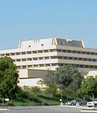
Hello, men! Uncle Eddie here! It's come to my attention that some Theory Corner men (Jorge)don't like my posts about architecture. They (Jorge) think the subject is boring. Imagine that! A manly pursuit like architecture is boring to these people (Jorge)!!! Yes, it's hard to believe that some people (Jorge) who visit this site can be that depraved and uncultured.

I've thought about it and have decided that disciplinary action is called for. I hate to punish everybody for the misdeeds of a few (Jorge) but what choice do I have? A good captain someimes has to show his crew the cat-o-nine tails. Bad apples (Jorge), you brought this on yourselves!!!!


See this (above)? Kinda nice, huh? You'd like more, wouldn't ya?...Of course you would.


But THIS (above) is what you get!!!!!!!!!!!!!

And THIS (above)!!!!!!!!!

AND THIS (above) TOO!!!!!!!!!!!!!!!!!!!!!!!!!!!!!!!!!!!!!!!


AND...and...and even..even this (above)!!!!!!!!!!! (puff!)!!!!!!! (pant!)!!!!!!!!! Whadaya think 'a that!? (Puff!) (Pant!) (Puff!)

Now see what you've done? You bad apples have unleashed Mr. Bad! I take no resposibility for it!

Tuesday, January 02, 2007

ABOUT HUNDERTWASSER

Andrew asked me what I thought about Hundertwasser, the modern German painter-turned-architect. Well, I like some of his pictures . The one above is interesting.

I also like his small-scale architecture. The public bathroom above is brilliant. The idea of using a tree to symbolize urination is wonderfull. No doubt the public urinal is the focal point of the entire street. I also like the trim which looks like the kind of beautiful bead bracelets that little kids make out of painted macaroni.

I also like this corner restaurant (above). Hundertwasser's buildings make a great contrast to other styles. That's what he's best at. In my opinion a whole neighborhood in his style would be too much.


Here's a nifty wedding cake of a building (above).


I'm not a fan of his larger works, like the one above. Take away the colorfull, melted tile facade and you're left with fairly banal buildings. Architecture is mainly about interesting three-dimensional shapes and spaces, not quirky facades. Architects should revel in the idea of space and travel all over the world collecting interesting experiences of it. They shouldn't be seduced into a too literal transcription of ideas that only look good in two-dimensional drawings.

His large-scale, Nabi-neo-art-nouveau apartment exteriors (above) are terrible. I wish he'd return to small-scale work.


THE AFTERMATH OF CHRISTMAS AND NEW YEAR

I like Christmas, no strike that, I LOVE Christmas but I'm glad it only comes once a year. Every year I promise myself to make it simple and tidy and every tear it ends up being big, complicated, unpredictable, sloppy and sentimental.

The tree we got was big again. I can't see getting a small tree. A tree needs to be noble and awe-inspiring. It should never fit comfortably into the room it's intended for. Putting it up should be
difficult, the branches should knock over and break fragile knickknacks on shelves all over the room. There should be fights about how to fit the giant stump into the stand.
I like decorating a tree with a mixture of multi-colored and white lights. I like balls of many colors and lots of happy little toy and angel ornaments. When my kids were little they used to decorate by putting ornaments only on the branches they could reach so that the tree looked naked except for a kazillion balls on the bottom. They were really proud of their work and would frequently stand back and look at it, struggling to hold back a tear, they were so overcome with the profundity of it all. After everyone had gone to sleep everybody in the family would, one after the other, sneak into the living room and re-arrange the balls to suit their own tastes. I can't tell you how many fights this caused..and still causes, even now. I miss the kind of Christmas tree that was a simple, fragrent pine with lots of space between the branches. They looked a bit scraggley but you could hang tinsel and ornaments on them and they would hang straight down. Todays trees are more like round bushes that are cut into cone shapes with a chain saw. They're nice and plush...too plush! Nothing put on them ever hangs down. Ornaments just sort of lie on the branches. I have to admit that they look good though.

I made only one major blunder this year. My son lives in New York City now and he could only spend a week with us over the holiday. I was looking forward to doing all sorts of things with him but none of them materialized because he spent most of his time visiting his old school buddies. I was so disappointed at what I considered a snub that I half snubbed him when it came time to bundle him off on the plane back to NY. After the plane took off I felt horrible in the extreme! I should have learned my lesson from earlier years: never, I mean never, snub anybody over the Christmas holiday, even if they deserve it! We have the whole rest of the year for snubs. Snubs defeat the whole purpose of Christmas and make the snuber feel miserable. I think I'll call my kid when I finish writing this.
In spite of this I had a great Christmas and I hope you did too!

Saturday, December 30, 2006

Friday, December 29, 2006

MORE ARCHITECTURE

Here's an English residential street (above) done in the brutalist style. The houses are probably cozy enough inside but outside they present an intimidating row of clunky slabs which seem to menace passers-by.

The houses also seem oddly out-of-sync with the hilly terrain. Hills are usually friendly and inviting. You want to climb them so you can take in the view and the sweep of the sky. Here the hill has been taken over by big, dark cubes which conspire to block the sunlight and the view of the lowlands.


Here's another English street (above) built on an old continental model. The architecture may be foreign but it works and I can't for the life of me understand why the English are so reluctant to import good visual ideas from their neighbors.

Here's the brutalist style again (above), this time in America. This building is a terrain hog which probably throws all the smaller buildings around it out of scale. The building almost certainly is OK inside. Outside it's a big, sentimental, selfish Baby Huey of a slab, solicitous of its own workers and indifferent to everyone else.

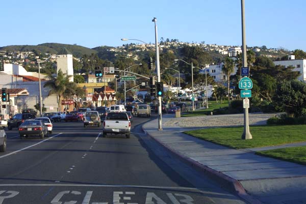
I thought I'd end on a positive note. Here's a typical cluster of chain stores and gas stations that you find in American hollows where major routes intersect. I want to dislike it but I can't. It's a whore but it's an honest whore. It's happily commercial. Here the weary traveler can find coffee and a bacon, lettuce and tomato sandwich served by a cheerful local waitress. Here are liquor stores full of lottery tickets, tobacco, dirty magazines, candy, comics, beer and ice. Liquor stores are islands of sanity and if they ever disappear the world will be a sadder place.

BTW, notice the lack of garish signs and billboards. I've seen places that were actually enhanced by their signs but this little hollow does very well without them.

HOW GUYS SHOULD DRESS FOR A DATE

I was thumbing through the recent book on MacPhearson when I stumbled on these two cartoons. I must have stared at them for 15 minutes before I finally figured out what was so interesting about them...the people in these pictures are dressed perfectly for the occassion they're in!

The guys are wearing tuxes, which is a nice way to go if you can afford it, but that's not the most interesting thing. The really interesting thing is that they're all wearing black and white. When two black-suited men talk to each other they merge into a new black sillouette which incorporates them both. When a third or a fourth join them they form another shape still. A bunch of men alone still form a pattern: dalmation spots against a sea of white. As long as every man wears black the dark shapes keep changing all night like a kaliedescope.
Another reason a guy should wear black is that it sets off the girl he's with. If the girl wears light colors or flower patterns then black makes a perfect contrast (I can't believe how gay this sounds!). You would think that guys would lose their individuality by becomming a background for the women they're with. Oddly enough that isn't true. Black is background but it's also agressively foreground. Black and white looks good on a guy, they're's no denying it.

Thursday, December 28, 2006

REMEMBER THE CLOUDS I TALKED ABOUT?

It turns out that they were the precursers of a storm which knocked out my power lines. I'm writing this on one of my local library's computers with someone in line staring impatiently over my shoulder even though I only just sat down.

It's just as well. I can't access my picture file from here. I'll post later, or maybe tomorrow. Before I leave I think I'll see if the library has the Sports Illustrated swimsuit issue.

Bye for now.