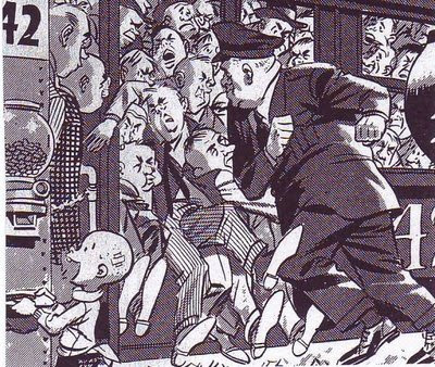
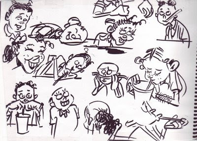
 Here it is, some of my choicest yearbook pictures. Some were xeroxed from the Spumco library, some from my own collection and some (above, bottom right) from my kid's yearbook. Boy, yearbook photography sure has declined in the last 30 years, but I've posted on that subject already.
 Sunday, January 28, 2007
YEARBOOK PHOTOS: A DIP INTO MY PRIVATE RESERVE
 Here it is, some of my choicest yearbook pictures. Some were xeroxed from the Spumco library, some from my own collection and some (above, bottom right) from my kid's yearbook. Boy, yearbook photography sure has declined in the last 30 years, but I've posted on that subject already.
 Saturday, January 27, 2007
ARE THE SUBURBS A FIT SUBJECT FOR ART?
 Yes, absolutely! Especially for cartooning! By way of an example how about this picture (above) of a suburban sidewalk by Crumb. The kid looking at the girl with the funny hat reminds me of the Thomas Hart Benton picture of the farmer peeking at a sleeping nude woman. Both beautifully capture a sensual moment and both seem to have something to say about the enviornment the subjects are in. Farms and suburbs are the products of human thought and are therefore charged with sexuality.
 Suburbans (above) must go to work, all at the same time. Wood found a rough beauty in that.
 A Crumb girl (above) takes time to read her notebook in a suburban greasy spoon. A wonderful depiction of a quiet moment in the city.
 This (above) is an old sketchbook page (previously published on this blog) that I did of my daughter when she was a kid. I did it in a suburban fast food restaurant. Life happens in fast food places just like it does in arab street bazaars and picturesque Provence streets. Why are so many modern artists blind to that?
Thursday, January 25, 2007
BOTTICELLI'S PROBLEM

I am sooooo sleepy and I need to do put up something quickly before I doze off at the keyboard. How about this: the incredible backward men's fashions in Renaissance Italy around 1480 or so?
 Both of these Botticelli portraits have the same problem, the heads look they're twisted backwards, Exorcist-style. The faces seems to be looming over the subjects' backs! I used to think that the fault was Botticelli's, that he just couldn't draw a decent male chest to save his life, but I think I was mistaken. I've seen the same problem in other portraits from that era. Apparently backwards fashions were all the rage in those days.
 I shouldn't be surprised. In my own time I've seen Ultra-baggy pants, stove-pipe pants, Jogging shorts over long pants, maxi skirts, mini-skirts, girls' shorts with lace trim that looked like underpants, camel-toe jeans, fanny packs over stretch bike-racing pants, formal shapeless grey Frankenstein jackets for men, checkered sneakers, cars designed to look like sneakers, girls' goth outfits complete with metal lunchbox and voodoo doll, big combs left in male afros, gold chains worn with T-shirts, tongue studs, day-glow fishnet T-shirts, mass-market shirts with "BUM" written on them. torpedo bras, no bras, penciled-in eyebrows, bee sting lips....well, it would be a long list. What modern person is entitled to look with disdain on the Italians for wearing backwards clothing?
 Both of these Botticelli portraits have the same problem, the heads look they're twisted backwards, Exorcist-style. The faces seems to be looming over the subjects' backs! I used to think that the fault was Botticelli's, that he just couldn't draw a decent male chest to save his life, but I think I was mistaken. I've seen the same problem in other portraits from that era. Apparently backwards fashions were all the rage in those days.
  I shouldn't be surprised. In my own time I've seen Ultra-baggy pants, stove-pipe pants, Jogging shorts over long pants, maxi skirts, mini-skirts, girls' shorts with lace trim that looked like underpants, camel-toe jeans, fanny packs over stretch bike-racing pants, formal shapeless grey Frankenstein jackets for men, checkered sneakers, cars designed to look like sneakers, girls' goth outfits complete with metal lunchbox and voodoo doll, big combs left in male afros, gold chains worn with T-shirts, tongue studs, day-glow fishnet T-shirts, mass-market shirts with "BUM" written on them. torpedo bras, no bras, penciled-in eyebrows, bee sting lips....well, it would be a long list. What modern person is entitled to look with disdain on the Italians for wearing backwards clothing?
Wednesday, January 24, 2007
CARTOONISTS VS. ILLUSTRATORS
 What I'm about to say was inspired by a recent blog entry by John Kricfalusi: "Dan Gordon and What Makes a Cartoonist," on "All Kinds of Stuff," Jan. 16, '07. I congratulated John on the article but when I quoted my favorite parts he was appalled that I seemed to have misunderstood the point he was making. Well, John's certainly the expert on what his intended message was but I still like my own deviation from it, which is presented below.
Using John's article as a springboard I now see character artists in the animation industry as being divided into two camps, the illustrators and the cartoonists. Illustrators, like the guy who designed the Robin Hood fox below, draw beautiful, well-proportioned pictures. Cartoonists (like Mad magazine artist Don Martin, above) draw funny pictures. Obviously some artists can do both but most have a bias in one direction or the other.
 There's no reason for these groups to be antagonistic, after all a good cartoon requires both skills. The problem is that employers, who are almost never cartoonists themselves, favor the illustrators. After all, illustrators make the most professional-looking drawings. Writers, who often have employer's ear, also favor illustrators. Cartoonists chafe at unfunny scripts and will usually try to finess them. Illustrators make the perfect employee because they actually like the guidance provided by long and usually unfunny scripts, they just want to make the pictures look professional. Anyway, the consequence of all this is that cartoonists have to do a lot of hustling to get work, even in the cartoon industry.
Unfortunately a new group has arrived which is ambivilent to both cartoonists and illustrators: the 3D animator. A lot of 3D animators don't see the point in learning how to draw. They never had time to learn in school because 3D is so labor-intensive and besides, they reason that the people they work for will provide the characters. In my darkest moments I sometimes imagine a world where art school graduates not only can't draw but can't even imagine why anyone would want to draw. I rush to add that this is an admittedly unrealistic fantasy. Anime is coming up fast and is still drawing-intensive, even if it favors illustrators. John Kricfalusi loves cartoonists and continues to train them and at least three studios have put the word out that they're interested in hearing pitches for 2D projects.
Talking about John, I forgot to say why he was so disturbed by my talk about cartoonist/illustrator differences. John believes that there's no reason why caroonists shouldn't be able to draw as well as illustrators, if not better. Cartoonists in the past did it routinely, why shouldn't we? In spite of what I said in the opening paragraphs I have to admit that he has a point.
Tuesday, January 23, 2007
UPDATING SUPERMAN
 Superman's gone through drastic design changes in the last 25 years. Here's a few of them...
First of all (above) there's the stocky, Robbie-the-Robot, bag-of-grapefruits Superman. Photoshop highlights abound.
 Here's (above) a prissy Superman, done in purple.
 Here's a long-haired Superman.
 Here's (above) a Jack Kirby-meets-Bruce Timm-style Superman. It's fun to imagine what the comic would have been like if the whole story had been posed as extreme as the cover.
 Here (above) is the German Expressionist Superman. I'd have bought this one, just for the weirdness of it.
 Here's (above) the Superman-as-Stud Superman. It looks a parody of Wood and Frazetta. If the story inside had matched the cover I'd have bought it.
For contrast here's (above) my favorite old-school Superman artist, Wayne Boring. Boring took the stories very, very seriously. His Superman was manly and heroic, a guy not to be messed with. John K is a big Boring fan. I wonder how many other fans are out there.
SOME INTERESTING MATISSE
 This is not going to be a popular post. Most of the people who come here are cartoonists and cartoonists are indifferent to Matisse. Maybe it's because his love of pattern seems effeminate, maybe it's because line artists are instictively hostile to colorists. I don't know, maybe a commenter can explain it.
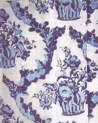
  Anyway, I have a real treat for the small handfull of Matisse enthusiasts here. Here (above) is the original cloth that inspired several of his later paintings, including the blue and green painting above (topmost). It's a chance to compare the inspiration with the final product.
 The blue and green painting is shocking. The colors seem to burn off of the canvas. I'm amazed that Matisse was able to look at the cloth and derive the ideal of pure, vibrant color from it. Of course to get across the idea of pure color he had to use mixed, textured color. This doesn't suprise me because psychologically intense color is almost always textured. That's why a colorist like Matisse was bound to be attracted to fabric. Hold up a red card then hold up
a piece of cloth colored with the same red. The cloth always seems redder. It may not really be redder but our brains are wired to perceive it that way.
I think we get misled about how color and texture work because we look at the mid-day sky and the sky seems brilliant even though it's only a light, graded blue and seems to have no texture at all. That's because the sky is backlit in a sense. It's all about the difference between additive and subtractive color. A pigment of sky blue (one that really is the same blue as the sky) straight out of the tube won't appear bright unless it's textured.
I'm always surprised that liberated color appears so agressive and so...well, evil and alien. The energy in color is usually locked up and hidden under a matrix of other colors and distractions. When released through texture and contrast it goes wild and seems to attack the viewer. Don't you feel that when you look at the blue painting above? If I were a colorist I might find myself talking to the color as it develops because it definitely seems to have an agenda opposed to my own.
The real excitement in seeing the cloth pattern is in the realization that the alien blue Matisse coaxed out of it was there all along. It makes you see other common objects in a different light.
Sunday, January 21, 2007
Subscribe to:
Comments (Atom)


