Wednesday, January 31, 2007

RALPH BAKSHI: HERO

I put up something about Ralph a few months ago but there's a lot more to say about the man than I was able to say in a single post so here I am, telling the same story again in more detail. Everybody knows that Ralph directed ground-breaking films like "Fritz the Cat" and "Heavy Traffic" but a lot of fans don't know what a decisive role he played in starting up the animation boom that started in the late 80s.
If you remember, the animation boom had two causes: "The New Adventures of Mighty Mouse" and "Rodger Rabbit." I don't know the story about how a flamboyant project like Rodger Rabbit ever got OK'd by Disney but I was at ground zero for the Mighty Mouse show. Here's the way it happened....
At the outset of the project Ralph called in his three directors, John K, Bruce Woodside and I, and begged us not to do anything drastic that would get him in trouble with the networks. Ralph explained that he had a reputation as a pornographer because of his X-rated features and was anxious to get a foothold in TV animation where he could turn out charming, beautifully executed cartoons for kids and make a legitimate and uncontroversial dollar. This show was all about building his credibility as a mass-market, quality film maker. He said he knew that we were all chomping at the bit to make something edgey but that we should put a lid on it for a season or two. Later, when he'd proven himself, he'd give us more slack.
I was genuinely moved and resolved to do what he asked for. So was John. We both did relatively sedate first cartoons. They were so sedate that the first show won an award for "pro-social filmmaking" from the then powerfull Action for Children's Programs (or is it "programming?" I can never remember).
The problem was that we had a really hot studio with a lot of gifted artists mostly picked by John. Not only that but John was in the throws of a personal creative explosion. He was always sharp but now that he was in his element, living his dream and surrounded by every physical asset needed to turn out great cartoons, he went into ecstatic creative overdrive. I wish I'd kept the drawings and written down the ideas that came out at lunchtime and during breaks. Every one of them was side-splittingly hilarious! Add to this that Ralph himself was a first-rate cartoonist and could appreciate what was happening even while he was struggling to control it...add that and well, it was a ticking bomb that was bound to explode.
Ralph could see where things were going. He kept reminding us that this show was his nest-egg and that we needed to rope ourselves in but he couldn't prevent himself from laughing at it all. This was a high-stakes game for Ralph and I can only guess at the anxiety all this must have caused him. He must have had moments when he'd wished he'd never met any of us.
I imagine that the network was also getting antsy but, like Ralph, they were also aware that they had something unique and special on their hands. I'm sure the good reviews helped but Ralph still had to spend a lot of time on the phone, soothing things over. At some point in all the complicated negotiations Ralph decided to dig in and fight for the show as it really was. He was no longer pitching it as a harmless show for 5 year-olds but as an unashamedly funny show for all age groups. He crossed the Rubicon. I heard him say to someone in the corridor: "I'm Ralph Bakshi! My name is on this show! I'm not going to put my name on something second-rate!"
Well, the rest is history. Ralph backed up John and TV animation was never the same again. Ralph risked everything to make it happen. He didn't have to do it. He did it because he was a true artist and because, when push came to shove, he had guts and integrity. So, by the way, did Judy Price, the network executive who had to stand up for all this to her superiors; two courageous people that we all owe a debt to.
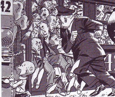
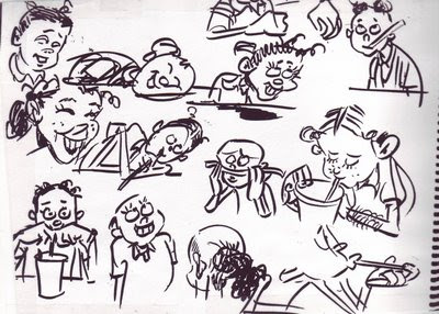
BTW, the drawings here are all telephone doodles by Ralph Bakshi.

Monday, January 29, 2007

WHAT HAPPENED TO FILM POSTERS?

This (above) is what the film-going public got in 1937.

This (above) is what the film-going public got in 2006. Kinda minimal, isn't it?

This (above) is the kind of poster fans got in 1945...

...and this Above) is what film fans got in 2005. Minimal isn't the word; this new poster is bleak! What a difference 60 years made!

Here's another poster (above) from 1936 . If I weren't so sleepy I'd put up a cool film poster that I found from 1912. Take my word for it that poster artists in 1912 could kick our butts! How did that come about!?


PHILOSOPHY CORNER

UNCLE EDDIE: "Sophie! So you think it's wrong to label people. Tell me why!"


SOPHIE: "It's very simple, Uncle Eddie. Labeling a person reduces them to a simplistic cliche. You don't listen to the real argument people make because you're addressing yourself to a cardboard caricature."

UNCLE EDDIE: "But Sophie, labeling is necessary. Most people's thinking does fall into an existing category of belief, even if they're not aware of it. Recognizing that allows you to take shortcuts and get to the center of their argument quickly."


SOPHIE: "But each man is unique, especially the thinking man. Maybe each individual has his own deviations from the mainstream thinking of his side."

UNCLE EDDIE: "Of course he has his own deviations but it's still usefull to open up an argument by attacking the generalization he represents. This forces the man to quickly shed the indefensible parts of his argument. Doing that clears the air quickly and
focuses the argument on the real areas of disagreement."


SOPHIE: "Hmmmm...I never thought of that before. Uncle Eddie, it's difficult to argue with you. You're eyes...a woman could... a woman could get lost in them."


UNCLE EDDIE: "Many do, inquisitive one. Many do."

Note: Thanks to Mad magazine for the graphics. Buy Mad so I don't get sued.


Sunday, January 28, 2007

YEARBOOK PHOTOS: A DIP INTO MY PRIVATE RESERVE

Here it is, some of my choicest yearbook pictures. Some were xeroxed from the Spumco library, some from my own collection and some (above, bottom right) from my kid's yearbook. Boy, yearbook photography sure has declined in the last 30 years, but I've posted on that subject already.


I don't know about you but these pictures make me want to draw. I womder, besides yearbooks, what other sources contain good pictures of ordinary people?

Saturday, January 27, 2007

ARE THE SUBURBS A FIT SUBJECT FOR ART?

Yes, absolutely! Especially for cartooning! By way of an example how about this picture (above) of a suburban sidewalk by Crumb. The kid looking at the girl with the funny hat reminds me of the Thomas Hart Benton picture of the farmer peeking at a sleeping nude woman. Both beautifully capture a sensual moment and both seem to have something to say about the enviornment the subjects are in. Farms and suburbs are the products of human thought and are therefore charged with sexuality.

Suburbans (above) must go to work, all at the same time. Wood found a rough beauty in that.

A Crumb girl (above) takes time to read her notebook in a suburban greasy spoon. A wonderful depiction of a quiet moment in the city.

This (above) is an old sketchbook page (previously published on this blog) that I did of my daughter when she was a kid. I did it in a suburban fast food restaurant. Life happens in fast food places just like it does in arab street bazaars and picturesque Provence streets. Why are so many modern artists blind to that?


Thursday, January 25, 2007

BOTTICELLI'S PROBLEM

I am sooooo sleepy and I need to do put up something quickly before I doze off at the keyboard. How about this: the incredible backward men's fashions in Renaissance Italy around 1480 or so?

Both of these Botticelli portraits have the same problem, the heads look they're twisted backwards, Exorcist-style. The faces seems to be looming over the subjects' backs! I used to think that the fault was Botticelli's, that he just couldn't draw a decent male chest to save his life, but I think I was mistaken. I've seen the same problem in other portraits from that era. Apparently backwards fashions were all the rage in those days.

I shouldn't be surprised. In my own time I've seen Ultra-baggy pants, stove-pipe pants, Jogging shorts over long pants, maxi skirts, mini-skirts, girls' shorts with lace trim that looked like underpants, camel-toe jeans, fanny packs over stretch bike-racing pants, formal shapeless grey Frankenstein jackets for men, checkered sneakers, cars designed to look like sneakers, girls' goth outfits complete with metal lunchbox and voodoo doll, big combs left in male afros, gold chains worn with T-shirts, tongue studs, day-glow fishnet T-shirts, mass-market shirts with "BUM" written on them. torpedo bras, no bras, penciled-in eyebrows, bee sting lips....well, it would be a long list. What modern person is entitled to look with disdain on the Italians for wearing backwards clothing?

Wednesday, January 24, 2007

CARTOONISTS VS. ILLUSTRATORS

What I'm about to say was inspired by a recent blog entry by John Kricfalusi: "Dan Gordon and What Makes a Cartoonist," on "All Kinds of Stuff," Jan. 16, '07. I congratulated John on the article but when I quoted my favorite parts he was appalled that I seemed to have misunderstood the point he was making. Well, John's certainly the expert on what his intended message was but I still like my own deviation from it, which is presented below.

Using John's article as a springboard I now see character artists in the animation industry as being divided into two camps, the illustrators and the cartoonists. Illustrators, like the guy who designed the Robin Hood fox below, draw beautiful, well-proportioned pictures. Cartoonists (like Mad magazine artist Don Martin, above) draw funny pictures. Obviously some artists can do both but most have a bias in one direction or the other. There's no reason for these groups to be antagonistic, after all a good cartoon requires both skills. The problem is that employers, who are almost never cartoonists themselves, favor the illustrators. After all, illustrators make the most professional-looking drawings. Writers, who often have employer's ear, also favor illustrators. Cartoonists chafe at unfunny scripts and will usually try to finess them. Illustrators make the perfect employee because they actually like the guidance provided by long and usually unfunny scripts, they just want to make the pictures look professional. Anyway, the consequence of all this is that cartoonists have to do a lot of hustling to get work, even in the cartoon industry.

Unfortunately a new group has arrived which is ambivilent to both cartoonists and illustrators: the 3D animator. A lot of 3D animators don't see the point in learning how to draw. They never had time to learn in school because 3D is so labor-intensive and besides, they reason that the people they work for will provide the characters. In my darkest moments I sometimes imagine a world where art school graduates not only can't draw but can't even imagine why anyone would want to draw. I rush to add that this is an admittedly unrealistic fantasy. Anime is coming up fast and is still drawing-intensive, even if it favors illustrators. John Kricfalusi loves cartoonists and continues to train them and at least three studios have put the word out that they're interested in hearing pitches for 2D projects.

Talking about John, I forgot to say why he was so disturbed by my talk about cartoonist/illustrator differences. John believes that there's no reason why caroonists shouldn't be able to draw as well as illustrators, if not better. Cartoonists in the past did it routinely, why shouldn't we? In spite of what I said in the opening paragraphs I have to admit that he has a point.