Sunday, April 15, 2007

THE BEST CONVERTIBLE EVER


The car above isn't the best convertible ever, I just put it there as a teaser. No modern car qualifies. The modern aesthetic allows only the head to appear behind the wheel. You can't get an open car feel when you're cocooned that way. 


Early convertibles had a better idea: They (above) were a sofa sitting atop a motorized carriage. The driver was high off the street and could feel the wind all over his body. Driving it must have seemed like a magic carpet ride. If you didn't look down you'd hardly be aware you were in a car. It would seem like your seat was just floating down the street.


Okay, here's (above) my pick for the best convertible design of all, the best of the best. I speak of the Stanley Steamer. It has all the advantages of the austere gas-propelled car at the top of the post but is a beautiful work of art besides. I actually had a short ride in one of these, thanks to Jay Leno.


Here's (above) a later version of the Stanley. It's still beautiful but now you have to open a door to get in and you're behind the engine rather than above it. It's a great design but I prefer the earlier green and brass model. In the newer version the driver is a functioning part of the car's steering and control rather than a god-like figure who floats above it.


Here's (above) a Mercer Raceabout. The dashboard is far in front of the driver so he still feels somewhat independent of the car. No doors, a beautiful piece of work. This is one of the last convertibles that really delivered the convertible experience. After this drivers would sit in enclosed boxes.


Friday, April 13, 2007

PHILOSOPHY CORNER

My favorite recent films are both deeply philosophical. Hurry up and rent them
so we can talk about them!

The first is 'The Devil wears Prada" which asks the question, "What kind of person really makes the world work?" The film's amazing answer is, a mean, self-centered, dominating, talented tyrant like the character Maryl Streep plays.
I believe it. My hunch is that at the heart of everything really worthwhile is a tyrannical genius who wills the thing into existence and who sacrifices everything to keep it alive (no, I'm not talking about John K.). Everyone else is either too dumb or too inept to do it. This person is indispensable.

A lot of people would be willing to accept all this providing that the tyrant isn't dominating and self-centered after work. Under the gruff exterior some people demand a heart of gold. I'm not sure if I go along with that. It seems to me that in the real world you have to play rough to keep the ship afloat. Nice guys would sink it because nice guys can't keep the bad guys at bay. And you can't play rough part time. You'll never be good at it unless you're rough all the time and unless you actually enjoy it. Our tolerance of people like this enables the rest of us to live the humane and stimulating lives we currently lead.

Are there exceptions? Of course! John K 's a nice guy, so was Clampett. So was Bach! So was Mozart! But every leader and innovator can't be like that. We should have the wisdom to accept antibiotics with gratitude regardless of whether or not Pasteur was nice to his assistants.


The other philosophical film was "Pursuit of Happiness" with Will Smith. I almost didn't see the film, it looked so hokey. Boy, am I glad I did! The film reminds me of the old saying, "Nothing is as beautiful as a good man struggling against adversity." Smith's character is such a man. He doesn't blame anybody for his problems, he doesn't turn cynical, he just keeps focused on finding a solution, no matter how bad things get.
I don't know much about the Stoics but I can't help thinking about Smith's character as a stoic hero. I never took the stoics seriously because I thought their way of dealing with loss is never to want things in the first place, which seems drastic and unnatural to me. Things I've heard lately make me wonder if I misunderstood them. Smith's character definitely has an effective philosophy and if it turns out to be stoicism then I want to find out more about it.


Thursday, April 12, 2007

PICTURES TO DRAW FROM

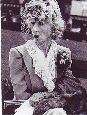
All photos by imogene Cunningham, except maybe the first (above). Click to enlarge.


Wednesday, April 11, 2007

BRASSAI'S PARIS AT NIGHT (1930s)

I think I can guess how Brassai must have felt. Even today the area around Montmarte (spelled right?) is full of mystery after dark. Late at night when the streets are empty and fog covers the treetops the effect is unforgetable. Click to enlarge.


Holy Cow! The text is slanted! I'm leaking consonants! Anyway, the quote above is the reason I put up this piece about Brassai. Before reading it, it never occurred to me that a part of town that's particularly appealing or mysterious should be left standing even if the architecture is just so-so. A street or a square or a neighborhood that attracts people, that exerts an indefinable magnetism or charisma over generations, should be preserved even if no one can figure out what the attraction consists of.
A famous thriller writer called this "felicitous architecture." He pointed out that some churches seem especially "holy." Others seem especially suited for weddings. He talked about a cheerful room in Williamsburg where three future presidents proposed to their wives. On the other hand he talked about places where murders routinely happen. Maybe he's right. Remember Van Gogh's picture of the ugly red pool room? He called it a room you could die in. Maybe architecture and spaces have the power to subtley influence human behavior.
The trench-coated figure above is Henry Miller who would frequently drop by unannounced to see if Brassai wanted to explore the night-time streets with him.


Another terrific quote! You wouldn't want to do without the melting clocks and flaming horses of full-blown surrealism but you could argue that the greatest pictures of all are the more subtle ones which show the weirdness underlying everyday reality.


Tuesday, April 10, 2007

WHICH BACKGROUND MEDIUM FITS FUNNY CARTOONS?

Pen & ink with light wash?

Ink wash (above)?


Watercolor (above)?


Gouache (above)?


Acrylics (above)?


Computer (above)?
Myself, I would say the ink wash method supports gags and cartoony drawings the best. If humor was the only factor to consider I'd say the whole industry should switch to ink wash (or a black & white gouache equivalent) tomorrow. It's funnier by a mile.
The problem is that audiences like color and so do I. I can't help it, I like beautiful cartoons. In my opinion the color mediums that best support the comedy/beauty combination are watercolor and gouache. Some of the best and most indisputably funny Ren & Stimpy episodes used acrylics but the acrylics were done in a style that often looked like gouache so they're difficult to classify.

Certainly the background medium that supports comedy least is the computer. Can any background be funny if it's colored in a computer? I've laughed at gags in shows that had minimal computer backgrounds but in those cases the job of the background was simply to not get in the way. It wasn't a positive comedic asset, except as a design element. There are probably exceptions to this but I'm too sleepy to think of them.

Monday, April 09, 2007

KANDINSKY'S COLOR THEORIES

It's unfortunate that most of the color theorists since Chevreul have been abstract painters rather than representational ones. I like to thumb through my Itten, Albers and Kandinsky color books once in a while but I have to admit that they're not very usefull. They are a lot of fun, though. Here just for the heck of it, are a couple of Kandinsky color theories. Maybe they'll spur you on to make theories of your own.

According to Kandinsky certain colors (above) have an affinity for certain forms. A dull shape like a circle deserves a dull color like blue. A shape with intermediate interest like a square deserves an intermediate color like red. A dynamic, interesting shape like a triangle deserves an enegetic, luminous, psychotic color like yellow.


A hexagon is midway in interest between a square and a triangle so it gets the midway color it deserves, orange. Toilet cover seats get green.


Lines also have an affinity for certain colors. Bold, dynamic lines like diagonals get a bold color like yellow. Less drastic diagonals get a less drastic color, red. Dead lines that are nearly horizontal get a dead color like black. Slightly active lines like verticals get a dull color like blue.
Kandinsky even has a theory about coloring lines according to their centrality in the composition. Lines in the middle get yellow. Sad, unloved lines that hug the edge of the frame should get dull colors.


The same goes for angles. Drastic accute angles get drastic colors, more sedate obtuse angles get bland colors like blue.


Ditto curves. Of course a line usually has both drastic and sedate curves and angles and the color of the line changes accordingly.


Here's all these theories in a single painting. Interesting, huh?

Sunday, April 08, 2007

THEORY CORNER SPORTS PAGE: MUHAMMAD ALI & SECRETARIAT


Just to show Ali's method, here's (above) a quick win that he scored against Brian Lamb in 1966.


Above and below Cassius Clay (Ali) vs. Sonny Liston. Liston hated Clay and on one of the rounds they kept fighting even after the bell. What a battle!


The fight was stopped by a doctor after part three, so if you're in a hurry you can skip part four. Watch it if you can, though; it's a fascinating glimpse into what the people who ran the fights were like in the 60s.


Above and below two races by Secretariat in the early 70s. These are hands down the best races I've ever seen. Seabiscuit certainly was an interesting horse, and I liked the film, but could he do this?