 Don't go out of your way for this, because it's just fooling around. Nothing rehearsed or figured out. We'll be talking about old-time radio and acting out some stuff for an hour. It's on a local (Los Angeles) college radio station, KXLU (88.9), at 7 o'clock tonight (Wednesday). You can also hear it live, online:
Wednesday, September 12, 2007
UNCLE EDDIE LIVE ON RADIO TONIGHT!
Don't go out of your way for this, because it's just fooling around. Nothing rehearsed or figured out. We'll be talking about old-time radio and acting out some stuff for an hour. It's on a local (Los Angeles) college radio station, KXLU (88.9), at 7 o'clock tonight (Wednesday). You can also hear it live, online:

Tuesday, September 11, 2007
WHAT TO DRAW WHEN SKETCHBOOKING


These quick sketches are terrible but they're good enough to make the point that I have in mind, which is that most people draw the wrong thing when they go out sketchbooking.
If you draw people as individuals you'll end up as often as not with cliches: the middle-aged guy with a gut, the fat woman wearing tight clothes, the guy nodding off while he tries to read his newspaper, etc. That's because ordinary people people look pathetic when you draw them in isolation. They're glazed over from shopping or working. Your catching them at their worst.
Where people come alive is in conversation. That's where they become psychological and fleshed out. Take the fat woman. When she's talking she's no longer just a stereotype, she's a human being with a point to get across. She's more interesting.
Now the problem with this is that but people don't stay still when they talk. You have to draw your memory of what they looked like, which is hard, and an instant later you're diverted by the next pose. It's not a good way to turn out pretty drawings, but if you're lucky you might capture an interesting moment.
Monday, September 10, 2007
PRE-RECORD OR POST-RECORD?
 I got to the wharves, strolled around for a while, then stood on the corner, smoking. From out of the shadows she reached out and took my hand.
Woman: "You look like you could use some... company."
Uncle Eddie: "You look like trouble, sister, and I don't want any trouble!"
Woman: "Listen to me. I have things to say. You're the blog guy, aren't you? I saw your picture on the internet."
Uncle Eddie: "Maybe. What's it to you?"
Woman: "Plenty! Follow me!"
 Woman: "Go ahead, drink up. It's a clean glass! Look, I gotta talk about this pre-recorded/post-recorded thing. You draw the film first then put the music on at the animatic stage, right?"
Uncle Eddie: "Maybe."
Woman: "Well, that sucks! No wonder modern cartoons have no rhythm! You gotta start with a sound track that works, that's beautiful and dynamic and inspiring in its own right. "
Uncle Eddie: "Well, ya wanna see what the film's gonna look like before you put music on it."
Woman: "Stupido! Put music on it!? A funny cartoon should be PRE-RECORDED!!!! You don't draw a film first, with whatever random timing you feel like, then hand it over to the music guy to save it. The music, voices and major effects come FIRST! Do that and you won't have to worry so much about the timing! "
 She slipped off her shoes and unfastened two buttons. She was open to her bra. Her dress slipped up, above her knees. I tried not to look. But I didn't succeed.
Sunday, September 09, 2007
MORE HOME DECORATION FOR CARTOONISTS
 Here's (above) a reprise of the living room picture I posted yesterday. I like this room but I was surprised to find that some of my friends were indifferent to it. Well, I can see why. The book shelves are made with tacky wood, the coffee table looks like it came from a thrift store, the varnish looks like it was applied with a roller, and the fireplace is confined to a tiny box. the room definitely has flaws.
The amazing thing is that it succeeds in spite of the flaws. Against the odds it feels cozy. It's like a big, friendly mutt. An artist could get ideas in a room like this. I'd love to explain why it succeeds but I can't. Why do some spaces work and others don't? Maybe a comparison with some other types of rooms would help.
 Here's a Sears catalogue room (above).
Here's some sterile modern monstrosity. I won't bother criticizing these. It would be too easy. Instead I think I'll compare the room I like to other artistic rooms like the ones below. No I'm not gay, and I don't watch home make-over shows on TV. I just feel sorry for artists who are stuck with depressing environments.

Here's an artsy room (above) that has appealing shapes and colors but never comes across as a room that people live in. The furniture is uncomfortable and isolated in little islands, and there's a pervasive feeling of bad taste passing itself off as good taste. It looks like a furniture museum.

This room is better than average. It's tasteful, sort of. But a house isn't supposed to look like a furniture catalogue, and an artist is supposed to rise above simple good taste. An artist is supposed to be on the track of something profound, something really fundamental in life, and that's missing here. There's too much visual noise. I couldn't think in a room like this.

You see this kind of room sometimes, where one stark color dominates. The variety of the real world is reduced to a single, screaming statement. Architectural Digest loves rooms like this, which is why I never read that magazine.

Here (above) is a room that tries too hard to be rustic. It's a cliche. There's nothing spontaneous about it.
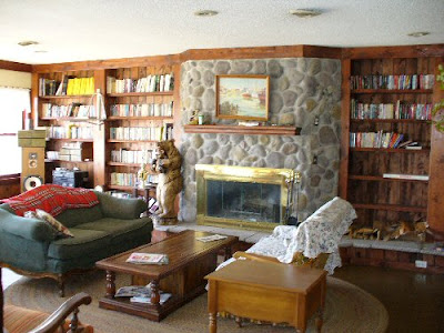 Here we are back at the original room again. Maybe now the naysayers can see why I like this room (above). It has "good vibes," and the right vibe is worth its weight in gold.
The furniture is plain and comfortable and the fireplace and book shelves have a nice, quietly dynamic design. If you know anybody who has a knack for making rooms with good vibes like this, beg them on bended knees to decorate your place. Pay them well for it, and take their advice, no matter how crazy it sounds. It's as important to have stimulating, cozy, sociable rooms as it is a good winter coat or a car. Bad or awkward rooms can kill your creativity.
Saturday, September 08, 2007
THANKS TO JOHN & KALI FOR THE KILLER PORTRAIT!


What a surprise! I got this tonight just before we all watched a Hedy Lamar film, the one where she runs naked around the woods! John did the drawing and Kali colored it! Unbelievable! Thanks guys!!!!
 I'll have to find a place in Theory Mansion to hang it. Maybe just above the fireplace.
 And talking about fireplaces....
I'll have to find a place in Theory Mansion to hang it. Maybe just above the fireplace.And talking about fireplaces....WHAT ANIMATION CAN LEARN FROM BALLET
 I hesitated to put this up because a lot of people don't like ballet, probably because they've only seen it on TV. It's a medium that has to be seen live. The thump on the floorboards, the sweat, the commitment and almost super-human determination of the dancers to do impossible things; none of this translates to the screen. In almost every case the people who don't like ballet are the ones who've never seen a good one.
Anyway, there are a lot of parallels between ballet and animation. The examples I'll use here come from the collaboration between Balanchine and his star ballerina, Suzanne Farrell. Balanchine fell in love with 16yr.-old Farrell who was forty years younger. They both new it couldn't work in the long run but they were determined to translate the intensity of what they were feeling into art. It was a case of two first-rate people giving everything they had to an ephemeral medium.
Here (below) is an excerpt from Joan Acocella's "Twenty-Eight Artists and Two Saints." Farrell eventually became a teacher and here's what Acocella says went on in her class. Click to enlarge the page.
 Holy Cow! I never heard of developpe' before and now I'm dying to try it in animation. Not an animated ballet, I mean something funny that requires a long, nuanced unravelling in a single scene! And what's this thing about gathering space to make a turn? Maybe I could use that if only I could see an example of what Farrell was talking about!
Wow! True enough! An animator has to be in the moment too, in a sense. A really good and unique performer is wasted by a director with a too specific view of how an action should be done (this doesn't apply to John).
 This (above) is why I don't believe in animatics. Even the wrong choices a first-rate artist/filmmaker makes give a feeling of live performance and spontaneity to a piece. Choices, good or bad, reflect the character of a filmmaker. Getting too precious in a quest for perfection is a big mistake.
BTW, I do believe in careful editing, I just don't believe in animatics, which are a tool of the devil.
 Unbelievable genius! Balanchine (above) was right! You can't change artists, all you can do is develop what they already have. Clampett was great at this. He didn't try for a homogenized unit. He pushed Scribner and others to take what they were already good at and make it even better.

Much wisdom here (above)! This is one of the many reasons why animation scripts should never, ever be written by writers. Writers don't know what individual artists in the unit are good at. Only another artist could appreciate that. A good story has to be tailor-made to fit the strengths of the artists who will work on the show.
Wednesday, September 05, 2007
PUNISHMENT!

Soooo...you guys didn't like the Yiddish Theater post! Gee, that's too bad. I thought entertainment people would be interested in reading about where modern entertainment comes from. I guess I was mistaken.
 And you didn't like the vaudeville posters I put up! You didn't even like this one (above)!Amazing! I guess you prefer the wonderful technique in modern posters.
  Maybe the vaudeville posters would have meant more if people knew something about the characters they were about. The McFadden's Flats poster I put up referred to the section of town that the Yellow Kid's Hogan's Alley was located in. If you're not familiar with Hogan's Alley click to enlarge the newspaper page above.
 The Happy Hooligan poster I put up referred to the character in this comic strip (above, click to enlarge).
And you didn't like the story analysis! Really? Nothing special, huh? You know, it didn't come from a book. It took me hours of thinking to figure that one out. I'd hoped it would be useful to readers who might want to write something funny someday. But...I was mistaken.
Grrrr! What a bunch of meatheads! Why do I waste my time doing stuff for people who don't appreciate it?
I'm taking off for a couple of days to brood! I'll be back (maybe) Saturday, Sept. 8th!
Subscribe to:
Posts (Atom)