Tuesday, December 17, 2013

ITTEN'S COLOR BOOK


If you've attended art school in the last 40 years the chances are that your color classes used one of these books (above) as a text. I find that amazing since these books are intended for use by abstract artists who paint flat color fields, a category that doesn't include many artists. How on Earth did these specialized books come to dominate color education? I have a theory that might explain it, but I won't reveal it til the end of the post. 

Anyway, there's more than one reason why these books get used year after year. For one thing, they're cheap. The Itten book comes in a small thin edition and the paperback of Albers' book is almost pocket-sized.


Another reason is that both books have an academic, high-minded tone. Artists seem to like that. Maybe it's because we artists flatter ourselves as being the equivalent of doctors and scientists. We like having a book on the shelf that only the select understand.


Maybe it's because a lot of our ilk used to be Marxists and Freudians and that gave us a taste for the edgy manifesto style those authors use. Itten had a keen awareness of how image can sell a product. That's him above, carefully dressed and looking like the villain in a James Bond film.

Anyway, I had a chance to thumb through the books the other day and here's what I saw.
   

Both books start the same, with an emphasis on color gradients. They both begin with a black and white palette (above) where the values are restricted in different ways.


So far, so good. With the idea of limited black and white choices established, they go on to show how the same kind of limit (above) works for colors, too. You can favor the middle value colors with only a few darks and lights, or favor the darks and lights with only a small number of middle values. That's an interesting idea.


Unfortunately at this point they branch off into the esoteric. Both write more than you need to know about simultaneous contrast. Albers gets into a long discussion of flat, transparent colors layered on top of each other (above). It absorbs a lot of his attention at the expense of concepts that might have been a lot more useful.


Itten got into esoterica of his own. That's his color square pattern above. His book is full of them. The patterns are very pretty but, really, they're just pleasing colors of different types with some pure black and white to set them off. Why devote so much ink to them?


Maybe Itten would argue that setting off colors is no small thing. Look at the target above. It's just the three primary colors set off by black and white, but what a difference the black and white makes. Black and white are powerful activators of other colors.

Now here's the theory I promised: these books get bogged down in trivia and are only minimally useful for art students not specializing in abstraction or flat graphics. I believe the reason the books, especially Itten's book, dominates art schools is that it's so beautiful to look at. Itten's patterns especially look good on white paper with black print. The paintings themselves aren't always that interesting or profound but surround them with black and white as Itten did and they're riveting. Itten's arresting page layouts also help.

In other words, the real contribution Itten made was his re-invention of the art text book. In his shrewd hands the subject of the art book was less important than the look of the book itself.

Interesting, eh?


Sunday, December 15, 2013

ISAMU NOGUCHI

Here's some work (above and below) by one of my favorite American artists of the 1950s: Isamu Noguchi. He's a recent discovery for me. I never heard the name til Auralyn told me about him.

 
He's most famous for the boomerang coffee table (above). Are these still for sale? Imagine: a museum-quality object d'art that you can afford to have in your own living room!


These shapes (above) are drawn on a grid on paper, but it's not inconceivable that somebody's made a mass market cardboard mobile of this. I'll have to look it up.


Wow! I'd love to have a plaster copy of this (above)! That's Noguchi in the foreground.


Here's one that looks like it was influenced by Kandinsky. 


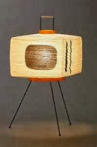
 Noguchi designed a lot of paper lanterns. Here's one that looks like a TV.


Early on the man was a realistic sculptor. Geez, the guy could do everything!


Thursday, December 12, 2013

STILL MORE NEW YORK CRIME PHOTOS

Can you take a few more crime photos? I warn you, it's grim stuff, not for the faint of heart.


We'll start with a crook being transported by the police. He hides his face from the photographer, no doubt because he doesn't want his mother to see the photo in the paper.


Above, Brooklyn teenagers reveal the armor they tried to wear to a rumble.


Above, a homicide victim...killed in his own apartment by a shot through the window. The picture was taken in 1925. 


Across town another man was murdered, also in his own home. Police always take at least one photo from directly above a corpse in the belief that this conveys more information than any other kind of shot. 


Maybe one of the murder victims was killed by one of these men (above). They're professional hitmen. Here they clown around for the camera, maybe in the belief that their lawyer will get them off. In this case they were wrong.


In 1960 John Favara (above, left), a neighbor and friend of mobster John Gotti (above, right), accidentally ran over and killed Gotti's twelve year-old son. A few months later Favara was kidnapped and "chainsawed" to death.


Yikes! A convict's bleak funeral in the mudflats.


Above, another hoodlum being transported by the police. The guy looks contemplative, as if he can see a vision of the horror awaiting awaiting him in prison. Imagine it...years away from the rest of the world, locked up in a cage with violent crazies.


Pictures of criminals were hard to get in the 19th Century. They just wouldn't sit still.


Flashbulb photography changed all that. Here's (above) the wife and child of the man who kidnapped Lindberg's baby. This was taken the day after his execution.

Probably newspapers can't run this kind of picture in our day. In my opinion that's a mistake. The news is made more exciting by pictures like this.


Was this a crime? Maybe it was just an accident. Imagine being a policeman and having to see things like this day in and day out.


*****************************

These photos were sampled from two interesting books: "Shots in the Dark" by Gail Buckland and Harold Evans, and "New York Noir."


Wednesday, December 11, 2013

MORE ON COLOR WHEELS

Aaaargh! I'm so sleepy I can hardly type, but I want to be sure I always get something up on a Tuesday, even if it's not well thought-out.

Anyway, here's my latest enthusiasm: color wheels. I like the ones figured out by Color Wheel Basics. It's a series of wheels that emphasize tints and shades, and secondary and tertiary colors.


I take a lot of flak for having color wheels on the wall. My friends say that a real artist doesn't need them. Maybe that's so, but looking at them stimulates my imagination, so up they go.

This interior decorators wheel (above) favors the kind of colors that were common a hundred years ago.
Here's (above) my most frequently used one.


New color wheels are always coming out. This Itten-type wheel looks like it would be fun to have on the wall but how does it work? Maybe it's not a wheel at all. Maybe it's just a nice pattern. I like the way that black sets off the other colors. Come to think of it, the wheel I said I use most often has plenty of black.


Here (above) are two that I just discovered. How the heck do they work?

This (above) is a color wheel that attributes flavors and aromas to the different colors. In this wheel tart and tangy are the complements of medicinal. I can't think of a use for this, but I'll bet it would have interested offbeat color theorists like Kandinsky.


Thursday, December 05, 2013

THE EX-THEORY CORNER READER


THE CONSEQUENCES OF NOT CHECKING THEORY CORNER EVERY DAY: A TRUE STORY

The reckless artist/computer user lapses from his Theory Corner routine. He views the site less and less as the months roll by. With the added time he's "saved" he takes to drink. His wife demures but he insists she take a "little sip."


 Devoid of the intellectual stimulation they took for granted on Theory Corner, and now being habituated to the bottle, the couple is unemployable. The wife is forced to take in washing.


With insufficient money to pay the bills, the family's furniture is repossessed. The dissolute artist consoles himself with mindless YouTube videos about funny house cats. His mind deteriorates.


 His wife and children are forced to take to the streets and beg.


 Now they face eviction. The children go to bed hungry. Even the computer has to be sold. They're bereft even of cat videos.


 Driven by alcohol, the ex-Theory Corner reader blames his wife for his problems. He treats her roughly.


 She sees no way out. On the waterfront a cry is heard in the middle of the night.


 Finally the trembling, emaciated artist winds up in a lunatic asylum, sans wife, sans children, sans everything. All day long he mutters to himself, "Theory Corner... Theory Corner... Theory Corner...."

A WORD TO THE WISE IS SUFFICIENT.

Wednesday, December 04, 2013

COSTUME DESIGN FOR THE MOVIES

There's a new book about costume design called, "Hollywood Sketchbook: a Century of Costume Illustration." I'm no expert but I'll be very surprised if this isn't the best book done on the subject in decades. Take a look at a few pictures and see what you think.

That green dress above looks like something Ginger Rogers might have worn. I like the slanted pose.


Haw! I wonder what film this dress was for.  Well, costume design for film isn't the same as fashion design. Costume design for the movies is supposed to heighten our understanding of a particular character in a particular situation in a particular story. It doesn't always aim to make that character look good.


Okay, I recognize these dresses (above) from Caberet. 


Yikes! Stork legs!


I know I've seen this (above) design somewhere...maybe on Eve Arden in a 40s film.


 What were these sketches for? Commenters said they're Munchkins from The Wizard of Oz.

I threw this (above) in because I liked the back shot of the girl.


Holy Mackerel! This (above) looks like something Bakst would have done, but it's by someone else.