Thursday, May 29, 2014

MANLY WALL DECORATIONS

My own taste for framed wall pictures is for art, architecture, and aviation and space subjects, but lately I've been wondering if the walls of at least one room in the house should be devoted to sports, specifically manly sports.  Something rousing...you know, something to get the adreniline going. 


That's Max Baer. He was reputed to have killed two men in the ring. 


Maybe cartoons about manly sports is the way to go.


How about a framed picture of a race horse?  I can think of no subject better than the great Sea Biscuit. Look at his peculiar, out of scale hind legs. People used to say, "You can always tell which horse is Sea Biscuit. He's the one that doesn't look like a thoroughbred." 

On the other hand look at his front half. It's the aspect of a champion.


Above: Secretariat. Pictures that show that horse's famous neck muscles are highly prized.

Maybe a framed picture of a Royal Straight Flush.  Who knows? Maybe it'll give me luck. 

I like chess posters even though I seldom play the game. This one explains the strategy. 

Wednesday, May 28, 2014

THE DISRAELIS, FATHER AND SON

That's Benjamin Disraeli above, the flamboyant Prime Minister of Britain during the reign of Queen Victoria. My connection with him dates back to high school when I fell in love with an anthologized essay of his father's:"The Man of One Book."  I had no idea who the author was, I just liked the style and the content of the piece, and made an effort to copy it.

I was vastly impressed with the elder Disraeli, how he seemed to love learning, and how he kept his focus and stuck to his point without ever failing to entertain. This blog is influenced by that style, though the style has been so corrupted by other influences on me that you might have trouble finding it.


The father had an enormous influence on his famous son, Benjamin. Thinking about them calls to mind the close relationship of John Stuart Mill and his dad...it's the rare case when a boy and his father are virtually the same person. It's hard to talk about the younger man in the abstract, so I'll include a wonderful scene (above) from a film about Benjamin Disraeli called "The Mudlark."


George Arlis played Benjamin Disraeli in another terrific film called "Disraeli," which I won't attempt to excerpt here. Nobody I played this film for liked it nearly as much as I did. I admit that it's a strangely uncinematic and old-fashioned movie, and that it probably played better on the stage than on the screen. I forgive the faults because it has one of the virtues of the elder Disraeli's essay style; a narrow, relentless focus on the character of its subject.

Anyway, here's (below) an excerpt from the essay I liked so much in high school:


If I remember right, the essay ended with the admonition: "Beware the Man of One Book."

In my case the one book was really one author, Bertrand Russell. Starting at the end of high school I read everything of his that I could get hold of and eventually I began to think like him. Now, all these years later, I've come to disagree with him about almost everything. The amazing thing is that I still love the guy. He taught me how to think, even though I've come to different conclusions.

Read Disraeli's essay at: http://www.readbookonline.net/readOnLine/42777/


Friday, May 23, 2014

CARICATURING BOXERS

You'd think boxing would be the easiest of all sports to caricature for the papers. After all, the posing is often pretty extreme. My guess is that boxing is actually one of the most difficult sports to caricature.

The problem is, that some poses that look great in photography often don't work well in newspaper cartoons. Why, I don't know. Even when they're superbly drawn as they are in this Mullin sketch (above) they sometimes miss the mark.


If the newspapers would allow a caricatured blow by blow of a fight like Jack Davis did here (above), readers would probably love it.


Haw! Maybe they'd love it too much. It could provoke a lot of street frights.


I wonder if short, funny, animated caricatures of real newsworthy prize fights would work on TV? I could picture it on ESPN. In "Boo Boo Runs Wild" John K proved that animation was a great medium for things like this.


Tying animation to real prize fights would certainly offer challenges. For one thing, it would put a limit on how far the animator could exaggerate. In real life the kind of punches that do the most harm in the ring are often jabs and short, close-in blows (above) that aren't very photogenic.


That doesn't mean it can't be done.


*********************************************

And for the vets on Memorial Day...


THANK YOU!!!!!!!


Wednesday, May 21, 2014

BACK FROM THE HOSPITAL

I regret to report that I had the heart procedure done and it turned out that I didn't need a stent, just a funny-sounding drug. I should be happy about that but before I went under the knife I described the problem to friends in such gruesome detail that they were half convinced I'd never survive, and that had consequences.

They treated me to lunches, laughed at my bad jokes, gave me caricatures (above, from John)...everything to ease my transition into the next world. Gee, under the circumstances my survival seems somehow...ungrateful.


Here I am (above) flat on my back in the hospital, checking out the colorful plastic on the wall. Geez, you'd think Lego had designed the room. Immediately after I was wheeled into the operating room.


It was incredibly futuristic; something like the one above, but even better. I got this picture from the net.


It was something like this room, too.  Absolutely gorgeous!


For comparison here's (above) the kind of bare bones room I had my last operation in. Boy, what a difference!


In general the cardiac ward looked like a futuristic synthesis of three styles. One of the styles was an updating of the cool headquarters that SPECTRE always has in the James Bond films.


Then there was the Frank Lloyd Wright influence, especially in the nurses stations. I couldn't find any adequate pictures of those stations on the net so here's (above) a detail of a living room designed by Wright, which some of the stations resembled. The stations communicated dynamism, intellect, efficiency and fun.


The last influence was Lego. Lego should seriously consider branching out into real world architectural design. The Lego people somehow manage to make plastic glorious and fun, and hospitals are full of plastic. Wright's influence perfectly fits the Lego world and the best synthesis I've seen so far was my cardio ward. 

Well, that's it for now! Many, many thanks for the kind comments from readers!


BTW: John put up a blog post about my surgical woes: http://johnkstuff.blogspot.com/

Sunday, May 18, 2014

UNDER THE KNIFE!

Yikes! I'll be under the surgeon's knife in a couple of days so I guess it'll be midweek before I'm back to Theory Corner again. It's to fix a heart problem, maybe with a stent.  That meant major surgery in my Dad's time, but this is 2014 and the procedure might require only an overnight stay in the hospital. Thank God for fiber optics!

What they're doing requires threading a tube into the groin and up the coronary artery to the heart. Can you believe that? I swear, every medical thing nowadays has to do with the groin. Wait and see...even dentists will figure out ways to involve the groin in what they do. What is this groin fascination? And I have to be partially awake while this is going on!

Anyway, I'll be back in a few days.


Wednesday, May 14, 2014

THE FACE OF TYRANNY

I'll start with Cesare Borgia (above), a violent psychopath whose senseless wars of conquest helped to undermine the Italian Renaissance. Orson Welles played him in a film called "Prince of Foxes" which I highly recommend. 

His was an interesting face, no? Some contemprary painters patterend their depictions of Christ on him. 


Here's Caligula, the mad young Roman emperor. The sculptor made him look crazy, which must have been a dangerous thing to do.


How about Genghis Khan (above)? He waged brutal, senseless war just to enhance his own reputation.


Then there's the mass murderer, Stalin, shown here in the days when he was a young thug.


Here's (above) Ivan the Terrible, a man who was aptly named. He was an evil man but I cut him a little slack because at great cost he stood up to the Mongol invasion and thus bought time for Europe to achieve a new Golden Age.


Then there was Mao, apparently the greatest mass murderer of the 20th Century, stacking up a body count that exceeded even that of Hitler and Stalin. Read about what went on when he tried to enforce his "Great Leap Forward."

By the way, Hitler certainly deserves a high place in this rogues gallery but I left him out because I couldn't find a suitable picture. Every photo of him has already been seen a gazillion times.

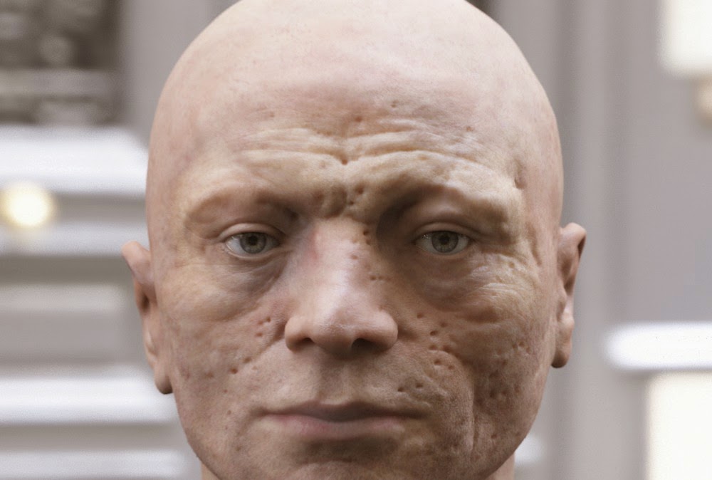
Not so frequently seen is this recent reconstruction of the head of Robespierre, architect of the French Revolution's "Reign of Terror." I always pictured him as having a thin, angular face, but I guess I was wrong.

Sunday, May 11, 2014

WHAT FASHIONABLE PEOPLE ARE WEARING NOW


Well, if you're a fashionable guy then you're probably already eyeing nerd pants like these (above). They're the latest thing. They show lots of ankle and a have high waists that wrap around the bottom of the ribcage.


Hey, it beats the old fashion look that it's replacing. I was never a fan of baggy shorts (above).


Let me digress to remark that you never see stovepipe shorts (above) on the street anymore. Stovepipes were always worn with black socks and a nose ring. 


Of course the recent guy fashion that you see on the street every day is the skin-tight neo-emo jeans. The picture above is the girl equivalent of that. It's all over the place now but the high waist-nerd look will probably replace it in a few years. Tight jeans are just too hard to put on. 


The big news in women's fashion is the replacement of high heels with ultra high heels (above). 


The newest shoes are thick and high, and are usually black. I saw women wearing shoes similar to these (above) at the mall today.