Friday, January 15, 2016

EXPESSIONIST SCULPTURE (EXPANDED)

One of the best war memorials I've ever seen is a German Expressionist sculpture (above) by Ernst Barlach. It was executed in clay in 1927 to commemorate the dead of WWI, but the Nazis didn't like it and WWII intervened with the result that it wasn't cast in bronze until 1952. It's a pity that it's not better known. The horror of war may never have been depicted as accurately.

Thinking about Barlach made me curious to know more about the Expressionist sculptors.


So far as I know the first Expressionist sculptor was Rodin, a Frenchman. For Rodin nature was a starting point but it always had to be modified by human bias. You could argue that sculpture was always like that but Rodin added exploration and risk and performance. Even humor.
Rodin worked in clay, marble and bronze but lots of later German sculptors preferred wood. Maybe that's because their African influences worked in that medium. Maybe it's because wood was cheap and the artists were poor. One sculptor (Kirchner, above) said he liked wood because the process of carving and creation were visible on the finished piece for all to see. Conventional sculpture was worked in clay and handed off to others
for casting. Only in wood could you say that the final product was produced by a single mind.


Incidentally, I like the way Kirchner frequently photographed his sculptures (above) against painted patterns. 


For all its beauty there's something wild and almost unhinged about early German Expressionism, as if the artists who did it were crazy or under a lot of stress. It was an odd discipline because in its early stage it seemed incapable of expressing happiness or sentimentality.

I don't know of any other medium that deliberately excluded a whole range of human emotion. Even so, there are ideas and insights it would be difficult to express if that kind of art didn't exist.


In order to illustrate this point I had to use a painting rather than sculpture. That's because sculpture rarely succeeded in isolating the negative emotions as well as painting. The same might be said of early Expressionist architecture. The first examples were somber and horrific (above).


Later the medium evolved into something that could convey humor and fun.


Tuesday, January 12, 2016

HOME ART STUDIO IDEAS


Art workplace designs are on my mind these days. I'm not hard to please. Mary Blair (above) has the essentials in this photo: adequate light and a big table to spread out on. I do wonder though, if there's some scheme that would work even better. Doing the blog about kids classrooms as adult work spaces made me wonder if there are other templates out there that might be worth trying. 


Like a kitchen for example. When you think about it, an average kitchen already resembles an art workspace. It's got a table, cabinets and drawers. Replace the stove and refrigerator with file containers and you're in business!

Of course, if you convert your kitchen to a studio where are you going to cook?  Hmmmm.


Well, how about drugstore counters? Make your basement look like a drugstore. An artist with lots of books could could work at a drugstore-type counter/desk with his books and supplies on shelves behind him.


Or diners...the ones made from old railroad cars. Each booth could be a separate desk containing a separate project. When you get tired of working on one thing you sit down at another desk and pick up what you were working on there. 


Or what about those big circular cash and wrap desks (above) that you see in stores like The Pottery Barn and Crate & Barrel. Geez, they take up a lot of space, though. They're probably pricey, too.


I like the shelves you see in some stores. These shelves have concealed spotlights underneath, which use Hollywood-type lighting to show off what the store's selling. If I had a shelf like that at home I'd stack it with art supplies and works in progress.  The idea would be to sell myself on my own artwork by displaying it to myself with maximum advantage. An artist needs to have confidence that what he's done will appeal to people. Maybe you have to sell what you do to yourself before you can confidently sell it to others. 


Friday, January 08, 2016

MARY KINGSLEY'S AFRICA


One of the benefits of having a blog is that in the course of research I occasionally stumble on something really interesting that I would never have known about otherwise. Such is the case with Mary Kingsley, an influential but today little-known African explorer of the late 19th Century. I'm reading her book, "Travels in West Africa" right now and it's the best book on that continent that I've come across in years.


I'm guessing that Kingsley was the prim and proper Victorian model for Catherine Hepburn's character in "African Queen." She traveled for a while with an Irishman who its tempting to imagine was a bit like Humphrey Bogart. A coincidence? I don't know.


When Kingsley was a middle-class little girl in Victorian England her well-traveled father used to tell her stories about what was regarded as "Darkest Africa." Kingsley was so excited by these stories that she saved her money and threw herself on the continent as soon as she was able. That was a brave thing to do since West Africa was known as "The White Man's Burial Ground" due to the prevalence of disease and hostile natives. Another English woman who preceded her had her hands chopped off and was left for dead by guides who stole her supplies. Nevertheless, Kingsley was undaunted.


Kingsley had her own take on Africa. She believed in self rule for the Africans but also believed that they needed Britain's indirect guidance.  She disliked many of the village huts she saw which she regarded as unaesthetic. She was even critical of African birds which didn't tuck their wings firmly against their sides as Victorian birds should but were unkempt and slovenly.


It's fun to imagine what the natives must have thought of her. Lots of them had never seen a white person before. I picture her emerging unannounced from the leaves, arrayed in Victorian finery, and casting disdainful looks at the birds and huts she saw.


She talked about the "fan" who were nomadic tribes who were thrown off their traditional land by hostile neighbors and were forced to settle on some other tribe's land in order to survive. As you can imagine the different tribes sometimes hated each other. In order to survive men took wives in different nearby tribes in order to have friendly contacts there and meals that could be safely eaten without poison. For people in that position European monogamy must have seemed like a formula for suicide.


She met different traders, many of them town-influenced blacks, who had European goods to trade, but theirs was a dangerous profession. To raise the price of an item, regardless of the difficulty in obtaining it, was to invite a massacre. When the time for trading was near lots of tribesman came to the trader fort and just hung out for days, sneaking magical trading powder (a guess: lion's dung?) into the traders food and sometimes squatting on the dinner table and looking longingly at the trader's meal. He could shoo them away but he had to be careful not to offend lest he invite bloodshed.

I hope the reader will forgive me for writing about the negatives, which are always more fun to read about. She certainly encountered a lot of beauty and kindness as well. That's reflected in the last paragraph of the book, which I'll quote here:


Wednesday, January 06, 2016

HOME ART STUDIO IDEAS

I've been thinking about home workspaces lately and I'm wondering if kindergarten classrooms could serve as a template. That's because I remember how inspiring my kids schoolrooms used to be. All those clever mobiles and hamster cages and colorful bulletin boards...they were beautiful! I even liked the low tables...well, sort of. Seeing them made me want to nudge the kids aside and draw.

Here's a few of the ideas I've seen on the net so far. Most of them are from Reggio Emilia which is an Italian preschool of the Montessori/Waldorf sort. I have no idea if the theory behind Emilia has any merit...I just like the way some of their classrooms look.


I like their custom-made furniture. What do you think of the multiple easels combined with the long paint rack (above)? It's not a bad idea if you have more than one project going at a time.


I like some of their shelves (above), too. Also the idea of dividing the room into different work areas.

'Nice curved shelves! And I like the hanging branch and dangling...I dunno...stuff! The rest of this room (above) could be better, though.


A hanging swathe of blue cloth. Interesting!


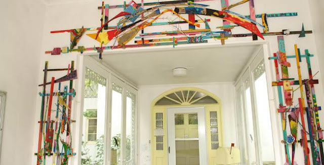
Wow! A nice door surround!


Here's (above) an interesting supply shelf/room divider.


 Ni-i-i-i-ice!!!! It's a small bed sheet-type diorama/room light. It need only stand out from the wall a few inches, and it could be as small as 3' X 4'. Anything that would look good in silhouette could go behind it.


Here's an interesting idea for a basement studio. The rafters above are simply the exposed  floor boards supporting the room above. Only the trees and cheap old railroad ties are added. Pillars like these might be great places to display artwork in progress.

Nifty, eh?

BTW: what about my previous attraction to Julius Schulman's studio design (above)? The answer is that I like it as much I ever did. When the time comes to build my own workplace I'll commit to whatever scheme seems to fit the space I have to work with.


Monday, January 04, 2016

ROLLERCOASTERS


I had an absolutely wonderful New Year's holiday with my family but they refuse to let me write about them here so I'll have to talk about something else...like my trip to Magic Mountain with Mike. Boy, the park was crowded! I'm in the picture above...can you see me? I'm the one with the pimple behind my ear.

'Just kidding. I got this picture off the net.


I didn't get many photos. I was too distracted by all the girls wearing yoga pants. This girl (above) stood out by wearing a one piece, skin tight, yoga body suit...or so I thought. The camera picked up what my eyes couldn't...that it was actually a two piece outfit. Oh, well. 

I'm grateful to Mike for gallantly shielding the girl from my intrusive camera. By doing so he inadvertently gave us an opportunity to study his nails which I'm happy to report are spotlessly clean but are curiously pointed on the top edges.


Anyway, if you live in LA you know that Magic Mountain is primarily a roller coaster park. The roller coaster biz is highly competitive and MM does everything it can do to provide the most terrifying, grueling, gut wrenching rides possible.


You have to wonder where this competition is going to end. How steep will the slides get  before they're deemed too steep?


Yikes!

I guess the only limit is how much G-force the human body can take.


We must be inching up to that limit now.


Or maybe not.


The amazing thing is that we become blase to speed after a while. You get used to it.


The same ride that had us screaming for mercy the first time invariably seems tame a few rides later. 


Maybe that's why coaster designers are always chasing bigger and better thrills.


I can't imagine what kind of coasters my kids will see.


The real game changer will come when computers can guarantee that fast moving vehicles won't crash or hit anyone and noisy vehicles will operate at a tolerable decibel level. When problems like that are overcome then expect to see roller coasters and even airplanes planes operate in the city. Expect to see low-flying gondolas and jets race through city streets and sidewalks, sometimes a few feet off the ground.


On a slightly different topic: my own belief is that 50 years from now about 1% of the population will live for months at a time in rented mobile houses strung together like trains. Live-in cruise ships built for that purpose are on the drawing boards right now.

One day your house/train might be slowly threading through exotic urban centers (above)...


...and another day it might be winding around Rocky Mountain trails.

Interesting, eh?


Saturday, January 02, 2016

BEDROOM DESIGN


Here's (above) a bedroom from Frank Lloyd Wright's Heart Island House. What do you think of it? For me it's too formal, too much like a terrific living room that just happens to have a bed in it. It lacks..."bedroomness." Wright was a peerless designer of living rooms but his imagination failed him when it came to bedrooms and kitchens.


 Ditto for Cliff May, another of my favorite architects. Bedrooms seem to have bored him. This one (above) looks like he devoted no thought to it at all.


For good bedroom ideas I find myself turning to less well-known designers. What do you think of this dark, low ceiling bedroom (above)? It's cozy and fun...evocative, too. It's like a Goldrush cabin in the Klondike or the Captain's quarters of an old 19th Century sailing ship.

I like to imagine that this room is one or two steps down from the level of the rest of the house, and that prompts an interesting question: is it a good idea to graft a cool historical bedroom onto a stylistically modern house? I'd say yes, but lots of people would disagree.


I like this (above) well-lit Ikea bedroom. I don't like what looks like a plain particle board cupboard on the extreme left, but the general layout seems fine. You can't see it from this angle but the headboard of the bed is a bookshelf on the side that faces the window. There's room to walk back there.


Here's a modest but still cozy bedroom idea, also from Ikea. It's cheery and even pleasingly austere, as if a nun sleeps there. Once again the lighting makes a big difference.