Sunday, March 27, 2016

MARY BLAIR SECRETS

 It's always fun to run familiar pictures through Photoshop filters to see what happens. Sometimes the simplified color and shapes make it easier to see how the artist organized his ideas. I'll try that here with a couple of pictures, starting with a Mary Blair concept sketch for the nursery in Disney's "Peter Pan."

BTW: I like the granular light coming from the green lamp.


Wow! The filter shows a monochrome brown picture with color accents...no surprise there...but the shapes are revealed to be dominated by linear horizontals punctuated by spaces, like some kind of I Ching diagram. The red and white shapes are more organic and attention-getting.


As I said, most of the picture is brown but what colors there are seem to be double complementaries, like the kind in the diagram above. Some artists avoid this color strategy because it's unappealing when a picture has only those kind of colors. That all improves when the colors are used as accents within an otherwise monochrome scheme.


Here's (above) a terrific Boucher. Maybe it's a detail from one of his allegory paintings, I'm not sure. 


Put a filter on it and the structure is revealed.  The two cupids and the bust form an obvious triangle, but...Yikes!...there's a strong, dark horizontal about 2/3 of the way down from the top, and a blue/black focal point under the cupid's art paper.

The colors appear to be basic red, yellow and blue primaries modified by tints and shades and co-habiting with neutrals.


Last but not least...here's (above) the George Herriman caricature I put up recently. Let's take one more look at it, this time filtered.


Holy Cow!!!!! Boy, am I glad I did that! The blacks form spots all over his shape. That means the points of black were an important design unifier, and not just borders around the colors.

Interesting, eh?


Friday, March 25, 2016

OLD EUROPEAN COTTAGES

Cozy houses are on my mind lately, so I thought I'd write about cottages. Here's a nice contemporary one (above), done in the old style, but it's a bit too...I don't know...too perfect. I'll bet a Beverly Hills lawyer lives here. Let's see if I can rustle up something more authentic...


....something a little more rural...like this (above) one.
  

Inside it's a bit cramped, and the ceiling's kind of low, but it's cozy and the low top no doubt makes it easier to heat.

What I like most about this room is the large kitchen table. I imagine that friends who came to visit sat at the table and chatted with the owners while they cooked and cleaned.


That's the way it is today in Steve Worth's kitchen (above). On entering the house, guests ignore the living room and instead take a seat at the kitchen table. This is a cottage-style kitchen with comfortable chairs and a big table you can walk around.


I concede that a cozy living room is a thing of beauty. Even so, the kitchen is a more natural gathering spot.


I don't know anything about the history of cottages. To judge from pictures I've seen, old European cottages frequently consisted of one large room containing a hearth, a table, and cabinet beds. Other rooms were for additional beds and storage. Lots of cottages contained a fire pit (above) in the middle of the floor.

Having a fire pit rather than a stove or a hearth strikes me as odd since the room must fill with smoke sometimes, even if there was ventilation. Maybe the smoke was welcome because it drove vermin out of the thatched roofs. Maybe smoke was rare because the only thing that was ever cooked was soup and that only required enough flame to simmer.


Maybe families with a big hearth and lots of iron kettles were thought of as upper crust.


Maybe an interior oven was a status item, even if the oven was only a mound of mud or clay like the one above. This wasn't a poor folks' cottage. It had a carved door, a cabinet for china, formal chairs rather than a bench, and a separate bedroom.

I can't tell what the floors in this photo were made of but I'll guess that they were dirt floors. I'll also guess that dirt floors were doctored somehow to make them more solid than you'd expect dirt to be.


Here's (above) a Russian cottage with thick, wooden walls and inexplicably high ceilings. Boy, that bedspread looks great! Every room, even in modern houses, should have one key item that's special, something fussed over, like the blanket.


Here's a cottage that's packed with cabinets that look like they once belonged in more affluent homes.  There's a story here...I wish I knew what it was.

My guess is that modest cottages, where generations of the same family lived for years, frequently had a high-end item or two on display. Over time families accumulate unusual things.


Monday, March 21, 2016

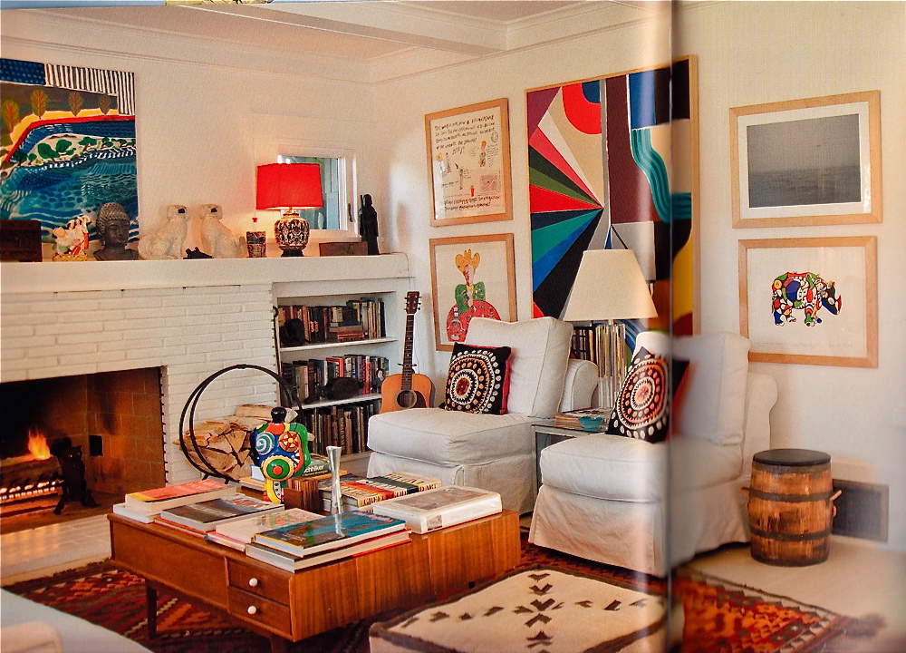
A TERRIFIC SMALL LIVING ROOM

I'm still looking for ideas I can use when I find a new house. I'm on a budget so I'll have to make a Devil's Choice: a small house with complex and interesting shapes, or a larger house with boring rooms but decent square-footage. I'd gladly take the small place if I could find something like this (above), but what are the chances of that? 

Is this living room practical? I'm not sure. The open staircase means that sound from the living room goes unimpeded up to the rooms above, and that could cause arguments. On the other hand, it's soooo cozy and artsy. I like the level changes on the floors between rooms, too.
  

I wouldn't have picked some of this furniture (above) myself but I like the color contrast. 


If I were to have a large, simplified color graphic on the wall I might choose something like this (above).


Here's (above) another room in the same house.  Once again the color and dark textures read great against white. 


Maybe I'll get lucky and find something big and cheap (above)...but I doubt it.


That's all I have to say for now. I'll end with this infinitely cool coffee table that dominates the room. I wonder where you'd find something like that? I'd probably have to make it myself.


Friday, March 18, 2016

FRANK READE'S WEEKLY MAGAZINE

Thanks to authors Paul Guinan and Anina Bennett (and archivist Joe Rainone) I discovered Frank Reade Jr., the fictional 19th Century version of Tom Swift. I can only say, "Wow! Where has this been all my life?" 


Frank Reade Magazine kicked off with an 1892 story (a reprint of a story written in 1868) about a Steam Man (above) of the Prairie. Some people say American science fiction began with this story.


Apparently the idea for a robot powered steam car came from a real idea (above) that was actually patented in 1870.


Is this (above) a doctored photo or is it real? I can't always tell.


I have to admit that, judging from the excerpts I've read so far, the prose in those stories wasn't very good. That's okay. The ideas were terrific.


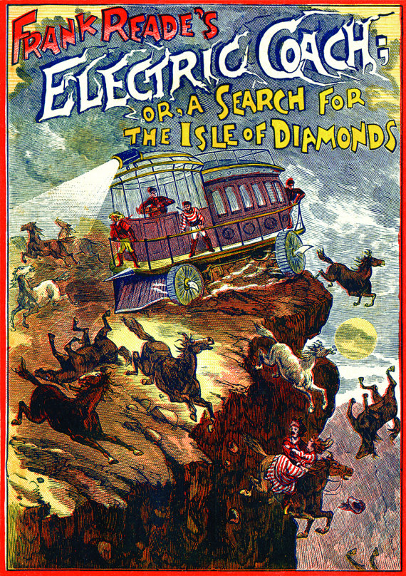
Anyway, the stories were popular. Reade came up with a trackless horseless carriage (above) that really caught the public's imagination. It's interesting that the carriage wasn't a single-person conveyance, but rather something a group would ride, with an idealistic captain at the helm, a la Jules Verne.


I forgot to mention that the prairie robot was eventually replaced by a free-standing semi-intelligent robot: "Boilerplate."


Later Frank Reade took to the air in a series of ever-changing airships.  Reade's character lived in a time when believers in heavier-than-air flight were divided. Some thought airships would only work if they had flappable wings like a bird (above). Others favored Da Vinci's helicopter.


Reade tried both but favored the DaVinci copter (above), which was similar to Verne's design in "Rubor the Conqueror."

Interesting, eh?


Tuesday, March 15, 2016

DIANA VREELAND: HARPER'S BAZAAR EDITOR


That's Diana Vreeland above, the editor of Harper's Bazaar and Vogue in their peak years from 1936 to 1944 when those magazines were undergoing a Golden Age. Theory Corner owes a lot to her influence, although I almost never read her magazines, and I only discovered her name a couple of weeks ago. 

My connection with her comes from the magazine editors she might have influenced, and who in turn influenced me: Harold Hayes (Esquire), Hugh Hefner (Playboy) and  Harvey Kurtzman (Mad).


I discovered Vreeland while researching Horst, the photographer. Horst credits Vreeland and Alexey Brodovitch with introducing Surrealism (above) to American women's magazines.


She had a vision that fashion photography could be elegant and lighthearted at the same time.  


She favored models (above) with personality. 


She also had a taste for the mystical and eerie, as in this photo (above) by Cecil Beaton. It reminds me of the female vampires in the film, "Dracula."


Her photo essays frequently told a story, or rather they suggested a possible story which the reader was invited to construct. Her dramatic models were often thoughtful and in the throws of moral choice. The photo above is by Dahl-Wolfe.


Most impressive, in my opinion, was how she inspired the great photographers she worked with. The examples above and below are from a photo shoot she commissioned, where the models were to pose in furs in far away Japan. For any other fashion magazine that would be a simple matter of photographing models in front of temples. Not so for Vreeland. She wanted more.


Vreeland wanted an indescribable fantasy that exceeded what was possible in the real world. To underline the unreality of it, she chose models who were incredibly tall and lean and, in the case of the man, philosophical. The shoot took place on a plain field of snow-covered black volcanic pebbles...no temples, no cherry trees.


I'm guessing that this approach influenced Hugh Hefner whose fantasies were equally audacious and unreal. 


This is a room in Vreeland's apartment. Haw! I wonder what her husband thought of it.  It's right out of her outrageous "Why Don't You...?" column in the 30s Harper's Bazaar.  


I'll end with the unlikely story of how Vreeland got the job at Harpers. After all, she was an indifferent student in high school, she never went to college, she had no experience in publishing, and she was considered plain-looking by her friends and family.

She got it because she had the good fortune to social dance at a night spot where Harper's editor Carmel Snow was in attendance. Snow was the rare executive who realized that her business was operating far beneath its potential and needed fresh blood. In Vreeland, a total stranger up to then, she saw someone who was passionate, theatrical, charismatic, poised, well-dressed, danced well, etc., etc.

Snow offered Vreeland the job of fashion editor the very next day on the condition that Vreeland work her way up through the ranks, albeit on a fast track. The rest was history.

Interesting, eh?


BTW: There's some nice books about Vreeland, but the one essential thing to see is the documentary film: "Diana Vreeland: The Eye Has to Travel."

Sunday, March 13, 2016

THE WRIGHT BROTHERS FLY

This morning I did some reading about the Wright Brothers and their famous first flight in 1903. That's (above) Wilbur flying the glider version of the plane over the sand dunes of Kitty Hawk. 

The brothers suffered a lot of crashes and setbacks. When they finally succeeded very few people were there to see it.  If I've got it right, the first sustained glider flight lasted 59 seconds, which is a long time if you think about it.


Here's (above) a motorized version of the plane.  Here the vertical front rudder in the glider has been replaced by two tiny horizontal wings. I don't see the engine but I'll assume it's there because two propellers are visible. Each prop rotated in a different direction for stability.

At first I thought it odd that the propellers were in back of the wings. I mean, isn't it the job of a propeller to throw wind over the wings? I guess it isn't. According to an article I just read, the propeller is only there to pull the plane through the viscous medium of the air.


There's a lot about flying that's counter-intuitive. I always thought that the wing shape causes low pressure on the top and that in turn allows high pressure underneath to push the wing up. Evidently that's not exactly true. What really happens is that a vacuum layer forms over the top of the wing and the plane is pulled up from the top. Interesting, eh?


Lilianthal, another aviation pioneer, noticed that bird feathers on the outside tips of the wing had a different shape and direction than the other  feathers, and he spent a lot of time trying to figure out why.  So did the Wright Brothers but they eventually concluded that it wasn't important.


Boy, I'd like to have a working model of the Wright plane...one like this zombie child (above) has. You can get one for 50 bucks. It has a hand-cranked motor located in back of the wings, near where the real ones were.

I also discovered this morning that you can buy an electric motor for home-made  paper airplanes. It costs 20 bucks...a real bargain if it works.

 You can even put two motors on a paper airplane! Hmmm...maybe if the plane's made of card stock.


I also looked up paper plane designs and discovered that a lot's been done with that. Here's a soda straw airplane that someone claims can fly.


Here's (above) a fly-powered airplane, with flies super-glued to the wing. It didn't work out so good.