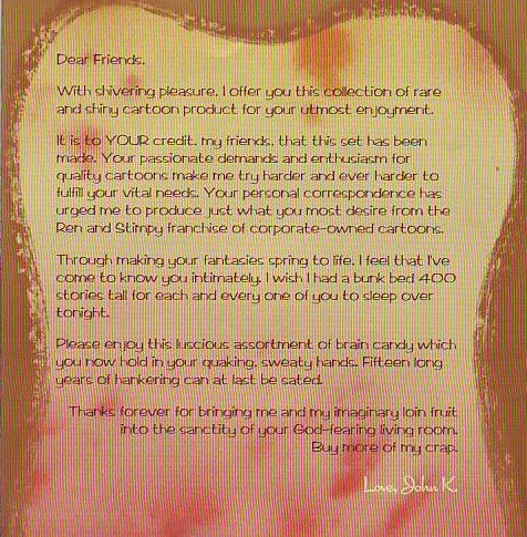
Do whatever you have to do to get this DVD! Steal purses from little old ladies, sell your children into slavery....anything! It's that good!
A lot of fans were put off by some of the gags in these cartoons and it's easy to see why. There's some gay jokes, some cruelty to animals, some gross gags...most people will find at least one thing that rubs them the wrong way in here. That's the bad news. The good news is that the remaining 99% of the content is pure bliss and, taken as a whole, the contents of this set are probably the most innovative and funny thing to happen in animation in the last half century.
For me the best cartoons in the box, the pearls of greatest price, are "Naked Beach Frenzy," "Ren Seeks Help" and "Stimpy's Pregnant." Naked Beach Frenzy is hands down one of the funniest cartoons ever made. I defy anyone to sit still during the lifeguard and Shampoo Master sequences. Ren Seeks Help is packed with tour de force acting scenes which will probably change the way animation is done forever and Stimpy's Pregnant contains what might be the greatest Mr. Horse sequence ever. And those are just the top three ! I could write all night about the great gags in the other films!

It's a digression but I can't help putting up the note John wrote to his fans on a card on the inside of the box. John is not only the greatest artist working in the industry but he's the greatest writer as well. These are beautiful words. If you read enough of what he writes you begin writing and talking that way yourself. Like everything John does the words beg to be imitated.
BTW, people who pre-paid for the set are getting their's in the mail now. I'm not sure when the discs will appear in the stores.

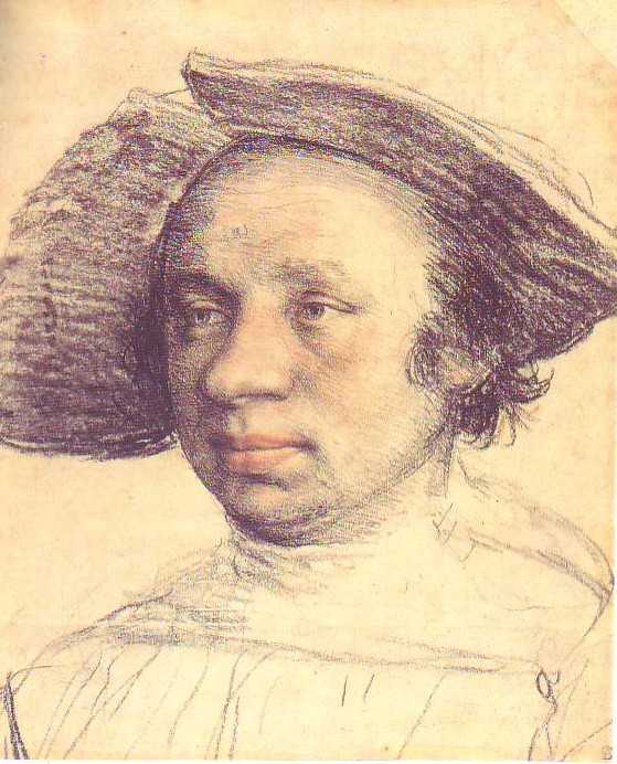
 I love to draw hands. That's because hands have a life of their own.
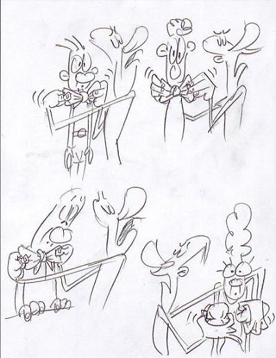 Hands are pretty good at revealing what their owner really thinks. A face may listen to a boring speaker with what looks like rapt attention but way down below the hands are playing with keys or tapping on the table. Sometimes the hands are more than just magnifiers of their owner's true feelings. Sometimes they have feelings of their own. Hands may be macho, gay, happy, sad, lecherous or virginal, even if their owner possesses none of these qualities (these thoughts cry out for drawings to illustrate them. Sorry, I didn't plan this post very well). I'd love to do a short, pencil-test film of an extreme version of this idea where a guy's hands, acting completely on their own, grope the people around him and get him into trouble.
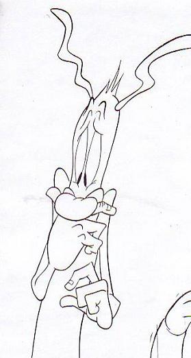 Here's a drawing where the excitable hand is frightened and clings to the face, which is only mildly disturbed. At least that's what I had in mind when I drew it. The understory about the excitable hand is sometimes for the artist only. Sometimes you want the understory to be so subtle that the audience isn't even aware of it.
 Most stories don't lend themselves to this hand theory and those I board the normal way, as above. Even so, it still works for the occassional scene. I'll try to find some examples.