Monday, February 13, 2017

THE HOUSE FROM "LEAVE HER TO HEAVEN"


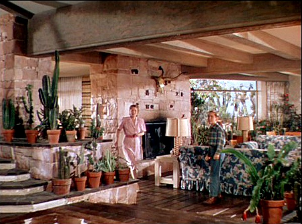
Architecture is on my mind these days, and I thought I'd talk about another favorite film house...this one from the 1945 thriller, "Leave Her to Heaven."  The stars: Gene Tierney and Cornel Wilde.  The director: John M. Stahl.  The location: Arizona.  Gee, I wish I knew the art director's name because this post is really about his work. 


This (above) is the best view of the exterior I could find, but it doesn't quite match the log cabin look of the picture at the top. I think the film presented these as different views of the same house, though. Anyway, this view kinda' makes you want to take a dip, doesn't it?


And here's an indoor shot highlighting one of the best staircases in all of film. It's only rival...in my opinion... is the Czar's staircase in Von Sternberg's "Catherine the Great."


This interior was built on a set in L.A. If I understand right
it was inspired by a real house in Arizona, but lots of alterations were made by the set designer.  Not bad, eh?


Above, a slightly different angle.


This house (above) is cozy as well as modern. That's a trademark of architect Cliff May. You don't suppose he had a hand in this film, do you?


The dining area (above) is raised two or three steps above the living room. Nice.


Of course, it helps to have Gene Tierney serving up the meal.


Above, the area in front of the dining table.


Here's (above) the set of another house in the film.


How do you like the Dutch door and the large windows that go all the way down to the floor?

BTW: Most of these pictures were found on a site called "Hooked on Houses."

Thursday, February 09, 2017

JEAN-JACQUES SEMPE: GENIUS

Here's (above) a view of Parisian rooftops by the underrated (underrated in the USA, that is) Paris Match and New Yorker cartoonist, Jean-Jacques Sempe.  I imagine that Sempe's work has special appeal for architects. In addition to his own great ideas he has a knack for stimulating ideas in others... a valuable man to have around.

Take these Parisian rooftops for example.  They're so beautifully caricatured that they stick in your mind. Over time you find yourself wondering why ground architecture is so frequently inferior to what's on roofs and why can't we make better use of rooftops than we have so far?


Sempe's full of architectural ideas. In this case (above) he seems to believe that if we're going to light up business buildings at night then we should really light them up, with big windows and strong lights. "Sure," I say to myself, "why not?"


I could write pages on the thoughts that spring to mind when I see the city scene above. On Sempe's small street the traffic congestion is actually picturesque. You'd expect the cramped drivers to be stressed out but maybe they're soothed by the people watching opportunities. Is the answer to traffic congestion smaller one-way streets rather than big two-direction boulevards?  Probably not, but you have to admit that the idea is provocative.

BTW: what a seat that guy behind the big window has! It's a people watcher's dream.


While we're on the subject of people watchers, what do you think of this restaurant scene (above)?  You look at this picture and you're instantly transported to a time and a place where you spent time with a friend in a quiet restaurant while humanity paraded along outside the window. But wait, this is about people watching....

Notice we're looking down at the diners, as if from a higher level. The diners can push aside the curtains and look out and maybe down at the passersby, and people on the higher level can look down at the diners. Do you get it? In other words, the Peoplewatchers themselves can be peoplewatched. It's an interesting idea.


Here's (above) a Sempe outdoor coffee house. Isn't it great? It takes so little to make people happy. Why, oh why, do we torture ourselves with inferior spaces?


I also like what Sempe has to say about the simple pleasures of life, like splashing through rain water.  Is there a way that architecture can improve the splashing experience?

Adults like to avoid the rain and kids like to play in it.  Sempe seems to ask if there's some way architecture can satisfy both types.

I wish architects would spend more time imagining how cities can be made for fun.  Wind, rain, snow and lightning are too often treated as obstacles. Maybe architects and engineers can transform them into opportunities for pleasure.  A first step might be for them to read Sempe.


Monday, February 06, 2017

THE LATEST TREND IN ART

What's the latest trend in art? That's a good question!


We're departing from previous 50s-type Modern Art, no doubt about that.  50s art was often about weird organic shapes. Here's (above) a piece by Jean Arp who was fascinated by bread mold and lava lamps. I like it because its funny, but I guess it's not for everybody.


At least Arp was neat. You could eat off the floor in his studio.


Most artists aren't like that. We're a landlord's worst nightmare.


I don't know why but a lot of us just can't think unless we're surrounded by clutter.


If you're a landlord and this puts you off, then you'd better not talk to your artist friends about it. We're a volatile bunch, easily offended.


Maybe that's because we're full of anxiety. We're required to comment on hard to pin down things like what's "in the air."


Critics expect us to be the early warning radar of what's coming next.

Yikes! I don't know what's in the air. I have enough trouble finding my car keys. That's a big responsibility they're laying on us.


Oh, well...we'll do our best.


So what's in the air? My best guess is sentimental dog paintings. Dog slippers, dog pens, dog Kleenex...anything dog. There. You can bank (bark) on it.

[BTW., none of the art portrayed here is mine.]

Friday, February 03, 2017

AN IDEAL HOUSE!

I just saw the 2006 Gwyneth Paltrow movie, "Proof." It was director Director John Madden's next film after "Shakespeare in Love," a film I watched at least a half dozen times. I'm tempted to talk about the story here but I'm an artist and I'll try to stay focused on the wonderful house that was used in the film. That's it above.

In the story a bereaved Paltrow was the daughter of a famous mathematician, recently deceased.  This was the house her character grew up in.


Isn't that porch wonderful?  It could use some paint, though. Maybe "stressed" wood was still in fashion in 2006. 

Throughout the film horizontals and verticals are stressed. The art director thought that was appropriate for a film about math people.


'Nice neighborhood. Lots of trees and shrubs.


A large living room with hardwood floors makes for a perfect party.


I love the upstairs halls that you find in houses like that.


Geez, the dad's workroom was even messier than my own. I like it, though. Are those subway tiles behind the desk?


I especially like windows of that type, and notice the fibrous wall covering.  It allows the entire room to function as one big bulletin board.


Window sills are covered with shells and concentric cactus plants...it's the math theme again.


Even the pattern on the bedspreads is subtly math themed with repeating patterns. I'll discipline myself to ignore the quasi-nude scene that this scene builds to.


The kitchen continues the math idea with linear fluted trim on the windows and doors. It's a great look. 


Ditto the breakfast area with linear patterns on the cushions and vertical paneling on the walls. That's the sun room on the other side.


I love sun rooms! The architecture, the light and temperature...everything is different out there. Rooms like this are like little Robinson Caruso shacks grafted onto manor houses. It's a terrific idea! 


I'll end this with Paltrow lit simultaneously with dim blue and straw-colored lights. That's an easily achievable effect even in ordinary homes!


INTERNET WAS DOWN: BACK TO NORMAL NOW

.....

Wednesday, January 25, 2017

LAUTREC AND THE MOULIN ROUGE

I'm writing this to make a point about the purpose of the best pictorial art, but I'll need to set up an example first, and for that I offer the Moulin Rouge (above), the famous Parisian dance hall and theater as it was around the late 1890s.


The MR promoted itself as the birthplace of the Can Can. Some say it wasn't, that "kicking the Moon" had been around for decades. I dunno. What I do know is that lots of people believe this combination of Offenbach-type high energy music and eroticism was as good as entertainment gets.


 Anyway, here's (above) the outdoor beer garden in the back. Nice, eh?


To promote the Moulin the management contracted with well-known artists to turn out a series of posters which were pasted on fences and billboards all over Paris. Surely the greatest of all these artists was Lautrec. That's his very first poster for the Moulin, above. Geez, he was smoking hot right out of the starting gate.


It didn't hurt that he was working in an inventive new style that seemed to underline the hipness of the club.


The man had stiff competition. Jules Cheret (above) turned out charming posters that were dynamic and colorful.


Steinlen, the creator of the Chat Noir cat posters, emphasized the joy of people watching, of being shoulder to shoulder with dangerous, unpredictable, fun loving people (the poster above wasn't done for the Moulin but was typical of Steinlen's later work for the club).

Even so, I'll bet that for most people the laurel goes to Lautrec. Where other artists simply promised a good time, Lautrec seemed to promise something transcendent, something approaching insight and ecstasy. How the heck did he achieve that?


By way of an answer I offer two Lautrec drawings commissioned by performers at the Moulin. Both are close-ups showing a Moulin actress sitting in a carriage, but only one possesses the Lautrec magic.


 That's the second one, above. Here the actress is also in a carriage but she's unaccountably underlit as if by theatrical footlights, and she's elegant and accompanied by what looks like a rich man.

More than simple admiration it creates a yearning in the viewer to be there in that special time and place, to witness a confident performer in an exotic club in the world's most interesting city. You're induced to feel that if you miss this magical night you'll regret it for the rest of your life.

The point I'm trying to make is that Lautrec was selling adventure and a Utopian vision. He was selling dream fulfillment. In the case of the poster above he was selling the thumping of dancers on floorboards and eroticism and wild music played in blinding light.