Tuesday, August 15, 2006

LITTLE ANNIE FANNIE LAID BARE

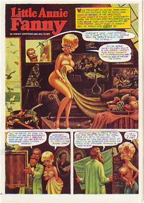
Here's (above) a Little Annie Fannie episode from September 1963. Attributed artists: Kurtzman, Will Elder and Russ Heath. I love the "dipped-in-strong-tea-and-burgundy" color scheme. Here's a treat (above): Kurtzman's original watercolor painting of the same page! All the colors we associate with Annie Fannie are here: brown, yellow, orange, red, and green. I think I prefer this rough color scheme to the finished product which mutes the colors to make the word balloons pop better.

Can anyone do a better job than I have at describing the difference between Elder's final color and the Kurtzman rough? I know there's more to it than what I described.


Here's (above) Kurtzman's original black and white value treatment. The first panel is a whole, self-contained art lesson in how to contrast values for maximum impact. Kurtzman's made me a believer in the idea that you should always take time to do a monochrome value treatment first.

Monday, August 14, 2006

NEWSPAPERS IN 1890 BETTER THAN OUR OWN?

It's hard to believe but newspapers in the late 1800s were more attractive in one respect than papers are now. The biggest difference is that old newspapers relied mostly on pictures that were drawn. An artist can draw a news event, say a murder, in the most exciting way possible. He'll show you the shooter (top picture, above) sneaking up to the victim's home and taking a bead on her. A photographer can't do that. He's stuck with showing up the next day and taking taking a picture of an empty house surrounded by yellow police tape.

Even televised news is at a disadvantage compared to artist-rendered print media. How would the TV news cover an event like the one shown below where a buffalo went on the rampage? If the cameraman didn't happen to be there all he can do is photograph witnesses talking about it.

We all know that print media is eventually going to lose out to digital media but, given it's magnificent history, it should go down swinging, using every asset at its command. It should tell the news with both art and photography.

BTW, my sources for these pictures, The Police Gazzette and Frank Leslie's ,were weeklies and had a bigger budget for drawings than did dailies of the time.

Sunday, August 13, 2006

THE GREEK TRAGIC HERO AND HOW THE IDEA RELATES TO CARTOONING

Believe it or not, the Greek concept of tragedy applies to animation and cartooning. By "Greek" I mean the Homeric Greeks. According to historian Warner Yaeger the Greeks thought about tragedy differently than we do. We pity tragic heroes, they admired them.

The tragic hero led a deliberately unbalanced life. He devoted all his energy into becomming supremely good at one important thing. He may have been a lousy father and an indifferent husband, he may have had no table manners at all, but in his field of expertise he was unbeatable. Of course this skill came at a great price.

The Greeks believed that sooner or later the tragic hero would be brought down by his inability to cope with menace from the part of life that he neglected. They admired the kind of man who took this kind of risk. Modern people admire balance. The Greeks (before Aristotle's time) admired imbalance, though they thought only special people were suited for it.

How does this relate to cartooning? If you have skill and a special passion for it the Greeks say "Go for it! Go all the way and don't look back. " You'll definitely pay the price, but it's worth it.

Saturday, August 12, 2006

I LOVE CROWDS!

I love crowd shots. They remind me how much fun it is to be with a lot of people who like the same things I like. One of my all-time favorite crowd photos is this one (above) in what appears to be a nightclub. The people look like they came out of an old master's painting like Gericault's "Raft of Medusa." This is every performers dream, to be surrounded by listeners who "get it," who are on the same wavelength. Click on the picture to see the detail.

Crowds look better in magazines than in newspapers. Papers just can't resolve the faces, at least not photo faces. Drawn crowds like the Wood drawing above look good in any print medium. If you're a print cartoonist learn how to draw funny crowds!


I know who did this crowd: Weegee the great New York tabloid photographer. A gambler's just been shot and a torrent of humanity streams out of the tenaments to get a look. It has that gritty 50's feeling. Humanity is portrayed as consisting of angels and demons with every shade between.

Friday, August 11, 2006

DRAWINGS BY JOHN K. & CHUCK JONES

Here's a rough (above) that John did for Ren's opening shot in "Sven Hoek", R&S second season. The shape and height of the chair is hilarious, the placement of the picture frame is perfect. Like everything John draws the line is confident, the silhouette lets lots of air in and the pose is funny as it can be. Notice how he avoids "twins" in the legs and feet. Click to enlarge. Another John drawing (above), probably from the same show. I don't think this was intended for production. John was always drawing things like this on scrap paper to show people how to draw the characters. Look how tight the sausage of Stimpy's body is! And the emphasis on volume actually makes the drawing funnier!

Here's a xerox of a drawing that Chuck Jones did, maybe in the late 70s. Maybe it was a telephone doodle. The face on the right is an interesting blend of flat and constructed style. There's something offputting, even evil, about the characters but the skill is undeniable.

Thursday, August 10, 2006

MORE ABOUT DELSARTE

Readers who hated the last post I did about Delsarte will probably hate this one too. It's a hard sell to convince people that Delsarte's old-fashioned "tie-the-pretty-girl-to-the railroad-tracks" school of acting is actually worth studying.


  Here's the picture (above) I posted a few days ago. Look at it closely. The woman refers to the man as a giant, yet she's looking down and her hand is at waist-level. Why isn't her hand way up? She should be pointing up to the sky, shouldn't she? The guy's a giant after all. When she says he acted like a dwarf she looks upward disdainfully. What's going on? How come at the mention of "dwarf" she looks up, where she didn't at the mention of "giant?" Why is the orator defeating our expectations? Why don't her expressions and attitudes describe what's happening in the dialogue?

The Delsartean answer is that her gestures are describing what's really happening in the scene. the emotional point of the scene is that she's heart-broken with disappointment. The description of the guy is secondary, and is only an excuse to convey her emotion. The idea that gesture shouldn't slavishly follow text is extremely interesting. I remember a quote from Norbert Weiner: It is a cybernetic law that the more expected a communication is, the less information it contains." In other words, gestures that only mirror the dialogue are boring. Gesture should ADD to what the dialogue tells us!


Delsarte is full of ideas like this. How about the one where he says gesture should always preceed dialogue? Or repeated expressions of the same thought should always be identical? Or never dwell on the final word? Or geture should always be choreographed? Or...well, you see what I mean. It doesn't matter if the man is right. What's important is that he stimulates our imaginaton!

Wednesday, August 09, 2006

MORE CARICATURES OF ME!!!

Here's more caricatures of me by John Kricfalusi. The one on top has ears growing out of my cheeks, little curly hair whisps and lemur fingers. The expression defies description. It's an emotion that science hasn't catalogued yet. I see the figure as something out of "Island of Dr. Moreau":

"Men die under the lash...of his TORTURING WHIP...
Women SHUDDER at the touch ...of his CRUEL CARESS!
There's no escape...from this HALF MAN/HALF ANIMAL'S PARADISE OF TORTURE!"
Here I am (above) as a rat. I seem to be a likable rat. I have a curly, little whisp of an upper lip with piano keys dangling from it, a cavernous ear, and eyes that look like custard cups with a couple of flies sitting on them.
Oops! Here's the beast man again:
"What FIENDISH EVIL lurks behind this face? What WEIRD VENGEANCE is brewing!?"