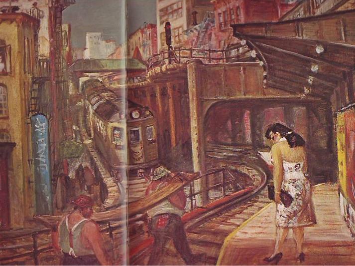
It's hard to believe but newspapers in the late 1800s were more attractive in one respect than papers are now. The biggest difference is that old newspapers relied mostly on pictures that were drawn.
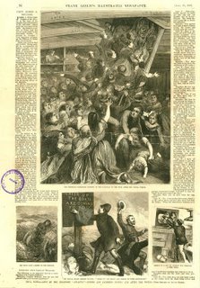
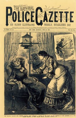
An artist can draw a news event, say a murder, in the most exciting way possible. He'll show you the shooter (top picture, above) sneaking up to the victim's home and taking a bead on her. A photographer can't do that. He's stuck with showing up the next day and taking taking a picture of an empty house surrounded by yellow police tape.
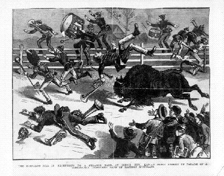
Even televised news is at a disadvantage compared to artist-rendered print media. How would the TV news cover an event like the one shown below where a buffalo went on the rampage? If the cameraman didn't happen to be there all he can do is photograph witnesses talking about it.

We all know that print media is eventually going to lose out to digital media but, given it's magnificent history, it should go down swinging, using every asset at its command. It should tell the news with both art and photography.
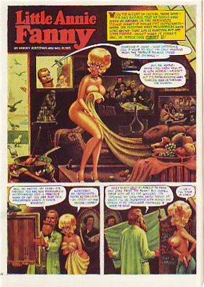
BTW, my sources for these pictures, The Police Gazzette and Frank Leslie's ,were weeklies and had a bigger budget for drawings than did dailies of the time.

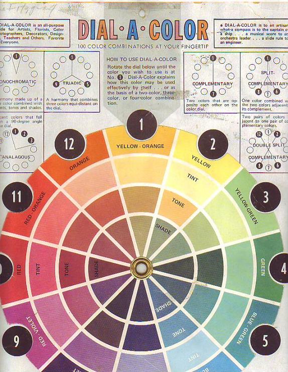 Here's my favorite wheel (above). Sorry for the condition. I bought it in the 80s and it's been stepped on, spilled on, ripped and repaired many times since. It may be out of print now. The copyright name is just an address: Box3193 Amarillo, Texas 79106.
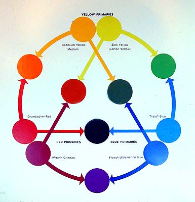 Here's my second favorite (above). It's a reminder that there are warm and cool versions of every color.
 Here's the version (above) currently sold in the art stores in my area. I took off the rotating wheel and use it as a single card.
 Here's the Itten wheel (above): Shades on the outside and tints on the inside. 'Not that useful for what I do but I have it on my wall anyway because it's so beautiful and mysterious! I should put up a Munsell wheel too but I can't find one that I like.