Friday, August 26, 2016

FUNNY FIGURE DRAWING MODELS

I like to think that comedic models will become common in future figure drawing sessions. I further fantasize that the best models...i.e. the funniest ones, the most fun to draw...will become much sought after on the art school circuit. I predict that we'll see a lot of certain types of characters. I'll mention a few of them here. 

Well, there's the Mr. Meek type (above). 

With costume changes the very same model could, in the same session, be a flamboyant dandy...


...a dancer or a singer...


...a snob...

...or a goofball...

...or a villain like Captain Hook.


As with male models you'll want female models who, with a costume change, could play different kinds of roles.  Skinny Olive Oyl-types (above) would be fun to draw and could probably do double duty in the same session.


She could also be a dancer (above)...


 ...or a funny melodramatic actor.


I don't mean to give the impression that one model could handle all the women's parts. For other sessions you'll also need a big-boned model (above).

With a couple of pillows tucked into her clothes she could be a hefty post-middle age woman.


You'll obviously need a sexy bathing suit model (above). This requires someone funny who's voluptuous and curvy, not thin like a super model.


You'll also need a dramatic actress who can parody actresses like Garbo or Bette Davis.

Monday, August 22, 2016

COMEDIC FIGURE DRAWING / TECHNIQUES I'D LIKE TO TRY


For comedy drawing sessions I usually prefer draped models.  Sorry, I don't know who drew this. 


I don't think oddball contortions are the best use for a comedic model.

I prefer funny poses. There's always something about them that you'd never have figured out if you were just winging it. In this case (above), the angle of the feet. I like the clothing wrinkles, too. 


Maybe if someone held her feet up you could get something like this (above).


I like ignorant poses. 


As an experiment I'd like to try poses that are influenced by movies and animated cartoons I've seen. Somewhere out there, there's bound to be comedic male models who can do exaggerated public speaking poses like the ones Daffy Duck's doing here (above and below). 

The padded shoulders and gloves magnify Daffy's gestures so I'd try that on the real life model.


For a text, maybe fragments of one of Billy Sunday's prohibition sermons. Or maybe a poem. What do you think of this Walt Whitman parody (below)? 


AFTER WALT WHITMAN
by Richard Grant White

I happify myself.
I am considerable of a man.  I am some.  You are also some.  We
   are all considerable;  all are some. 
Put all of you and all of me together,  and agitate our particles by
   rubbing us up into eternal mash,  and we should still be some.
No more than some, but no less. 
O ensemble!  O quelque-chose!  O women!


Yes, women!
They look at me and my eyes start out of my head.
Women watch for me;  they do.  Yes, sir!
They rush upon me;  seven women laying hold of one man. 
O turnips!  O cucumber!  O beets, parsnips, carrots, O sass!


Geez, I'd kill to get a female model who could do poses like the one above.  The big butt is no problem. That's just pillows or towels stuffed into stretch pants. The hard thing would be to find a wig like the one above. Maybe a long wet rag might do the trick. Students can always make up the details of the long, funny hair, even if the real model's hair is short.


They can make the hands bigger than life, too.


Here's a pose that would require students to draw with a dark, "Sharpie"-type line...or, even better, a thick-and-thin capable brush pen. Charcoal or some other grey medium would be a great addition.

The idea isn't to copy the Olive Oyl reference slavishly but to make a funny, graphically stark and cartoony caricature of the live model.


Sunday, August 21, 2016

I LOVE L.A.

Gee, I love Los Angeles. I ask myself what person typifies the city. Walt Disney? Charlie Chaplin? Jack Warner? Howard Hughes? Raymond Chandler? Ray Bradbury? Architect Cliff May? All those names, surely, and dozens of others, but for me the name that sticks out is simply...Jayne Mansfield.


I don't know what her personal life was like but her public image was one of frivolity and lightness, of driving along Malibu beach with the wind in her face in a brand new convertible. I can't imagine someone like her coming out of a gritty city like Chicago.


Can you get a good, classical education here? No, possibly not, but that's a problem the world over.


For me Los Angeles was a utopian dream the world had. We're a fantasy conjured up between beatings by some prisoner in a dictator's dungeon.


Even now, years after the golden age, there's still electricity in the air.


Even when you're not on the beach, you're on the beach...'know what I mean? There's a delightful lightness here.


The city does have a culture. We're all just too busy to notice it.


Don't worry about it. Just have a hot dog.


Some really dopey ideas originated here, and we'll no doubt pay the price, but history will marvel at what happened here...what all us Okies and misfits managed to pull off in the Southern California desert.

When I'm forced to leave they'll have to pry my fingers off the city limit sign.


Thursday, August 18, 2016

COMIC BOOK DRAWING MISTAKES

I love the drawing mistakes on old comic book covers. Here (above) a tiny car drops off a dead man who, if he were standing upright, would be taller than the door. His girl, who has a gigantic left leg, backs up to a miniature staircase. It's all goofy, but it works...for me, anyway. 


I don't mind mistakes when they're funny.


I guess that's why I like early comics. They're full of mistakes! How do you like the hand in front of the girl's face or the inappropriate (and no doubt unintentional) grab?

The most frequent mistakes had to do with perspective. Lots of early artists had trouble with it.  What do you think of the panel above? The shooters in the foreground appear to be standing on ladders.

I'm glad editors let them get away with it. It meant that artists felt free to try drastic angles. Sure there were artists who didn't make mistakes, but that's because they played safe and avoided shots that were hard to draw. That's cheating the reader.


The best artists eventually figured out perspective but their later work never had the guts of their earlier stuff.  Even famously smooth DC artist Carmine Infantino (that's his work, above) had trouble with perspective when he first started out. I like his early work better. 


Stunning Exorcist-type head turns (on the bald guy, above) were often combined with bad perspective. The guy in blue appears to be standing on a stack of telephone books.

It's my belief that gutsy but primitive art prompted writers to write better stories, but I guess making the argument for that would require a separate post.

**************


BTW: I've got a lot of work to do around the house so my posts might be a bit irregular for a month or so. I'll get on a normal schedule just as soon as I'm able.

Friday, August 12, 2016

NEIL ADAMS


Neil Adams is a great super hero artist, no doubt about it, but I prefer a simpler approach, probably because I come from a comedy background. The superhero artists I like include people you probably never heard of, in fact, I don't know some of their names myself. 


I like the artist who did this panel, above. I'm guessing it's Jack Cole. I love the way the character takes giant Kirbyesque strides as he walks, but his torso is fairly normal. He's talking to the camera, but it's easy to imagine that he's talking to a friend who's taking giant strides beside him. I'd like to see walks like this animated. 


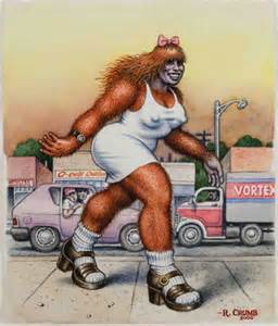
Here (above) a different artist suggests a wonderful animated walk. The pipe smoke makes it even better. 

Who did this one (above)?  It's one of my all-time favorite comic book runs. We're told the character is frightened out of his wits yet his lower body seems to be calmly standing in place. Does it work? Mmmmm....I have to admit that for me...it does. 


I'm guessing that the artist posed in a mirror for the picture, but the mirror was one of those tiny medicine cabinet mirrors and he couldn't see his lower body. 


In art school they always emphasize strong silhouettes, but this artist (above) prefers the opposite. His character's pointing arm is lost within his overall shape. A mistake? Maybe...but it's kinda' funny.


Maybe evil characters should have to earn their earn their silhouettes. A certain kind of character (above) could start a story with arms tucked inside his body shape then acquire stronger silhouettes as the story deepens.


This character's (above) great! His neck seems to be broken so his head stands perfectly upright even though his body leans forward. I like it, though. It makes him more interesting. I also like the way the guy's head sits on his right shoulder. Genius!


Check out the way his head (above) turns to face the woman beside him. It's the Exorcist method of head turns where the body faces forward while the head rotates to a profile. 


Above, the guy in the airplane is back again, this time with a flat body and a volumetric head. Veeery nice!

The kind of artist I'm talking about relishes unconventional fight poses. He experiments with all sorts of ways to give and receive a punch. 


When fisticuffs don't work the characters might resort to biting and strangle holds. Hey, nobody said the superhero life is a bowl of cherries. 

*********