

I'm exaggerating of course, color isn't really evil, but it certainly is aggressive, scary, and alien.
What do you think of the Kokoschka watercolor above? Probably Kokoschka started out with the intention of making a weird, "edgy" picture but I can't help regarding it as a normal picture gone awry. I imagine the artist beginning by filling in a line drawing with color then wondering what would happen if he let the gray and red dabs find their own boundaries based on the intrinsic "will to power" of the color.
I imagine the artist being horrified to find color oozing out of every pore of the drawing til it mutilates and almost obliterates the human subject. In my fantasy the painter is amazed to see how blithely color takes a human-like life.
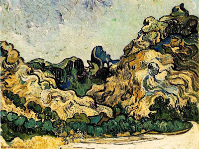 No, I'm not crazy. I'm just trying to see what would happen if I identified with the color I was using and gave it a sort of personality. I have a feeling a lot of painters do this. In the Van Gogh above I imagine the color feels tied down and restrained by all the lines. Artists frequently use lines and textures to anchor a color, to pin it in place, to subordinate it to line.
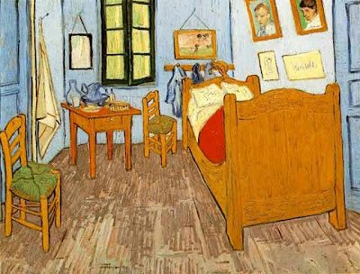
Here, in the bedroom painting, color is restrained another way, this time by being diluted with white or gray( or color mixtures that have the same effect as adding gray). The muted color is confined and imprisoned by the additives. It's made a slave to the line drawing that contains it. That's not a bad thing for us viewers. The restless color wants to break out of its bonds and our subconscious awareness of this struggle makes the muted color seem more alive and intense.
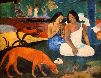
Another way to restrain color is with shape as in the Gauguin above. Simplified shapes make for strong walls that effectively keep color inside.

Gauguin got the idea of creating drawings that would approximate the natural borders the color would create for itself if it were unshackled. I don't mean that the color naturally wants to take the shape of a girl and a man's face. I mean the colors found a natural proportion in relation to one another and the girl is the subject the artist imposed on that proportion. The color still comes off as aggressive and unleashed but it's been tamed a little to suit the artist.

7 comments:
This is a great post! I love the idea of colours having a life of their own and an artist struggling keep things in order. I sit here looking at my tubes of watercolours - Prussian blue calmly resting in place while Vermillion is almost bursting with anticipation hehe! I think that is what's so appealing to me about Van Gogh's later paintings. There's a definate feeling of contained madness.
Great post, Uncle Eddie! (Sorry about the brevity - just getting over bronchitis and I'm half stoned on meds....)
Very interesting. I like your idea of simplified shapes restraining color. I'm sure that thought will help alot of painters.
How could Max and Dave Fleischer have missed what you describe (in colors coming to life, overtaking the artist's vision), as the story for a cartoon short? I don't mean a "Duck Amuck" kind of thing, but little tubes of oil paint with legs running around, using long handled sable brushes for weapons. It's pure gold, Eddie! Now watch someone come in here and prove that Charles Mintz already did it. Well, even if someone did do it, the result probably wasn't as memorable as you describe the scenario.
Hey, Eddie, I alwyas hate getting your blog off-topic but I hope it's worth it. I found an anime you might like! The Amazing Three"
Speaking of Gaugin, and being off topic, anyone read the Salon, a graphic novel where Braque and Picasso and Gaugin, etcetera, get crazy on a particular kind of absinthe?
Jorge: Wow! That was great! Thanks for the link!
Post a Comment