Saturday, August 26, 2006

NEWSPAPERS USED TO PUT COMICS ON THE FIRST PAGE!

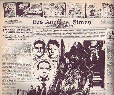
At least the LA Times did on this Sunday in 1931 (above). It's a good-looking page, isn't it? Only an artist could have created a page like this. Newspapers need artists, not just for cartoons but to do page layouts. They just don't know it.


Compare it to a typical modern page (above). The layout and choice of pictures is uninspired and the color doesn't add anything except cost. I doubt that an artist was consulted.
Normal color photos don't look good in washed-out daily newspaper color. U.S.A. Today was the first daily paper to carry lots of color photography but they were smart. They knew the color news photos sucked so they made a big deal about making a flashy artist-driven weather page with large, solid areas of flat color. Not only that but they put the flashy weather on the back page where every commuter on the train could see it while the owner was reading the side with the bad photos.
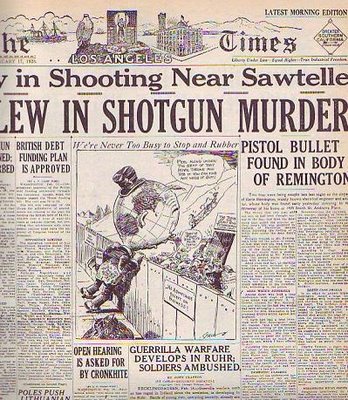

It seems like drawings began to disappear from the first page of the Sunday Times somewhere in the mid-30s. Maybe WWII, with its need for diagrams and maps, brought them back for a while but after that they vanished almost completely. Why? I wish I knew. Anybody care to make a guess?


Friday, August 25, 2006

MAYBE WE SHOULD SNEAK BIAS INTO NEWSPAPER PHOTOGRAPHY

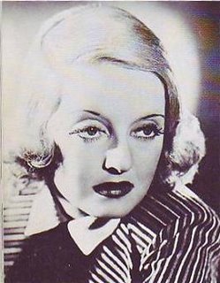
Don't you think that news photos would be more interesting if they contained an emotional bias? I'll use these old pictures of Betty Davis to make my point. Imagine that a local girl has just won a science fair. Would it be wrong to portray her as slutty (above) with the graphic implication that she slept with someone to get the medal? OK, OK, it would be wrong but surely there's a parallel universe where it would be right. Things are more fun that way.

Here's a woman (above) whose husband just died when she took his picture near the edge of the Grand Canyon. Was his fall accidental? The picture lets us know what the photographer thinks.


Here (above) are two contestants for a beauty contest. Maybe the photographer has a favorite. What's wrong with that? Newspapers need to be more interesting. We have to figure out a way to make bias work. Maybe we should do biased photo essays recapping the events of a case after the court decides it.

Thursday, August 24, 2006

WRINKLED CLOTHES ARE FUNNY!

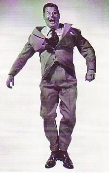
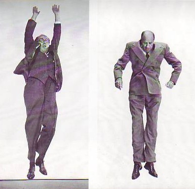
When Phileppe Halsman's "Jump Book" was re-printed in the 1980s I didn't pay much attention. There's a lot of gimmick books out there and this didn't seem to be any different. Now that some time has passed I could kick myself for not buying it. All those wrinkled suits are funny!


I don't know about you but I LOVE wrinkles..as long as they're somebody else's! It's funny when you see someone who had to dress fast stuck with wearing a shirt that's wrinkled on one side or a jacket with flaps that just won't stay down. Or what about the suit jackets that work their way up as if the wearer had an invisible set of shoulder pads on? Suits have a life of their own. We wear them but we don't own them. We're just their means of locomotion.
Maybe the all time best suit wrinkles in animation were in the the kissing sequence in "Coal Black." Scribner must have had wrinkled people pose for him. Why aren't there more cartoon scenes like that? Every cartoonist should study wrinkles with the same determination that he studies old stand-bys like male breasts and nose hairs.
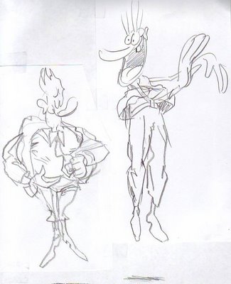
These are terrible sketches but I'll put them up anyway because I got a great idea while drawing them! What if cartoon characters walked around wearing wrinkled clothes? It would at least make a great sequence wouldn't it?...or maybe not. (Groan!) I need to get some sleep.

Wednesday, August 23, 2006

EDITING TOOLS ARE HURTING ANIMATION

In my opinion recent cartoons are too heavily edited, even when the editing is done by the cartoonist/creator himself. Now that editing is easy and can can be done on a laptop every shot in a cartoon is edited and re-edited til it's considered perfect. That may enhance the filmic quality but it diminishes the sense of preformance and risk. Some cartoons give me a case of "smoothitis."

Easy edits also tend to increase the number of cuts. We all know films that benefited from frequent cuts but I bet I can point to an equal number that were hurt by it. Fred Astaire used to cut his dance scenes as little as possible and it's easy to see why. It's the same reason that magicians on screen resist too many cuts. The audience assumes that the cuts cover up mistakes or chicannery. They think cuts make the performance easier, too easy in fact, and they paid to see somebody do something that's difficult.

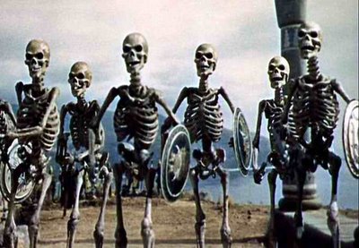
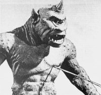
On a related subject, I'll add that quirky motion sometimes adds to the appeal of a scene. Some of the jerky stop-motion on Harryhausen's best scenes (I emphasize the words "some" and "best") actually improved the fantasy. It gave the monsters an unreal, unearthly style of movement that fit the story. Cartoon animation works the same way. Nobody wants jerky animation but we want to see some near misses, some last-minute saves, some cheats that give us an idea of how difficult it is to move this stuff. We want to see a first-rate animator's struggle. Hemingway wrote that nobody can appreciate a good bullfight til they've seen a bad one. That applies to what we do. Let's stop being so slick!

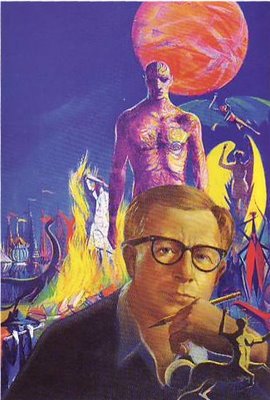
RAY BRADBURY HATES ME!

It's a strange to think that sci-fi writer Ray Bradbury, the sweetest guy in the worl, a guy who likes just about everybody, can't stand me. I still don't understand exactly what I did. I'll tell you what I know and maybe you can figure it out.

A few years ago I went to hear him speak at a church auditorium near UCLA. It was a few days before Christmas and there were actually snowflakes in the air, a rarity in LA. I was feeling great, not only because of the holiday but because that very day I'd figured out what I thought was the true meaning of Clement Moore's "Night Before Christmas." I told my friends about it but they didn't seem very impressed. It occurred to me that maybe Ray Bradbury would be a more receptive audience.


  Ray's speech was wonderful and afterward he offered to sign books, including books of his that people brought from home. I didn't have a book but I got in line and patiently waited my turn. When I finally got up to him I was almost bursting at the seams. "Ray" I said. "I figured out why "The Night Before Christmas" is the most famous Christmas poem! I can tell it to you in less than a minute!!!"

To my surprise a suddenly grimacing Ray leaned into my face and said something like: "Oh, you're a big man aren't you!? You know more than the rest of us don't you!? You're Mr. Bigshot aren't you!!!??" I was shocked. I could think of nothing else to do but a Ralph Cramden lip quiver: "Humna-humna-humna-humna!" I left the line and felt his stare on my back all the way out the door into the snowflakes.

Did I get him on a bad day? Maybe, but a few weeks ago I went to hear him speak again and he refused to look at me even though I was seated in the front row, right infront of him. There was a long awkward silence when no one could think of a question to ask and even then he wouldn't acknowledge me. He just looked around either side of my (tastefully) waving hand. You'll have to take my word for it that I didn't act in a way that any one else would find off-putting. Maybe I have the wrong pheronomes. Anybody have a thought about this?

Monday, August 21, 2006

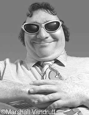
MARSHALL VANDRUFF: PIONEERING CARICATURIST

I used to work with Marshall at Cartoon Network. He's funny, passionate and loves people, qualities which manage to find their way into his caricatures.


Marshall did caricatures like these in the 80s and early 90s when professional computer caricature was still somewhat uncommon. I think he had to resort to added photographic and prismacolor enhancement to get what he was looking for.


What a shame that newspapers didn't pick up on what Marshall did...They could have had a Sunday comedy section built around funny pictures like these! As it happened Mad magazine picked up Marshall so it all had a happy ending!

Sunday, August 20, 2006

MAKING A FETISH OUT OF TIMING

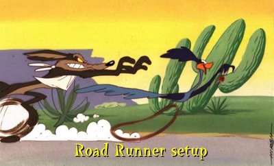
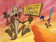
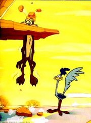
I absolutely love good cartoon timing but I have to admit that I've come to love it less in recent years. I've just seen it abused too often. A lot of cartoon producers and nearly every cartoon writer believes that timing will save an otherwise mediocre cartoon. It won't. It couldn't even save the Coyote and Roadrunner shorts and you're not likely to see better timing than that.


It all goes back to the purpose of cartoons. The purpose of a cartoon is simple: it's to blow the audience's mind. Nobody ever watches a cartoon, or any form of entertainment for that matter, with the intention of seeing something tepid that just passes the time. People want to be transformed and exhilerated. Even after a long day of work when you flop down infront of the TV and your standards are as low as they'll ever be, you'll still find yourself hoping to find a diamond in the rough. Timing isn't capable of delivering a diamond any more than a really good set of tires can drive you to the grocery store. Timing is just timing, something vital that takes its place among other vital things. Good timing plus drek does not a good film make.


A common story in recent animated features has a bunch of animals run away from captivity to pursue their dreams in some far away haven. How do you blow minds with a story like that? Is the premise intrinsically mind-blowing? No, but you could argue that some classic comedies had plots that were just as thin. Are the characters themselves "great" characters? Probably not. Are the gags strong enough to support the film? Well, maybe they're not THAT strong. It becomes clear when you look at the pre-production art that the backbone of the film, the thing that everyone's hoping will save it, is the timing.

The thinking is, tighten up the story, the animation and the editing as tight as they can possibly be and all the other problems will go away. But timing wasn't meant to bear that kind of burden. Timing is no substitute for charisma or imagination or street smarts or nobility or fine acting and animation or gut-satisfying humor and story. Timing is just timing.