Thursday, June 07, 2007

BOOK REVIEW: "EMOTIONS REVEALED"


Paul Ekman is a psychologist who's gotten a lot of attention lately for his studies of facial expressions. It's a hot issue now because of face recognition software which not only spots terrorists but is used increasingly as a kind of lie detector.

According to Ekman the long lasting expressions can be faked a lot easier than the short-lived ones which may only last for half a second. The short ones are almost involuntary and are fairly sure indicators of what the person's really thinking.

See if you agree with Ekman about how to interpret the short-lived expressions below.


Face #1 (above): Neutral mouth and drooping eyes indicate a slight sadness or tiredness. The eyes still have focus so the tiredness is mild.

Face#2 (above): If you guessed anger Ekman says you'd be wrong. This is disgust. You can tell by the wrinkled nose and narrowed eyes.
Face #3 (above): Anger or pointed sadness, but this time expressed with the lowered lips alone. Compare this to #1 where the anger is expressed with the eyes alone.


Face #4 (above): Slight enjoyment expressed with the lips alone. The eyes are neutral.


face#5 (above): Highly controlled anger. The woman's getting mad and may not be aware of it herself yet. If you see this face on a real person it means trouble is brewing.


Face #6 (above): Disgust, this time expressed with a slightly raised upper lip and not the nose and eyes as in #2.

Face #7 (above): Upset, miserable. The lowered brows and tensed lower eyelids signal anger as well.


Face#8 (above): Masked anger. Covering up anger with a happy smile. In some circumstances could be amusement at being perplexed.
I'm not recommending the book, I've only had time to skim it, but I thought you'd like to know about it. There's not really enough pictures. How can you discuss faces in a book that's mostly text?

Wednesday, June 06, 2007

IS THERE AN AUDIENCE FOR FUNNY ANIMATION?

The other day someone said to me that it might be a waste of time to push for animation-intensive funny cartoons because the times just aren't conducive to them. What people want now is anime, which even in its humorous moments is more audacious than funny. Funny is gone. Kaput! Attempts to revive it are doomed to be futile! Doomed! Doomed!

My strongly-felt reaction was, "Oh, really?"


By way of a counter-argument let me relate a story taken from my own experience. A long time ago I had an idea for a novel which I'd hoped would eventually become a movie. It had to do with a really terrific and innovative school housed in a castle. I spent hundreds of hours thinking about it and writing an outline and when I was finished I showed it to my family to get their re-action. To my amazement they hated it!


My kids sat me down and told me earnestly that kids hate school and would never sit still for a story that glorified it, no matter how interesting the school was. My wife, trying not to hurt my feelings, gently but firmly told me that school stories were a Victorian invention and were completely alien to the modern spirit. Everyone else I told about it agreed. They loved the characters but didn't think anyone would buy into the school idea. (Sigh!) I shelved it.


Then Happy Potter came out.


Kids all over the world lined up around the block because they couldn't get enough of Rowling's cool school in a castle (OK, Rowling added magic). The last book sold 6.9 million copies on the very first day! I waited in line with my daughter for hours on the night before the book store opened. We were nowhere near the front because a kazillion fans camped out there before we got there. You couldn't walk for all the sleeping bags and tents! Kids were chanting and shouting out lines from the stories and my daughter, completely forgetting what she said years ago said, "Gee, I wish I could have gone to a school like that!"


Here's another example: westerns! When I was in high school it looked like western movies were dead. All the latest ones were psychological or had aging stars and depressing titles like "The Last Gunfighter." I'll bet in Hollywood you couldn't give away western scripts.


Then came Sergio Leone. What a difference a new approach makes!

The same could be said for physical comedy. For a while every one said physical comedy was dead. The common wisdom was that we'd never see the likes of Arbuckle or Keaton (above) again, that the fan base that supported them was gone forever.

Then came Jim Carey.
Carey's physical schtick was not only popular, it made him the highest paid star in Hollywood! He got $70,000,000 for a single film!
Now some one tells me that animation-intensive comedy is dead.
My answer is, "Oh, Really?"

Tuesday, June 05, 2007

HOW I LEARNED TO LOVE JIGSAW PUZZLES

Right up until a short time ago I thought that jigsaw puzzles were the dumbest form of recreation ever invented by man. I mean what is a jigsaw puzzle anyway? It's just a ripped up picture that you laboriously put together again. Who in their right mind would ever subject themselves to that unless they had a gun at their head? Well, that's what I used to think. Now, dear reader, I've learned to respect them... and so should you!


This dawned on me a few years ago when I was called for jury duty and had to report to a warehouse-sized waiting room somewhere in the arm pit of Los Angeles. For three days I waited there all day without being called. The boredom was killing me! I brought a book, a drawing pad and an mp3 player but nothing worked. The book was always the wrong book, it's no fun drawing bored people and I'd heard everything on the player a million times before. I thought I'd go nuts!


I tried to watch TV but all that was on were garbled commercials and soap operas and no one would let me change the channel. Nobody in the seats next to me would even talk. The girl beside me treated me like a masher and the old black women all around me just wanted to knit. I just had to sit there and listen to the hum of the flickering fluorescent lights while the Earth turned.


Somewhere along the line it dawned on me that I'd seen some old jigsaw puzzles on a table near the door. There were puzzles of Mount Rushmore and old 70s sitcom actors and a really sentimental one with a Huck Finn-type boy fishing with a stick and a string. I remember the title in big letters across the box: "Blessings on Thee, Barefoot Boy!"


No sooner did the thought enter my mind than I chased it out again. No, no! I couldn't bring myself to stoop so low! Anything would be better than puzzles! I spent another hour trying to sleep and make conversation with knitters and crazy people and finally I threw in the towel. OK...a puzzle! Wearily I cast a glance the table . All the puzzles were gone but one, the Barefoot Boy.


Well there was nothing for it so I listlessly stood up and slowly began to make my way to the table. I felt so stupid! After every step I had to fight down the urge to go back to my seat again. Weeeell.... after a bit I noticed a gay guy eyeing the table from across the room and he got up and started walking toward it. I figured he was just strolling for the exercise but I quickened my step just the same. As soon as I did that he began to walk faster. Then I walked faster, then he walked faster. There was no mistaking his destination now!


I ran for the table and so did he! We tore for the ratty old plastic table and he did a flying leap (I'm exaggerating here but not much) ahead of me and with a woosh of boney fingers he scooped up the puzzle before I could reach it! Aaaargh! It's painful to recall this! He gave me a smug, "So there!" look, and I had to watch while he sat down at the table and shaked the pieces out. Defeated and dejected I returned to my seat and endured two more hours of almost unbearable sensory deprivation.


So what did I learn? I learned that the humble jigsaw puzzle is a thing of beauty to those who are desperate enough to need it. I'd no sooner make fun of it than I'd make jokes about penicillin. Now I take puzzles seriously!


Um... for those who are interested here's the famous poem. My grandparents had an embroidered version of this stanza on their wall.


BAREFOOT BOY


by John Greenleaf Whittier


Blessings on thee, little man,
Barefoot boy, with cheek of tan!
With thy turned-up pantaloons,
And thy merry whistled tunes;
With thy red lip, redder still
Kissed by strawberries on the hill;
With the sunshine on thy face,
Through thy torn brim’s jaunty grace;
From my heart I give thee joy,—
I was once a barefoot boy!


Story copyright 2007 by Eddie Fitzgerald

BEFORE THEY WERE FAMOUS

Every comics fan is familiar with Krigstein's subway story (excerpt above).
Not many have seen his earlier work done in the 40s "Classics Illustrated" style (above). I used to hate this style when I saw it later in reprints. If someone told me the artist would transcend this awkward style and go on to become a significant EC artist I wouldn't have believed him.
Every body's familiar with Kutrzman's 50s work (sample above)...

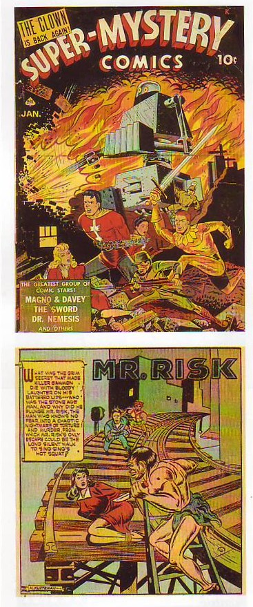
...but how many have seen his earlier work (above) from 1942 and 43? Looking at the early pages who would have guessed that Kurtzman would have become the legendary stylist and creator of Mad Magazine?
BTW, isn't the "Mr. Risk" page interesting? The anatomy's off but it has guts and appeal. The background figures look like the kind of thing Kirby would draw years later. Is that a coincidence or did one of the artists influence the other?


Here's (above) some Wood from the early 60s. It's the style we're all familiar with.

Here's (above and below) Wood from the period around 1949 - 50. It's a style that none of us are familiar with. I find these pages shocking! There's not a trace of Wood's later style here! The man completely re-invented himself in the subsequent years.


The reason I posted these is to make the point that none of us should ever get discouraged if our work isn't as far along as we'd like it to be. People learn and people change. Nothing's carved in stone.


Monday, June 04, 2007

BOOK REVIEW: "THE MANIPULATED MAN"

I have a small but treasured collection of books which I call my "weird collection." they're one-of-a-kind books, sometimes from a small publishers, which contain unpopular opinions which the rest of society has never seriously considered.


One such book is "You May Smoke" which argues that cigarettes are good for you. Another is called "Hollow Earth" which claims that mastadons live in a hollow earth lit by an interior sun. Another claims to have a photograph of God and still another claims that since men cause most of the world's crimes that men should killed off in enormous numbers so that women can feel safe again. I don't agree with these opinions but I sure am glad that I bought the books. If readers are interested I'll share some of these in the coming months.


My first "weird" book is Esther Vilar's "The Manipulated Man." I bought the book in a used book store a long time ago but I think it's still in print, maybe from a small publisher. Vilar was a German doctor, and a severe critic of the feminism of her time (1972). Here's (above) a sample of her writing style.

If Vilars could see into this era she'd see a mountain of indepedent research papers by women.


After fifty women (above) turn into "indifferent heaps of human cells."


Vilars lived in the era when most women were housewives. She considered these wives (discussed above) to be contemptable parasites on their husbands. She was particularly mad about make-up and fashion which she considered childish and manipulative.


In the world of Vilars, men don't matter except as providers. We're just background to the real show which is women competing with women.


Women are only interested in other women (above) but not in a lesbian way.


According to Vilars men are socialized at an early age to be slaves to women.


As you can see (above) , Vilars' women are far from having penis envy. Actually I agree with her on this point. Where did Freud get that from anyway?


Vilars' women yawn through sex.
Speaking for myself most of the women in my life have been very interesting and also very supportive of the things I wanted to do. I wonder if Vilars modified these opinions over the years? I wonder what she's doing now?


Sunday, June 03, 2007

A NIFTY ARCHITECTURE BOOK


Here are some pictures from an old architecture book that I found in the library. Sorry, I
forgot to scan the title page so I don't know the name.
Anyway I like what this guy is saying. This high-density residential street (above) is terrific. Amazingly streets like this sometimes contain a few small and unexpected shops. I guess the owners live upstairs or behind the store. The author's right; tourists love streets like this and zoning laws that prevent them from being built are silly.
I used to think commercial plazas like this (above) were a good idea. The parking lot has convenient access from the street and the "U" shaped plaza seems to invite people in.


I shed the plaza notion completely the instant I saw this picture (above) showing the way commercial properties used to look. The caption explains it all. I love the idea that people live above the shops. City dwellers should always live near shops. Shops are exciting in their own way and they remind us that we're intelligent creatures who make things and trade for things.


Thankfully this arrangement (above) is pretty common but it's worth taking a moment to appreciate it. Sidewalks on residential streets need a buffer to keep the parked cars at a distance. A strip of grass and trees does the job perfectly. I've seen a lot of new streets that don't have this and this someday we might wake up and find this kind of street has become rare.
BTW, I like trees that are moody and distinctive and which form a sort of stippled canopy over the sidewalk.


Here's another picture that caused me to change my mind the instant I saw it. I used to believe that even small town public buildings should be a showcase for new and exciting architecture. I still would like to see that if the right architect could be found, but barring the discovery of a genius I think we could do worse than build traditional structures like the one above.
Let's face it, small town bureaucrats aren't likely to pick exciting young architects like Howard Roark to build their public buildings. If they decide to build modern they'll usually end up building soulless post-modern wind traps. I choose the Greek facade (or something else traditional) as the lesser of two evils.

Friday, June 01, 2007

PHOTOS BY THE YOUNG HALSMAN

I know what you're thinking: "Why did he put up this picture of Monroe (above)? It's well done but everybody's familiar with it already!" Well yes it is familiar and that's exactly why it's worth writing about.

The picture is by Philipe Halsman. Halsman took the classic, most seen pictures of dozens of Hollywood celebrities. He knew how to flatter the subject, how to distill the essence of what they want to project to the public, and get it on film. For comparison here's a picture of Marilyn taken by somebody else (below).

What a difference! The color picture is sultry, pure and simple. The black & white Halsman begins with sultry but adds innocent, feminine and makes Monroe look young. Boy, Halsman gave his clients their money's worth! Plain old sultry just wasn't good enough!


Here (above) is Halsman's Jimmy Durante. Compare it to the picture done by someone else, below. Again, a big difference! Halsman gets across the idea that Jimmy is an entertainer, that he has a big nose and that he's a nice guy. He looks old but it doesn't seem to matter. You find yourself thinking that it's amazing that he can project so much energy at his age.


Here (above) is the other guy's picture of Durante. The smile is forced and the impression you get is of that of an old man who's to be pitied for his age.
The lesson I draw from this is that planning means everything when you take a picture. You have to know what it is that you want to emphasize and, equally important, know what you want to de-emphasize. Of course Halsman is a genius and it never hurts to have a genius behind the lens.
I thought you might like to see some of the pictures Halsman took when he was young. In those days he was interested in making bold, expressionist statements. These are great pictures and if Halsman had never done anything else he'd still be worth remembering. The amazing thing is that he went on to even greater achievement with the celebrity portraits.


Who'd have thought that a back could be so interesting? The back BTW, belongs to Winston Churchill.


I wonder who this (above) is? The picture has a great expressionist quality.


These (above) are almost surreal! Ahh! refreshed at the fountain of Halsman!