 I was going to go to the beach but I think I'll work instead! 'Hope you have a great holiday!
(Thanks to Rogelio for the Price picture!)
 I'm going to stick my neck out and say yes, they are. Even so, there are some puzzling things about that sex.
 And why glass unicorns? A few vile men will buy pewter Gandolfs but you never see a guy with a glass unicorn.
 Maybe all these girly tastes have their genesis in the girly bedroom. I don't know of any real estate on Earth where a guy is more uncomfortable and itchy than in these pink and lavender infernos.
 Maybe that's where girls learn to cultivate cute.
 Or maybe they get it from books like this (above). I deliberately printed the picture small lest readers feel their eyes have been pierced by icepicks.
 Someone shoot this poor dog and put it out of its misery.
 Some women executives make girly otherness work for them. They tinker together ultra-fem offices, with pink, fuzzy carpeting and magical rainbow posters. When a business guy comes in they seat him in a rickety wicker chair next to a rickety wicker shelf, and the shelf is packed to the gills with glass unicorns. Of course the glassware is on the very edge of the shelves.
 You can't over-estimate the importance of home decoration. If you're a cartoonist then it's especially important because you need a stimulating environment.
 It's also customary to have a small accent painting nearby. How about something something quiet and understated like this (above)?
 Males like to have a picture of an undraped woman on the wall (above) and male cartoonists are no exception. It adds a touch of class to a room, reminding us of the great pictures of the old masters.
 A sculpture or two wouldn't be out of place. This one (above) is by Brancusi.
 Whatever you do, never buy Laura Ashley-type furniture. It's fine for non-cartoonists but it's lethal for people of our breed.
 This (above) is more like it. A cartoonist can't think without a certain amount of leather and wood around. And don't forget the stuffed animal heads. I'm an animal lover so I'd substitute fake heads. They get more realistic every year.
 Of course cartoonists naturally want a little color and design in their lives. For those who prefer soft, mushy furniture why not use colorful coverings like the kind in Cliff Sterrett comics (above)?
 For additional spot paintings I recommend the kind you see on the walls in the backgrounds of Smokey Stover panels (above). Be sure the hanging wire and nail are visible.
 Last but not least, I think a framed portrait of some inspirational hero is in order. Something that'll get your juices going when you pass it in the hallway. For me that would be Bob Clampett or Percy Dovetonsils. Ah, giants walked the Earth in those days!
 Sid: "You're here for the recipe, right? This burger's for cartoonists only...are you a cartoonist? Do you have I.D.? Hey, put the wallet back! I'm just kidding! OK, have a seat and listen up!
  Sid: "Start with lean ground beef...not the very leanest, you need a little fat...and an equal amount of ground angus and ground sirloin (That's 1/2 hamburger , 1/4 angus and 1/4 sirloin). Supermarkets keep these already ground and wrapped, right next to the ground beef.
  "OK, mix all the burger meats in a bowl, together with a raw egg. Add some spices. John uses chili powder, oregano and red and black pepper. No salt! Add some chopped onions. Mmmmm! Smells good already!
 "Now grill the burgers on the BBQ. Don't put the hood on, that's not the manly way. A real man allows the burgers to quick cook so they get crispy on the outside and mushy on the inside.
  "Now turn the burgers over and put the cheese on top. No crummy American cheese, it has to be sharp cheddar or Swiss. Toast the rolls. When the paddie's cooked take it inside and heap on the bacon and peppers. Add some lettuce, maybe the deep green kind with the red tips. It has to be lettuce with flavor -- no iceberg! Serve it up with fresh, sliced onion rings. Put on the roll.
 Funny magazine cartooning goes way back, maybe to the 18th century. If I wanted to include funny pictures from other sources like books and pamphlets I could have gone farther back than that.
 Man, looking at these makes me want to draw something with a coquille pen! You know, the kind of pen that has tiny, cylindrical tips with flexible points.
 How do you like those thin, horizontal lines?
 I wonder why there are no refillable coquille pens? Wouldn't it be great to have a pen like that when you're out sketching? You'd be all ready when you encounter people like the ones above.
 This (above) is Punch's spot illustration style. The pages are full of funny little drawings like this one.
 Here's a nice one that emphasizes foreground/background contrast. The original was reproduced tinier than what you see here.
 Just for contrast, here's a strip, as much of it as I could fit on my scanner, from last week's Sunday Comics section in The Daily News. What a difference 165 years make!
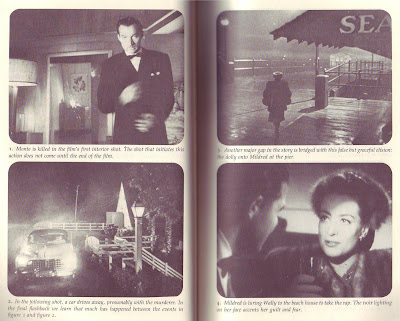
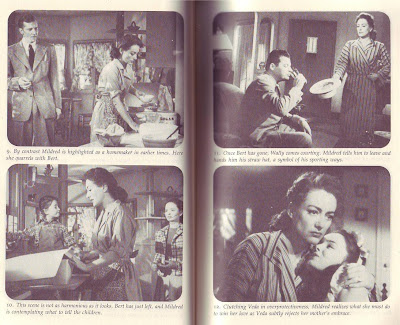
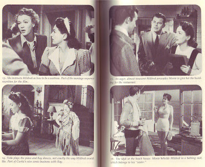
 The guilt is eating me alive! I know I promised not to do another "Mildred Pierce" post, and I know that fewer than 1% of the people reading this have access to the film...or even care about it. I'm sorry, but I've just gotta write about this thing anyway. I can't help myself! I'm obsessed! Pity me!
 He had six famous writers (one of the was Faulkner) take a shot at it before he got what he wanted. It was frustrating because combining two separate genres isn't easy and he didn't know how to go about it. He just had a feeling that he'd know it when he saw it.