
Wednesday, August 30, 2006
Tuesday, August 29, 2006
MORE CECIL BELL
 Here's more pictures by my favorite New York City painter, Cecil Bell. I like this woman in green (above). She's sexy, a woman whose whole life is absorbed by the task of appealing to men, but she's also an admirable person in her own way. Bell realizes the value of people like this and paints them.
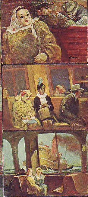 How do you like the picture of the tug and the two chatting women? I could stare at it all day. Two normal, admirable women casually chat next to the technological marvel of the steel structure of the ferry. Behind is the wild, untamed force of the sea and a massive, smoking shape like a giant bullfrog slides past. You can almost smell the sweat, steel and woolen clothing in the ferry interior.
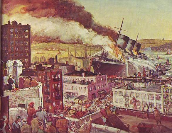
This really happened! It's a scene out of Bosch! A flaming ship out of control smashed through the docks and beached itself on the city street. The people on the roofs, the wild twisting flames, the water canons on the tugs and the wailing of the sirens create an indelible memory.
Monday, August 28, 2006
IS IT WORTH ARGUING WITH CRAZY PEOPLE?
 No, of course it isn't, not if the person is completely crazy, but how often do you come across that? Most crazy people are half crazy or a quarter crazy, something like the way Jack Nicholson was in "As Good as it Gets." How do you treat them? Do you argue back knowing that they may not be listening?
 A further complication is the fact that some half crazy people seem to know the difference in principal between right and wrong. They seem to have a moral sense that can be appealed to. Maybe no one ever does. I don't know of any books or magazines that are written exclusively for the mentally ill. On the other hand they may hear an exceptional amount of moral philosophy from people they irritate, more than the rest of us do. It's hard to generalize; there are so many kinds of crazy. Some of them are nice people, some of them are jerks.
In my opinion it's a good idea to explain why what they're doing is irritating you, even if the explanation would be painfully obvious to any normal person. It may not do any good but you never know. Like I said, there's all kinds of crazy. Maybe at the bottom of the twisted tunnel in their minds somebody's listening.
WHAT DO YOU THINK?
Sunday, August 27, 2006
MINNIE MOUSE'S AMAZING HOUSE
 Two of my favorite spots at Disneyland are Mickey and Minnie's houses. None of the pictures here do them justice. The best parts are beautiful and surprisingly sophisticated.
 The exteriors (one shown above) are amazing for their use of space. The houses seem simultaneously very big and very small. I'm not referring to spaces behind facades but to what you actually see from the street. How did they do that? And look at the garden; the balance of shapes somehow makes it look like all the elements are in motion. The effect is shocking! Are any architects paying attention to this? This is a really interesting idea.
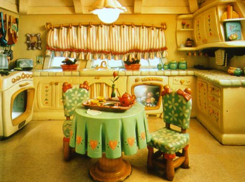 Sadly the picture of the kitchen (above) doesn't capture the dynamic quality of the space. The scale of the objects, the scuptured negative spaces and the magnificently sheltering ceiling are exciting! The only thing that mars it for me is the even spacing of the folds in the tablecloth. I only wish I could have gotten good photos of the living rooms.
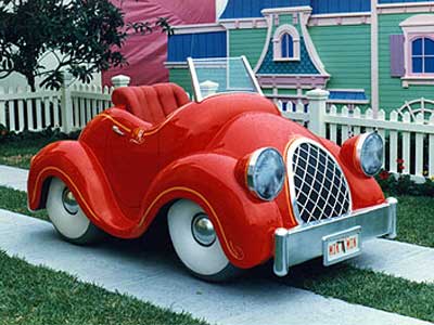 The car outside is amazing! Why aren't there real cars like that? I had to elbow some kids to sit in it but it was worth it. It's even more attractive when seen from the vantage point of the driver inside the car.
A final word about the house: don't misunderstand me. I know that wacky, wonky, skewered lines would grow tiresome if you had to live with them every day. I'm not suggesting that the real world be dismantled to make room for Roger Rabbit-type houses. What I'm saying is that the spatial proportions here are fascinating and would continue to be so even if the lines were straightened out.
Saturday, August 26, 2006
NEWSPAPERS USED TO PUT COMICS ON THE FIRST PAGE!
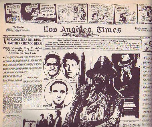 At least the LA Times did on this Sunday in 1931 (above). It's a good-looking page, isn't it? Only an artist could have created a page like this. Newspapers need artists, not just for cartoons but to do page layouts. They just don't know it.
 Compare it to a typical modern page (above). The layout and choice of pictures is uninspired and the color doesn't add anything except cost. I doubt that an artist was consulted.
Normal color photos don't look good in washed-out daily newspaper color. U.S.A. Today was the first daily paper to carry lots of color photography but they were smart. They knew the color news photos sucked so they made a big deal about making a flashy artist-driven weather page with large, solid areas of flat color. Not only that but they put the flashy weather on the back page where every commuter on the train could see it while the owner was reading the side with the bad photos.
 It seems like drawings began to disappear from the first page of the Sunday Times somewhere in the mid-30s. Maybe WWII, with its need for diagrams and maps, brought them back for a while but after that they vanished almost completely. Why? I wish I knew. Anybody care to make a guess?
Friday, August 25, 2006
MAYBE WE SHOULD SNEAK BIAS INTO NEWSPAPER PHOTOGRAPHY
 Don't you think that news photos would be more interesting if they contained an emotional bias? I'll use these old pictures of Betty Davis to make my point. Imagine that a local girl has just won a science fair. Would it be wrong to portray her as slutty (above) with the graphic implication that she slept with someone to get the medal? OK, OK, it would be wrong but surely there's a parallel universe where it would be right. Things are more fun that way.
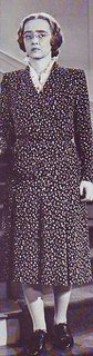
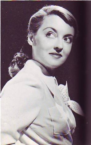 Here's a woman (above) whose husband just died when she took his picture near the edge of the Grand Canyon. Was his fall accidental? The picture lets us know what the photographer thinks.
Here (above) are two contestants for a beauty contest. Maybe the photographer has a favorite. What's wrong with that? Newspapers need to be more interesting. We have to figure out a way to make bias work. Maybe we should do biased photo essays recapping the events of a case after the court decides it.
Thursday, August 24, 2006
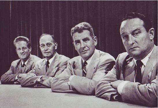
WRINKLED CLOTHES ARE FUNNY!
 When Phileppe Halsman's "Jump Book" was re-printed in the 1980s I didn't pay much attention. There's a lot of gimmick books out there and this didn't seem to be any different. Now that some time has passed I could kick myself for not buying it. All those wrinkled suits are funny!
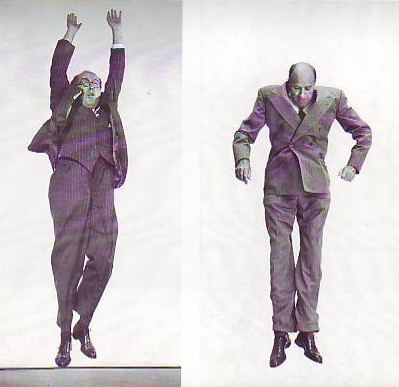 I don't know about you but I LOVE wrinkles..as long as they're somebody else's! It's funny when you see someone who had to dress fast stuck with wearing a shirt that's wrinkled on one side or a jacket with flaps that just won't stay down. Or what about the suit jackets that work their way up as if the wearer had an invisible set of shoulder pads on? Suits have a life of their own. We wear them but we don't own them. We're just their means of locomotion.
 Maybe the all time best suit wrinkles in animation were in the the kissing sequence in "Coal Black." Scribner must have had wrinkled people pose for him. Why aren't there more cartoon scenes like that? Every cartoonist should study wrinkles with the same determination that he studies old stand-bys like male breasts and nose hairs.
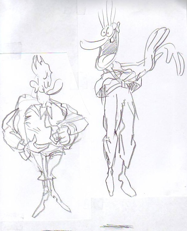 These are terrible sketches but I'll put them up anyway because I got a great idea while drawing them! What if cartoon characters walked around wearing wrinkled clothes? It would at least make a great sequence wouldn't it?...or maybe not. (Groan!) I need to get some sleep.
Subscribe to:
Posts (Atom)