Monday, August 21, 2006

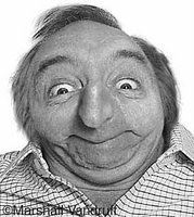
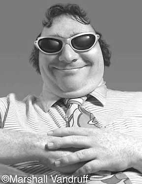
MARSHALL VANDRUFF: PIONEERING CARICATURIST

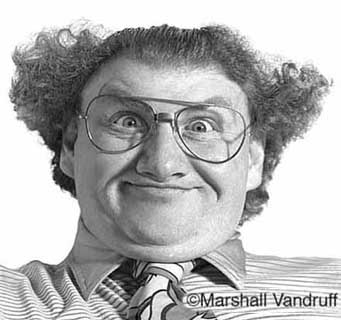
I used to work with Marshall at Cartoon Network. He's funny, passionate and loves people, qualities which manage to find their way into his caricatures.


Marshall did caricatures like these in the 80s and early 90s when professional computer caricature was still somewhat uncommon. I think he had to resort to added photographic and prismacolor enhancement to get what he was looking for.


What a shame that newspapers didn't pick up on what Marshall did...They could have had a Sunday comedy section built around funny pictures like these! As it happened Mad magazine picked up Marshall so it all had a happy ending!

Sunday, August 20, 2006

MAKING A FETISH OUT OF TIMING

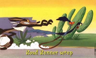
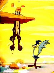
I absolutely love good cartoon timing but I have to admit that I've come to love it less in recent years. I've just seen it abused too often. A lot of cartoon producers and nearly every cartoon writer believes that timing will save an otherwise mediocre cartoon. It won't. It couldn't even save the Coyote and Roadrunner shorts and you're not likely to see better timing than that.


It all goes back to the purpose of cartoons. The purpose of a cartoon is simple: it's to blow the audience's mind. Nobody ever watches a cartoon, or any form of entertainment for that matter, with the intention of seeing something tepid that just passes the time. People want to be transformed and exhilerated. Even after a long day of work when you flop down infront of the TV and your standards are as low as they'll ever be, you'll still find yourself hoping to find a diamond in the rough. Timing isn't capable of delivering a diamond any more than a really good set of tires can drive you to the grocery store. Timing is just timing, something vital that takes its place among other vital things. Good timing plus drek does not a good film make.


A common story in recent animated features has a bunch of animals run away from captivity to pursue their dreams in some far away haven. How do you blow minds with a story like that? Is the premise intrinsically mind-blowing? No, but you could argue that some classic comedies had plots that were just as thin. Are the characters themselves "great" characters? Probably not. Are the gags strong enough to support the film? Well, maybe they're not THAT strong. It becomes clear when you look at the pre-production art that the backbone of the film, the thing that everyone's hoping will save it, is the timing.

The thinking is, tighten up the story, the animation and the editing as tight as they can possibly be and all the other problems will go away. But timing wasn't meant to bear that kind of burden. Timing is no substitute for charisma or imagination or street smarts or nobility or fine acting and animation or gut-satisfying humor and story. Timing is just timing.


MY FAVORITE COLOR REFERENCE

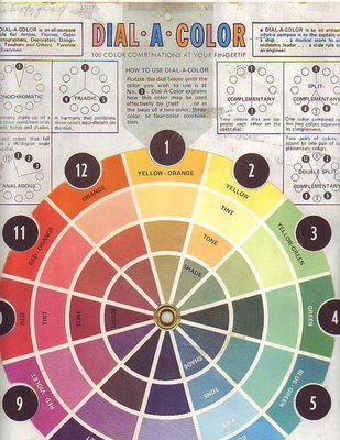
Here's my favorite wheel (above). Sorry for the condition. I bought it in the 80s and it's been stepped on, spilled on, ripped and repaired many times since. It may be out of print now. The copyright name is just an address: Box3193 Amarillo, Texas 79106.

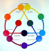
Here's my second favorite (above). It's a reminder that there are warm and cool versions of every color.
Here's the version (above) currently sold in the art stores in my area. I took off the rotating wheel and use it as a single card.Here's the Itten wheel (above): Shades on the outside and tints on the inside. 'Not that useful for what I do but I have it on my wall anyway because it's so beautiful and mysterious! I should put up a Munsell wheel too but I can't find one that I like.

Friday, August 18, 2006

GOOD ACTING IS GOOD READING

I'm not a professional actor so I'm sticking my neck out on this. I hope the pros will let me know if I don't know what I'm talking about. OK, here goes....

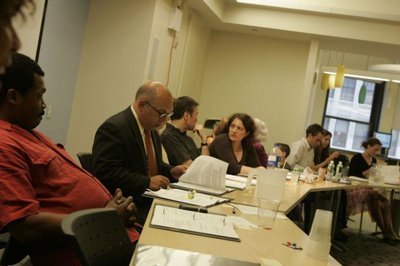
Good live action acting is good reading. Acting is not a branch of psychology or dance, it's a type of music. That's why the most important part of rehearsal is the reading. The actors and the director sit around a table, scripts infront of them, and try to find the rhthym of the dialogue. They're like a jazz combo trying to figure out how they all fit together. Some may come out of the reading with a larger role to play and some will come out with a smaller role to play. Sometimes an extra line or an extra character will be mandated. It's all part of the quest to find the overall "sound."


When I use the word "reading" I'm not only referring to what happens around the table but also to the literal act of reading itself. Good acting is frequently rhetorical and oratorical, even when it's fairly intimate. Thinking about acting as a sort of heightend speech from a podium prevents an actor from getting too precious and emotionally self-indulgent about a line. It reminds him that his main asset is the quality and control of the voice itself. A good actor knows that how you say something is often even more important than what you say.

ONE OF MY FAVORITE AMERICAN PAINTERS

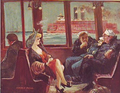
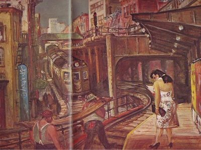
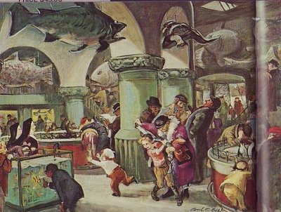
You'll have to click on these pictures because the small size doesn't do them justice. Even when enlarged they'll still be too small. There's nothing for it but to buy the book ( out-of-print) : "Cecil C. Bell" by Phyllis Barton.

Bell was a Depression-era "ash can" painter like Reginald Marsh or John Sloane. He clearly loved New York: the El, the ferries, the sidewalk fruit stands.

He's also one of America's greatest erotic artists. The sensuality of some of his subjects - always fully clothed and in public - seemed to echo the sensuality of the physical city all around them. He seemed to see the city as a labor of love by the people who built it.

He was great at mood pieces. It must have been wonderful to go to the city acquarium and take in all the big ugly fish, the institutional green walls and unvarnished wooden floors, the enthusiastic kids and the heroic mothers who tended them

Thursday, August 17, 2006

ARTISTS WHO "OWN" THINGS

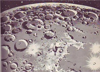
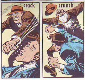
The highest compliment one artist can give another is to say that he "owns" something. In other words, he draws something so well that it's definitive; no other artist is ever likely to draw it as well. In that sense I think most of us would agree that Wally Wood "owns" craters (above) and bullet holes.
Here's a few real craters (above) for comparison. Wood's craters are better than the real thing!


Of course Jack Davis owns knuckles. If you were thinking of competing, forget it. Knuckles are covered!

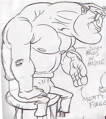
In my opinion John Kricfalisi owns lumoxes. Nobody draws a beefy, intimidating guy better than John. Come to think of it John may own crotches too, I mean crotches of clothed figures. He seems to think it's funny that men have to carry all that plumbing with them, sometimes in tight pants, and everybody who talks to them has to pretend not to notice.

Anybody else care to venture an opinion about who owns what? I believe my daughter may be the world's foremost neck hair specialist. I'll post the drawing the claim is based on as soon as I can find it.

Tuesday, August 15, 2006

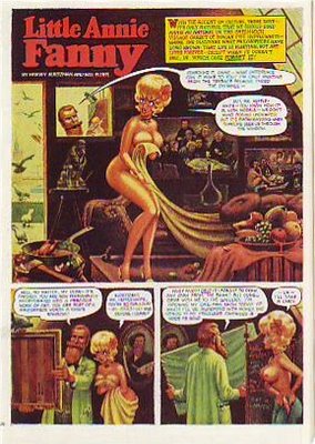
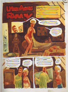
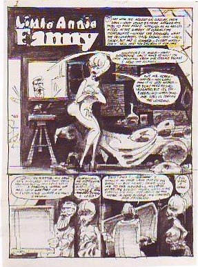
LITTLE ANNIE FANNIE LAID BARE

Here's (above) a Little Annie Fannie episode from September 1963. Attributed artists: Kurtzman, Will Elder and Russ Heath. I love the "dipped-in-strong-tea-and-burgundy" color scheme. Here's a treat (above): Kurtzman's original watercolor painting of the same page! All the colors we associate with Annie Fannie are here: brown, yellow, orange, red, and green. I think I prefer this rough color scheme to the finished product which mutes the colors to make the word balloons pop better.

Can anyone do a better job than I have at describing the difference between Elder's final color and the Kurtzman rough? I know there's more to it than what I described.


Here's (above) Kurtzman's original black and white value treatment. The first panel is a whole, self-contained art lesson in how to contrast values for maximum impact. Kurtzman's made me a believer in the idea that you should always take time to do a monochrome value treatment first.

Monday, August 14, 2006

NEWSPAPERS IN 1890 BETTER THAN OUR OWN?

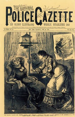
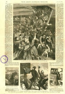
It's hard to believe but newspapers in the late 1800s were more attractive in one respect than papers are now. The biggest difference is that old newspapers relied mostly on pictures that were drawn. An artist can draw a news event, say a murder, in the most exciting way possible. He'll show you the shooter (top picture, above) sneaking up to the victim's home and taking a bead on her. A photographer can't do that. He's stuck with showing up the next day and taking taking a picture of an empty house surrounded by yellow police tape.
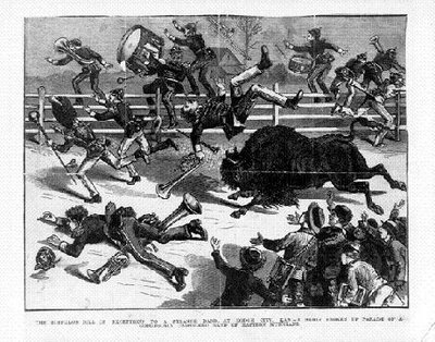
Even televised news is at a disadvantage compared to artist-rendered print media. How would the TV news cover an event like the one shown below where a buffalo went on the rampage? If the cameraman didn't happen to be there all he can do is photograph witnesses talking about it.
We all know that print media is eventually going to lose out to digital media but, given it's magnificent history, it should go down swinging, using every asset at its command. It should tell the news with both art and photography.

BTW, my sources for these pictures, The Police Gazzette and Frank Leslie's ,were weeklies and had a bigger budget for drawings than did dailies of the time.
Sunday, August 13, 2006

THE GREEK TRAGIC HERO AND HOW THE IDEA RELATES TO CARTOONING

Believe it or not, the Greek concept of tragedy applies to animation and cartooning. By "Greek" I mean the Homeric Greeks. According to historian Warner Yaeger the Greeks thought about tragedy differently than we do. We pity tragic heroes, they admired them.

The tragic hero led a deliberately unbalanced life. He devoted all his energy into becomming supremely good at one important thing. He may have been a lousy father and an indifferent husband, he may have had no table manners at all, but in his field of expertise he was unbeatable. Of course this skill came at a great price.

The Greeks believed that sooner or later the tragic hero would be brought down by his inability to cope with menace from the part of life that he neglected. They admired the kind of man who took this kind of risk. Modern people admire balance. The Greeks (before Aristotle's time) admired imbalance, though they thought only special people were suited for it.

How does this relate to cartooning? If you have skill and a special passion for it the Greeks say "Go for it! Go all the way and don't look back. " You'll definitely pay the price, but it's worth it.

Saturday, August 12, 2006

I LOVE CROWDS!

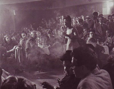
I love crowd shots. They remind me how much fun it is to be with a lot of people who like the same things I like. One of my all-time favorite crowd photos is this one (above) in what appears to be a nightclub. The people look like they came out of an old master's painting like Gericault's "Raft of Medusa." This is every performers dream, to be surrounded by listeners who "get it," who are on the same wavelength. Click on the picture to see the detail.

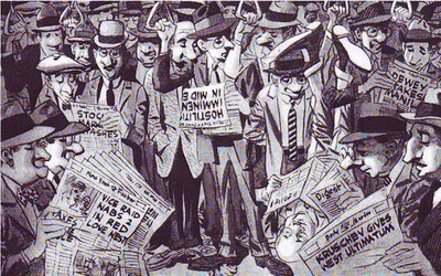
Crowds look better in magazines than in newspapers. Papers just can't resolve the faces, at least not photo faces. Drawn crowds like the Wood drawing above look good in any print medium. If you're a print cartoonist learn how to draw funny crowds!


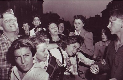
I know who did this crowd: Weegee the great New York tabloid photographer. A gambler's just been shot and a torrent of humanity streams out of the tenaments to get a look. It has that gritty 50's feeling. Humanity is portrayed as consisting of angels and demons with every shade between.

Friday, August 11, 2006

DRAWINGS BY JOHN K. & CHUCK JONES

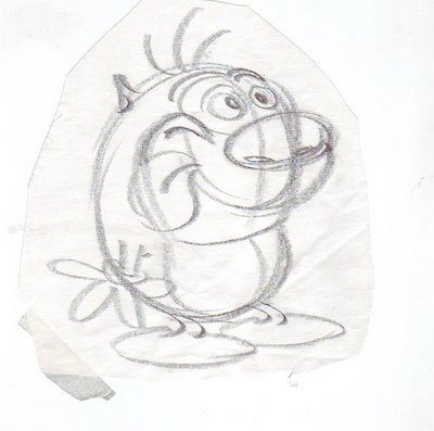
Here's a rough (above) that John did for Ren's opening shot in "Sven Hoek", R&S second season. The shape and height of the chair is hilarious, the placement of the picture frame is perfect. Like everything John draws the line is confident, the silhouette lets lots of air in and the pose is funny as it can be. Notice how he avoids "twins" in the legs and feet. Click to enlarge. Another John drawing (above), probably from the same show. I don't think this was intended for production. John was always drawing things like this on scrap paper to show people how to draw the characters. Look how tight the sausage of Stimpy's body is! And the emphasis on volume actually makes the drawing funnier!

Here's a xerox of a drawing that Chuck Jones did, maybe in the late 70s. Maybe it was a telephone doodle. The face on the right is an interesting blend of flat and constructed style. There's something offputting, even evil, about the characters but the skill is undeniable.

Thursday, August 10, 2006

MORE ABOUT DELSARTE

Readers who hated the last post I did about Delsarte will probably hate this one too. It's a hard sell to convince people that Delsarte's old-fashioned "tie-the-pretty-girl-to-the railroad-tracks" school of acting is actually worth studying.


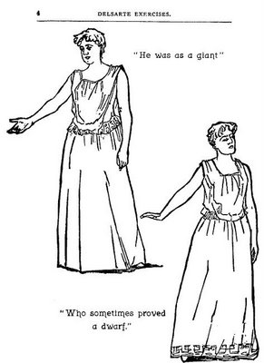
  Here's the picture (above) I posted a few days ago. Look at it closely. The woman refers to the man as a giant, yet she's looking down and her hand is at waist-level. Why isn't her hand way up? She should be pointing up to the sky, shouldn't she? The guy's a giant after all. When she says he acted like a dwarf she looks upward disdainfully. What's going on? How come at the mention of "dwarf" she looks up, where she didn't at the mention of "giant?" Why is the orator defeating our expectations? Why don't her expressions and attitudes describe what's happening in the dialogue?

The Delsartean answer is that her gestures are describing what's really happening in the scene. the emotional point of the scene is that she's heart-broken with disappointment. The description of the guy is secondary, and is only an excuse to convey her emotion. The idea that gesture shouldn't slavishly follow text is extremely interesting. I remember a quote from Norbert Weiner: It is a cybernetic law that the more expected a communication is, the less information it contains." In other words, gestures that only mirror the dialogue are boring. Gesture should ADD to what the dialogue tells us!


Delsarte is full of ideas like this. How about the one where he says gesture should always preceed dialogue? Or repeated expressions of the same thought should always be identical? Or never dwell on the final word? Or geture should always be choreographed? Or...well, you see what I mean. It doesn't matter if the man is right. What's important is that he stimulates our imaginaton!

Wednesday, August 09, 2006

MORE CARICATURES OF ME!!!

Here's more caricatures of me by John Kricfalusi. The one on top has ears growing out of my cheeks, little curly hair whisps and lemur fingers. The expression defies description. It's an emotion that science hasn't catalogued yet. I see the figure as something out of "Island of Dr. Moreau":

"Men die under the lash...of his TORTURING WHIP...
Women SHUDDER at the touch ...of his CRUEL CARESS!
There's no escape...from this HALF MAN/HALF ANIMAL'S PARADISE OF TORTURE!"
Here I am (above) as a rat. I seem to be a likable rat. I have a curly, little whisp of an upper lip with piano keys dangling from it, a cavernous ear, and eyes that look like custard cups with a couple of flies sitting on them.
Oops! Here's the beast man again:
"What FIENDISH EVIL lurks behind this face? What WEIRD VENGEANCE is brewing!?"

Tuesday, August 08, 2006

JUST ONE MORE WORD ABOUT BOMBSHELLS

I have no idea how blogger will arrange the pictures I scanned in. Probably in the ugliest way possible. Oh well, nothing can dampen my enthusiasm for this post. I love talking about blonde bombshells. It was one of the greatest entertainment innovations of the 50s. It was not only good for busty actresses and scandal magazines but for popular literature, art, comedy, and the morale of the whole civilized world.


So far as I know the bombshell was invented by Norma Jean...I don't know her last name...the genius who transformed herself into Marylin Monroe. She was already beautiful but she wanted more than beauty, she was looking for something funnier and more flambouyant. She began by imitating Jean Harlow's look in "Dinner at Eight" then she slowly personalized the look. In the act of stylizing herself she helped to stylize the whole era she lived in. Charismatic, super-stylized characters like Marylin and Elvis provoke new structures in the media that portrays them, new kinds of stories, music, film making and acting. They're catalysts who stimulate everyone else's creativity. No wonder Arthur Miller fell in love with her.

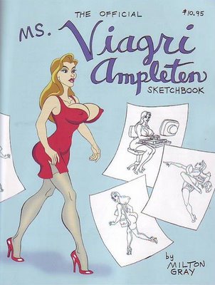
INTRODUCING MILT GRAY'S MS. VIAGRI AMPLETEN

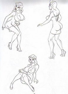
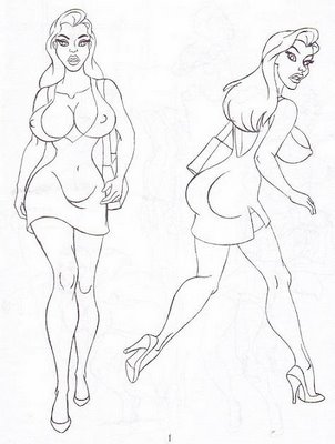
I wonder if blonde bombshells are making a comeback? For some artists they never really left. One of those is my friend Milt Gray who's just published his own how-to-draw-the-bombshell book (above). Milt is from the Jessica Rabbit, Bill Ward, Eric Stanton school of girl art. He goes bananas over a certain part of the female anatomy. Can you guess which part?
The pictures in the book are character layouts from a 12-minute sexy adventure film he's working on. He estimates that he'll have to generate about 15,000 drawings so down the line he'll need some help. If you need a job and can draw or animate this sort of thing, let him know. He plans to put up a web site soon at www.miltongray.comAt the moment the only way to get the book is from Astounding Comics, 224 E. Orange Grove, Burbank 91502, tel: (818) 953-7234 (What's the store's net address? Aaaarrgghh! I forgot to ask and it's a trillion o'clock at night as I write this). The store accepts mail orders.


By the way, You should also look up an article Milt wrote on animation timing for John Kricfalusi's blog. It's flat out one of the best things I've ever read on the subject!

Sunday, August 06, 2006

MOVEMENT THEORIES OF DELSARTE

A while back I talked about Laban's theories of gesture. Maybe I should give equal time to gesturist I like a lot better: Francois Delsarte. Delsarte was the 19th century theoritician who came up with the over-the-top acting style you see in some silent films, the ones where the poor old lady is thrown out of her house by the evil, black-caped landlord. The technique is so old-fashioned and so funny-looking that our entire modern theory of acting exists to refute and bury it. That's too bad because nothing better has ever been invented.

I'm not saying that we should throw out all the great performances of the last 100+ years and go back to stylized caricature. What I'm saying is that we should keep what was of value in Delsarte: strong sillouettes, an emphasis on style that seems real rather than realism, and acting with the whole body rather than the face where it's appropriate.


If you think Delsarte was only studied by campy, second-rate actors, think again. Among his advocates were dancerIsadora Duncan and fundamentalist preacher Billy Sunday (above and below). I'd like to add Lawrence Olivier but that's a guess and I haven't read it anywhere.
Billy Sunday is the best American orator I've ever heard. You can hear him here at: http://billysunday.org/audio/prohibition.wav
Delsarte was a elocution theorist as well as a movement specialist. Billy Sunday didn't try to tone down Delsarte, he pumped it up and exagerrated it. He was the most popular preacher of his day. I've never seen a film of Billy but I've seen a lot of still pictures. He must have put on quite a show.