

Thanks to a link on Michael Sporn's site I discovered a terrific blog devoted entirely to animation backgrounds.
Michael's blog: http://www.michaelspornanimation.com/splog/
Rob Richard's background blog: http://animationbackgrounds.blogspot.com/
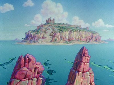
The one at the top (above) is one of my favorites, maybe from "Saludos Amigos." Man, I'd give a lot to own that! One of these days I'll copy it just to see what I can learn from it! I've learned something already, namely the primal graphic appeal of the dog penis (the red-tipped mountain on the upper right).
 Here's (above) another example of that, from a Popeye film. It does seem to add something.
 Looking at the Disney backgrounds I'm struck by how often the artists used very dark colors. I envy audiences who saw these films in technicolor. Technicolor reproduced rich, saturated darks without losing the details.
 Is this background (above) from "Alice" or "Peter Pan?" It doesn't look like much when shown small like this, so be sure to click to enlarge.
 Here the darks aren't just an an accent, they completely dominate the picture. In spite of that, the picture comes off as colorful. I'll bet characters read beautifully on top of this. I'm guessing that this is inspired by Mary Blair, who in turn might have been inspired by 17th century Dutch flower paintings.
 Speaking of Mary, here's her head made into a cottage for Alice in Wonderland.
 Rob provides us with a picture (above) for comparison.
 Even Pinocchio BGs (above) had lots of darks.
 TVs used to be bad at reproducing darks. Maybe the Trinitron was the first to do it successfully. A whole generation of artists saw films like Alice only on inferior TV monitors and probably couldn't understand why the backgrounds were so well-regarded.
 Sometimes Disney took the dark thing too far, as with this downshot of Goofy's home (above). The garish orange house looks like it was pickled in formaldehyde. The darks seem menacing and inappropriate to the subject. Even so, it's an interesting experiment.


 Aargh! I couldn't bear to end this without something hand-drawn. Here's a portrait (above) by caricature genius, Grigor Eftimov.
 Here's Grigor at work.


 Superman doesn't always share the tastes of his friends...
 ...particularly Robin.
 No, Superman's a normal guy. It's amazing that even Superman doesn't score every time.


 I don't know this woman (above) but I'm willing to believe that Marlo captured her very soul!

 Living rooms frequently looked barren and uncomfortable in 1900. Maybe that's because they had a different function then than they do today. In those days living rooms were meant to show off the owner's wealth. So were dining rooms. A lot of the real living took place in spacious kitchens. Nowadays kitchens have shrunk and people actually use their living and dining rooms.


