Don't you love sideshow banners? Half the time they're better than the exhibits they promote.
Compare the old-time banner at the top to the recently made one above. Is it just me or are these later graphics too slick, too dependent on the lettering?
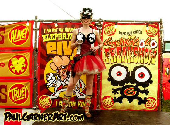
They're clearly influenced by underground comics.
Some of the newer banners (above) are even influenced by manga.
I liked carnival banners better when they were made by ex-sign painters who could draw human figures, but just barely.
n
I like the way the old banners were executed on canvas with what looks like thinned house paint. The lettering was deliberately understated.
I like the way the thin man is caricatured in this picture. The man is suave. He's proud to be skinny.
By way of comparison, the banner above is too realistic. The fat girl looks too much like a real fat person. Her weight doesn't suggest any entertainment value.
This (above) is more like it. The proportions are deliberately caricatured and unrealistic. This girl's fat and proud. She feels sorry for you because you aren't fat.
On the other hand, maybe the real girl actually looked like that. It strikes me that when I was a little kid I actually saw someone like that. Maybe carnival fat people used to be a breed apart in that they had different proportions than most fat people. Maybe the professionally fat, the people who made their living at it, knew how to cultivate a silhouette like the one in the picture above.
Anyway, the myth persists that carnival artists can't draw. That's not true. If they couldn't you'd get banners like the one above, which wouldn't be useful to anybody.
I said banner artists could only just barely draw, but I take that back. They were actually pretty skilled, but in a style that was self-effacing and came from a folk art tradition.
It's funny how every medium that's been around for a while develops a style that fits it like a glove. By way of an example, here's (above) the familiar "X-Ray Specs" which used to be widely advertised. If the illustration above had been used for an ad I don't think it would have sold the product very well. It's too sophisticated. You can't sell a lowbrow product with highbrow graphics.
On the other hand, this badly-drawn art (above) wouldn't do the job either. It makes the product look shoddy and the seller seem untrustworthy.
Here's (above) the perfect compromise, the one that caught on with the public. The principals of art are observed but the artist still comes off as primitive. He projects the image of a trickster, a joke teller; someone who's not above using the product himself.
You won't realize how good the original artist was until you compare what he did with later artists (above) who tried the same thing. The later artists couldn't create an iconic image. Drawing iconic is a rare and under-rated skill. I wish I could take lessons from somebody who knows how.
The later X-Ray Spec artists were eventually dumped in favor of the original artist and new art (above) was commissioned. It was iconic but the old pizazz was gone. The original art caught the artist at his dazzling apex. What catastrophe happened to him afterward? Alcoholism? Alimony? Disillusionment? Formal art education? I don't know.
So what am I getting at here? 'Just the notion that the style of art should fit the unique medium the art is created for.