
 I've been busy today so I had to reprise an older article to stay on schedule. I hope nobody minds. I think you'll find the subject interesting:
Before I begin this piece I want to apologize for ripping into kids book illustrator Lane Smith so hard in a previous post. I deliberately chose his least-appealing book so it wasn't a fair appraisal. Sorry Lane! Maybe I can make up for it by illustrating this new piece with the best book my local library had (above) by another artist, Mark Teague. It's a pretty appealing book, I admit, but I have to criticize it to make a larger point.
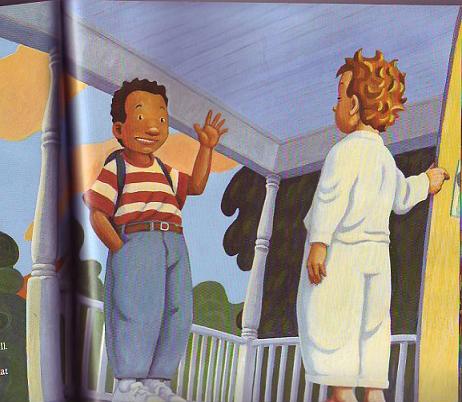 The point I want to make is that books of this type are trying to compete with comic books and they can't. In a comic book the picture of the two kids above would have rated a single panel on a single page. In Teague's big, expensive picture book, the kind that only has a few pages, it gets an entire two-page spread. All that for a picture of two kids talking on a porch? That seems odd to me.
Kids picture books always give too much weight to minor events and too little to major events. There simply aren't enough pages to tell a good story correctly and the artist is burdened with the necessity of trying to make each page, no matter how trivial in content, an artistic masterpiece. Is that really what kids want?
 Any one of these Carl Barks comic book panels (above) might have been a full-page illustration in a Mark Teague book, but all that elaboration would have gotten in the way of the story. My experience with my own kids is that kids definitely want stories, but the expensive illustrated books aren't geared for that. They're geared to deliver a simple artistic impression. Kids want stories but the expensive picture books we give them deliver objects of art instead.
 Mark Teague is a really talented guy but he's working in a medium...thin illustrated kids books...that doesn't tell stories very well. I bought a couple of Teague books for my kids when they were still young, and all these years later I still have them. They're almost in mint condition. The hardcover Cochran Barks collection, on the other hand, is falling apart from my kids frequent reading. What does that tell you about what kids like to read?
One last point: we all have favorite illustrated books that we actually did read often when we were kids. My admiration for those old illustrators knows no bound because they managed to entertain in such an uncongenial medium. I'm glad I had those books and the illustrators that created them deserve a lot of credit. Even so, it's my belief that really young kids would learn more and have more fun if the bulk of their illustrated reading favored cheap, well-done pulp comics rather than pricey illustrated books.


