Sunday, July 27, 2008

I JUST OPENED A TIME CAPSULE / BUCKET OF FILTH


I know I said I wouldn't post anything til Monday but it occurred to me that since everybody's in San Diego at the Con I can do something completely stupid and self-indulgent and no one will ever know. OK...so here's a quick post about my daughter's bucket of filth. It's something so personal that it would interest only me but, hey... I'm the only one reading this!

Today I discovered a cardboard box in the garage that appeared to be full of knick-knacks that my kid owned when she was seven. I blew off the dust and there it was, a real time capsule from my daughter's youth. I waited for her to come home and we opened it together. There in the middle of the box, surrounded by old pens, sock puppets and diaries, was a real seven year-old's bucket of filth (John K's term) contained in an instant coffee jar.


With infinite caution my daughter opened the jar and smelled the brown liquid inside. No, no...I know what you're thinking, and it wasn't that. No, it was something weirder; you could tell what it was from the smell: ketchup, soy sauce, dirt, turpentine, chili powder, hot sauce, powdered toothpaste and English Leather cologne. SO THAT'S WHAT HAPPENED TO MY ENGLISH LEATHER!!!!!! I got that as a present and never got to try it out. It mysteriously disappeared!

I asked my kid what the concoction was for and she replied matter-of-factly that it was meant to resurrect witches. As witches are want to do, before they step into the fiery lava that will end their reign of evil, they turn to the nearest kid and describe the chemical that has the power to resurrect them. It's a heavy thing to be trusted with a formula like that, and she went through much soul-searching about the ethics of bringing witches back to life, but the lure of science proved irresistible.


Also in the box was an old tee shirt, the one she was always putting on the dogs. If the dogs were nice guys and accepted the cumbersome tee shirt they were rewarded with having their back legs tied together with scarves.

There were also diaries full of misspelled complaints about friends who snubbed her and long multiplication problems like a hundred trillion times eleven. It also looked like she was at work on a personal written language that looked like what you see on Celtic rune stones.

OK, enough personal stuff! On Monday we'll return to solving the world's problems.


Friday, July 25, 2008

THE BEST MAP SITE

Michael Sporn has recently linked to a terrific map site that I never knew existed.

http://strangemaps.wordpress.com/

Maps are fascinating. At various times I've had ocean navigation and flight maps on the wall, and until recently I had a heraldic map of Scotland up. You can see it on a post I put up almost two years ago on the subject of ideal pictures to hang in a boys room.


I post this baseball map (above) not because the idea is so clever, but because the color is gorgeous. Notice how the lettering at the top pops out.


Wow! Is this (above) by Gilray? Wouldn't it be great to have a full-sized poster of this on the wall?


A map of Heaven (above) has been long over-due. I notice though, that the Garden of Cartoon-Infatuated Naked Women is missing. And where are the statues of Milt Gross and Don Martin?


Another long over-due map, the map of the center of the Earth (above). It correctly locates the underground city of Shamballan.


The world envisioned by Homer (above).


Here's a rendering of a city (above) which includes architectural highlights of the western world. They're not always the buildings I would have chosen, and the painter seems to favor long boulevards framed by wind traps, but the basic idea is terrific. I'm surprised that no city in the world (outside of Disneyland and The Tivoli) has chosen to make itself into an anthology of the best architectural ideas the world has to offer.

IT'S SAN DIEGO CONVENTION TIME, SO I'LL BE GONE TIL MONDAY, JULY 28!


Wednesday, July 23, 2008

CARTOON ADS SELL THE PRODUCT

Al Capp may have been the greatest cartoonist-pitchman in the history of print media. You read his ads and you actually want to buy the product! How often does that happen? Just looking at these two pages (above and below, be sure to click to enlarge) makes me salivate for Cream of Wheat and Fruit of the Loom! How did he do it?


Well, right off the bat you can see that his ads used arresting fields of saturated color. I imagine that most of the rest of the pictures in the magazine, including the ads, were photos and would have used diluted, greyed-down color. Capp's stuff must have really popped out.


Capp wasn't above using stark primaries to get attention. That and thick, black lines certainly made the images jump from the page. Here (above) he fearlessly attempts to sell rutabagas (yellow turnips), surely the most difficult item of all to make ads for.

Notice the astonishingly bland and generic typeface on the Arrow Canning Company logo. That's obviously not Capp's work. You can tell that the client was a simple man who went along with the cartoon idea, but insisted that it be integrated with what he believed was the magical, charismatic quality of the original Arrowhead logo, so beloved by his aging grandmother. With clients like this Capp still managed to make art.


You have to enlarge this (above). Here Capp goes wild with expressionist graphics. It sells the product, though.


It helps to have a genius like Capp doing your ads, but even comic ads drawn by fairly normal artists (above) are effective. You have to wonder why magazines don't carry more of them. People like them so much that they'll even endure the tedious copy underneath the strip.


Well, maybe not in every case. I had no desire to read the boring copy below the Midol comic (above). Even so, I willingly read the drawn part of the ad and it succeeded in stamping the brand name on my brain.


Maybe this (above) is what killed comic strip ads.


Thanks to Mike Fontanelli who wrote the terrific article these Capp ads were swiped from. If you haven't read Mike's piece yet, then run don't walk to ASIFA-Hollywood's archive site and take a look. Steve Worth, who for my money is one of the best web designers in the business, did a great job of formatting it all.

Sunday, July 20, 2008

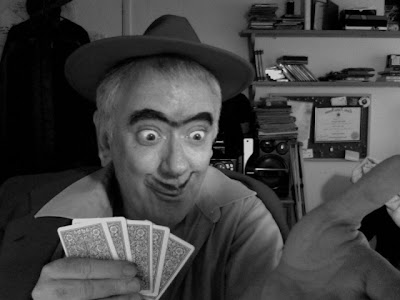
"THE CARD GAME" (PHOTO STORY)

Old Lady: "Me? But I've never played poker before. I don't even know the rules!"


Ernesto: "It's simple. I'll teach you!"

He deals.


Old Lady: "Gee, the cards are so pretty."


Old Lady: "We're supposed to bet, aren't we? Will a quarter do?"


Ernesto: "Yes, a quarter!" 


Old Lady: "I guess I lose. I don't even know what the cards mean."


Ernesto: "No, you won! Say, you have a knack for this game! Are you sure you never played before?"


Old Lady: "But you lost your money. You might need it later on. You should take your quarter back."


Ernesto: "No, no. You won it fair and square. You keep it! Let's bet a little more. That'll be even more fun."


Old Lady: "Gee, I don't have any more money with me...er, would this deed to my house be OK?"


Ernesto: "(GULP OF DELIGHT) Why, um... yes! As it happens I have the deed to my own house with me."


Ernesto: "We'll just leave these in the middle. This is ever so much fun."

He deals.


Old Lady: "Well whaddaya waiting for? Let's see what you got!"


Ernesto: "Oh no! You first! I insist!"


Old Lady:  "Royal flush, king high, double hearts up using the Italian ranking system favored by Ken Pincus in his famous Cleveland game against Rudolf Lercher!"


Well, that's it! In the spirit of the new Batman movie I made the characters dark just to see what would happen. Boy, it's creepy isn't it?

Friday, July 18, 2008

CARTOONIST PHILOSOPHERS (AND WHAT A CHAIR IS FOR)

Billy Debeck put soooo much effort into this sheet music cover (above). It's as if the act of drawing was a sheer delight to him and he couldn't bring himself to stop.


A beautiful girl strokes an old man's beard (above) and he's in seventh heaven. Can any other graphic art portray happiness as well as cartoons can ?


I stole this (above) from John K's blog (original clippings from Marc Dekter). Milt Gross never seizes to amaze. The people are funny, the spaces are funny, and the character relationships are funny...but he doesn't stop there. When you enlarge this you'll see that the whole strip is a celebration of the simple fact that rooms and staircases exist. You can spend years cultivating an awareness of little things like that in a Tibetan monastery, or you can read Milt Gross for a nickel. Gross make us glad to be alive by celebrating the commonplace.


Haw! For Opper (above) everyone has a uniform including hobos, and when you wear the uniform of that profession or personality type then you act accordingly. We want to play roles and the uniform gives us an excuse.


Goldberg, like Gross, is capable of expressing profound loving relationships between people. Here (above) the wife threatens the husband with a rolling pin, but you get the feeling that the real reason he gives her what she wants is because he loves her. She's fat and plain-looking but he loves her anyway, and she loves him. Cartooning is an incredible medium. It can express the deepest emotions with just a few lines.


Bud Fisher (above) celebrates open space and, amazingly...the nature of chairs (!). Fisher made me realize what a chair is for. They're obviously for comfort but they're also for reflection, which we apparently have to do frequently. We sit and think about everything we just saw, then after a minute we pop up, ready to see new stuff. We walk around seeing more things, then we plop down and think about the new stuff we just saw. It goes on and on like that. Apparently the indoor world is so strange and unnatural that we have to spend part of every day talking ourselves into accepting it.


Here (above) Herriman's characters gather outside the mysterious wall. Cartoon characters can't bear to stand around randomly. When there's nothing to do they organize themselves into a group pattern. The closely-knit clump of creatures walks from place to place, occasionally releasing one of their own to perform a real-world task. When the task is done the lone creature returns to the clump.


Here's (above) a couple of Herrimans stolen from Mark Kausler's site. According to Herriman we love to sit in containers and put everything, including ourselves, on top of mounds. How would we know that if it weren't for cartoons?

Tuesday, July 15, 2008

KETMAN DOMINATES ANIMATION?

The picture above isn't me. It's Czeslaw Milosz, the writer. More about him in a minute. What I need to talk about now is cartoon acting.

Years ago I decided to specialize in funny cartoon acting. I did it because I loved it, and was a fan of the great cartoon actors like Rod Scribner, and because I thought it might give me an edge in the job market. Now years later I have to admit that the edge wasn't much of an edge. I think I lost as many jobs as I gained because of the acting thing. A lot of new animation was about design and and didn't seem to require acting; as a matter of fact, acting seemed downright out of place.


How did this design emphasis come about? Why does it seem to exclude acting? Why would artists want to exclude acting? I have a bizarre and probably wrong explanation for it. It's pretty silly, but then again this is a theory site and if you can't do silly theories here then where can you do them? the theory is all about...

Ketman

According to the Wikipedia, ketman is an arabic word which means "paying lip service to authority while holding personal opposition." I prefer a broader definition that I got from Czelaw Milosz's Cold War-era book, "The Captive Mind." Milosz lived under communism where an unguarded word at a party could lead to a prison sentence. He said that the only sure way to be safe was not even to think of opposition to the government. If you allow yourself to think about it, even if you're good at holding it in, sooner or later you'll blurt it out in public and get in trouble. So you practice ketman... you avoid certain topics, you learn to think of controversial issues in terms of broad generalities and homilies, even if you're at home alone.

Of course in a state like the one Milosz lived in lots and lots of things were politicized so the number of subjects to avoid was pretty large. Milosz believed that this kind of restraint led to mass neurosis and a crippling of the elan and zest for life of a whole people. Only liquor seemed to help. Believe it or not all this has to do with animation.

My crackpot theory is that the reason modern animators have rejected comedic acting and work in such a cold style is because they've become uncomfortable with social interaction, and the reason they're uncomfortable with this is because they've practiced ketman all their lives. I blame political correctness.


Modern white guys are bundles of restraint. Talking to them you get the feeling that every sentence is a tortured navigation through dangerous waters. You can't say for example, "She's an idiot" because idiot is an offensive term... a hate crime... and men are not supposed to criticize women without a lengthy philosophical disclaimer stating their good intentions and history of fairness. I can only imagine what it must be like to be a student in art school where half of the students regard themselves as political police whose job it is to inhibit the speech of the other half of the students. My guess is that students resort to ketman to get through the day.

Remember what Milosz said about ketman? If it can cripple the elan and zest for life of whole nations, I don't think it would spare art students.

My guess is that design rules animation right now because design is appealing all by itself and doesn't require characters to have acted relationships with each other. Relationships are minefields to the young, at least to young men. Relationships have an unpleasant association requiring ketman to soothe things over.

Well, that's the argument. Do I believe it? I'm not sure. I can think of almost as many arguments against it as for it, and it is pretty self-serving. You could argue that design emphasis comes about because it's congenial to Flash animation, or that cold but beautiful graphic styles have been popping up ever since Picasso. I don't know...

...WHAT DO YOU THINK?

Saturday, July 12, 2008

WHAT KIND OF SONGS BELONG IN AN ANIMATED MUSICAL?


No, I'm not gay, and I'm not obsessed with musicals, but I've had to study dance moves lately and I'm glad I did.  Animation people could learn a lot about about the way the best Broadway people used to set up musical numbers. Maybe part of their secret was that they started out with good, danceable music. By way of an example here's  (above) "Steam Heat" from the movie "Pajama Game", choreography by Bob Fosse.  Here's an excerpt from the lyrics by Richard Adler (music by Jerry Ross):

I've got ::cling cling:: fsssss steam heat.
But i need your love to keep away the cold.
:::Instrumental:::
They told me to throw some more coal in the boiler.
But that don't do no good.
They told me to pour some more oil in the burner.
But that don't do no good.
Coal in the boiler. No good. Oil in the burner. No good. Cold? NO! Hot?
YES! sssssss yes yes yes come on union get hot!!
:::Clapping:::
BOINK BOINK!! BOINK BOINK!! BOINK BOINK!!
:::Instrumental:::
I need your love to keep away the cold. I need your looove to keep awayyyy the colddd....fsss YEA!!

Interesting lyrics! With a song like this the dancers didn't have to struggle to interpret a song that was meant to be passively listened to on the radio,  they got to dance to music that was tailor-made to look good on the stage. I wish more animation songs were like that. I don't mind one or two passive listening songs in an animated musical feature because they get radio play and that brings people into the theater, but all the rest of the songs should be stage songs, songs that lend themselves to visual interpretation like "Steam Heat."


Here's (above) the "Steam Heat" song watered down to make a popular radio version.  Most of the funny, quirky sound effects and repeats in the film were deleted or softened to make passive radio listening easier. Do you see why radio versions suck? 

In the case of animated musical features, you should never hamstring the project by using too much visually neutral, radio-type music in the story.  Actually the Pajama Game people did it right...they had one version for the film and one for the radio.  They didn't handicap their movie with too many passive listening elements. 

I should quit while I'm ahead, but I can't help commenting on another idea that handicaps animated musicals, namely the idea that a song is needed to cover every major story point.   I've so often wanted to strangle Disney executives for loading features with songs like: "Here I am a perky, intelligent young girl and I'm ready for love if I can find the right man, provided of course that I also have a fulfilling career." Nobody in their right mind wants to dance to that. No animator with any guts wants to draw it.

You don't have to cover every story point with a song.  Remember Dorothy in "The Wizard of Oz?" She never had a song where she sings about how weird and frightening Oz was.  The wicked witch never had a song. Lots of important emotions never got a song...yet there was time for fun stuff like "Follow the Yellow Brick Road."