
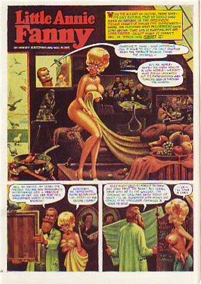
 Here's (above) a Little Annie Fannie episode from September 1963. Attributed artists: Kurtzman, Will Elder and Russ Heath. I love the "dipped-in-strong-tea-and-burgundy" color scheme.
  Here's a treat (above): Kurtzman's original watercolor painting of the same page! All the colors we associate with Annie Fannie are here: brown, yellow, orange, red, and green. I think I prefer this rough color scheme to the finished product which mutes the colors to make the word balloons pop better.
Can anyone do a better job than I have at describing the difference between Elder's final color and the Kurtzman rough? I know there's more to it than what I described.
 Here's (above) Kurtzman's original black and white value treatment. The first panel is a whole, self-contained art lesson in how to contrast values for maximum impact. Kurtzman's made me a believer in the idea that you should always take time to do a monochrome value treatment first.
13 comments:
A sweet archaic color scheme- which for some reason always reminds me of 70s furniture, and moose lodges.
That is a tried and true method of getting the best color results. Nowadays with Photoshop, the process is much faster now that you can change the picture to black and white in a flash, and turn off the lines layer to study what looks best. A great method indeed!
Many cartoonists hated working under Kurtzman's thumb. But Kurtzman and Elder were a great team! In fact, Will Elder actually prefered working with Kurtzman and his layouts.
These Little Annie Fanny comics completetly consumed Will Elder's time at the beginning because of how lush and detailed in color they are. So they were done with a larger team for a while, with the help of Jack Davis, Frank Frazetta, Al Jaffee, Russ Heath, and Arnold Roth. With a crew, the art styles changed too much between strips, so Elder and Kurtzman decided to keep it a two-man project and just work harder.
Notice how Elder resisted drawing all the background gags (or chicken fat, as he called them) which was popular in his MAD art. He left the chicken fat out of the Little Annie Fanny strips so that the characters could seem more realistic and lifelike, rather than just a vehicle for gags.
The two of them had complete mutual trust while working on these. Kurtzman did the thumb drawings and color codes. Will Elder then applyed numerous color-wash overlays. Everything was done with tempera and watercolor (only the word baloons were done with ink). Elder was a master painter, and had a technique of putting down a single stroke and picking up the former stroke with the next one resulting in a distinctive and singular luminescence!
These Annie Fanny cartoons are available from Fantagraphics Books, and so is Will Elder: The Mad Playboy of Art. I recommend them!
I love all this art. And all the T and A too!
Good God Shawn, you are an encyclopedia.
I'm not sure how easy it is to get a true impression from these reproductions... this might have to do with aging, but the finished page has a yellowness about all the highlights, like a yellow glaze over the whole thing. The watercolour rough is much more raw and earthy in the browns, some umber action going on there perhaps.
But I feel like an extremely ignorant student sitting in your classroom making meek suggestions, I know NOTHING.
I need to start reading your blog on a daily basis Eddie, I can't keep up!
Hi Eddie, I've never seen those roughs before. What a treat! Where did you find them?
To me the color comp and the finished color look as close as can be imagined, with whoever did the final coor staying very true to the rough. The word ballooons "pop" just as much in the rough color comp as in the final. is it just me? I don't see the colors being muted to any discernable degree. Hmm. *Squints* Anyone else?
These are pure gold, all three. I LURVE seeing stuff like this. What book is it from? An Annie Fanny collection?
Kali: You convinced me! I'm getting Photoshop! Er...well...maybe. The medium you draw and paint with tends to influence your style. It's risky!
Shawn, Chloe: Interesting!
Steve, Jenny: the artwork is from the catalogue book of the recent MOCA show: "Masters of American Comics."
Eddie, a lot of people don't actually draw in Photoshop; what Kali is talking about (I think) is that any picture you draw, paint, whatever that you scan into Photoshop can have the color easily and instantly(and temporarily)turned down or "off" so you see only the values. It's really helpful.
...Actually, rereading Kali's post again, I see she probably does draw with it--to turn off a line layer you would have to have drawn the image on a tablet directly in PS...but I know you don't work that way.
Still, PS can be very helpful & fun to play with with conventional scanned art too.
If you used it that way it'd of course have no effect on your drawing, except to show you your values, or how it looks flopped, etc.
"Kali: You convinced me! I'm getting Photoshop! Er...well...maybe. The medium you draw and paint with tends to influence your style. It's risky!"
"Eddie, a lot of people don't actually draw in Photoshop; what Kali is talking about (I think) is that any picture you draw, paint, whatever that you scan into Photoshop can have the color easily and instantly(and temporarily)turned down or "off" so you see only the values. It's really helpful."
It's fun sometimes to draw in PS, but ya I would never say it's better than anything else at all (markers are my weapon of choice). Like Jenny said, you can put your scanned drawings in there and really study them by using all the quick color altering options. Yay technology!
Elders "Chicken fat' as it turned out in Annie Fannie, usually came to fruition as crowd scenes. (Wasn't someone just talking about crowd scenes?)
Kurtzmans always has that effortless line to his layouts, but, especially with Annie Fannie, he may have really worked considerably towards that single line, with construction, in multiple colors of colored pencil or one of those ballpoints with four colors even.
And as others have said, sometimes there were multiple great talents working on the finished pages
Hey Eddie,
If you or anybody reading this wants to swing by my blog and criticize my drawings from the Preston Blair book I'd be most greatful!
I feel like such a leech using the comments section to ask for visitors to my blog, so if it is troublesome feel free to delete any and all of my posts.
Crumpled: About the art, in my opinion you need to practice different kinds of S curves so you can get more confidence in your line.
About the writing, it's terrific! That first short story about the desert island was really a lot of fun to read, even though I didn't understand the ending at all. The next story had a great beginning but it feels like you didn't know where to go with it. Boy, you could be a really interesting short story writer if you could make the second half of stories as interesting as the first. You'd have been perfect for the 1930s pulps. You have an unbelievably good instinct for starting stories and getting a reader's attention.
To other readers: Please don't ask me to crit you're work. I'm not qualified.
Jenny, Kali: Thanks for the advice. I'm chomping at the bit to try it so I can see what you're talking about!
Hi people
I do not know what to give for Christmas of the to friends, advise something ....
Hello. Good day
Who listens to what music?
I Love songs Justin Timberlake and Paris Hilton
Post a Comment