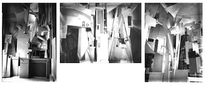
Here's "Merzbau,"(above) a terrific corner of a room by German Dada artist, Kurt Schwitters.

I'm a big fan of Schwitters. Starting in the 1920s he'd build these constructions (above) in every house or apartment building he lived in. Almost all of them survive only in photos he took, casualties of war or indifferent landlords. He had faith that someday these sculptures would influence things, and he was right, they did.

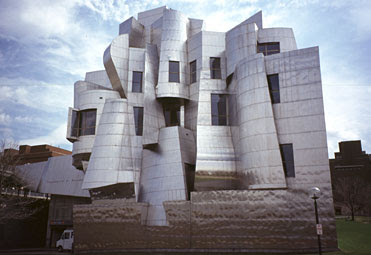
The old Dadaists work survives today mostly in the architecture of Frank Gehry. Gehry likes to make buildings out of dynamic, chaotic, confusing shapes, just like Schwitters. Some of them, like the one above, are very exciting, at least when viewed from the outside.

Of course he sometimes goes too far. This model (above) is for the administration building of a playground. There are so many non-structural decorative elements that there can't be much room left over for the offices.

Here's (above) the Disney concert hall in downtown L.A. It strikes me as a conservative, sterile, fairly standard post-modern structure embellished by extraneous twisted shapes, but maybe I'm wrong. I haven't been inside yet.


You've got to give it to Gehry, he seems to have gotten better with age. His earlier buildings were just too sterile. Here (above) are two views of Gehry's famous Winton Guest House. I wish I could have found a wider aerial shot of the house because when you see it in context, with all the trees around, you realize that this design has no fit with its location at all. It's bad enough to see arid stuff like this in the city but in the country it comes off as a jarring incongruity.

Here's (above) one corner of the California Science Center. You can't see the airplane attached to the side of the building from this angle which is OK because the design of the airplane, which is a genuine work of art, had nothing to do with Frank Gehry. I can't stand this building. It contains so much wasted space that there's not much room left over for actual exhibits.

Here's (above) Gehry's design for Loyola's law school, here in LA. What have we got? I see a plain, blank wall with the standard post-modern windows and the standard industrial stairs. Gehry's firm built a lot of things I bet he wishes he could take back now.
 Here's "Merzbau,"(above) a terrific corner of a room by German Dada artist, Kurt Schwitters.
 I'm a big fan of Schwitters. Starting in the 1920s he'd build these constructions (above) in every house or apartment building he lived in. Almost all of them survive only in photos he took, casualties of war or indifferent landlords. He had faith that someday these sculptures would influence things, and he was right, they did.
  The old Dadaists work survives today mostly in the architecture of Frank Gehry. Gehry likes to make buildings out of dynamic, chaotic, confusing shapes, just like Schwitters. Some of them, like the one above, are very exciting, at least when viewed from the outside.
 Of course he sometimes goes too far. This model (above) is for the administration building of a playground. There are so many non-structural decorative elements that there can't be much room left over for the offices.
 Here's (above) the Disney concert hall in downtown L.A. It strikes me as a conservative, sterile, fairly standard post-modern structure embellished by extraneous twisted shapes, but maybe I'm wrong. I haven't been inside yet.
 You've got to give it to Gehry, he seems to have gotten better with age. His earlier buildings were just too sterile. Here (above) are two views of Gehry's famous Winton Guest House. I wish I could have found a wider aerial shot of the house because when you see it in context, with all the trees around, you realize that this design has no fit with its location at all. It's bad enough to see arid stuff like this in the city but in the country it comes off as a jarring incongruity.
 Here's (above) one corner of the California Science Center. You can't see the airplane attached to the side of the building from this angle which is OK because the design of the airplane, which is a genuine work of art, had nothing to do with Frank Gehry. I can't stand this building. It contains so much wasted space that there's not much room left over for actual exhibits.
 Here's (above) Gehry's design for Loyola's law school, here in LA. What have we got? I see a plain, blank wall with the standard post-modern windows and the standard industrial stairs. Gehry's firm built a lot of things I bet he wishes he could take back now.

17 comments:
Someone has a house on the slopes in Pittsburgh that looks like a Gehry deisgn. It is a bunch of blocks pushed into each other and each block is a different garish color. If I can find a picture of it I'll show it to you.
I actually think the playground administration building is pretty awesome. Functional, beautiful? Maybe not. But it looks fun.
A big jumbled shiny piece of mayhem.
I definitely wouldnt want to see alot of buildings that look like that, but one is alright.
Gehry's Guggenheim Museum in Bilbao, Spain is another example of architecture as one-liner.
I think he's VASTLY overrated, but the Disney Hall is wonderful-and yes, you really do need to be inside to appreciate it.
I love Gehry's work. Most new buildings are stale and boring. There's a new strip mall not far from where I work that's designed from that 60's modern style, and not in a good way. There are more interesting buildings at some of the nearby car dealerships.
I used to want to see everything in the art deco style or that deco streamline style. Though I think most of the private deco interiors suck, but the public buildings I thought were neat.
Frank Gehry on the other hand thinks out of the box. I can see his buildings fit easily in some Sci Fi movie or in some of the enviromental artist work you see in game design. We need more people like him.
I like the inside of the Disney Hall- the acoustics are amazing! You can here some one sneeze from across the huge hall hahah.
I have seen Gehry's work in various places. I really don't care for him at all. His style is too sterile and cold.
The Jay Pritzker Pavilion right across from my school campus looks stale. It doesn't help that the other architectural structures clutter up the small block. The pavilion itself feels and looks like it's just filler to show how Chicago misspends their tax money.
Thanks for connecting Gehry to Schwitters. I hadn't thought of the connection myself, but certainly do now. I like Gehry's daring though can't say I've been in any of his buildings. That, of course, would be the real judge.
I liked Gehry until I knew anything about architecture. First is my hatred of dadaism and how much they encouraged the destruction of reason and art; and how he's really like the anti-Frank Lloyd Wright. His buildings look impressive, but just because modern architecture is boring doesn't mean the 'exciting' stuff is 'good'. What is different is not necessarily good by definition.
I love Wright's architecture as a chord with nature- man conquering nature by obeying it.
William: Wow! An interesting thought! I agree 100%! A building can be exciting to look at but be cold, unfriendly, and detached from the community it belongs to.
In LA it's interesting to contrast Gehry's Santa Monica mall with the walking street that leads up to it. The walking street, which consists of renovated traditional stores and restaurants, is much more fun to walk through.
Farmers Market on Fairfax is another example. The traditional outdoor architecture is a thousand times more congenial than the modern shops nearby.
I am very thankful to have a Gehry designed building at my college. It's a real treat, and one of his really good designs. When you go inside, it's like you're in the chamber of some organic creature or structure of some kind. Just as wild and imaginative on the inside as outside.
the other day i jsut saw some x-ray view of the Disney Hall and it was pretty intense. I wishi could find that image again.
photos of the interior are definitely more impressive than the exterior.
http://l.yimg.com/www.flickr.com/images/spaceball.gif
http://www.disneyconcerthall.org/wdch/building/interior.html
overall i'd rather Gehry's buildings exist than never existed even if we wish for more consistently forward designs.
I like some of his buildings, but I'm not sold on what they're doing to the AGO in Toronto. It seems like they're just remodelling the facade and slapping a bunch of crap to the front of it. They should've just knocked it down and let him design a new building from the ground up.
I wonder how Gehry would design my dream cottage/ log cabin in the Poconos?
I also wonder how what a DeLorean would look like if he had designed it with help from H.R. Giger.
- trevor.
I love gehry and shwitters and I always thought that their designs would make ausome puppet sets. There is this cool russian artist who builds work like this during the supremist period I don't have his name now, but I do know some cool painters from that time like Lyubov Popova, Aleksandra Ekster, and Malevich, but Malevich I find that his concepts are sometimes more interesting than his work. His concepts have a bizarre outlook about modernist and supremist art and where it lies in the history of art.
I have mixed feelings about all of these, having grown up under the influence of the Sullivan/Wright doctrine that form must follow function. Here we have the opposite extreme. But then I've never fully understood the basis of the S/W doctrine. In Sullivan, the idea is that form follows function in all living things. We shouldn't be so separate from the rest of nature. Maybe what we have here is two different views of "man's place in nature," as they used to say.
Post a Comment