Thursday, July 31, 2014

THE TIME TRAVEL STORY (PART 1)

EXT. NEW YORK CITY: THE GIRL TIME TRAVELERS EMERGE FROM MACY'S WEARING EXPENSIVE CLOTHES:

ISABEL (VO): "That was fun. Where's Tony?


CLARE: "He's coming! I see him. Hey, look at this...a satin and tulle swing dress for only 5 dollars! And gloves for two dollars! That cleaned me out!"

KATHY: "I got this round collar jacket for 4 dollars. Can you believe that? But that cleaned me out, too. How about you, Irene?"


IRENE: "Mine cost a little more than that, but I still have lots of money left."


ISABEL: "That's because you Xeroxed your money. We had to buy old dollar bills at collectors prices, the kind that are silver certificates."


TONY WALKS INTO SC.:

TONY: "Wait a minute! Wait a minute! Irene, you Xeroxed your money!? I told you that everything we took back to 1952 had to be from that era. You said you understood that. If that fake money changes something in 2015, I could lose my job for taking you here. We could all be arrested!"


THEY CROSS THE STREET:

IRENE: "Calm down, Tony. Nobody said anything. They all took it and gave me change, so what's the harm? Even the gun store took it."

TONY: "Gun store? You bought a gun?"


IRENE: "Yeah, from that store. A cute little revolver. They're legal in 1952.

TONY: "Throw it away. Toss it in a trash can. Get rid of it. I could lose my job."

IRENE: "Stop with the job, already. Everything's fine. Don't be such a wimp."


THEY PASS A ROW OF PANHANDLERS:


TONY AND THE GIRLS WALK PAST THE PANHANDLERS, PRETENDING NOT TO SEE THEM. ONE OF THEM GETS UP AND CHASES IRENE. HE PASSES HER THEN BLOCKS HER WAY.

BUM: "'Just a dime. That's all I'm askin' for. Won't ya help a guy out?"


TONY: "Um...Irene, I have a dime. Here, take it."


IRENE: "I don't want your dime."


BUM: "C'mon, take it. Do a good deed."


.........CONTINUED IN PART 2  [this entire story and text (not photos) copyright Eddie Fitzgerald 7/30/2014]

THE TIME TRAVEL STORY (PART 2)

IRENE: "Why, you pathetic little fool. Get out of my way."


BUM: "Look, all I'm askin' for is a dime, lady. A pretty lady like you...it's not gonna break you."


KATHY: "Haw! It looks like you have an admirer, Irene."


IRENE: "Oh yeah? Well let him admire this."

BAM! BAM! SHE SHOOTS HIM, AND TOSSES THE GUN DOWN A SEWER.


WITNESS: "Oh, my God...she shot him!

A PASSING AMBULANCE STOPS:

AMBULANCE TEAM: "He's dead...a bullet through the forehead! 'Anybody see who did it?"

WOMAN: "I saw it! That lady over there did it. They argued about somethin' and she just took out a gun and shot him."


TONY (DISTRAUGHT): "Wh...why'd you do it Irene? You promised you'd be careful. YOU PROMISED! That's why I took you along. You promised you wouldn't speak to anyone in this time. You promised you wouldn't allow anything you do, no matter how insignificant, to influence anybody in any way. And now this."


IRENE: "Oh, there you go being a wimp again. Nobody cares about him. He was just a bum. And besides, most of these people lived their lives and died long before 2015. What you're seeing are just shades. It doesn't make any difference what you do to them. They're not real.


CLARE: "I don't know, Irene. They look pretty real to me."


 IRENE (CONT): "Anyway we'll be out of here in an hour."


IRENE (CONT) (VO): "There's our ride home now."


CROWD: "You ain't goin' anywhere, Lady! Somebody call a cop!"


IRENE: "Get your hands off me! Don't touch me!"


SHE TAKES SOMETHING FROM HER PURSE AND QUICKLY UNFOLDS IT.

IRENE: "Okay, people...let me introduce you to 2015!"


TONY: "IRENE! Where did you get...you weren't supposed to..."


ZZZZZRRMMM! A LASER BEAM THEN AN EXPLOSION THEN A SERIES OF NAPALM-LIKE PLUMES OF FIRE OBLITERATING HALF A CITY BLOCK: 


CROWD: (SCREAMS OF PANIC)


MORE DESTRUCTION AS THE BEAM SWEEPS ACROSS BUILDING TOPS:


CROWD: (MORE SCREAMS OF PANIC)


TONY DRIVES UP IN A CAR, SCREECHES TO A HALT, SHOUTS TO THE GIRLS:

TONY: "Get in! Get in! We've gotta get to the airport!"


This entire story and text (not photos) copyright Eddie Fitzgerald 7/30/2014)

*********************************
I'd need parts 3 & 4 to tell the whole story, where the "Cleaners" come in, but I think I'll end it here. Finding pictures to illustrate what I wanted to say took hours, and I still didn't get the photos I wanted. *SIGH*

Tuesday, July 29, 2014

NAKED POETRY READING


Greetingth again, poetry loverth!!!!!! Here's a reprise of "Naked Poetry Corner" from 2010.

To get the effect you have to WATCH BOTH VIDEOS AT THE SAME TIME, so keep them both in frame.

Turn on the bottom (B&W) video, then wait three seconds and turn on the top (color) video!

Many, many thanks to Lalalizabeth, who made her video completely independently and whose videos can be viewed on YouTube.

Sunday, July 27, 2014

DO ARTISTS HAVE TO WORK IN A CONTEMPORARY STYLE?

Gee, I like Milt Gross. The picture he did above is so typical of his approach. It's cartoony, earthy, intellectually challenging, skillful, and it radiates happiness and good vibes.


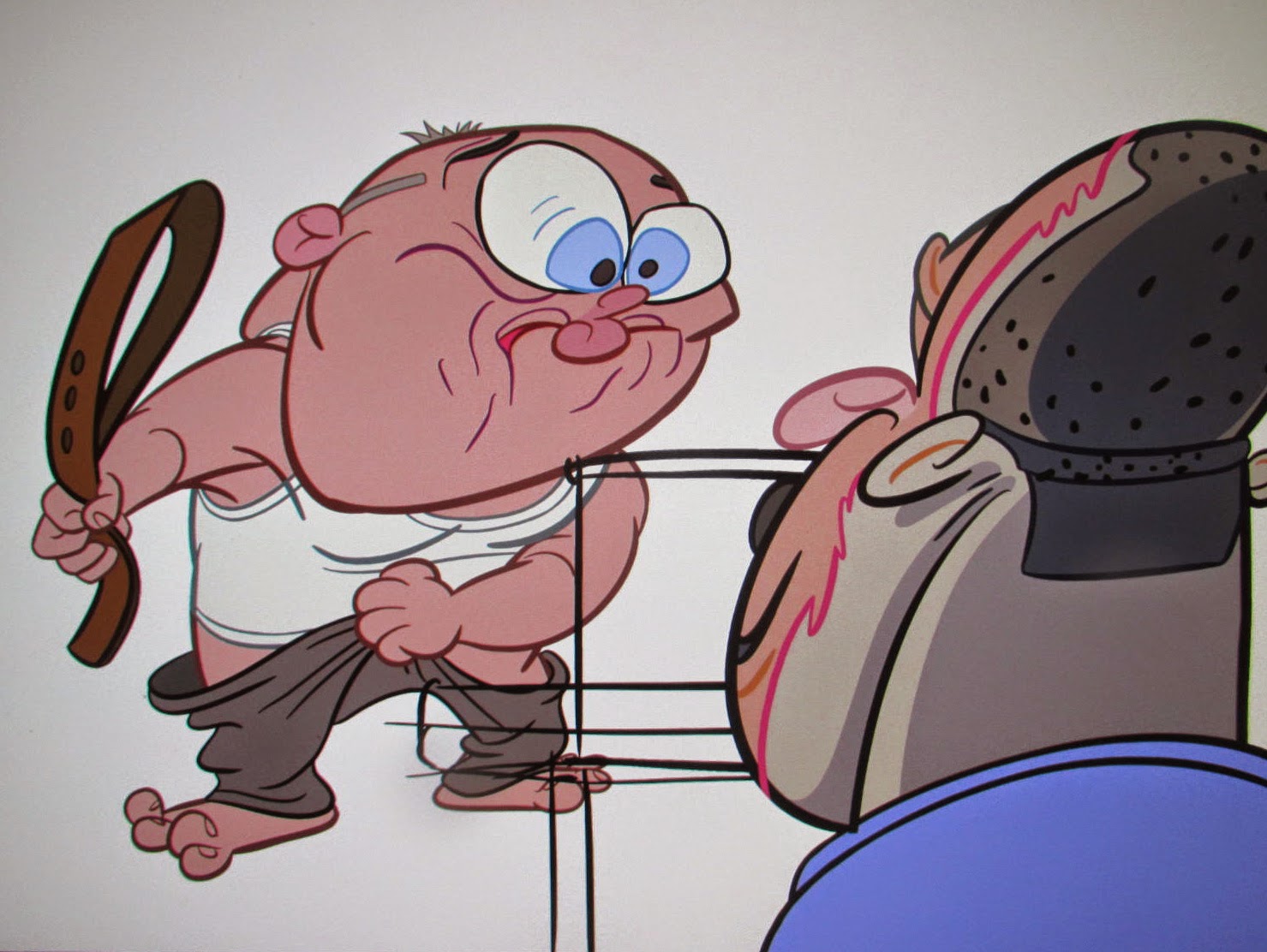
For comparison here's (above) a frame grab from one of the better Post Modern cartoons. Cartoons with a PM look aren't exactly to my taste, even when they're as fun and creative as this show. Gross's work seems to be the product of a noble soul who's seen the dark side of life and managed to find humor in it. Post-Modern styles seem to be the product of artists who's aim is simply to be "nice" and entertaining. That's the feeling I get, anyway. 

Maybe it's just me but I'd feel strange showing a "nice" cartoon to someone who's been unemployed for a year, or to a G.I. in Afghanistan, or to someone who's been disappointed in love. Nice is fine but it seems like a narrow focus.  

On the other hand, what's wrong with being nice? I have a friend who uses nice to capture elusive qualities like charm and youth and femininity and I'd be horrified if something I said made her stop. Maybe I'm just out of sync with my time...a toothless fogey who angrily shakes his cane at passing airplanes. 


In my own defense I'll digress to a bit of history. I'm guessing that if you asked the average person living in 1968 which contemporary artist exemplified that era, the answer you'd get would be Peter Max (above). Even the Beatles favored that style. His was "The 60s Style."


Fast forward to 2014 and the artist everybody (or at least every comics fan) associates with the 60s isn't Peter Max, it's Robert Crumb (above). That's interesting because Crumb himself was a 1910s, 20s, 30s and 40s man. You don't see much of Peter Max in his work (above). His subject matter was highly contemporary, but his artistic influences were older.


Ditto John K.  John defines the modern funny style yet two of his biggest early influences were Bob Clampett and Hanna Barbera, people who did their best work in the 40s. late 50s and early 60s. Once again, the subject matter was contemporary but the influences were older. I hasten to add that Both Crumb and John developed startlingly original styles...I'm only talking about their early influences here.

So, is it necessary to draw in a "nice" Post Modern style in order to be a mirror to your time in 2014? No, that's not what John and Crumb did.  Of course, there's always room for something good, no matter what the style...even if it's Post Modern.

BTW: Thinking about Peter Max reminds me of what I like about the man. That blue picture of the Earth above is beautiful and deserves to be remembered. Most people aren't aware that after his psychedelic period he took up abstract painting, and some of the canvases aren't half bad.


What do you think of this one (above)? My friends say it's kitsch, and although it flirts with that, it still succeeds in making me think about the mystery of color.


Max didn't design Yellow Submarine but you can see that his ideas exerted an influence. I think The Blue Meanie was the best villain in an animated feature in the last half century.

[Thanks to a commenter who identified the Yellow Submarine designer as Heinz Edelmann. I just looked him up on google and was much impressed.]


Friday, July 25, 2014

WHY ISN'T THIS PICTURE FUNNY?

Let me rephrase that. It is funny...Milt Gross did it and he's incapable of drawing anything that's not funny...let me ask instead, "How could this picture have been even more funny?" 


The answer? It could have been more funny with the addition of witnesses, as Gross originally drew it. Everything is made more funny when your goof is seen by somebody else. That way your injury is compounded by humiliation.

Interesting, eh?

Thursday, July 24, 2014

I9TH CENTURY STAGE DESIGN

I confess to liking the old-fashioned theatrical backdrops (above) of the 19th Century.


I think it was the sets in the old Melies films (above) that won me over. Look at the one above...bathing beauties, military men and a scientific space canon all sharing the same scene with the intriguing rooftop world of the big city. All those aspects of reality within one frame...what an interesting idea!


I also like the 19th Century style long shots in some of the old Fleischer cartoons. I like the idea that at odd times we're catapulted into a larger reality that gives us a different perspective on the story. Using ultra long shots only to establish a scene is a waste of a powerful tool. 


Old time theatrical backdrops had lots of balconies, windows, winding paths, caves and ledges. I guess the stage designers felt that was the way to get the most bang for their buck. That's okay...those old sets produced a surreality that reinforced the unnatural dialogue delivery and over-the-top stories of the day.


Someone who likes that old style doesn't have to slavishly copy the 19th Century. It's an idea that easily adapts to modern aesthetics. Here's a modern home that uses it. In houses like the one above you get a glimpse into multiple realities with just one glance, and there's plenty of hiding places, opportunity for unwelcome intruders to avoid detection, spying, sudden escapes, chases, athletic moves, dances and surprises.


Here's (above) a home design by Wally Wood that follows the same principal.


Tuesday, July 22, 2014

PRETTY GIRLS/UGLY FACES

I had had cataract surgery yesterday and I'm recovering at home. Wow! I highly recommend this if you're in need of it. The world is so much more colorful than it appeared only a couple of days ago. I look around and the impression I get is that I'm in Paradise or The Garden of Eden. Everything is so deliciously clean and bright!


Since I'm temporarily stuck in the house and haven't the clarity of vision to read much I amuse myself by going to Google Images and looking up funny faces.


What do you think of these?

Friday, July 18, 2014

"CANS WITHOUT LABELS"


I haven't seen the final cut of "Cans Without Labels." Nobody has. There's still some unfinished scenes. What I have seen is a medley of finished scenes with the sound and effects cut in, and they're an absolute stunner. The film is a game changer, a pirate broadside into the hulls of the lumbering dreadnoughts that dominate the animation industry. Fans who supported this film on Kickstarter won't be disappointed.

Unfortunately I hit a computer glitch on my end and won't be able to show the beautiful frame grabs that I promised. It's frustrating, but maybe this is for the best because it may provoke John to make a much better presentation on his own site.

The man continues to evolve. The animation experiments we saw on the recent Kirk Douglas film and on The Simpsons title are now improved and incorporated into character intensive storytelling. No, it's not too wonky or too stretchy...it's juuuuuuuust right. This'll be a much studied film and If you're a cartoonist you'll find yourself drawing compulsively after seeing it.

'Nuff said.

I have eye surgery coming up on Monday morning so I might be out of action for a few days. On the other hand I might blog continuously 'cause I'll have nothing else to do while I'm forced to hang around the house. See you soon!