Tuesday, September 18, 2007

THINKING ABOUT ART SCHOOL

BEFORE YOU START TO READ RUN, DON'T WALK, TO JOHN KRICFALUSI'S SITE WHERE HE TALKS ABOUT HIS IDEAL ART CURRICULUM FOR ANIMATORS. IT'S SIMPLY THE BEST THINKING ON THE SUBJECT THAT I'VE EVER SEEN IN PRINT!


What I'll try to do here is put down a few thoughts on the state of art schools in general (which includes traditional colleges offering an animation/art program) and animation courses in particular. The biggest recent change in animation curriculums is that they're almost all computer-centered. Every school wants to be known as cutting edge, preparing students for the jobs of the future and all that. As a consequence drawing courses have diminished in importance and now you can graduate from art school without being able to draw or paint. That's an historic change! Imagine that! The practice of hundreds of years reversed in my own time! How did such a big change come about?


Well, the computer obsession is the obvious first answer. That's odd because the favored animation of art students -- what they watch for recreation and inspiration when they're not being forced -- is anime, which is 2D. Students seldom watch 3D for fun unless its video game graphics. You get the feeling that they don't really like 3D all that much but they're persuaded that learning it is the only way they'll get a job. Is that true? Who gave them that impression?


The obvious answer is, "The box office told them! 3D is the only animation that makes money!," but is that true? 3D has been in TV animation for well over a decade now and what are the most popular animated programs? The answer is "The Simpsons," "South Park" and "Family Guy," all 2D. OK, south Park is computer animated, but it's deliberately made to look like it's not. No computer TV that looks like computer TV has been a prime-time hit. 3D has beaten 2D at the cinema box office but what was the competition? "Treasure Planet?" "Home on the Range?" These are executive-driven films are not at all what I would call fair competition.


My own guess is that high school teachers and art schools turned things around; high school teachers because they scared their students to death with the "college-or-scrub-toilets-for-a-living" rhetoric, and art schools because they took in so many non-artists that the foxes are beginning to rule the hen house.


The upshot of this irresponsible advice in high school was that every student who wasn't academically inclined went on a frantic search for colleges that offered easy degrees...and what college is easier to graduate from than an art college? In unprecedented numbers non-artists flooded art schools and they were backed up by big, tax-payer-backed student loans, so they were not turned away. How will these students pay back those loans? Remember when art schools had strict entrance requirements?


The influx of non-artists into art school is changing the nature of art school. A lot of students don't feel comfortable with traditional art and are much relieved when they can bail out into computers. Very often non-artists run art schools and they tend to repeat the non-artist mantra: "Everything will be computers right around the corner." That's only a half truth. 3D certainly is the future of animation but good animation programs are not by a long shot right around the corner.

Present-day 3D programs like Maya are clunky and unresponsive and there's no relief in sight. Art schools should be preparing students for a longer transition period but instead they're putting all their eggs in one futuristic basket. Maybe that's because 60s-type people run the schools and that generation was obsessed with what used to be called the "generation gap." They watched their parents lapse into irrelevance and they learned the lesson... on pain of death don't fall behind the trends. Unfortunately for them the anticipated trend in 3D was slow in coming. Today, all these years after "Tron," 3D animation is still expensive, insensitive to cartooning and expressive acting, has difficulty creating appealing characters, and is hard to use.


Even so, the fantasies of non-artists about how art should be done can't be ignored. They're training the next generation of artists and that'll have its effect. We still have to meet the challenge of anime, which is the immediate threat on the horizon, and that battle will likely be fought with 2D. My advice to young animators is to learn how to draw, cartoon and animate effectively, in addition to whatever computer skills you can pick up. If John K ever starts a school then kill to get into it. That's the real article. One day 3D will be as easy to use and creatively useful as a common pencil, and we'll all wonder how we got along without it....but we're far from being there now.


By the way, my own experience with art school management has been the opposite of what I've described here. Everybody I've worked for has been an artist, sometimes really good ones. Good art schools with competent and idealistic managers do exist and they're worth seeking out.

MORE DELSARTE ACTING THEORIES

I just re-read one of the Delsarte acting posts I put up months ago. Gee, I didn't do a very good job of explaining it. Let me try again, using my own words and my own sketches this time.

Delsarte believed that certain movements are highly symbolic and powerful. When you're happy you want to throw your arms up in the air. When you're sad you want to put your head down and slump forward. Probably everybody in the world recognizes and uses these gestures...everybody except actors.

Delsarte believed that actors avoid these obvious gestures because they seem too over-the-top, too caricatured. He thought that was a pity because no other gestures convey so much power. He created a system for using gestures like these without looking ridiculous.

In the sketches above, drawing A is a watered down version of the gesture that's full strength in drawing B. The second has a lot more power, especially when seen from the side, but it might be too strong for some scenes. Delsarte says, use the broad gesture anyway, but do it at an angle that would flatten it a bit from the audience's point of view, as in drawing C. Interesting, huh?


Delsarte wanted to bring broad gestures like the one on the left above, back to acting. Of course extended arm poses aren't the only type of broad action he was interested in. The guy on the right doesn't simply talk to his friend to get his attention, he grabs his arm before speaking. That conveys to the audience that what the speaker's saying is important. The arm grab's a powerful symbol and Delsarte wonders why we don't use it.


Sometimes a gesture combines two powerful symbols. Here's (above) a gesture indicating strong emotion that ends with a strong but unexpected "come hither" gesture.

Sunday, September 16, 2007

A FEW PHOTOGRAPHS FROM THE 50S


I'm embarrassed to say that I don't know who took these pictures. Anybody here know? They're all serious, seemingly 0ff-the cuff pictures of literary people from the 50s. Maybe the John Houston picture above was taken a little earlier, I'm not sure. Click to enlarge.


It's funny that the intellectuals of that era preferred raggedy, hazy, snapshot-type pictures like this one (above) of Sartre . My guess is that a formal picture, taken with a view camera and lights, was considered bourgeois. I think it still is some circles. I like both kinds myself.

Here's a picture of Edith Piaff who's one of my favorite singers. She has a tragic face which is appropriate for someone who sings so often about love gone awry.
But love gone awry or no, intellectuals were expected to have tragic faces. My guess is that they wanted to convey how difficult it was to live in a society dominated by the man. The fact that they lived in a liberal democracy with universal education and a standard of living unmatched in history made no difference. Their job was to convey great suffering and inner anguish.


This (above) is Becket, a playwright that I find unreadable. I forgive him though because his face is a gift to caricaturists everywhere.


Saturday, September 15, 2007

LOOKING AT ARTIST/MODEL PAINTINGS

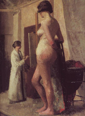
I've always liked artist and model pictures. When they're done right they're strangely soothing and appealing and...classic, for lack of a better word. Even when they contain major perspective flaws like this one (above), where the painter seems to be a dwarf and the model a giant, they're still fun to look at. Maybe artists like them because they remind us of hours of pleasant concentration.


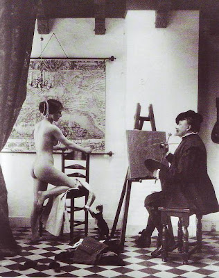
I used to think the main selling point was the sex, where a beautiful girl lets you paint her for hours on end. There's something interesting about turning sex into art. But that can't be all. Look at the photo above. It's got a naked girl, an artist and a faux Vermeer setting...and it doesn't work on any level. What's missing?
You can make a great picture (above) even when the model has her clothes on, but naked is better. Nudity is always a profound and shocking revelation.


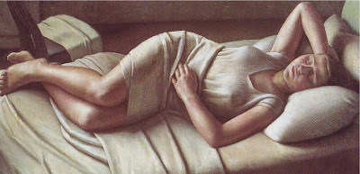
Artist/model pictures seem to work best in soupy colors like yellow, brown, olive green, black,and white (above), or in warm grays and browns like the draped model picture above that. I wonder why that is? Somehow the 19th century managed to put a lock on this kind of subject matter.

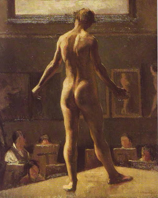
By the way, I think this figure with its back turned to us (above) is a guy.


Here's another perspective problem (above) where giant men appear to be painting a tiny woman. Once again we forgive the flaw. The picture is terrific but, just to nitpick, the bold treatment of the men in the foreground seems to undermine the serenity you're supposed to feel in a classic artist/model picture. You're not supposed to be admiring the detail.


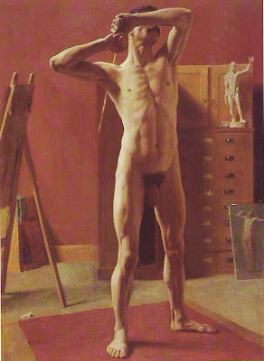
This picture (above) isn't by Eakins but it reminds me of his stark, anatomical style. This is a wonderful picture but once again, the boldness undermines the tranquility you're supposed to see in studies of this kind.
In my opinion, artist/model pictures always seem to work best when they feel like a study, something the artist dashed off in two or three days. Maybe that's because quick studies are good at capturing the immediacy and starkness of the naked skin.


This picture (above) is off-topic since there's no artist in it, but I include it anyway. It's an interesting idea to have a woman pose in a tight skirt, bathed in subdued, white light.


Friday, September 14, 2007

HALLOWEEN'S 6 WEEKS AWAY!

Today I'm going to pay a visit to the Halloween stores in my neighborhood. I can't wait! For me Halloween is the time of year when the rest of the country agrees with me about what's important. I see it as a time to stock up on things I'll need the rest of the year.

Mostly I like funny masks but I also like the kid art that people put up in their windows. Here's a sample above. Come to think of it, maybe these were done by adults trying to pass as kids.


This one (above) isn't too bad.


More kid stuff (above). Grade school teachers are great at setting off kid art to the best advantage. Individually these masks aren't special at all but together against black they look great. The gray stripe along the bottom is a touch of genius. Put your thumb over the gray and you'll see that the picture suffers without it. Where do teachers learn how to do that?


Old Halloween cards are the best.


More genius kids stuff (above). How do they think of things like this?
An Indonesian mask? I'm not sure. It sure looks great, though!


South Sea island-type masks done by kids...beautiful stuff!


Thursday, September 13, 2007

MY DINNER WITH ANDRE (JOHN K) PART#3


We met at noon at the local Italian restaurant. John ordered Chicken Calizonne, which was good, but didn't have a bit of chicken in it. Boy, John doesn't have much luck with restaurants! Anyway, the conversation commenced.


We got to talking about the 70s when even white people wore afros. It was the age of Superfly!


Black guys' apartments of that era were always, with almost no exception, decorated with black leather and chrome. They're not like that now, but in those days it was mandatory.


All the rooms were like that, and they were spotless. You could eat off the floor! No clutter like in my house. Nothing but furniture and walls and vast amounts of empty space.


Invariably the pictures on the walls were cloth prints, framed with chrome, The subject was always the same: naked black women with huge afros. I guess if you didn't have these you were shunned by other blacks.


We marveled at how many Superfly accessories you could buy in those days: afro salt shakers, afro lamps, clippers to give your dog an afro...you could put an afro on anything and people would buy it! To make the point John drew some accessories of his own on his napkin, starting with the afro faucet (above).


Here's (above) the afro refrigerator and the afro parakeet with white double-pronged disco belt.


Then there's the afro pubic hair drawing which, in case kids are reading, I'll reproduce tiny. Anyway, John proved his point...anything can be embellished with an afro.


Another subject we hit was the shocking lack of facial expressions and body language in men. What's going on? Men are so stiff (you know what I mean)! They're like cigar store indians!


It's a point of honor among men to look as lifeless as possible. What gives?


Girls, on the other hand, seem to get more elastic every day. Guys, we're loosing the rubber war!


Well, there was more, but that's all I have time for. Once again we sighed, knowing the world would probably disregard what was expressed here this afternoon.


Wednesday, September 12, 2007

I DID IT!

Well, I did it! Kali helped me out and her dad came along and did some parts. Maki engineered creatively. I have to say that I was terrible and the whole thing was incredibly anarchic and disorganized but I still had fun and am I'm glad I did it. Sometimes you just have to throw yourself into a new situation, make your mistakes and see what the lay of the land is.

One of the several things that I learned is to write for the people (including me) who are actually reading the lines. I should have known that before. Everybody's a better actor when they're playing characters that resemble their real-life selves.

UNCLE EDDIE LIVE ON RADIO TONIGHT!

Don't go out of your way for this, because it's just fooling around. Nothing rehearsed or figured out. We'll be talking about old-time radio and acting out some stuff for an hour. It's on a local (Los Angeles) college radio station, KXLU (88.9), at 7 o'clock tonight (Wednesday). You can also hear it live, online:

Tuesday, September 11, 2007

WHAT TO DRAW WHEN SKETCHBOOKING


These quick sketches are terrible but they're good enough to make the point that I have in mind, which is that most people draw the wrong thing when they go out sketchbooking.

If you draw people as individuals you'll end up as often as not with cliches: the middle-aged guy with a gut, the fat woman wearing tight clothes, the guy nodding off while he tries to read his newspaper, etc. That's because ordinary people people look pathetic when you draw them in isolation. They're glazed over from shopping or working. Your catching them at their worst.

Where people come alive is in conversation. That's where they become psychological and fleshed out. Take the fat woman. When she's talking she's no longer just a stereotype, she's a human being with a point to get across. She's more interesting.

Now the problem with this is that but people don't stay still when they talk. You have to draw your memory of what they looked like, which is hard, and an instant later you're diverted by the next pose. It's not a good way to turn out pretty drawings, but if you're lucky you might capture an interesting moment.

Monday, September 10, 2007

PRE-RECORD OR POST-RECORD?


I got to the wharves, strolled around for a while, then stood on the corner, smoking. From out of the shadows she reached out and took my hand.


Woman: "You look like you could use some... company."


Uncle Eddie: "You look like trouble, sister, and I don't want any trouble!"


Woman: "Listen to me. I have things to say. You're the blog guy, aren't you? I saw your picture on the internet."


Uncle Eddie: "Maybe. What's it to you?"


Woman: "Plenty! Follow me!"


Woman: "Go ahead, drink up. It's a clean glass! Look, I gotta talk about this pre-recorded/post-recorded thing. You draw the film first then put the music on at the animatic stage, right?"


Uncle Eddie: "Maybe."


Woman: "Well, that sucks! No wonder modern cartoons have no rhythm! You gotta start with a sound track that works, that's beautiful and dynamic and inspiring in its own right. "


Uncle Eddie: "Well, ya wanna see what the film's gonna look like before you put music on it."


Woman: "Stupido! Put music on it!? A funny cartoon should be PRE-RECORDED!!!! You don't draw a film first, with whatever random timing you feel like, then hand it over to the music guy to save it. The music, voices and major effects come FIRST! Do that and you won't have to worry so much about the timing! "


She slipped off her shoes and unfastened two buttons. She was open to her bra. Her dress slipped up, above her knees. I tried not to look. But I didn't succeed.


Sunday, September 09, 2007

MORE HOME DECORATION FOR CARTOONISTS


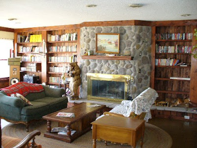
Here's (above) a reprise of the living room picture I posted yesterday. I like this room but I was surprised to find that some of my friends were indifferent to it. Well, I can see why. The book shelves are made with tacky wood, the coffee table looks like it came from a thrift store, the varnish looks like it was applied with a roller, and the fireplace is confined to a tiny box. the room definitely has flaws.

The amazing thing is that it succeeds in spite of the flaws. Against the odds it feels cozy. It's like a big, friendly mutt. An artist could get ideas in a room like this. I'd love to explain why it succeeds but I can't. Why do some spaces work and others don't? Maybe a comparison with some other types of rooms would help.
Here's a Sears catalogue room (above).


Here's some sterile modern monstrosity. I won't bother criticizing these. It would be too easy. Instead I think I'll compare the room I like to other artistic rooms like the ones below. No I'm not gay, and I don't watch home make-over shows on TV. I just feel sorry for artists who are stuck with depressing environments.


Here's an artsy room (above) that has appealing shapes and colors but never comes across as a room that people live in. The furniture is uncomfortable and isolated in little islands, and there's a pervasive feeling of bad taste passing itself off as good taste. It looks like a furniture museum.


This room is better than average. It's tasteful, sort of. But a house isn't supposed to look like a furniture catalogue, and an artist is supposed to rise above simple good taste. An artist is supposed to be on the track of something profound, something really fundamental in life, and that's missing here. There's too much visual noise. I couldn't think in a room like this.


You see this kind of room sometimes, where one stark color dominates. The variety of the real world is reduced to a single, screaming statement. Architectural Digest loves rooms like this, which is why I never read that magazine.


Here (above) is a room that tries too hard to be rustic. It's a cliche. There's nothing spontaneous about it.


Here we are back at the original room again. Maybe now the naysayers can see why I like this room (above). It has "good vibes," and the right vibe is worth its weight in gold.

The furniture is plain and comfortable and the fireplace and book shelves have a nice, quietly dynamic design. If you know anybody who has a knack for making rooms with good vibes like this, beg them on bended knees to decorate your place. Pay them well for it, and take their advice, no matter how crazy it sounds. It's as important to have stimulating, cozy, sociable rooms as it is a good winter coat or a car. Bad or awkward rooms can kill your creativity.