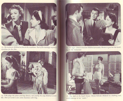
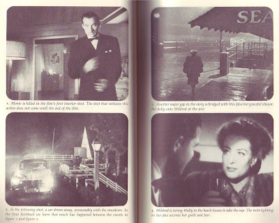
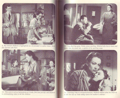
 The guilt is eating me alive! I know I promised not to do another "Mildred Pierce" post, and I know that fewer than 1% of the people reading this have access to the film...or even care about it. I'm sorry, but I've just gotta write about this thing anyway. I can't help myself! I'm obsessed! Pity me!
Anyway, as I may have said in a previous post, the story is about a mother who works her fingers to the bone to give her daughter a highbrow education, then the daughter rejects her for being low class. It doesn't sound like much, but the screenplay is terrific and James Cain, who wrote the novel the film is based on, is a really significant writer who even now is underappreciated. Maybe that's because some of his books are so flawed.
 I read "Double Indemnity" and was amazed to see to see that Cain gave his brilliantly-conceived characters the short shrift and spent most of his time on trivial details of the crime. I also read the novel of "Mildred Pierce", and that had the same problem. Once again the characters and situation were brilliant, but Cain didn't know what to do with them. That's OK. He was still a brilliant writer.
Jerry Wald, who produced the film, wanted to flesh out the talky Cain story and add a murder. He'd just seen "Double Indemnity", which was a wildly successful Cain adaption, and since that had a murder in it , Wald figured Mildred should have one too. He also had the notion that you can combine women's melodrama with noir crime, something no one else had done before (though D. Indemnity and "Laura" came close). Wald was trying to create a new genre.
He had six famous writers (one of the was Faulkner) take a shot at it before he got what he wanted. It was frustrating because combining two separate genres isn't easy and he didn't know how to go about it. He just had a feeling that he'd know it when he saw it.
Sometimes he had three writers working simultaneously and completely separately on the same project, a practice that makes writers furious. One writer "broke the spine" of the improved story, but was too slavish to the book in the details. Two others added too many fantastic and implausible elements, and made the story too long. One made the story too violent. Wald believed melodrama couldn't support too much violence. One murder was enough.

Finally he had enough interesting scenes to make a good story. Every writer contributed something of value, but it was still too long. With the shooting date approaching he took the bold step of getting a radio writer to condense the story. Radio people were experts at telling long stories in short formats. The radio guy, Ranald MacDougal, accomplished miracles and tied it all together deftly.
At one point in the story Mildred marries a guy and one minute later -- one minute! -- she decides to divorce him...and it works! Now that's compression! MacDougal did it by making the audience hate the guy and want to see Mildred divorce him. We're actually impatient to see Mildred dump him and when she does it, after only a minute of screentime, our only reaction is "Well, it's about time!" MacDougal actually makes the guy appealing in certain other parts of the film, he just emphasized the negatives in this section to smoothe over the story compression. Wow! Is that expert writing or what!?
I forgot to add that Wald hired Curtiz to direct the film, which was a brilliant choice. Curtiz injected humor into the story to smooth over the sometimes fuzzy logic, and it worked beautifully.
I'm not aware that Jerry Wald did anything else that was particularly distinguished, but in 1944-5, when Mildred was made, he was definitely cooking with gas. The womans' film/noir synthesis he created is now one of the most common types of film.
 I'm going to stick my neck out and say yes, they are. Even so, there are some puzzling things about that sex.
 And why glass unicorns? A few vile men will buy pewter Gandolfs but you never see a guy with a glass unicorn.
 Maybe all these girly tastes have their genesis in the girly bedroom. I don't know of any real estate on Earth where a guy is more uncomfortable and itchy than in these pink and lavender infernos.
 Maybe that's where girls learn to cultivate cute.
 Or maybe they get it from books like this (above). I deliberately printed the picture small lest readers feel their eyes have been pierced by icepicks.
 Someone shoot this poor dog and put it out of its misery.
 Some women executives make girly otherness work for them. They tinker together ultra-fem offices, with pink, fuzzy carpeting and magical rainbow posters. When a business guy comes in they seat him in a rickety wicker chair next to a rickety wicker shelf, and the shelf is packed to the gills with glass unicorns. Of course the glassware is on the very edge of the shelves.


 It's also customary to have a small accent painting nearby. How about something something quiet and understated like this (above)?
 Males like to have a picture of an undraped woman on the wall (above) and male cartoonists are no exception. It adds a touch of class to a room, reminding us of the great pictures of the old masters.


 Last but not least, I think a framed portrait of some inspirational hero is in order. Something that'll get your juices going when you pass it in the hallway. For me that would be Bob Clampett or Percy Dovetonsils. Ah, giants walked the Earth in those days!


 I read "Double Indemnity" and was amazed to see to see that Cain gave his brilliantly-conceived characters the short shrift and spent most of his time on trivial details of the crime. I also read the novel of "Mildred Pierce", and that had the same problem. Once again the characters and situation were brilliant, but Cain didn't know what to do with them. That's OK. He was still a brilliant writer.
 He had six famous writers (one of the was Faulkner) take a shot at it before he got what he wanted. It was frustrating because combining two separate genres isn't easy and he didn't know how to go about it. He just had a feeling that he'd know it when he saw it.