Thursday, March 21, 2013

LIMBURGER CHEESE


This post is about Limburger cheese, the world's stinkiest food. I just bought a block but I haven't opened it yet. I figure I'll open it here and take my very first bite with the whole world watching.

"When I was a kid my dad used to bring this stuff home just to watch the rest of us run for the exits. He thought it was funny. I'll bet he never ate any of it!


"Okay, enough babbling. Let's open the sucker!"


"The-e-e-re we go!"


SFX: (SNIFF! SNIFF!)


"Oh, that's nasty!!!!"


"Oooooh, I just caught a second wave. That really is nasty!"


"Now, now...let's not rush to judgement. This is America where every food is entitled to a taste test."


"Well, you know....it's not really half bad. It tastes like Camembert."


"In fact...I think...I think I like it! Who'd'da thunk?"

Tuesday, March 19, 2013

RALPH BAKSHI SKETCHES

At the risk of stating the obvious, Ralph is one heck of a cartoonist! What do you think of the sketch above, particularly of the guy at the bottom? The beautiful lines, the humor, the philosophy and street experience embedded in the drawing...could Hockney or Warhol have done better?


I'm amazed that Ralph (above) was never offered a regular comic strip in the papers. Maybe he was and I just never heard about it.


If I'd been a newspaper editor I'd have offered Ralph a regular space of his own to do whatever he wanted to do. Ralph would have been great with continuing characters, but I'd have been equally happy if he'd decided to simply be a cartoonist observing the world around him the way Herriman (above) used to in the early 1900s. 


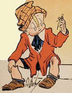
What were Ralph's formative influences? I wish I knew. I know he likes the old Percy Crosby strip "Skippy" (above). Skippy wore loose, oversize clothing and a funky hat, just like the characters in Ralph's doodles.


Crosby was incredibly creative with Skippy's jacket (above), the way it wrinkled and wrapped. Artists get off on things like that.


My guess is that George Lichty (above) was an influence...


...as was Billy De Beck's "Barney Google."

Ash Can artist Reginald Marsh (above) might have been an influence.


Ralph colors his sketches a little bit like Marsh colored his (above).


Crumb must have influenced Ralph. Crumb used Herriman style line technique from the early days of comics to depict what he was seeing on the street in the 60s. I'm guessing that the idea that you could use the old to depict the new was a real revelation to Ralph, who was himself a fan of early cartooning.

Do all these possible influences add up to Ralph? Nope, he's one of a kind. There's no mistaking a Ralph drawing for anyone else's.


************************

BTW: Thanks to Steve Worth for permission to photograph the "Coonskin" drawing at the top.

Friday, March 15, 2013

HOW ARTISTS SHOULD LIVE


This, believe it or not, is a post about the need for fabric and textural variety in interior decoration. I need to make that clear right away because at first glance the whole post looks like a bunch of girls in their underwear. That's because all the images here come from adult sites. I just didn't know any other place where I could find the kind of colorful interiors I had in mind. I'll try to clean up the pictures where I can. It's the best I can do.

Anyway, I think the house shown here (above) is an Australian photographer's collective. This is the kind of environment artsy people of all kinds thrive in. Artists require color. We have to see it all around us every day. It's not enough to put colorful posters on the wall. Color requires texture and pattern to read effectively, and that means fabric, plants, stone, glass, and wood grain.


Look what these windows (above) do for this room.


I like fabric draped over furniture. The example above is a little too girly for my taste, but it makes the point.


I love this picture (above) because it really sells the idea of a sleeping porch that doubles as a sort of greenhouse or potting shed. It's a whole room devoted to color and texture, and to the changing quality of light as the sun makes its way across the sky.

How do you like the muted yellow bedspread and the purple and indigo pillows? What do you think of the weathered old rug on the floor and the artfully sagging old cot?


It wouldn't cost much to build a structure like this (above). The roof is corrugated translucent plastic, and the screens are weighted plastic screening fabric that hangs like drapes. I like the Japanese-style frame.


I like rooms that are drenched in light in the daytime, and are dark and mood-lit at night. For a spot that's dark no matter what the time of day I suggest luxurious, thick, heavy, dark green...either as a carpet (above) or as a drape.


Bed linens (above) are a great excuse for complex color. The patterns here remind me of washi, the Japanese colored rice paper that you see in craft stores.


You can't get away with fabric this flamboyant (above) unless you're a girl. On the other hand, Matisse probably had stuff like this around the house.

********************

Well, that's all I have to say about that. On another subject, I'll be posting twice a week from now on, probably on Monday and Thursday. That's one day less than before. The reason is that since December I've gotten more than a third fewer hits. The number is still pretty good, but I'm a ham and I miss the larger audience. Maybe it's for the best because this'll give me more time to work on income-producing projects.

Wednesday, March 13, 2013

MORE FOOLIN' AROUND

Warning: this might not be office or school safe.

There... I like this head (above) a lot better than the previous one. 

Out with the old (above) and in with the new!


Boy, I get a lot of mileage out of this expression (above). It comes in handy for lots of things.


I got this (above) off the net, but I can't remember where.
This eight-legged woman (above) didn't turn out well at all, but I kinda like the idea. The painted part of the caricature is by Tomo. 


Last but not least, here's another photo from the net.  This kid was photographed at the very moment he was about to drop the "F" bomb.  Yikes! Imagine if the kid didn't learn any other word til he got older.

Also, you can tell by the condition of his nose that this kid snorts his baby food. A born iconoclast.

Monday, March 11, 2013

RED LEGS

Just fooling around. Here's a caricature of me done by John K on top of a pair of legs I found on the net. 

Here's a caricature of Nate drawn by Aaron Philby on top of the same legs. Holy Cow! It works!


Saturday, March 09, 2013

CARICATURIST NATE KAPNICKY


Haw! Here's a funny man at work. The caricaturist is Nate Kapnicky

 I found out about Nate from Aaron Philby. That's Aaron above, drawn by Nate.


 Nate has a proper appreciation of stupidity.

 Give the subject (above) a haircut and a shave and he could pass for a doctor, but the caricaturist is trained to overlook unimportant things like character and intelligence. A caricaturist quests after the ultimate, the summit, the Grail of funny art...I speak of the quality of sublime ignorance.
 Holy Mackerel! The guy looks like a hawk!


 Above and below: two awesome interpretations of the same girl. I like the use of subtle, grainy color in the portrait above.


 Holy cow! Notice that both versions show a fever blister. I know what you're thinking, that it's cruel to show that. It is, and for that reason I wouldn't have done it myself, but in Nate's defence I'll add that a caricature is done for the benefit of the crowd of watchers, as much as for the subject. Watchers like things like that.


 Above, a noble nose.


 Wow! A terrific side view (above)! Man, when you draw one this good you hate to give it away!


 I'm surprised that most caricaturists prefer to draw frontal poses. It seems like side views are usually more funny. Years of mugging in front of a bathroom mirror make most people adept at hiding their ignorance in a frontal pose. Few people, on the other hand,  are practiced in hiding it from a side view.


 Yikes! This kind of caricature (above) is not for the timid!


Wednesday, March 06, 2013

ALIEN LIFE FOUND ON EARTH?

Can planets with extreme climates support complex life? Maybe. This little creature, only a millimeter long, is a tardigrade, also called a "Water Bear." It can live for decades without food or water, can survive temperatures ranging from near absolute zero to well above the boiling point of water, and can survive high pressure and very dangerous
radiation.


It's (above) so different than other life forms on Earth, that it's tempting to speculate that it doesn't come from here, but there's no evidence of that. It does have DNA just like we do, but it's more efficient at repairing it.

Russia attempted to salt Phobos with these things, but the rocket failed so Phobos was spared.


That's (above) an artist's rendering of our own galaxy. It's a spiral emanating from a bar. Probably the odd shape is the outcome of a collision with another galaxy. It must have happened a long time ago because it takes a while for merged galaxies to find a stable shape.

Just how old is our galaxy? Believe it or not, our own is one of the oldest galaxies we know of. It began to form long ago, shortly after galaxies first came into existence.


Question: which is older, the Earth or the Sun? Answer: the Earth. The proto-Earth formed when the Sun was still a hot ball of gas, before it ignited and became a star.


 When the Sun ignited it pushed out a giant shock wave that sent most of the smaller rocks and dust out past the present edge of the planetary Solar System. They settled into  a disk of remote asteroids called the Kuiper Belt. I think the Ort Cloud might have had a different origin.


Probably I'm the only person on this site who failed to see this footage when it was new. It's the meteorite that recently fell in the Urals. Although the rock is thought to have been no bigger than a car, the impact energy is estimated to have been that of several Hiroshimas.