Wednesday, October 21, 2015

BERYL COOK

I don't know what I think about Beryl Cook. She had talent and an interesting point of view, but her subject was post middle-aged British housewives, the kind that Monty Python used to make fun of, and I don't know if I'm ready for that.


Cook's women are a bundle of contradictions. On the one hand they're kind of uneducated and unexciting, and on the other hand they're immensely good-hearted and somehow imbued with the character that's been the spine of British culture for centuries.


Her earlier period is my favorite. Cook painted traditional women who are colliding with modern times.


No matter how many new ways they adapt there always seem to be more that they're expected to catch up to.


Cook managed to capture the kind of cozy, sentimental life that lots of older Britains have evolved.


Her housewives always have lots of friends. Nobody in her pictures suffers from loneliness.


Haw! She's famous for her "Ladies Night Out" pictures.


Cook is sometimes compared to Donald McGill (that's his work, above), the prolific creator of British seaside postcards in the 40s. About McGill, George Orwell wrote (click to enlarge):


There are obvious differences between Cook and McGill but there are similarities, too. Both had an obvious affection for their subjects and both saw themselves as popular entertainers in the music hall tradition.

BTW: I like what Orwell said about Shakespeare injecting that kind of music hall comedy into tragedies. It's a combination that works.


For comparison, here's how two other painters handled themes a bit similar to the ones that Cook tackled.  The first (above) is by a contemporary Australian painter and is called, appropriately, "Ladies Night Out."  Sorry, I don't know the artist's name.

The painter's very skilled but he's not as cartoony as Cook, and cartoons are a more efficient way of handling themes like this.


The second is by Cecil Bell, one of my favorite New York City painters. If Cook had handled a similar theme, with women on board a ferry on a windy day, she would surely have had one of the women face the wind like this (below).

That's because Cook was a cartoonist at heart. She wouldn't have been able to help herself.

Monday, October 19, 2015

A TERRIFIC FILM OPENING

I've a huge interest in film gambits, "gambits" being a chess term for the opening moves of a game. The term can apply to storytelling as well. "It was the best of times, it was the worst of times" was a gambit, as was "Call me Ishmael." Here's the the gambit for the terrific TV miniseries, "Olive Kitteridge."

The story is about a woman suffering from chronic depression in a small New England town.

It opens with silhouettes of buildings set against unsettling dawn skies. You get the feeling that something's wrong in this town, and has been for a long time.


The pounding surf intensifies the mood.


Now here's (above) where the really original part begins. A fishing boat is seen in an ominously tempestuous sea. One still frame can't do this image justice. A ship in a daytime shot usually symbolizes hope and escape. Not so here.

Far from being a symbol for escape, the boat may be seen as a sentry preventing escape and confining the townspeople to their prison.


The film trucks out of a porcelain image of the ship. The painted image is a happy one but the audience knows better. Seeing the creepy ship in this nice old-fashioned context firms up our conviction that whatever's wrong in this town has deep roots, and that the towns people might even have had a hand in covering it up. 

  
Smash cut to a street in the town where a woman is discovered lying dead on the ground. The music and art direction lead us to believe that she was somehow killed by a supernatural thing. It capriciously felled an innocent woman and left her limp as a rag doll on the ice.

This isn't a horror film, so the supernatural element I'm talking about isn't part of the plot. Even so, it's important. Sherlock Holmes stories are like that.  There always a supernatural subtext in them, and it makes the stories more interesting.

Fascinating, eh?


JOHN KRICFALUSI, KELLY ARMSTRONG


Haw! I don't believe it! This is the most insulting caricature I've ever gotten and yet it's so funny that I wouldn't part with it for anything. How does John do it?


Here, thanks much to commenter "ibcf" and his source Bob Jacques, is an unedited deleted scene from "Tales of Worm Paranoia."  Animator: Kelly Armstrong. Boy, Kelly did a great job on this! It's a pity it had to be deleted for time.

Friday, October 16, 2015

ECLECTIC DECORATING

I'll be moving to a part of the country that gets gloomy in the Winter and I want be sure the new house is cheerful and colorful. My plan is to compensate for the overcast by using a lot of interior white to bounce the available light around. I'll also go for an eclectic look that'll justify the use of bright color accents.

I like the room above a lot. If I can get something like that going I'll feel like I've accomplished something.


This room (above) has some interesting ideas. It's far from perfect, but it's white and colorful, succeeds in being challenging, and has a nice artsy feel.


 Hmmmm...a bit too girly and minimalist. I like some of the color, though, and the black Franklin Stove is a nice touch. I'll have to think about this.


I'm not a weaver or a fabric designer but I need an excuse to surround myself with the kind of color that you find in those trades.


My work area will probably be influenced by Julius Schulman's set up (above)...only with lots of color.


Some colorful Ralph Bakshi frame grabs on the bulletin board wouldn't hurt. Boy, Ralph has a good feel for color!  His "Last Days of Coney Island" film will debut on Vimeo at the end of the month.


Wednesday, October 14, 2015

HALLOWEEN ART MASKS


Geez, it looks like I won't have time to get a really good costume together for Halloween. If I had I might have tried a painted face of some sort. Maybe something painterly, like the kind of thing Philip Burke does. What do you think of his Arnold Schwarzenegger (above)?

I do worry, though. What if I put all that paint on and couldn't get it off? I'd have to go through life like that. Does gouache wash off easy? Is it poisonous?


Painted masks look great on girls!


Picasso's style makes for great painted faces (above). Even when it doesn't completely work, the attempt is usually worth seeing.

Here's (above) an interesting effort. Geez, Picasso would have made a great fashion designer.

I wonder if Picasso-type face makeup will become the standard for women someday. Stranger things have happened.


This girl (above) is dressed in cardboard. She deviates from the original in some ways but she looks like she had fun and she proves a point: Picasso could design real clothes.


For comparison, here's (above) the original.


I never thought of Picasso as a fashion designer til now. He was so prolific that you'd expect to see all sorts of wearables based on his designs, but I searched the net and didn't find a single one. Isn't some of his work public domain now? 

Lots of designers did their own version of Picasso's general style (above), but that's not what I had in mind. Not tee shirts, either.


Wow! This kid looks great!


Here's a takeoff on Picasso's "Weeping Woman" from 1937. 


For comparison (above).


On the net I came across some Picasso-type cars. I kinda' like this one.

Monday, October 12, 2015

CONCRETE BLOCK BOOKSHELVES


You can make great bookshelves with bricks or concrete blocks and a few planks, but that's a potential only, something that's seldom seen in the real world. Most tall brick shelves look horrible. These guys (above) pulled it off because they have an unusually high ceiling and are professional designers.


Most brick and plank shelves look like this (above)...


...or like this...


...or (Gasp!) like this!!!!!


Brick bookshelves should be low and wide...the length of the entire wall! The two-tier shelves in the picture above aren't made of bricks and planks but the proportions are right. I'm stuck with using available examples. Two tiers of books is just right. One more tier of books on the top shelf, with no plank on top, also works, but that's the limit...no more!

Tucking this kind of shelf under windows works best but if that's not possible, and you need more height, then the additional upper shelves should be bracket shelves.


 Frank Lloyd Wright used used to say "Emphasize the horizontals!" That goes for bookshelves as well as walls. Bookshelves like the ones above should have a dynamic, wall-to-wall horizontal sweep.

There should always be a little air space under the bottom shelf. That's to make it appear that the shelves are so light that they're flying. In reality they're heavy enough to squash an elephant!


Last but not least, the wooden planks should be thick, wide and long.  Don't use wood that's thinner than the ones in the example above. When I used to have shelves like this I used three inch thick cedar planks. If I remember right, they were 9 inches wide.

I prefer a natural wood look. One coat of varnish only. The thin, glossy white planks that are sold as bookshelf planks aren't thick enough. They look like they're struggling to hold the books and evoke pity.


Saturday, October 10, 2015

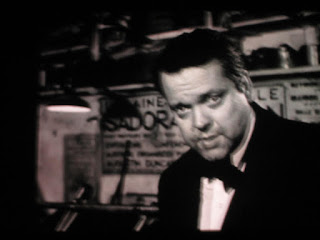
ORSON WELLES: GENIUS

I promised some friends that I would tell them how the last complete episode of Orson Welles' TV travelogue show turned out. Well, I saw it last week at Steve's and it was, just like the other episodes, a revelation.  Some call it the Jean Cocteau episode, but Cocteau was hardly in it. Mostly it was an interview with a skilled American sculptor who lived in Paris and insisted on wearing a toga instead of pants.


Steve rightly summed up Welles' role as that of the listener. The focus was on what the sculptor had to say. Orson spoke only to provoke the man to keep talking. What seemed to interest Welles was not the man's opinions about pants but rather his dignity and good will. As in the other episodes Welles found a subject who represented what was good about mankind and just let the camera roll, trusting that we'd be interested. And we were.


One more thought: Welles was a little more active than I indicated here, though his technique was subtle. With his own voice and demeanor he established a civilized and encouraging tone. Maybe with a different interviewer the man's opinions would have degenerated into a rant, but with Orson they came across as thoughts deserving respect. The film was shot in the aftermath of WWII and I imagine that Welles believed in the healing power of friendly and intelligent conversation.

Interesting, eh?