Wednesday, April 12, 2017

CANS WITHOUT LABELS IS FINISHED!!!!!!!!!!

Ahem! I'd like to announce...for those who haven't heard...that John K's film, "CANS WITHOUT LABELS" is finished!!!!!!!!!!! The film's finished, that is, but the titles still need work.

Anyway, I've seen it and it's unbelievably delicious. It's easily one of the best things he's ever done.

On seeing it my first thought was that I desperately wanted toys of the characters. My second thought was that I pity the poor filmmaker who has to follow it when it appears on TV.


 Poor John. I guess he'll be swamped with fans now.


I wonder if he'll be required to autograph breasts. It's a grueling job but, well...you don't want to disappoint anyone.


By the way.....to all the Kickstarter contributors whose vision and idealism made Cans possible...this video (above) is for you. For maximum effect start it at the 17 second mark.


Congrats John!!! You da man!!!!!!!!!!!!!!!!!!!!!!!!!!

BTW: That picture (above) is of D. W. Griffith doffing his hat in salute to French director Abel Gance.

Saturday, April 08, 2017

ART SCHOOL PLASTER CASTS

Every art school used to have a huge collection of white plaster casts. Some still do. White allowed the student to see shadows more clearly and shadows are a lot of what pulls a composition together and suggests drama.

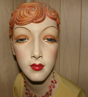
I'm writing this to suggest that we expand that collection a little bit to include a few colored mannequin heads. Mannequins don't have the same educational value as classical busts but the best ones are nice and cartoony and are often a good way to drive home a few basic lessons about what to emphasize on a face.  What are those lessons? Read on.


Most of the old flapper-era female mannequins favored clear, sharp, Catherine Hepburn-type chins.


Real women on the other hand, often had weak chins, and would probably have preferred to emphasize their eyes. That wasn't so easy to do. According to an article I read the older kinds of eye makeup had problems with dry spatter and required constant touch ups. More about eyes later. 


Back to sharp chins. They show to best advantage when the head is tilted back. That reinforces the haughty, aristocratic image that fashion likes to convey.


 Somewhere along the line a long, vertical mannequin faces were introduced. I think of it as a modified Asiatic look but you can find African masks that look a bit like that.


 The sharp chin never went out of style, though. It got new life when it was combined with the forward-thrusting muzzle. Here the whole bottom half of the face is pushed out. It's a very cartoony look.

For a while bulbous foreheads were in. How that started I can't even guess.


The big game changer was the invention of non-spatter eye make-up.  That changed everything. It allowed for an emphasis on the eyes rather than the chin and that led the mannequin makers to tilt the head down.


Thin faces give greater eye emphasis so the wall-eyed, wide-angle, thin look took over.


Mens mannequins were less influenced by beauty products. About the only major face product change in my lifetime was the use of shampoo to replace bar soap in the washing of mens' hair. Shampoo made straight hair possible and wavy hair models disappeared. Chin emphasis persisted, though.


We men also liked the ultra-manly J. C. Leyendecker look. Later came the Arnold Schwarzenegger look.


The Arnold look receded and the nice guy next door look (above) took over. That was followed by the Urban Hipster look, which is what we have now.

I'll end with the observation that the hippies were never represented in the mannequin world. They had disdain for fashion and the fashion world retaliated by snubbing them. Fascinating, eh?


Wednesday, April 05, 2017

PEDESTRIAN FOOTBRIDGES

Here's a photo (above) that made me want to stand up and cheer when I found it. It's of New York City, at Broadway and Fulton Street and Park Place, taken in 1866.

A book called "New York Then and Now" said the pedestrian footbridge was a popular place for courting couples who wore their best finery to watch the goings on down in the street.


Here's the same place today. It's a handsome corner even now, but even better in my opinion was the view with the footbridge from 1866. Amazingly, a purely utilitarian device to get people across the street actually added to people's enjoyment of the scenery. Well...it added to mine, anyway.


In my opinion footbridges add to the aesthetic value of any urban scene. Almost any man-made thing worth seeing is worth seeing from more than one angle.


There's so many kinds of footbridges.


Some (above) may not cross a road. Some are more like footpaths that cling to the sides of buildings, above street level.


Some bridges aren't bridges at all.


My favorite type of footbridge is the covered wooden kind, but maybe that's a fire hazard. Isn't there some way to make that sort of thing work in the city?

Unfortunately not all footbridges are equal. The white one above doesn't work because it's in a badly designed area, and doesn't seem to serve any important purpose.


This park bridge over swampy mud, on the other hand, earns its keep.


Maybe that aimless, white bridge could be made a little more interesting with addition of exercise bars.


Monday, April 03, 2017

A FASHIONABLE MOLE

I know what my new house will need...a touch of class. Maybe I'll put up some portraits of old English nobility. There must be prints you can buy like that.


Yeah, the Baroque look. 


Gee, all the wigs in those pictures have big clefts in the middle.

Maybe I'll need a landscape to offset them.


Portraits are useful because they hint at something I'm much too refined to assert openly...


...namely that I am...Ahem!...descended from English nobility.  Of course, there are no nobles in my family, and I'm Irish rather than English,  but I don't see why I should suffer because of that.


I'll need to find suitable women's portraits to hint at my wife's pedigree...

....something with lots of hair.


Something very ancien regime.


Something with a fashionable mole.


Thursday, March 30, 2017

THE BEST MODERN FASHION DESIGNER

Listen, I don't know anything about fashion but I love art and the most artistic and funny modern designer that's come to my attention is...by far...Thom Browne.

Browne's been around for a long time but I only became aware of him when he began working with a unique Dutch male model,  Thomas Hoefnagels. Haw! Hoefnagels looks hilarious in Browne's clothes, especially the suits...


Hilarious, but solidly artistic. The line, the shapes, the color and pattern, the sense of humor...it's all there. The use of the mask and beanie is inspired.


Browne even pads the legs of pants. Yikes!


Holy Mackerel!!!!! It'll be a while before you see this (above) in my neighborhood. 


For women Browne likes the Eliza Doolittle look.


That's all I have to say about Browne, but I'll add the work of a couple of other designers to make the point that fashion's made a big comeback lately. 

 Who designed this women's top (above)? Boy. the legacy of Calvin Klein is still with us. It's all about simple elegance, and rewarding people who stay in shape.


Ah, the English schoolboy look. Expect to see it on the street this year.


Sunday, March 26, 2017

OPENING PARAGRAPHS


Don't you love the way the best magazine writers used to begin their stories? How do you like this opening:

"The floor beneath Conners' feet dropped like a gallows trap. What had been solid, shining mahogany was suddenly a gaping black void. The man shot through space. Down, down, into the darkness below. 

The native servants stood blandly silent. From the opening in the floor came a thump then, after a moment, a horrible scream of terror, that echoed ominously through the room like a banshee's wail.

'For God's sake take me out of here! What is this thing? God, it's coming close to me!"  It's----' "

Very nice. I'll bet nobody ever stopped reading after an opening like that.

How 'bout this one:


"Night, black and rain-swept, shrouded the Kirty Institute for the insane. Gusts of howling wind attacked the ugly gray buildings like seas pounding some bleak, rocky coast. There was the same impression of desolation, of a savagely forbidding place that humans shunned."


"A small car lurched to a stop in front of the guardhouse at the gate. Two men got out, collars upturned, hats pulled low."

Nice. Very nice.

Of course you could argue that the best openings were the most brief.  Here (below) the writer grabbed our interest with just a few words:

"Sally, take that child away. Don't put it down in the dirt."

Huh? The dirt!? Yikes! What the heck was that story about? I found it excerpted in, of all things, a book about grammar, so I have no idea what the context was.

Ah, giants walked the Earth in those days!


Monday, March 20, 2017

MY BEE STORY

Here's how it happened. 

My wife and I were talking about the new house we're hoping to get and I mentioned a type of screen we could get for the back porch.  She said something like, "Oh, not that kind. Our bees'll get stuck in it." 

Huh? Our bees? 

I laughed and said, "Haw! you're gonna die when you hear this. I thought you said...aw, this is rich...Haw! I thought you said...here it comes...I thought you said...'BEES'. Haw haw, haw!"

She replied dryly: "Yeah. That's what I said...bees. I've wanted to be a beekeeper ever since I was a little kid."

(Groan!) A long discussion ensued during which I was reminded of favors that I owed.  The upshot was...you want to see a picture of me a year from now? That's me (above), and all the hapless guests who ignore the warnings and venture out into our backyard. 


I forgot to say that my wife wants a goat, too. 


We might have to let the goat live inside the house.


How can I kick the poor creature into the backyard when all that carnage is taking place out there?


Have you ever seen a corpse stripped by bees? Well...I haven't either...but it must be terrible.


I don't think any amount of coaxing will convince the pets to leave the house.

Would you if you knew the yard was full of bees?


I don't know what the neighbors will think. If we're lucky we'll have hippie neighbors. Bees don't sting hippies. That's why God created hippies...so there'll be somebody to love the world's bees.