Tuesday, February 06, 2007

A THEORY CORNER EDITORIAL

To Theory Corner Men:

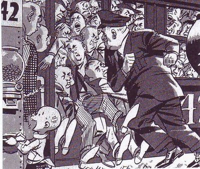
Men, let's face it. We've been selfish. We never talk to women the way they want to be talked to, the way they CRAVE to be talked to. They want their men to hold their hands and talk to them Don Juan de Marco-style, like this:

"There are some women...fine featured...a certain texture to the hair, a curve to the ears that sweeps like an eternal nautilus...these women have fingers with the same sensitivity as their feet...and when you touch their knuckles it's like pressing your hands around their knees..and touching this tender, fleshy part of their fingers is the same as brushing your hands around their thighs...and..."

OK, it sounds hokey to us but women eat this stuff up. And if they like it so much, why not give it to them? Consider that one half the world (men) has it in their power to make the other half of the world (women) substantially happier without spending a single cent. What a huge improvement for such a small effort!

I hear you say that that modern women would never fall for something this corny. NOT TRUE!

I've tried this on my family and female friends and it worked 100% of the time! I don't mean I tried to seduce them, just the opposite. I bragged before hand that I could get a reaction from them, whether they liked it or not, with over-the-top purple prose, then I read the dialogue hesitatingly from a dog-eared piece of paper in the presence of other people. Even under these circumstances, even with the most skeptical of women, after only a couple of minutes they were all reduced to shell-shocked puddles. Don't take my word for it, try it yourself and improve the world.
BTW, the picture is by the young Robert Crumb.

Monday, February 05, 2007

WHATEVER HAPPENED TO DERAIN AND VLAMINCK?

Here they are: Derain's portrait of Vlaminck (above, left) and Vlaminck's portrait of Derain (above, right). They were at the top of their form at the start of the fauve period in, say, 1905 and by 1910 they were passe'. What happened?


Here (above) is a Derain from 1905. it's full of verve and vitality.

Here (above) is a Derain from 1909. It's OK but what a come-down! What happened? Maybe the answer is that he bought a house in the country and fatally removed himself from the influence of his friends in the city. Or maybe he acquired depressing friends out there in the country. He hung out with German friends in this period and maybe they didn't understand color the way the French did.
Here (above) is a Vlaminck from 1905. Minimal shadows, unreal color on the tree trunks, color used to contain space...it's a really wonderfull example of the fauve style.


Here (above) is a Vlaminck from the 1920's. It's OK but the painter clearly wasn't interested in experimenting anymore. What happened? Why the precipitous decline? Historians speculate that he was demoralized by his association with Picasso. Apparently Derain felt old-fashioned in the presence of Picasso's Cubist rebellion and in 1907 he destroyed his fauve paintings when he moved to a new studio. Imagine that; fauvism starts in 1905 and one of the leading practitioners feels passe' by 1907. That's how fast things were changing in those days.
Here are photo portraits of Derain (above) and Vlaminck (below). Neither had to desert fauvism. The movement still had a lot of vitality as we know from Matisse's work. Matisse stood up to Picasso and matched him, innovation for innovation. What a pity that Derain and Vlaminck chose to capitulate rather than fight.


Sunday, February 04, 2007

THEORY CORNER FOR WOMEN (NO MEN ALLOWED)

Hello, Sisters! I reckon I'm not good at public speaking so I guess I'll begin plain and direct by showing you this plea for help that that I wrote to Uncle Eddie (above) a few weeks ago....

"Dear Uncle Eddie:

Beulah Bradshaw here. I'm sorry to burden you with this. I know you get thousands of letters from lonely females, more than you could ever answer, but I have nowhere else to turn. If you don't help me I'll just just have to buy a one-way ticket to the river, if you know what I mean. Won't you please help me? Here's my problem...

I've had affection for David, the boy next door, ever since I can remember. When he studied to become a doctor, I decided that being a nurse would be my career so that our work would bring us together. And that's exactly what happened. Then Chad, a handsome folk singer came into my life and suddenly there was...well, a new song in my heart. Now I have to choose. David is handsome and talented and has a plush society practice. Chad is something of a wastrel but his touch makes me tremble. What should I do?

Yours Expectently,

Beulah Bradshaw"

I don't know if I really expected Uncle Eddie to answer but a few days later his secretary called and told me that Uncle Eddie would be pleased to meet me that very afternoon at his villa in the Hollywood Hills. Within hours I was shown into the consevatory where I snapped this picture (above) of him lying down and shirtless, evidently in a state of near exhaustion after rescuing a kitten from a nearby tree. After introductions were made and the situation explained, the following conversation took place (transcribed from a tape recorder):

Uncle Eddie: "Beulah...may I call you Beulah?...please take my hand."

Beulah: "Gasp! You want ME to take YOUR hand!!?? Wait til I tell my girlfriends about this!"

Uncle Eddie: "Beulah, I want you to look into my eyes and answer the question I'm about to ask as truthfully as you possibly can. Will you do that?"

Beulah: "(Gulp!) ok...I mean, OK, Uncle Eddie!"

Uncle Eddie: "This, this Chad...can you speak to him without holding back? When you're with him do you hide anything from him?"

Beulah: "(Gulp!) Uh...no, I don't think so."

Uncle Eddie: "That's good! Now listen to me closely! Every woman is a mystery to be solved but she never hides anything from her true lover. Her skin color tells him how to proceed. The hue speaks like the blush of the rose, pink and pale, and she must be coaxed to open her petals with a warmth like the sun. Is this not so?"

Beulah: "Um...uh...(Gulp!) (Gulp!)...um...it's getting awfully, uh, hot in here."

Uncle Eddie: "And under her true lover's gaze the pale, dappled skin of her redness yields to the lust of his wave crashing to the shore, stirring up what lies beneath and bringing the foaming delight of love to the surface, does it not? And when he touches his fingertips to yours is it not like pressing your hands against his knees with the tender, fleshy part brushing...."

At this point I brushed against the recorder and accidentally turned it off. Anyway, after only a few minutes with Uncle Eddie I realized that Chad was the man for me. I want romance in my life! I want to live!!! Thank you, Uncle Eddie! You've changed my life!
!

DO YOU PLAY WITH YOUR NOSE WHILE THINKING?


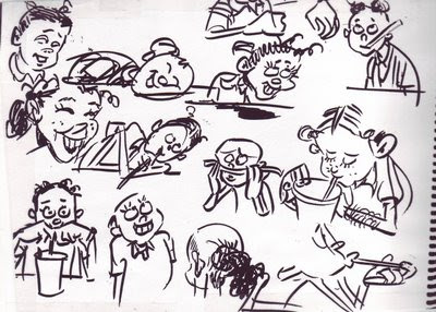
I do. These pictures were assembled from the margins of papers I was doodling on while thinking yesterday. These aren't good drawings but I include them here because they help make a point, namely that without cartooning we'd never be able to record a lot of the little things in life.

I don't know about you but my life doesn't contain many super events. When I'm not working most of my day consists of waiting while old ladies argue with the cashier, trying to eat while driving, complaining about the state of the world, oogling girls, trying to find a pen that works, etc. Illustrators like super hero artists aren't interested in stuff like this. If cartoonists didn't draw it then it would go completely unrecorded by artists.

I just saw a DVD of "Cars" and was struck by how little "small event" acting the film contained. The cars displayed fear of the dark, shyness and awkwardness when the story required it but these were clearly subordinated to the story and were never allowed to dominate whole sequences. For contrast think of how W.C. Fields devoted entire sequences of his movies to micro events like trying to shave when someone was blocking his view of the mirror. 

Wednesday, January 31, 2007

TAKING A COUPLE OF DAYS OFF!


RALPH BAKSHI: HERO

I put up something about Ralph a few months ago but there's a lot more to say about the man than I was able to say in a single post so here I am, telling the same story again in more detail. Everybody knows that Ralph directed ground-breaking films like "Fritz the Cat" and "Heavy Traffic" but a lot of fans don't know what a decisive role he played in starting up the animation boom that started in the late 80s.
If you remember, the animation boom had two causes: "The New Adventures of Mighty Mouse" and "Rodger Rabbit." I don't know the story about how a flamboyant project like Rodger Rabbit ever got OK'd by Disney but I was at ground zero for the Mighty Mouse show. Here's the way it happened....
At the outset of the project Ralph called in his three directors, John K, Bruce Woodside and I, and begged us not to do anything drastic that would get him in trouble with the networks. Ralph explained that he had a reputation as a pornographer because of his X-rated features and was anxious to get a foothold in TV animation where he could turn out charming, beautifully executed cartoons for kids and make a legitimate and uncontroversial dollar. This show was all about building his credibility as a mass-market, quality film maker. He said he knew that we were all chomping at the bit to make something edgey but that we should put a lid on it for a season or two. Later, when he'd proven himself, he'd give us more slack.
I was genuinely moved and resolved to do what he asked for. So was John. We both did relatively sedate first cartoons. They were so sedate that the first show won an award for "pro-social filmmaking" from the then powerfull Action for Children's Programs (or is it "programming?" I can never remember).
The problem was that we had a really hot studio with a lot of gifted artists mostly picked by John. Not only that but John was in the throws of a personal creative explosion. He was always sharp but now that he was in his element, living his dream and surrounded by every physical asset needed to turn out great cartoons, he went into ecstatic creative overdrive. I wish I'd kept the drawings and written down the ideas that came out at lunchtime and during breaks. Every one of them was side-splittingly hilarious! Add to this that Ralph himself was a first-rate cartoonist and could appreciate what was happening even while he was struggling to control it...add that and well, it was a ticking bomb that was bound to explode.
Ralph could see where things were going. He kept reminding us that this show was his nest-egg and that we needed to rope ourselves in but he couldn't prevent himself from laughing at it all. This was a high-stakes game for Ralph and I can only guess at the anxiety all this must have caused him. He must have had moments when he'd wished he'd never met any of us.
I imagine that the network was also getting antsy but, like Ralph, they were also aware that they had something unique and special on their hands. I'm sure the good reviews helped but Ralph still had to spend a lot of time on the phone, soothing things over. At some point in all the complicated negotiations Ralph decided to dig in and fight for the show as it really was. He was no longer pitching it as a harmless show for 5 year-olds but as an unashamedly funny show for all age groups. He crossed the Rubicon. I heard him say to someone in the corridor: "I'm Ralph Bakshi! My name is on this show! I'm not going to put my name on something second-rate!"
Well, the rest is history. Ralph backed up John and TV animation was never the same again. Ralph risked everything to make it happen. He didn't have to do it. He did it because he was a true artist and because, when push came to shove, he had guts and integrity. So, by the way, did Judy Price, the network executive who had to stand up for all this to her superiors; two courageous people that we all owe a debt to.
BTW, the drawings here are all telephone doodles by Ralph Bakshi.

Monday, January 29, 2007

WHAT HAPPENED TO FILM POSTERS?

This (above) is what the film-going public got in 1937.

This (above) is what the film-going public got in 2006. Kinda minimal, isn't it?

This (above) is the kind of poster fans got in 1945...

...and this Above) is what film fans got in 2005. Minimal isn't the word; this new poster is bleak! What a difference 60 years made!

Here's another poster (above) from 1936 . If I weren't so sleepy I'd put up a cool film poster that I found from 1912. Take my word for it that poster artists in 1912 could kick our butts! How did that come about!?


PHILOSOPHY CORNER

UNCLE EDDIE: "Sophie! So you think it's wrong to label people. Tell me why!"


SOPHIE: "It's very simple, Uncle Eddie. Labeling a person reduces them to a simplistic cliche. You don't listen to the real argument people make because you're addressing yourself to a cardboard caricature."

UNCLE EDDIE: "But Sophie, labeling is necessary. Most people's thinking does fall into an existing category of belief, even if they're not aware of it. Recognizing that allows you to take shortcuts and get to the center of their argument quickly."


SOPHIE: "But each man is unique, especially the thinking man. Maybe each individual has his own deviations from the mainstream thinking of his side."

UNCLE EDDIE: "Of course he has his own deviations but it's still usefull to open up an argument by attacking the generalization he represents. This forces the man to quickly shed the indefensible parts of his argument. Doing that clears the air quickly and
focuses the argument on the real areas of disagreement."


SOPHIE: "Hmmmm...I never thought of that before. Uncle Eddie, it's difficult to argue with you. You're eyes...a woman could... a woman could get lost in them."


UNCLE EDDIE: "Many do, inquisitive one. Many do."

Note: Thanks to Mad magazine for the graphics. Buy Mad so I don't get sued.


Sunday, January 28, 2007

YEARBOOK PHOTOS: A DIP INTO MY PRIVATE RESERVE

Here it is, some of my choicest yearbook pictures. Some were xeroxed from the Spumco library, some from my own collection and some (above, bottom right) from my kid's yearbook. Boy, yearbook photography sure has declined in the last 30 years, but I've posted on that subject already.


I don't know about you but these pictures make me want to draw. I womder, besides yearbooks, what other sources contain good pictures of ordinary people?

Saturday, January 27, 2007

ARE THE SUBURBS A FIT SUBJECT FOR ART?

Yes, absolutely! Especially for cartooning! By way of an example how about this picture (above) of a suburban sidewalk by Crumb. The kid looking at the girl with the funny hat reminds me of the Thomas Hart Benton picture of the farmer peeking at a sleeping nude woman. Both beautifully capture a sensual moment and both seem to have something to say about the enviornment the subjects are in. Farms and suburbs are the products of human thought and are therefore charged with sexuality.

Suburbans (above) must go to work, all at the same time. Wood found a rough beauty in that.

A Crumb girl (above) takes time to read her notebook in a suburban greasy spoon. A wonderful depiction of a quiet moment in the city.

This (above) is an old sketchbook page (previously published on this blog) that I did of my daughter when she was a kid. I did it in a suburban fast food restaurant. Life happens in fast food places just like it does in arab street bazaars and picturesque Provence streets. Why are so many modern artists blind to that?


Thursday, January 25, 2007

BOTTICELLI'S PROBLEM

I am sooooo sleepy and I need to do put up something quickly before I doze off at the keyboard. How about this: the incredible backward men's fashions in Renaissance Italy around 1480 or so?

Both of these Botticelli portraits have the same problem, the heads look they're twisted backwards, Exorcist-style. The faces seems to be looming over the subjects' backs! I used to think that the fault was Botticelli's, that he just couldn't draw a decent male chest to save his life, but I think I was mistaken. I've seen the same problem in other portraits from that era. Apparently backwards fashions were all the rage in those days.

I shouldn't be surprised. In my own time I've seen Ultra-baggy pants, stove-pipe pants, Jogging shorts over long pants, maxi skirts, mini-skirts, girls' shorts with lace trim that looked like underpants, camel-toe jeans, fanny packs over stretch bike-racing pants, formal shapeless grey Frankenstein jackets for men, checkered sneakers, cars designed to look like sneakers, girls' goth outfits complete with metal lunchbox and voodoo doll, big combs left in male afros, gold chains worn with T-shirts, tongue studs, day-glow fishnet T-shirts, mass-market shirts with "BUM" written on them. torpedo bras, no bras, penciled-in eyebrows, bee sting lips....well, it would be a long list. What modern person is entitled to look with disdain on the Italians for wearing backwards clothing?

Wednesday, January 24, 2007

CARTOONISTS VS. ILLUSTRATORS

What I'm about to say was inspired by a recent blog entry by John Kricfalusi: "Dan Gordon and What Makes a Cartoonist," on "All Kinds of Stuff," Jan. 16, '07. I congratulated John on the article but when I quoted my favorite parts he was appalled that I seemed to have misunderstood the point he was making. Well, John's certainly the expert on what his intended message was but I still like my own deviation from it, which is presented below.

Using John's article as a springboard I now see character artists in the animation industry as being divided into two camps, the illustrators and the cartoonists. Illustrators, like the guy who designed the Robin Hood fox below, draw beautiful, well-proportioned pictures. Cartoonists (like Mad magazine artist Don Martin, above) draw funny pictures. Obviously some artists can do both but most have a bias in one direction or the other. There's no reason for these groups to be antagonistic, after all a good cartoon requires both skills. The problem is that employers, who are almost never cartoonists themselves, favor the illustrators. After all, illustrators make the most professional-looking drawings. Writers, who often have employer's ear, also favor illustrators. Cartoonists chafe at unfunny scripts and will usually try to finess them. Illustrators make the perfect employee because they actually like the guidance provided by long and usually unfunny scripts, they just want to make the pictures look professional. Anyway, the consequence of all this is that cartoonists have to do a lot of hustling to get work, even in the cartoon industry.

Unfortunately a new group has arrived which is ambivilent to both cartoonists and illustrators: the 3D animator. A lot of 3D animators don't see the point in learning how to draw. They never had time to learn in school because 3D is so labor-intensive and besides, they reason that the people they work for will provide the characters. In my darkest moments I sometimes imagine a world where art school graduates not only can't draw but can't even imagine why anyone would want to draw. I rush to add that this is an admittedly unrealistic fantasy. Anime is coming up fast and is still drawing-intensive, even if it favors illustrators. John Kricfalusi loves cartoonists and continues to train them and at least three studios have put the word out that they're interested in hearing pitches for 2D projects.

Talking about John, I forgot to say why he was so disturbed by my talk about cartoonist/illustrator differences. John believes that there's no reason why caroonists shouldn't be able to draw as well as illustrators, if not better. Cartoonists in the past did it routinely, why shouldn't we? In spite of what I said in the opening paragraphs I have to admit that he has a point.

Tuesday, January 23, 2007

UPDATING SUPERMAN

Superman's gone through drastic design changes in the last 25 years. Here's a few of them...

First of all (above) there's the stocky, Robbie-the-Robot, bag-of-grapefruits Superman. Photoshop highlights abound.


Here's (above) a prissy Superman, done in purple.


Here's a long-haired Superman.


Here's (above) a Jack Kirby-meets-Bruce Timm-style Superman. It's fun to imagine what the comic would have been like if the whole story had been posed as extreme as the cover.


Here (above) is the German Expressionist Superman. I'd have bought this one, just for the weirdness of it.

Here's (above) the Superman-as-Stud Superman. It looks a parody of Wood and Frazetta. If the story inside had matched the cover I'd have bought it.

For contrast here's (above) my favorite old-school Superman artist, Wayne Boring. Boring took the stories very, very seriously. His Superman was manly and heroic, a guy not to be messed with. John K is a big Boring fan. I wonder how many other fans are out there.


SOME INTERESTING MATISSE

This is not going to be a popular post. Most of the people who come here are cartoonists and cartoonists are indifferent to Matisse. Maybe it's because his love of pattern seems effeminate, maybe it's because line artists are instictively hostile to colorists. I don't know, maybe a commenter can explain it.
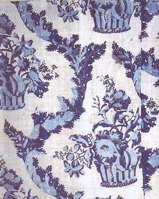
Anyway, I have a real treat for the small handfull of Matisse enthusiasts here. Here (above) is the original cloth that inspired several of his later paintings, including the blue and green painting above (topmost). It's a chance to compare the inspiration with the final product.
The blue and green painting is shocking. The colors seem to burn off of the canvas. I'm amazed that Matisse was able to look at the cloth and derive the ideal of pure, vibrant color from it. Of course to get across the idea of pure color he had to use mixed, textured color. This doesn't suprise me because psychologically intense color is almost always textured. That's why a colorist like Matisse was bound to be attracted to fabric. Hold up a red card then hold up
a piece of cloth colored with the same red. The cloth always seems redder. It may not really be redder but our brains are wired to perceive it that way.
I think we get misled about how color and texture work because we look at the mid-day sky and the sky seems brilliant even though it's only a light, graded blue and seems to have no texture at all. That's because the sky is backlit in a sense. It's all about the difference between additive and subtractive color. A pigment of sky blue (one that really is the same blue as the sky) straight out of the tube won't appear bright unless it's textured.
I'm always surprised that liberated color appears so agressive and so...well, evil and alien. The energy in color is usually locked up and hidden under a matrix of other colors and distractions. When released through texture and contrast it goes wild and seems to attack the viewer. Don't you feel that when you look at the blue painting above? If I were a colorist I might find myself talking to the color as it develops because it definitely seems to have an agenda opposed to my own.
The real excitement in seeing the cloth pattern is in the realization that the alien blue Matisse coaxed out of it was there all along. It makes you see other common objects in a different light.

Just for the heck of it I think I'll throw in a couple of other Matisse-related pictures. Here's an Egyptian tapestry that appears in a couple of his pictures. The wreath seems to spin and inject color into the field around it. I wish I could see the original.


Sunday, January 21, 2007