For a long time I've
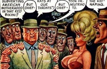
admired Will Elder's watercolor technique in "Little Annie Fannie" but I could never figure out how he did it. Now, thanks to an animation artist named J. T. Quinn I think I understand it.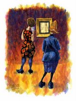
A couple of months ago I stumbled on Quinn's blog called "JT QUINN SKETCHBOOK" and there it was, Elder's Annie Fannie technique adapted to Quinn's own sketch ideas! I recognized the look instantly!
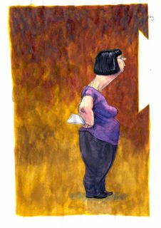
Reading on I discovered that Quinn had taken a class with Harvey Kurtzman at SVA in New York city. Kurtzman taught the class Elder's way of painting watercolors. You build the color slowly with layers of transparent washes. Eventually you get a rich, brilliant glaze then you finish by spotting the most important color areas with a little gouache. It sounds simple but I had to read about it in Quinn's blog before I could figure it out.
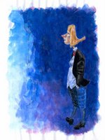
Quinn's a pretty good sketchbook artist. If you visit his blog you'll find the Elder section archived under August 21, 2005.
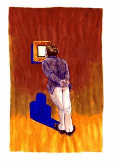
 For a long time I've admired Will Elder's watercolor technique in "Little Annie Fannie" but I could never figure out how he did it. Now, thanks to an animation artist named J. T. Quinn I think I understand it.
 A couple of months ago I stumbled on Quinn's blog called "JT QUINN SKETCHBOOK" and there it was, Elder's Annie Fannie technique adapted to Quinn's own sketch ideas! I recognized the look instantly!
 Reading on I discovered that Quinn had taken a class with Harvey Kurtzman at SVA in New York city. Kurtzman taught the class Elder's way of painting watercolors. You build the color slowly with layers of transparent washes. Eventually you get a rich, brilliant glaze then you finish by spotting the most important color areas with a little gouache. It sounds simple but I had to read about it in Quinn's blog before I could figure it out.
 Quinn's a pretty good sketchbook artist. If you visit his blog you'll find the Elder section archived under August 21, 2005.

11 comments:
Hey Eddie,
a lot of that painting is Jack Davis.
John: Holy Cow! You're right! It is Jack Davis! How could I have missed that!?
whoever it is- those are some rich high chroma colors- really pretty!
I'm perturbed by this claim of a "glaze" appearing over multiple layers of watercolor. This has never happened for me, and I've done thousands of shitty watercolors in my time with numerous products. Are these those special, super-glossy watercolors made by the fine people at Vaseline?
There must be something more to this.
Hey Eddie! Just saw the lost episodes last night.. They are phenomenal!! Watching them inspired me to draw something and I drew a charicature of John.. Check it out @ rmguimond.blogspot.com
Russ Heath told me that he & Will Elder worked together on pages, sometimes Russ would draw a head on one character & Will would paint the head & draw the body, and they'd pass the art around. All this time they were living at the Playboy Mansion in Chicago. I think the environment and the lifestyle was important to get the proper level of concentration
Kent B
Spizz: Maybe you used the wrong colors, or maybe you put them on too thick. A lot of watercolors aren't transparent enough to make a good glaze. Try Alizarin, Taransparent Yellow, Quin...(something) Magenta, or maybe Cobalt Blue.
Cableclair: That's great! But you must have been here before. Your English is perfect!
Ryan: You have to let me use that caricature!
Kent: Fascinating! Imagine living at the Playboy Mansion!
Eddie
Absoultly Eddie! I would be honored!
Eddie,
If anything, I've always gone a little too transparent and watched sadly as what looked wonderful at first got sucked into the paper.
And then there was that stretch where I was using my favorite paper (Arches Cover Buff) from lithography class, oblivious to its demand for more, more, more! More paint, damn you!
Boy, did I feel dumb when I finally cracked that one. On the other hand, it would have been really nice if my watercolor teacher had pointed that out when he examined my weekly shrouds of Turin.
Cobalt Blue? Yuck! Eat, sure, but paint with? No way. I'll have to consult one of my useless books to identify the transparenter-ish colors.
But... this glaze. Do you mean glaze like on a ham? Or a donut? Or like on an oil painting by some guy who's been dead for 400 years? Or is that a "term" that I should know, like "chiaroscuro"?
It can't be the paper--I've used everything, from shirt cardboard to you-can't-be-serious. Brushes, paints, all best quality. Oh! I think I know! I'll just stop using that special water I have shipped in from Perth Amboy, N.J.
Hey, Ryan G.!
Your caricature of John K is great!! I like your other stuff too!
Post a Comment