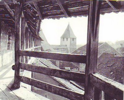
 Here's a few interesting pictures from my picture file. I believe this (above) is the ramparts of an old, fortified town in Hungary. I love this picture because it sucks you in and makes you want to run along the colonnade like a kid. Can't you hear the thumping of running sneakers on the wooden floor?
Why can't modern architects make spaces as interesting as this? The roof tops are fairly plain and unadorned but their placement makes them fascinating to look at. From the point of view of an observer looking over the railing the roofs form a kind of roof city, a mysterious town above the normal town, inhabited by...what? You can't stop your mind from weaving stories about it.
 A cool castle. I don't know anything about it. I swear this castle just appeared in my file without me scanning it in.
Here's a covered bridge (above) in Switzerland. Notice the paintings up in the rafters. Why would anyone paint pictures in such an exposed place? The wood is thick, ships beam/ Ghepetto's workshop wood. Is there anything more beautiful than thick, weathered, structural wood? The sides seem a bit tall to me. Maybe that's to protect users from cold, icy winds that howl down the stream in the winter.

11 comments:
That covered bridge looks exactly like the "picture bridge" in Pasadena that I told you about in your last architecture post.
"The sound of sneakers running along the wood floor" sounds like Ray Bradbury.
See ya
Steve
Great pictures! Those paintings in the bridge are an interesting idea. Did you get these photos from art books? Are there any close ups of those paintings?
I think the big difference between today and then is- everything then was designed for walking- thus lovely walkways, paintings on them etc. Today we have attractions off the side of the road while we're whisping away- thus things to be bigger get out attention.
How come you have so many pictures like these?
Do you know where in Switzerland this bridge is? It looks like one I walked across in Lucern. Actually there are two there, one across a small lake and the other across a roaring river. I also remember there were huge spiders up in the rafters too.
Engineers have the attitude these days that everything has to have curves and be over the top.. If they are all straight lines then what good is a designer? This was a conversation I had with an idustrial designer at my work about an overworked product from another company. Similarly with the bridge, designers feel they have to do something contemporary or artsy..
Everybody: Two of these pictures came from picture books that I have around the house but most of the pictures in my file come from library books. If I see a picture I like I scan it with no purpose in mind. I just like to look at the pictures now and then. My favorite (also the favorite of a commenter) is a picture I posted weeks ago of a rope bridge high above a jungle.
Kali was right, old architecture was designed to be appreciated by walkers. We should do that now. Architects should think about what's fun to experience and not what looks good in a model or a computer simulation.
I can't wait to see the painted bridge in Pasadena. I don't know if the bridge in the photo was in Lucern but I like the idea of spiders living in it.
My God those are beautiful! We tried to do some "stunning" architecture in the "Fortress" area of Tokyo DisneySea - but for the most part, such imagination is sadly lacking at today's theme parks & "location based entertainment" (apologies for the industry buzz word).
That first picture reminds me of some of the great illustrators of the 19th century like Edouard Riou & George Roux...
http://jv.gilead.org.il/rpaul/Voyage%20au%20centre%20de%20la%20terre/v004.jpg
Why do we rarely see illustrators like this any more?
Why did the post cut off my link?
Here it is again:
http://jv.gilead.org.il/rpaul/Voyage%20au%20centre%20de%20la%20terre/v004.jpg
Does anyone out there know if you can attach photos to the comments here?
Tangoroa: Wow! Nice picture! I'll keep the name of the artist in mind!
Eddie
Christ you took those thoughts right out of my head. My first thought on the first pic was 'how fun would it be to run along that balcony?'
I also very much agree about the loss of that kind of imagination in a lot of architecture these days. Nothing personal on architects, really--my geometry as applied to illustration sucks--but I'd like to see something more than a cube made of glass.
I actually think pedestrian-appreciated architecture should come back more.
Plus- Bauhaus happened..
"Hey guys, let's make everything flat and one color! Oh, oh, and let's disregard the thousands of years architectural form language has been developed in favor of a cube house! Forget all that artwork, statues, and skilled craftsmenship!"
!!!!!!!!!!!!!!!
Post a Comment