Saturday, December 23, 2006

MY CHRISTMAS GIFT SUGGESTIONS


I don't have time to write a decent post but I thought I'd make a few gift suggestions for last-minute Christmas shoppers:

1) How about an Extendo Fork and tubing as mentioned in previous posts? I can't think of a better gift and the price is certainly right!

2) One of those long claws with a pistol grip that you use to grab things off high shelves. Mike Fontanelli just gave one of these to a friend and I found myself envying the friend. These grabbers are great for pinching people and waking them up by grabbing their faces with it.

3) The gift that keeps giving...ITCHING POWDER! Best to make it yourself. The formula I prefer: 1/3 electric razor stubble, 1/3 ground-up cat-tail weed seeds, and 1/3 sand or Borax.

4) A copy of my favorite Christmas film, "Shop Around the Corner." Traditional favorites like "Wonderful Life," "Christmas Story," "Miracle on 34th Street" and the Sim's version of "Christmas Carol" are all great films but I've seen them so many times that I had to find something new, even if it was filmed in 1940. Shop Around the Corner is not only a great Christmas film but it's one of the best-written romantic comedies that I've ever seen.

Thursday, December 21, 2006

THE FUTURE IS HERE: STAINLESS SHIRTS!!!!

I wanted to draw the illustrations for this post but it looks like I won't have time so here's a photo instead. I'm writing about clean, white shirts and who exemplifies that for our time more than Saddahm Hussein? It seems like every time I see him he's wearing the cleanest, whitest, starchiest shirt that money can buy. Anway....
I'm writing to announce that science really has come up with a truly stainless white shirt. You can buy them, they're out there now. I bought one because I liked the cut of the shirt but I didn't really take the stainless label seriously. I figured no one would make a really stain repellent shirt for another, oh... hundred years at least. Boy, was I wrong.
Last week I was wearing my new white shirt while eating a big, squishy fast food burger in the car. I wasn't aware of it but the burger was dripping catsup, thousand-island dressing, grease and meat juice all over the front of my new shirt. When I finally realized what was happening it was too late. The stain was huge! It looked like a big, hairy hand had deliberately mashed a pizza into my chest. There was nothing for it but to go through the whole day looking like a bum.
Grief stricken, I steadied the wheel with my knees and grabbed a paper towel to wipe off what I could. To my shock and surprise the towel wiped off everything...not just the onions and pickles but the entire stain! Everywhere I wiped was white as snow, not a trace of grease!!!! I was, and still am, awe-stricken. The future is here! It's time to unpack the rayguns and rocket belts! Now I don't know if the teflon comes off after the first washing or if everyone who wears it will get cancer. All I know is that it worked like a dream the first time I put it to the test. If that's not news, what is?
HAVING TROUBLE READING THE PAGE?

Try coming to the page again and wait for the page to completely download before scrolling down. If you scroll down before the bottom bar says "done" then the page will smear down with endless repetitions of the first sentense.
For comment-writers: If you're a blogger yourself then you better transfer to the new Google-influenced system ASAP. If you're on the new system then when the comment box asks for your user-name and password you'll type in your new Google codes. The new user-name is always an internet address like bsykes@eartlink.com. The password is the new password you invented for Google when you tranferred from the old system.

If you want to comment but you haven't switched to the new Google system yet then I suppose it's OK to do everything the old way.

The new system is both better and worse. You get more bandwidth and it publishes real fast but it has some annoying idiosyncricies. On the comments page I'm constantly having to click off windows that warn me that letters might originate from unsecured senders.

Wednesday, December 20, 2006

THE STEPS OF WELLESLEY COLLGE

The building above is pretty lackluster but I'll forgive it because it contains a killer tunnel and staircase. You can see the entrance to it in this picture. It doesn't look like anything yet but keep walking.

The little staircase on the side acts as a pivot which orients you forward. There's a tantalizing glimpse of something at the end of the tunnel.

You walk toward the light, smelling the tunnel and feeling the broad, horizontal sweep of it. The image at the end gets more and more interesting. Like a stripper it only gradually reveals itself.


The steps don't rise evenly. Everytime you hit an especially interesting view the architect prolongs it by flattening the steps.

You climb the steps and the churchtower is dramatically revealed.

The reveal was so exciting that the full view almost comes off as an anti-climax. Neat, huh?


Tuesday, December 19, 2006

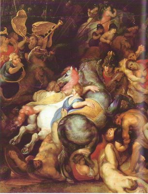
MORE OF THE INCREDIBLE PETER PAUL RUBENS

I don't have the bandwidth to comment so here they are, unaided by me. Click to enlarge! These won't look very good small.


Monday, December 18, 2006

THE BEST CHRISTMAS PRESENT

Nobody ever takes me seriously when I say this but here goes: the very best adult Christmas presents are....fuzzy slippers and cheap perfume for a woman and a wallet or a tie for a man, even if he has no money and never wears anything but tee-shirts. I'm not kidding, these really are good presents! Presents are meant to be symbolic. If you stress out over finding just the right present for every friend and family member you'll never enjoy the holiday.

If you're like most people and you think what I wrote above is crazy or irrelevant then here's my fall-back suggestion: give the person something completely unrelated to what they're interested in. It has to be something good mind you, something that's the best in it's field, but something the person has never even thought about. I don't smoke and I'm not really interested in cigars but I have to admit that I'd be curious to smoke what people in the know consider the best cigar. Maybe smoking isn't really a filthy habit at all if you smoke the right stuff.

On another subject, Chrismas shopping is sooooo stressful. I still don't know what to get my wife! Every year she always says, "I don't see why you're having so much trouble getting me a present! There's only two things I don't want: don't get me anything useful like an appliance because everybody benefits from that and it's not personnal. And don't get me something that's not useful because the house is filled with stuff like that already. Absolutely anything else would be fine!" And every year I always answer with gritted teeth, "What are you talking about!!!???! Every single thing in the universe is either useful or not useful! There IS nothing else!" This is an irreconcilable conflict.

Sunday, December 17, 2006

MIDNIGHT AT THE HOUSE OF PANCAKES

Two strangers (Kali Fontecchio & I) enjoy an idle cup of coffee...


Uh-oh! There's always an angry boyfriend....


That's it! There's more pictures but I have no more bandwidth! You can see the whole thing, including Kali's boyfriend beating me up, at Kali's blog where I swiped these:

http://kalikazoo.blogspot.com/

Saturday, December 16, 2006

A CHRISTMAS PRESENT FOR EVERONE ON THE BLOG

Here it is, a detail of "Clara Serena Rubens" by Peter Paul Rubens, circa 1614. Be sure to click to enlarge. Rubens made this portrait of his daughter when she was about five years old. She died when she was twelve.

The book I got this from, "Rubens A Master in the Making", calls this one of the freshest portraits in all of Western art and I know of no reason to disagree. Rubens was an amazing guy. He always painted the greatness in man. Never anything shabby or second-rate.

Here also is my Christmas card to every one courtesy of Vincent Waller. Thanks Vincent, and Merry Christmas everybody!!!!!!!!!!!!!!!!!!!! http://www.elfyourself.com/?userid=d46d1179b2cbbd0ec2f5e30G06121418

HOW TO IMPROVE YOUR PAINTING OVERNIGHT

I just watched Charles Reid's "Portraits in Watercolor" video and I have to say that I was impressed. Reid's technique is interesting but it's his mannerisms that really caught my eye. He seems to be a very nervous painter. The jerky, too-quick way he mixes his paints on the pallete, the way he brings the pallette up to his face, the way he almost seems to talk to the canvas under his breath all give the impression of an obsessed, crazed artist.

I don't mean to imply that I think Reid is crazy. He's not. But I admire him for taking on the attributes of a crazy person when doing so forces him into a greater intimacy with his picture. . Painters should curse at their pictures. They should engage in an angry, energetic and exhausting fight with their canvases. There's plenty of time to relax later when it's clear that the picture's going to work. The time of heightened risk, when success or failure hangs in the balance, should be supremely stressfull. Patton was right when he said the soldier who can loose and laugh wasn't much of a soldier. You should be so keyed up when drawing or painting that a dropped pencil or a ringing telephone would make you jump to the ceiling. Art is a serious business!

Wednesday, December 13, 2006

DAVIS & KURTZMAN DRAW THE SAME STRIP

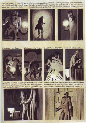
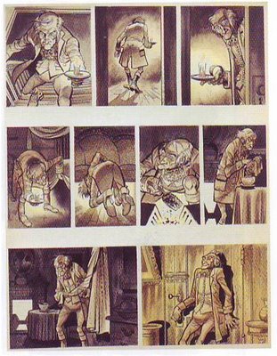
Kurtzman wanted to pitch a comic book version of Dickens' "Christmas Carol" but after doing one page he decided the project was more likely to sell if he brought in Jack Davis to do it. Consequently we have the same page, even the same panels, done to a finish by two interesting artists. Which do you prefer?


I should mention the book I got these from but I can't find it. The title was something like "Interviews With Artists."

ITALIAN FASCIST SCUPTURE

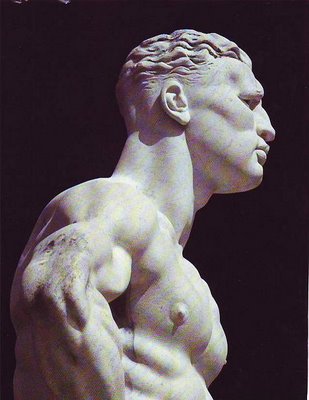
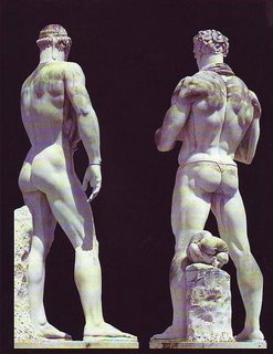
These statues were commissioned by Mussolini to decorate The Mussolini Forum, which was to house the 1944 Olympics before WWII intervened. As decorative sculpture they're not bad; as art...well, what do you think? Me, I'd say no. The technique is highly professional rather than artful and there's no transcendant quality in them.

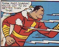
The statue above (topmost) put me off when I first saw it because it seemed to be glorifying a bully or a thug. I think I was wrong because beefy guys like that have been universally admired since the 30s. Even Captain Marvel (above) used to look that way. If you look close you can see some sensitivity and intelligence in the statute's eyes.
These are physiques (above) that I associate with Nautilus machines. I used to think exercizes that emphasize specific muscles were a modern invention but you see figures like this in Rubens and other old masters so I guess I was wrong. The guy on the right looks like he had a killer bowel movement.

I like this kind of manly sculpture (above) but the hair looks like it was turned out without much thought. Zaidenberg (the 40s how-to-draw author) used to draw deco hair like that using charcoal to make quick, chisel strokes. Ruskin in "Seven Lamps of Architecture" warned against schlocking what appears to be unimportant details like the hairline. I think he was right.

Tuesday, December 12, 2006

DISNEY'S NEW GOOFY CARTOON


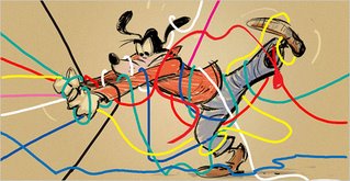
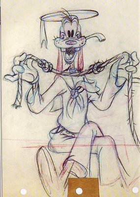
Warning: I'm about to criticize a cartoon that I haven't seen yet (it hasn't been made), that I've only seen two tentative concept drawings from (one shown above, topmost), and whose story I only know from a description in the newspaper. Not only that but I'm terribly hurt that they didn't ask me to work on it so I may, without knowing it, have a mean, small-minded desire to snipe at it from the sidelines. There, that's my disclaimer. Now the criticism...

I have to say that I'm wondering if the project is getting started on the wrong foot. According to the newspaper the story is about Goofy's attempt to install a new, high-tech TV in his house. Is that really a good idea? It's the type of premise that has no suprises built in. The gags and the acting could all be predictable. Not only that but it's a frustration story and frustration premises (like Pluto and the flypaper) tend to pass on their frustration and unease to the audience. When you think about it, the best Goofys - the ice hockey, football, and basketball cartoons, aren't about frustration. They may seem to be, but they're not.

On another subject, it seems to me that subtext of every good Goofy cartoon is the weird universe that Goofy inhabits and the delight the character takes in doing things with his amazingly agile hands and feet. The character is a full-animator's dream. He's also a physical actor's dream. Goofy is not the average guy next door any more than James Bond is the average spy. Goofy and Bond are hyper-characters and anything less than star-quality scenes will diminish them. Goofy can either exude charisma and magic as in the best Kinney cartoons or he can be a bland guy-next-door-type the way Reitherman treated him. Which way will Disney go? I guess we'll see.

Thanks to Amid's "Animation Blast" for the excellent Sibley animation drawing above. Drawings copyrighted by Disney.

Monday, December 11, 2006

PARTY AT THEORY MANSION!


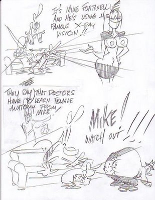
Gee, I guess that's the end of the party. I gotta get Mike to a doctor. If you don't have a ride home just sack out on the sofa! See ya!

Saturday, December 09, 2006

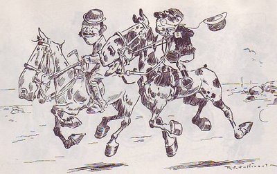
T. S. SULLIVANT: GENIUS

This isn't a post, I just wanted to put these pictures up for friends. Beautiful aren't they?

Thursday, December 07, 2006

PARTY INVITATION!

But to ease the pain of two days without Theory Corner......


I invite everybody to a party at the world famous THEORY MANSION (above)!!!


Tuesday, December 05, 2006

PLAYBOY'S LATEST CARTOON ANTHOLOGY!

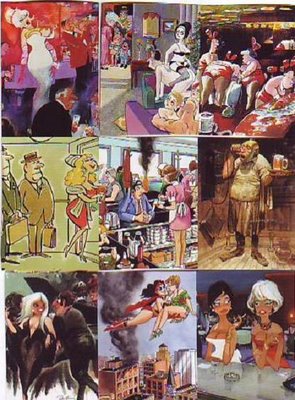
The best current book bargain I know of is "Playboy 50 Years: The Cartoons" which originally sold for $50 and is now an overstock selling at Barnes & Noble for $13. The colors have been "remastered", i.e., simplified and drained of their subtlety, but for thirteen bucks, hey, it's still worth it!
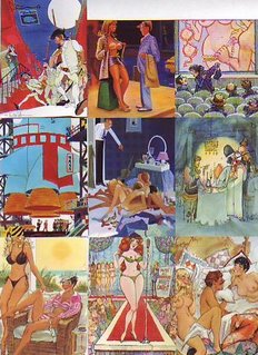
I organized a few of the better pictures above (topmost) by colorists I like: Sokol, Dedini, Davis and Kliban. I also put together a collage by artists whose colors I like a lot less (above) (come to think of it, the center artist above isn't bad...he should be in the "good" pile). What's the difference? Why are the colorists on top so much better than the guys below?

Right away I can see the better artists use a lot more darks. Most of them also use more white. The good ones also seem to have a bold plan while the lesser artists are content to use whatever seems unoffensive. The red, white and blue schemes don't work...maybe they'd look better with more pure white areas.

 
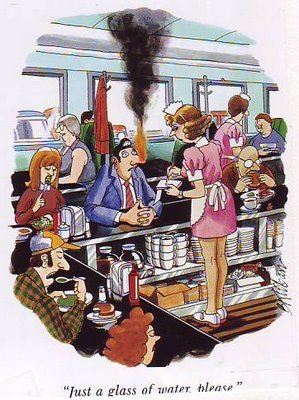
Nobody ever talks about Kliban's color but the examples in the book are all first-rate. His color is funny, it actually enhances the gag. This restaurant picture is especially good but I can't figure out what the color's doing. Anybody care to venture a guess?

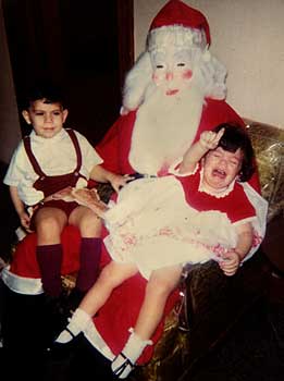
IT'S HARD TO BE SANTA!

Steve Worth just sent me these Santa pictures and I pass them on to you. Man, it must be hard to be Santa! The guy on the bottom has the worst job, he has to wear a mask all day!