Monday, December 10, 2012

MY NEW CAMERA

That's Auralynn (above), taken with my old Canon Elph snapshot camera. It's nice isn't it? Auralynn is naturally friendly and cheery and the camera did a good job at underlining that.

I loved that camera, it just wasn't great for low light photography, so on Black Friday I got a new one...a later model of the Elph, the 510 HS. I'm trying it out now, and I have to say...I'm having trouble with it.


 For comparison, let's try similar shots with both cameras. Here's (above) a shot I took a few months ago showing Auralynn leaning toward my old camera. Wow! The skin tones came out perfectly!


Here's (above) a similar shot taken with my new camera...the same restaurant, roughly the same time of day. GOOD LORD!!! Look how grotesque I look!!!! Okay, I don't have Auralynn's looks, but I shouldn't have come off this bad. I look like a gnarly old bridge troll!

Not only that, but....am I imagining it?....no, I don't think so....the camera actually made me look a bit....evil. Can you imagine that? A little party camera that makes its subjects look like the Spawn of Satan!!!!


Here's (above) a new picture of Auralynn, made with the new camera. The camera did its best to make her look evil, but she resisted and won the battle...this time. I shudder to think what awaits in the future.


Here's Mike's lamp table, also shot with the new camera. I must have had it on the Bloody Crime Scene mode. Mike's figurines all look evil. 

Alright, I admit I'm not being fair...I just haven't learned how to use the camera yet. I hope that's the explanation. If it isn't I'll just have to reset and specialize in pictures of life's seedy underbelly.


Thursday, December 06, 2012

CARL REINER: GENIUS


Here's Carl Reiner's pilot (above) for what would later become "The Dick Van Dyke Show." Poor Carl. The studio execs hated it. And justly so...it was just too generic. Fortunately Danny Thomas, who had his own production company, saw the potential in it and asked his producer Sheldon Leonard to give it a second try. That second try would make a BIG difference.

I thought it might be fun to compare the two versions. I'm cheating a little because I'm illustrating the second version with the seventh episode of the series just to make the contrast greater.


Here's (above) the way the way it looked after Leonard finished with it. He replaced Carl with Dick Van Dyke, brought in Mary Tyler Moore, Morey Amsterdam and Rose Marie, shot the series with a live audience at Desilu which used an innovative three camera technique, and picked powerhouse John Rich to direct. Carl was re-assigned as a producer, which effectively meant Story Editor with strong creative influence. Leonard saved the show.

 Now we all know Carl Reiner was an immense and flamboyant talent...look what he did with Sid Caesar...but when he had a chance to do his own show his own way he was strangely timid. He apparently needed other people to create an environment where he could come alive and be himself. That's what Danny Thomas and Sheldon Leonard did for him. They wanted to streamline the structure so Carl's personality could shine through, unencumbered. Wow! There were some good producers in those days!


One last thought: you're probably thinking that Dick Van Dyke and the rest of the cast were the true stars of that show, not Reiner. That's only half true. Somebody had to do for Dick Van Dyke what the executive producers did for Carl. Reiner made it possible for Van Dyke to shine. He gave Dick lots of physical shtick to do...more than any other sitcom would have allowed...and he carefully built up to the physical stuff so it would have maximum impact.

Take a look at the extended physical comedy in the scene above and remember...somebody had to allow that to happen. Somebody had to encourage it. Somebody had to give it context, so it wouldn't seem like a digression. That was Carl.


Monday, December 03, 2012

TOY COLLECTOR (PART II)

INT. MIKE'S TREASURE ROOM: IT'S FULL OF CARTOONY TOYS:

EDDIE (VO): "HOLY MACKEREL! I never expected anything like this!"


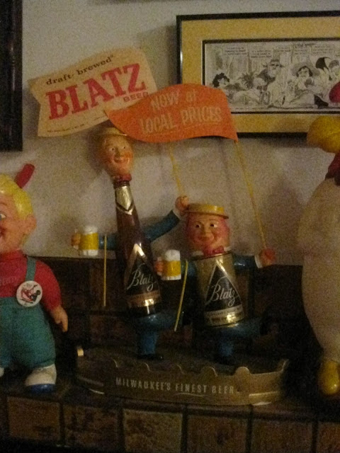
EDDIE (VO): "(Gasp!) Look over here! It's a Blatz Beer display! Why doesn't anybody make things like that anymore?"


EDDIE (VO): "And over here...Al Capp figurines! They must be rarer than hen's teeth! Mike, take a look!"


MIKE: "In a minute, Eddie. I need to pause to pay my respects to fine art." 


EDDIE (VO): "Whoa! A Davy Crockett hat! How cool is that!!???"


EDDIE: "Wait a minute! What's that, up there?"


EDDIE (VO): "Holy Cow! It's a cartoony Indian, and it's hilarious! If only you could buy things like that now!"


EDDIE (VO): "An Al Capp Indian! Ooh, my cup runneth over!!!!"


EDDIE (VO): "Yikes! Am I imagining it, or is the Chief smoking?"


MIKE (VO): "Sure he is! Lots of cartoon characters used to smoke!"


EDDIE (VO): "(Gasp!) And over there...it's Darn-Old Duck...and he's smoking, too! Waaaait a minute...that's a real smoke in his mouth! YOU put that there!"

MIKE (VO): "Busted! He just looked better with a cigarette!"


EDDIE (VO): "What the?....across the room...what's that figure on top of the heap?"

MIKE (VO): "Oh, I was saving that for last. Let's take a look."


MIKE (VO): "What do you think?"

EDDIE: (VO): "(GASP!) A thing of surpassing beauty. I'm awed."


Sunday, December 02, 2012

TOY COLLECTOR

EXT. MIKE'S HOUSE: STORMY NIGHT: 

EDDIE (VO): "So you're finally going to break down and show me your Secret Stash...the legendary vault where you keep your best collectibles!"

MIKE (VO): "Yeah, well I got tired of you pestering me about it."


INSIDE THE HOUSE :

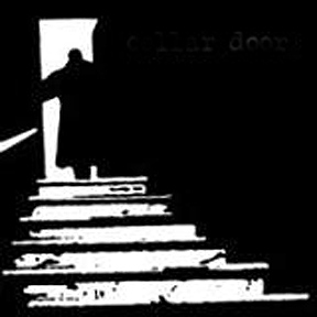
MIKE: "Okay, the way down starts behind this curtain. Are you sure you want to do this? You can still back out!"

EDDIE (VO): "Are you kidding? This is the chance of a lifetime! Lead on!"


MIKE: "Alright, follow me, and stay close. Don't touch anything!"


EDDIE (VO): "Geez, it's cold in here!"

MIKE: "It'll warm up."


EDDIE (VO): "Yikes! WHAT ARE THOSE!!!!????


MIKE: "They guard the stairs. Just step over them very, very quietly. 

EDDIE: "Er, Mike, I think I changed my mind. I wanna go back!"

MIKE: "Don't be silly. Keep going!"


EDDIE (FRIGHTENED) (VO): "W-what do you feed these guys?"

MIKE (VO): "Nothing. They eat intruders!"


MIKE: "This way! Be sure to copy every step I take exactly!""


EDDIE (UNCOMFORTABLE) (VO): "Haw! That was a great joke about eating intruders! And look at those fake signs! Haw, haw! I mean...heh...nobody ever gets hurt here for real, right?"


MIKE DOESN'T ANSWER BUT HUMAN REMAINS ON THE CAVE FLOOR TELL THE STORY.


MIKE (VO): "I told you it would warm up! Don't let the dragon know you're scared. Be very calm.  Tell yourself that you belong here."


EDDIE: "I belong here! I belonghereIbelonghereIbelonghereIbelonghere!"


MIKE (VO): "Okay, we're here."


MIKE (VO): "A couple of turns of the key, and......."


TO BE CONTINUED


**************************************

BTW, Thanks to Jack Benny for the great ideas!


Thursday, November 29, 2012

CHRISTMAS GIFT FOR A BOY


If you're looking for a Christmas gift for a boy, you could do no better than to give him a rousing poster of sea battles in The Age of Sail. 


Here's (above) a detail of the famous painting depicting The Battle of the Nile in 1798.

It occurred shortly after Napoleon succeeded in dodging Nelson and successfully landed his troops in Egypt. Nelson arrived right behind him, ready for a fight, and immediately engaged the French fleet in the harbor. The French made the mistake of arranging their warships in a singe line and the British arrayed themselves on either side of it, catching the French in a crossfire. It was a big victory for Nelson.

It looks like the painter was prevailed upon to paint a duplicate (above) of the Nile picture, only in more somber colors. 

Nelson was afterward involved in another battle with the French off the coast of Syria. Britain won but Nelson was seriously wounded. Oddly the battle was most famously commemorated in a poem called "Casablanca" written by a British woman about the bravery of a French boy who fought for the other side. For a hundred years the poem was read by every schoolboy in the English-speaking world, but it's now largely forgotten.     


My guess is that this one (above) is of The Battle of Trafalgar. Wow, massive ships of the line going at it, fang and claw.


Is this Trafalgar again?


I'm guessing that this one (above) is of Drake's ships vs. The Spanish Armada.


What is this (above)? The ships look like frigates. I'll guess that it's a scene from a battle on The Great Lakes, but I'm probably wrong.


I have no idea what this (above) is. Are those Congreve Rockets...the kind that Britain used against America in The War of Independence? Maybe they're just red-hot shot.

Unfortunately battle posters are often small and expensive...why, I don't know...but bargains must exist. Give it a try.

*************************


On another subject, have you seen this video yet?  'Chances are you have, but just in case.......

Wednesday, November 28, 2012

ARTISTS' HOMES

You expect artists, especially painters, to live in strange-looking houses (above), and thankfully some do, but most live in more sedate environments. I'm glad that at least some painters live in houses not far removed from the kind the rest of us live in. That way we ordinary people can benefit from seeing how painters transform ordinary houses, and make them seem special.


So here's an ordinary home (above)....very cheerful, very neat....


 ...and here's (above) a painter's house. Not cheerful exactly, but very cozy.


It looks like a place where way too much marijuana gets consumed, but I like the emphasis on color. You can see the influence of South America and India.


This house fairly shouts, "A hippie artist lives here!"


A number of California painters I've met live in bungalows (above). I wonder if the price  above was, more than a hundred years ago, the asking price.

.
Maybe it was the cost of the plans. A lot of people built their own houses from mail order designs.


Bungalows I've seen (above) had pretty good landscaping. Artists are good at stuff like that.


Good bathrooms, too.


Sorry about the girl. I looked all over the net for pictures of the kind of Bungalow bedroom I was looking for, and the only one I could find was this one, which is "R" rated.

If you can bring yourself to look past the model, notice how simple and beautiful the room is. The dark brown of the wood, the detailing on the windows, the colorful bedspread, the tactile rug, the human scale of things...it's a great look. You'll never see rooms like this in Architectural Digest. These rooms weren't meant to be fancy. They were meant to look lived in. Artists thrive in places like this.