Monday, December 14, 2015

RAMBLING THOUGHTS ABOUT ARCHITECTURE


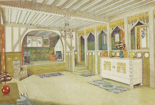
Hmmmm. I've decided that what I really want to live in is a converted 19th Century railroad station like the one above, but (Sigh!) what's the chance of that?


 Of course, a neo-craftsman house would be nice, too.

So would a one-of-kind artist's house like the one Carl Larsson built for himself!


Here's the same house with the color pumped up.


Wouldn't it be great to have a family room with a built in theatre like the one above? All family rooms should include a stage.


 On another subject, I take a lot of abuse from friends who don't understand why I like Ikea so much.  For them the store (above) is just a repository for cheap furniture. They're not getting the revolution that's happening there. Ikea is taking apartment design and applying it to homes. There's a youthful,  just-getting-started-in-life quality to some of the dioramas you find there, and I find them exhilarating. .


Traditional living rooms (like the blue room to the right) are meant to be fortresses against the world. They're a place of rest. The presumption is that you've had a hard day at work and just want to read the paper or watch TV. Not so the Ikea living room. Their living room is a place to work and think as well as rest. It's meant to be stimulating. That's the real revolution that's happening in architecture now, and no large company embodies that more than Ikea.


On my last trip to that store my mind was blown by the room above. Look at those greenhouse struts; you could hang anything on them! The room is so playful, so adaptable to any use you might have for it, and yet it's right next to the kitchen which is meant to be functional. In a real house you'd probably choose to have a permanent eating spot close by, but to put an anything room off to one side is pure inspiration!


Saturday, December 12, 2015

FUNNY SCULPTURE


When I first discovered the funny art of ancient Mexico I found myself wondering how it ever took root there. After all, the funny people had to live side by side with violent neighbors like the Mayans (above) and the pathologically aggressive Aztecs. But I checked and my timeline was off. The funny cultures thrived in the pre-Mayan, pre-Aztec era, before the time of Christ.


In that placid era they had time to play with their pets...


...and make fun of their goofy neighbors. 


Some of the caricatures were startlingly specific.


Pocket-sized joke sculptures were all over the place.

Every physical type was lampooned.


Women too, particularly women with thick legs. 


Of course males liked to sculpt sexy women. Who knows, maybe there was a religious reason for it. 


Haw! As time went by high-minded reasons might have become secondary.


My guess is that there was a thriving business in tiny porn sculpture. Was there a Hugh Hefner of that era? Were these figures sold "under the counter" in the marketplace?

I like the flat-on-their-backs, rigor mortis-type poses in this (above) example. Two thousand years later accountants may still be doing the deed this way.


Cultures that value comedy always strike me as being on the path to liberty and progress, but Mexican humorists lived in an increasingly rough neighborhood and, well...the rest was history.

Wednesday, December 09, 2015

CHRISTMAS GIFT IDEAS

Marionettes are a great gift. The hand-carved ones can be pricey, though. The one above costs $1100!!!!  It's worth it if you have the money, but if you don't there's no shortage of worthy mass produced ones...or you can make one yourself out of cardboard.

 How about a John K t-shirt!?

How 'bout a John K doll?


...or a Calder-type mobile? The knock-offs aren't always designed well, but now and then a decent one pops up. If you can't find one worth buying you can make your own. There's some good YouTube instruction on the subject.


Calder also did a lot of wire sculptures (above). I made some myself using my own designs and they turned out great! I had them (sans wooden stand) in the window for years. All you need is wire, needle-nose pliers, and something to bend the wire around like a board with a nail in it.


Framed fine art prints make a good gift. Use glass or vinyl in the frame only if the picture is light-colored.

I like Mexican dioramas. I have a little one similar to this (above) on my bulletin board.


How about a framed picture of Doberman's Sister (above)?


It'll look good next to your friend's picture of Percy Dovetonsils.


Or his picture of Ben Turpin.

Or Reggie Van Gleason.


Last but not least, how about an Edith Piaff CD? Everybody likes Edith Piaf!

Tuesday, December 08, 2015

HOME DESIGN

I'll probably be moving in February or March. We haven't started to look for a new house yet, but I'm hoping for something like the one above: a nice old gabled house on a cliff overlooking a valley...servants quarters...a stable in back.


Haw! That's what I want, but what I'll get will likely be something like this, above. That's okay...even modest new houses have improvements that would have been unheard of when I was a kid: big kitchens, unusual room shapes, the home office, lots of daylight, etc., etc. 


I've been reading about the history of home design and I'm amazed to see how many ideas that we take for granted are fairly recent. Believe it or not, comfortable chairs are a fairly recent idea, and even corridors...corridors!... are recent. Until the last 100 years or so you accessed your room by passing through other rooms to get there. Even Versailles (above) was built like that...well, mostly.


What I really want, and I'm afraid I may not get, is a nice, old fashioned front porch. I spent half my childhood on porches like that and I got some of my best kid ideas there. Who invented porches, anyway? I mean raised, front porches...the deep, spacious kind with a permanent roof. I think of them as an American invention, but maybe I'm wrong.


Pity the British poor. They had not only had no porch; they had no roof of any kind over their front doors.


Wait a minute, what am I saying? Pity the British rich, too! They had the same problem. With all their money the rich still had to stand out in the rain while they fished for their keys just like everybody else. Britains just don't believe in a sheltering roof over the front door.


Even the prime minister is expected to stand out in the rain while he waits to be admitted. How odd. Why not a porch? Why not recess the door inside the building?


But maybe I'm too quick to criticize. In the part of the U.S. I'm moving to there's very few porches, and very few foyers either.  The front door (above) just lets into the living room. No transition area, no greeting spot. A person coming in the door in the cold of winter lets in a gust of wind that probably sends every paper in the room flying. Yikes!


Friday, December 04, 2015

PINNOCHIO'S DARING JOURNEY


I had more to say about Disneyland than I could fit into Monday's post, so I'll write about that today.  What struck me on the last visit was the architecture of the Pinocchio ride, "Pinocchio's Daring Journey." I was amazed to see how many iconic details were packed into it. Everywhere there were turrets and towers, carved and painted pillars, flower boxes on balconies, colorful pennants of all types...well, it would be a long list. Suffice it to say that Central European motiffs were well represented there.


Inside (above) the architectural compression was even more extreme. Parts of faux buildings overlap and interfere with each other as if an earthquake had pushed them together. I found myself wondering if real-world business buildings could be made like that, I mean with tumbling block shapes. Would they be disorienting for the real-world people inside? Could they be made cheaply? I don't know.


I love this picture! The whole foreground and middle ground is a sort of art-directed tunnel in which cars on rails ratchet up to the front under a canopy of colorful shapes. It's all carefully lit like a Hollywood set with natural sunlight providing a counterpoint. The focal point, what everything points to, is a mysterious dark cave where we glimpse a warm-colored...something.


The car we're sitting in takes us into the cave and up to the something, which turns out to be dancing puppets (above). I love that double proscenium arch with the carving in the middle. I don't think that design was used in the movie, though.

 
The proscenium in the film (above) was simpler.


The ride fills the viewer with enthusiasm for puppets. You'd think the ride would let out into a store where you could buy puppets, but it doesn't...a missed opportunity in my opinion. Fantasyland desperately needs a good toy store where puppets of all kinds can be had. Most of the Pinocchio toys sold at Disneyland are plush dolls, which are inappropriate.


They should sell posters, too, like the one above.


The Pinocchio ride ends with a ride through Gheppetto's workshop where unique wooden toys are on display. Toys like that should be on sale.


One more picture (above) and I'm out of here....whaddaya think of these pennants? I'm considering making something like this for my workroom at home.


Wednesday, December 02, 2015

NEW PHOTOS OF PLUTO

The New Horizons probe has been slow to send back its images of Pluto, but they're coming in now and they're exceeding expectations.

Here's (above) an Everest-type series of mountains next to what appears to be a lava lake or a glacier.

Here's (above) the remnant of a shield volcano. It's possible that the lava coming out of Pluto's mantle was liquid water. 


Here's (above) a field of craters, most of which are about a kilometer across. They're not impact craters, but are cheese-type holes only ten feet deep in a bed of solid nitrogen. 


 Above, the five moons of Pluto and their relative sizes.


Above, that's Charon, the biggest of Pluto's moons. It's half the size of Pluto which makes it the largest moon in the solar system relative to the size of its host planet. This is an astonishing photo because it reveals a world which is divided into two distinct parts separated by a belt of stress cracks.

Seeing this reminds me of the speculation that Earth once had two moons, one following behind the other in the same orbit. The smaller moon caught up with the larger one and slowly squashed into it with the result that today half of our moon has a substantially thicker crust than the other half.

I call this speculation because there's another scenario that might also explain the thinner crust on our side. Advocates say that early on, our moon was closer than it is now, and was heated by the newly formed molten Earth. The heat softened the moon's crust on our side allowing volcanoes to spew out lava that changed the surface of the side facing us. This explanation has less credibility for me because it would lead to a thickening on our side, not a thinning, which is what we see.

Anyway, the squashed appearance of Charon lends support to the idea that some sort of gradual collision happened there.


That's all I have to say about Pluto, but I can't resist putting up this photo of Phobos, a moon of Mars. Phobos is much closer to Mars than our moon is to us, and it appears to be spiralling in for a crash. The white smears on the right are thought to be stretch marks as the moon is being pulled apart by tidal forces.

My source for this photo didn't include an estimate for the time of impact, so maybe it's no time soon. When it occurs the debris is expected to form a ring around the planet.