GREETINGS CARTOON FANS!
Thanks to friends John & Kali I'm able to post a real discussion of animation with lots of examples and not just a couple of stolen frame grabs. I even have a link to a film clip at the bottom! I feel so adult!
OK, enough gushing! Let's get down to it!

This is Porky on the doorstep from Clampett's "Kitty Cornered." This was the first Clampett I ever saw and when it came on my jaw practically dropped to the floor!
I was used to pose to pose animation where the inbetweens were just technical necessities. I didn't question that, I just assumed that animation involved a certain amount of tedium and there was no way of getting around it. Now here, in front of me, was a whole different way of animating! Here the animator (Rod Scribner) did his own inbetweens. I was shocked! It not only worked but it was fall-off-the-seat funny!

Most of the poses on this post are inbetweens. I had to leave out a lot to conserve bandwidth, but you can see that Scribner is cartooning like crazy, throwing in every funny idea that could fit. The pose above with raised arms reminds me of the old Keystone Cops poses that you used to see in newspaper comics. I love how Porky's fat little body compresses here. Look how delightfully seedy his eyes are!

This (above) is the kind of toothy, squinty expression you only get in inbetweens. Inbetweens should look like inbetweens. They should show all the transitory little emotions between the major emotions. Even a sad person will have a happy inbetween or two and visa versa.

Here (above) Porky struggles to get the word out. Even if he didn't stutter he'd have to struggle. We humans communicate with grunts and whistles from our lips and voice box and getting it all out past the mushy part of our muzzle requires an effort!

"OH BOB! YOU WERE SO GREAT! HOW DID YOU AND SCRIBNER THINK OF STUFF LIKE THAT!!!???" Oh...uh... pardon. I lost it for a moment.

So here's the pig again! He pushes out toward camera with his mean little baby face...

Then he antics back, looking very much like a human all of a sudden (as all animals should periodically), then...

BAM! A really explosive thrust outward (above) with big, dilated eyes and killer arm positions! Those arms work great with the bowed legs. Scribner was a great cartoonist as well as a great animator! What a dynamite combination!

Oops! He withdraws into a little compressed ball of peevish anger. Somehow we become aware of the nightshirt again.

His muzzle (above) prepares for another outburst. The cheek muscles pucker and stretch in preparation for forcing the words out.

A big antic (above) allows us to see how large the cranium is. The arms fly up as if to do another Keystone Cops pose but instead...

...instead he grabs the air like a baby and diddles it! And wow, look at the far away stare in Porky's eyes!

Is the anger dissipating? Sort of! Here's (above) another classic inbetween face showing the tired, squinting eyes again. Emotion is very tiring for us and we have to go into near sleep between emotions sometimes, even when we're excited and in the middle of broad action.
The world of inbetweens is a strange, surreal world where characters' real emotions hold sway. It's the world that would exist if all of us were prevented from taking stock poses to impress other people. It's the world of the ego rather than the super-ego. It's a place where people flash angry, infantile, ridiculing, lecherous, acquisitive, stupid poses at each other. In a funny studio the inbetweener would be a respected professional possessing great and mysterious secrets about the human condition.

Back to the cartoon: Porky snaps out of his reverie into this hilarious Joe Besser fists-up-to-the-cheeks pose. I like hands that hug the face. After all, the face is the master, the controller. What could be more natural than to have its minions nearby?
Gee, I must sound crazy talking this way. Anyway, it's a tribute to Bob Clampett that his cartoons stimulate discussion like this. I'm a huge fan of Jones and Avery but their animation is pretty straight-forward and not as nuanced as what Clampett and Scribner did.
Here's (below) the Porky on the step animation!
CLICK ON THIS TO SEE THE FIRST EVER OFFICIAL CARTOON CLIP!!!

OK, that's enough for one day! Return to your work-a-day world secure in the knowledge that you're a new man (yes, even if you were a woman before)! You've been up to the mountain! You've been refreshed at the fountain of Clampett!
 I'm reading a few books at once as I always do. I'm still reading "Animated Man" and I just finished Mc Bride's famous (some would say infamous) book on Frank Capra. Here's one of the books I have on my bed stand: "The Worst Case Scenario Survival Handbook: Extreme Edition." Have you read any of these Worst Case books? Are they serious?
 Here's (above) my favorite chapter: "How to Escape From an Angry Gorilla." The situation is that a gorilla has grabbed your arm. Maybe he's doing it to be playful, maybe not. There's no way to tell. You have no choice but to assume he's hostile. The book wisely advises the reader to be silent and act submissive. So far so good.
 Here's (above) another chapter: "How to Survive if You're Buried Alive." Aaargh! How gruesome! The book advises that you only have an hour or two at most before the air runs out. What you should do is wrap your shirt around your head like a bag with a big knot on your forehead to provide an air pocket for your face. You then kick the wooden coffin lid with your feet. The weight of the dirt above will have weakened the lid and if you're lucky you might succeed in breaking it. Your main problem will be channeling the dirt as it falls into the container and you dig your way upward.

 What I really want to talk about is how much influence a storyboarder should have on a film.
 Later on, in the TV era, writers and executives effectively got rid of directors and a new category of artist was born, the non-writer storyboarder. This was a terrible defeat for animation.


 "OH BOB! YOU WERE SO GREAT! HOW DID YOU AND SCRIBNER THINK OF STUFF LIKE THAT!!!???" Oh...uh... pardon. I lost it for a moment.


 London must have been something to see in the 1820s when Dickens was a kid. He loved to walk the streets and explore the mysterious alleyways and stairways that disappeared into shadows. The streets were teeming with life and I can only imagine the kind of characters he must have encountered.
 In the days before electronic media people cultivated their personalities. You had to carve out a unique identity for yourself and dress and move in a way that underlined that personality. We should do that today. Mild people should be very mild and louts should back slap and wear checkered suits. Stingy people should wring their hands, accountants should squint and earnest people should be well-groomed like Cary Grant. Our goal should be to remake society in such a way that street life will once again inspire cartoonists and filmmakers and writers like Charles Dickens.
 .jpg)
.jpg)


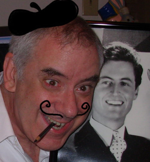
 Here's (above) a more youthful me. That's Kali mugging underneath. Anyway my face was V-shaped in those days and my eyes were somewhat wide open. Gee, I had a big nose and ears even then!