Saturday, March 24, 2007

WHAT WOMEN TALK ABOUT WHEN MEN AREN'T AROUND

Magnolia: "It's so nice here! Isn't it great to be away from men for a while?"


Mildred: "You bet! We can finally do the kinds of things WE like to do! Uh...Gladys, the ball's over here."
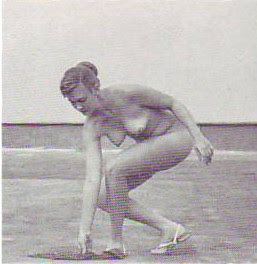

Petunia: "Oooo, look! A bus transfer!


Violet: "Yeah, men always want to talk about sex! Everything to them is phallic!"


Rodneyetta: "Violet, what are we going to do with you? You're so naive!"


Queen Elizabeth: "Hi girls! Do you mind if I hang out with you for a while? It's ever so stuffy in the palace!"


Magnolia: "(Gasp!) It's the Queen! And she's hanging out with us!!! Why that's...Uh, oh......Oh, dear..........Oh, no............" BRAAAAAP!!!


Mildred: "OH Jeez, Magnolia!


Gladys: "That darn Magnolia! She should do what I do. Whenever I want to do something gross like smell my armpits, I go behind a rock and do it in the shadows."


MILDRED: "We better go, girls! We have to get back to the Theory Mansion! Mike's going to be there tonight!
VIOLET: "Mike!?  You mean the world-famous cartoonist studmuffin?! I'm there!"


Friday, March 23, 2007

WAS RUBE GOLDBERG "PRIMITIVE?"

Did Rube Goldberg work in a primitive style!!??? Absolutely not!!!!!!! He was working in a deliberately comedic style, one of the most sophisticated and effective styles in all of cartoon history!
Poor Rube is always lumped together with Bud Fisher's "Mutt and Jeff" (the long, narrow strip above). Fisher was a funny and creative artist in his prime but he was never as funny, as innovative or as warm and "human" as Goldberg.

Goldberg had more in common with Milt Gross (no example here). Both were funny as hell and both seemed to love the people they were making fun of. I don't know about you but I find Goldberg's bottom two pictures of couples (above) to be extremely tender and appealing at the same time they're caricatured. Bud Fisher couldn't touch stuff like this.
So, is Goldberg's style primitive? No!!! If the purpose of a cartoon is to get laughs then this style is shockingly efficient. The audience is already smiling before they read the caption. If any style can be called primitive it's the modern style (with very notable exceptions), which simply doesn't deliver the comedic goods.
One last look at Goldberg (above) ...(Sigh!) and I turn you back to the modern comedic style below.
Note: I know the guy who did the color drawings above. He's a talented guy and he'd probably jump at the chance to work on something genuinely funny.


SHOULD I PUT UP ADS?


WRIGGLE'S SPEARMINT GUM!


OK, this isn't one of my better efforts. I really should have redone it before posting it but, honestly, if I'd done that then I'd end up redoing everything I put up and I'd loose interest in blogging. The only way I've been able to do this on a daily basis is to put up my first or first and a half try and just hope for the best. (Sigh!)

Wednesday, March 21, 2007

TWO HUNDRED WAYS TO SAY, "YOU'RE STUPID!"

Whew! (Puff! Pant!) Let me take a breather....OK, Back to it...


Man! That's a pretty complete list! The only name I can think of that's missing is "dork!"
Say, while I'm at it does anyone out there know which Harlan Ellison story contains his pages-long curse...or is it just a long insult? Fans will know what I mean. Come to think of it does anyone know where in the Bible I can find the long series of curses levied against anyone who touches the Arc of the Covenant?

Tuesday, March 20, 2007

WHEN THE FUNNY PAPERS WERE FUNNY (PART 2)

It's hard to believe but at one time the funny papers were actually funny. If evidence is needed here's (above) a couple of panels from George Herriman's "The Family Upstairs" (1911). Look at the woman's arms in the far left panel. They're not anatomical, they're probably not even on model; they're just funny. Look at the guy leaning against the wall in the far right panel. He's a bit stretched out but who cares? It's funny.


More Family Upstairs! I like the tall guy's hands and legs in the far left panel, and his running pose in the middle one.

Here (above) are a couple of panels from Frederick Opper's "Alphonse and Gaston" (1903). Sorry for the unfortunate racial content. I include it only because the characters and staging are so doggone funny.


Jumping ahead in time a bit, here's a panel from the book "I Shoulda Ate the Eclair" by Milt Gross. I'm told that a large part of the content in Milt's books appeared in the newspapers first so I'll regard this as newspaper art. And art is the right name for it. It's gorgeous and laugh-out-loud funny.

Here's (above) a sample from "Polly and Her pals" by Cliff Sterret. Wouldn't you like to have that furniture? Somebody should open up a Cliff Sterret store.


Last but not least, here's (above) a few panels from a 1942 "Maggie and Jiggs" Sunday Page. Funny, funny stuff from George McManus.


Sunday, March 18, 2007

JOHN CURRIN


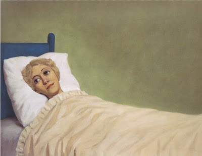
All of these pictures are by John Currin. I never heard of him before I stumbled on his book in the library. It's a big book too! The guy is really prolific! I don't know what I think of this stuff. What do you think?


He likes to paint new faces on magazine photos. This looks like a redo of a "What kind of man reads Playboy?" ad. This is my favorite of the pictures on this page.

HOW ABOUT SOME COUNTRY?


Thanks a million to William for sending me this link to the Collins Kids! John used to play this video all the time! Let me see what other good country I can find...


...How "bout this? Bob Wills and his Texas Playboys doing "San Antonio Rose!"


Or this: Jimmie Rodgers doing "Blue Yodel!" This is one of those infuriating clips that stops every few seconds the first time it plays, at least on my computer. If you have the same problem let it download in fits and starts then play it over again.

Saturday, March 17, 2007

TWO OIL SKETCHES BY RUBENS

Two beautiful oil sketches by Rubens. The first (above) looks strikingly contemporary. You could almost believe it was done with PH Martin's dyes.


The second (above) is a terrific example of how a forceful, dynamic composition can still contain amazingly subtle and graceful detail. And what are those red/oranges? Is that vermilion or did he figure out a way to make ordinary burnt orange and red look luminous?

Thursday, March 15, 2007

WHEN THE SUNDAY FUNNIES ACTUALLY WERE FUNNY

Here's Rudolph Dirks' "Katzenjammer Kids" from 1902! Click to enlarge. This is better than anything in the funnies now and it's more than a hundred years old! Good Grief! Where did we go astray!?
I love the spacious layouts. Having room to breathe makes the action funnier somehow.
How about an Alphonse & Gaston page (above) from 1904? The writing isn't exactly Hamlet but it doesn't impede the graphics like most TV writing these days. .

Here's (above) a George McManus page from 1906. Once again, the story isn't much but it enables funny, beautiful layouts and that's no small thing.


Wednesday, March 14, 2007

STAGE DESIGN


This is too big a subject to cover in one post but I can still put up some pretty pictures. My interest in stage design comes from being blown away by the sets (or the influence of sets) in cartoons like "What's Opera, Doc?" and animated features like "Fantasia" and "Alice in Wonderland." The backdrop above is from "Guys and Dolls" (1950) but it also looks a lot like the street outside the stadium in "Baseball Bugs." Animation is full of theatrical influence.


Guys and Dolls was famous for its backdrops. Here's (above) a moody sketch of the sewer where the crap game took place. The designer made it seem immense, important and mysterious, like the interior of a cathedral.


I also like the sketches generated by theatrical costume designers. I say "sketches" because the real clothing seldom looks as good as the sketch it was derived from.


Set design went through a lot of drastic changes in the last 100 years. Here's a Russian design from the years immediately after the revolution. The chair in the middle gives us the scale. Russian modernists were incredibly inventive but their efforts came to an end almost overnight when Lenin decided that he preferred realism.


I'm not a fan of Hockney's swimming pool paintings but his stage design is interesting. Forget the simplistic vertical curtains in the design above. Look instead at the way he uses the orchestra pit as a set design element. He paints the floor white so the standing musicians in black look like sticks or spikes. In another picture (unseen) he blackens the floor so the black musicians are invisible then he puts bright red caps on them. In yet another one he underlights the musicians so they look like zombies. Nifty, huh?


ANOTHER APOLOGY TO MIKE

I feel so bad! Mike is a wonderful host (I should know, I've been sponging off him for eons) and here I've gone and told the world that he's cheap and lives in a trailer park. Really, that's a terrible thing to do to a friend.

I don't have the words to express my sorrow so I thought I would read from book that puts into words some of what I feel. It's a childrens' book and the protaginist even looks like Mike. I'll just scan it in. It's named for the dog in the story: "Poohul."


Once upon a time there was a generous host named Mr. Michael. He loved to bake cakes and pies for the many guests he invited to his beautiful house.


Whatever the guests couldn't eat they took home in buldging doggie bags. "What a friend!" they all said, "Hoorah for Mr. Michael!"


What a shock then, when they discovered that a sleazey internet artist had accused Mr. Michael of being cheap! "He says Mr. Michael never has toilet paper for his guests! That's not true," said one outraged neighbor, "He almost always has toilet paper! And he's so generous with his pies! Who would print such a thing!?"


Who indeed? It was none other than "Uncle Bucktooth," a disgruntled guest who didn't like Mr. Michael's pretzels.


Now it so happened that Mr. Michael had a poodle named Poohul. Poohul was very upset by the slander his master had received. Not even a bath could calm him down.


"I'm gonna kick that guy's butt!" said Poohul.


And he did! Passers-by said it was the most gruesome beating they'd ever seen. Poohul acted rashley, they agreed, but all seemed to feel that Uncle Bucktooth had it coming.


A couple of months later when the heat had died down Poohul emerged from hiding.


The two friends were re-united and they danced and danced the whole night through. Poohul even wore womens' clothing! They were very, very happy, and lived happily...you guessed it... ever after!
The End.