Monday, April 30, 2007

THEORY CORNER FOR KIDS: A BEDTIME STORY

I know a lot of kids read this blog so here's something for them. It's a really sweet little story called "The Pokey Little Animation Writer." The story starts in a suburban bedroom where Billy's parents are roused out of their sleep by a knock on the bedroom door....


Knock! Knock! Knock! "Huuuh?" said Dad, waking suddenly. "Who...Wha...Wh...Who's there? For Pete's Sake, stop knocking!"


"Um...It's me Dad. I can't sleep! Er...I have urges I can't explain!"
"URGES!? Oh, Bashaw! What kind of urges could you have at your age?

"Well Dad, I know it's strange but I have an urge to find an animation artist and beat him up. I know it doesn't make sense but I get really mad at the thought of artists writing and directing their own stories. I guess that's silly isn't it? I mean, why should I get mad about what artists do?"
"Son, did you say... 'beat up?' Oh, Good Lord! I didn't realize you'd grown so fast! Um... Sit down , It's time you and I had a talk."
"Son, I'll just say it outright. Your mother and I are...are...outcasts...hated and shunned by all civilized people because of what we are...animation writers. And you son, you will grow up to be an animation writer too!"
"That's right," said Billy's mom, "that's why you get so mad when you think of low-life artists making their own cartoons!"
"But Dad...won't the artists feel bad if we take their medium away from them?"


"Naw," said Dad, "they don't have feelings like we do! If they had feelings they'd be writers like us. They just have...notochords!"


"Now get to sleep, Buckaroo! If you're good I'll take you out hunting tomorrow! If we find an artist directing a cartoon we'll trash him and you can break his pencils!"
And they did. And Billy and his family lived happily ever after.


THE END

Sunday, April 29, 2007

SHOULD CARTOONISTS TAKE LIFE DRAWING CLASSES?


Good question! My answer is yes...but with caution! We're cartoonists after all and not illustrators. A cartoonist can actually pick up bad habits in a life drawing class.

I don't know about you but when I draw undraped models I'm always shocked by the drama and profundity of the body. The human machine is awesome. Layer over that the nuances of intellect and personality and you have a very appealing subject to draw.

The problem is that it's too appealing. If you're like me, no matter how much you may have resolved to caricature the model (whole-body caricature) , the moment you see her all you can think to do is to revert to stark realism. Anything else seems unfit for the importance of the subject. This is why you have to double your resolve to caricature. If you have trouble doing this then you should pose the model draped for half the session.

Another problem is that realistic life drawing encourages scratchy lines. Realists tend to search for the forms with lots of tentative strokes til they get what they want. Cartooning isn't like that. A cartoonist needs to learn strong, confident lines.


Some cartoonists put their best effort into realistic life drawing because they're frustrated with the way their cartoons are turning out. Life drawing becomes a sort of holding pattern where they concentrate on general draughtsmanship for a while while the rest of their life sorts itself out. That's OK if the rest of their life does get sorted out but what if it doesn't? They can stall for so long that life drawing becomes the only skill they really have.

In my opinion you have to keep your eyes on the prize and remember what you're in the session for. If you're a cartoonist don't get lulled into doing what the realists do. They have their own reasons for being there, which are not your reason.

Saturday, April 28, 2007

IS COLOR EVIL?


I'm exaggerating of course, color isn't really evil, but it certainly is aggressive, scary, and alien.

What do you think of the Kokoschka watercolor above? Probably Kokoschka started out with the intention of making a weird, "edgy" picture but I can't help regarding it as a normal picture gone awry. I imagine the artist beginning by filling in a line drawing with color then wondering what would happen if he let the gray and red dabs find their own boundaries based on the intrinsic "will to power" of the color.

I imagine the artist being horrified to find color oozing out of every pore of the drawing til it mutilates and almost obliterates the human subject. In my fantasy the painter is amazed to see how blithely color takes a human-like life.


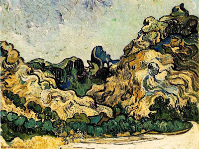
No, I'm not crazy. I'm just trying to see what would happen if I identified with the color I was using and gave it a sort of personality. I have a feeling a lot of painters do this. In the Van Gogh above I imagine the color feels tied down and restrained by all the lines. Artists frequently use lines and textures to anchor a color, to pin it in place, to subordinate it to line.
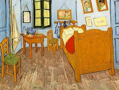


Here, in the bedroom painting, color is restrained another way, this time by being diluted with white or gray( or color mixtures that have the same effect as adding gray). The muted color is confined and imprisoned by the additives. It's made a slave to the line drawing that contains it. That's not a bad thing for us viewers. The restless color wants to break out of its bonds and our subconscious awareness of this struggle makes the muted color seem more alive and intense.


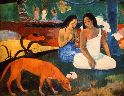
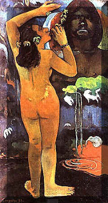
Another way to restrain color is with shape as in the Gauguin above. Simplified shapes make for strong walls that effectively keep color inside.


Gauguin got the idea of creating drawings that would approximate the natural borders the color would create for itself if it were unshackled. I don't mean that the color naturally wants to take the shape of a girl and a man's face. I mean the colors found a natural proportion in relation to one another and the girl is the subject the artist imposed on that proportion. The color still comes off as aggressive and unleashed but it's been tamed a little to suit the artist.


Friday, April 27, 2007

GEORGE GROSZ NUDES

In case you don't know the name, George Grosz was a Weimar artist who did scratchy drawings of seedy naked people with transparent clothing. He also did some pretty good oils. That's my favorite above. Click to enlarge.


I thought fans of Grosz might like to see some of his watercolors. What do you think?


Thursday, April 26, 2007

WHAT'S ON MY WALL


The red-haired girl on the top is by Lynn Naylor, girl artist extroadinaire. The picture on the bottom is a blow-up of Sadie Hawkins from a Li'l Abner strip. Nice stuff, huh?


I wish more artists would post pictures of what's on their wall. I'm always curious to see
what people put up, it tells you something about them. Most of what I have on the wall can't be scanned: Halloween masks, African masks, home-made theater dioramas, framed kid art, cels, etc.

Wednesday, April 25, 2007

WHATEVER HAPPENED TO ANIMATION DIRECTORS?


Is it just me or does anyone else wonder if the job and the job title are disappearing? In TV animation the director (often called a producer) is simply a sort of art director. The closest thing to a director in the traditional sense of the word is the writer.

The writer determines what the tone of the series will be, what stories will be made, all the details of the story, what characters will be used, and sometimes even what voice talent will be used. The writer is not answerable to the director, the director is expected to take the script that's handed to him and do the best he can with it. If he doesn't like it, well... there's the street.
A popular book for animation writers outlines the process:


Notice what's missing here? The script goes directly to the storyboarder. No nosey, interfering director to get in the way. What on Earth could a director contribute anyway? The advice to writers, "...nothing is left to the imagination of others", says it all. The director is one of those pesky "others."

I don't mean to say that the author wants to dispense with directors. My guess is that the director was omitted simply because the modern director's role is too unimportant to list in a short summary (obviously this doesn't hold for artist/creator-driven shows at places like Cartoon Network).

MIKE BARRIER'S "THE ANIMATED MAN"


It's silly to review a book that I've only skimmed but I'm going to do it anyway while the first impressions are still vivid in my mind. I'll go back and read it cover to cover next week when I finish the book I'm currently reading. My tentative opinion? It's great! Buy it! You'll regret it if you don't!


The book is full of suprisingly drastic opinions. I've never heard some of these ideas before so I'm at a loss to know what to think of them. For Mike the most important thing Disney ever did was to make Snow White and Pinnochio. Everything else was downhill from there. Disney never had the money or the time to make comparable films again.

Mike also believes Disney's impact on the American consciousness is over-rated. Changing demographics would have skewered things toward his kind of family entertainment even if Disney had never existed. He goes on to say that Disneyland was a creative disaster for Disney because it locked him into doing media for kids exclusively, something he hadn't done in the early films. The book is full of thoughts like this.


Mike is no stranger to drastic ideas. In his online review of John Canemaker's book on Mary Blair he says that Blair's flat style didn't fit with the kind of stories Disney was trying to tell. He then goes on to speculate that Disney knew it didn't fit and deliberately introduced the new style to subvert the animation department which he was no longer interested in. That seems doubtful to me but then I'm not an historian. Well, whatever the truth of the assertion you can't deny that it's interesting.
This is a suprisingly drastic book and admirers of Disney will find much to disagree with. It doesn't provide a lot of insight into how the films were made, maybe because Mike believed he'd covered that in his last book. On the other hand Mike also genuinely loves his subject. I'll have more to say about it after I've read some more.

Monday, April 23, 2007

FACES TOO SPECIFIC

One problem with a lot of modern portrait paintings is that they're too specific. Even a realistic portrait should be somewhat iconic. The picture above isn't a picture of of eternal beauty, it's too specifically a painting of Beulah J. Kratz (or whatever her name is). The same problem holds for the other three Lovis Corinth pictures immediately below.


Actually, this one of the nude holding the hairbrush isn't half bad.


I don't mean to say that all potraits should be sanitized and idealized. Not at all. But the more specific the picture is the more the style should be iconic, cartoony or deliberately mannered. The picture above by Otto Dix is a good example. It's very specific but it's cartoony and it works.


More realistic portraits are better off idealized somewhat like the pictures immediately above and below. They're by Raphael (above) and Rubens (below). You accept them as realistic but they're subtley stylized as well.


Do you agree?


Sunday, April 22, 2007

THE RIGHT ARCHITECTURE FOR LOS ANGELES

Of course Los Angeles should retain its deco architecture, it's craftsman houses, it's Googie's restaurants and hot-dog stands shaped like cartoon characters, nobody disputes that. But what about the rest? What should be the norm? What building style reflects the real soul of the city? That's easy...traditional Mexican style!


Well we are in the Southwest, after all. And it's about time that we made a radical re-assessment of Mexican style and how it compares to other styles. Mexican architectute isn't just one more quaint variation of the New World Spanish style, it's the very best variation. It's easily the most beautiful style anywhere in the Americas. It's probably more beautiful than what you'd find in Spain. It's world class, fully comparable to middle-European and Japanese styles.
It certainly is full of fun and color. Maybe that's because it's a synthesis of Spanish and native indian styles. Aztecs used to love those colorfull, complex jigsaw puzzle shapes and every indian seems to have inherited a taste for bright-colored handicrafts. Other South American cultures are colorfull too. I'm thinking of the Panamanian and Peruvian indians. The difference is that they colored only their textiles. Mexicans colored almost everything.

I know what you're thinking, what about the Haitians (not portrayed in pictures here)? They REALLY color everything! But they don't have the Mexicans' taste. Sorry. Haiti overdoes it.


These pillars are the natural, uncarved forms taken by a palm tree that grows in Mexico. Are the tendrils part of the palm or are they the kind of parasitic wooden vine that strangles trees? I don't know, but they sure are pretty. Try not to look at the ugly, modernist wall behind the pillars. I guess even Mexico has its share of bad architects.


Los Angeles isn't that far from Mexico. What could be more natural than a Mexican influence on what we do here? Why are we impoting East Coast and Bauhaus styles when one of the world's most pleasing styles exists right in our own backyard?
The red brick house above is from England. It's the house that was just in the news for being trashed by English MySpace readers. It's pretty ugly, isn't it? Why does modern England insist on building so many ugly houses? The amazing thing is that they're right next to France where tourists flock to see the traditional architecture. I guess the English are just too proud to be influenced by foreigners. And so are we. We in the Southwest U.S. are just too proud to be influenced by the beauty next door.


Saturday, April 21, 2007

MAGIC FOR KIDS


Kids are great! One of their many assets is that they're a great audience for magic. Their jaws drop when you wave your hands and the supermarket door opens. When I did that for my son for the first time I thought he'd faint. He was positively awe-stricken. I was expecting him to kneel down and worship me as a white god. My favorite trick of all though, was the disappearing nickel.


It's almost too easy. You put a nickel in your palm and tell your kid (my daughter in this case) that you're going to make it disappear right infront of her eyes. Now kids aren't stupid, and they're likely to say something like, "Piff! Piff! C'mon Dad, nobody can really do that! I wasn't born yesterday!" It's important to little kids that you know they're worldly and not to be trifled with.

So you say to the kid, "No, I mean it! It's real magic! Just watch the nickel closely and it'll vanish right infront of your eyes. " The kid gives a skeptical look. "Here it goes...keeeeep watching...!" The kid's face gets closer to your palm. "I feel it starting to disappear...It's starting to ...yes, there it goes...Oh my God, it's...it's...!" Then sudden;y, "HOLY COW! WHAT'S THAT BEHIND YOU!?" Huh? She turns to see what you were pointing at and you pocket the nickel! When she looks back again the palm is empty. Klong! The kid is flabbergasted! Nothing to do now but sit back and receive waves of awe and adulation.

Gee, I miss that. Kids have a way of making you feel like a king. BTW, the kids in the pictures aren't mine, I got them off the net.

Friday, April 20, 2007

A BIT OF "A BIT OF FRY AND LAURIE"


A couple of clips form "A Bit of Fry and Laurie." These guys are great!


Thursday, April 19, 2007

TENNESSEE WILLIAMS: CARTOONIST


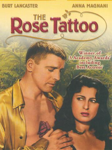
I don't know if Tennessee Williams ever drew anything but I regard him as a cartoonist. You could say that he's a cartoonist with a typewriter, rather than a pencil. His stories are over-the-top and funny, and his characters are fun to draw. Here's a drawing I did (below) of Anna Magnani from the William's film, "The Rose Tattoo." Magnani was brilliant in this film. What an under-rated actress!
Williams comes from the Ibsen-Chekhov-Strindberg school of writing. These guys liked character conflict, even when it didn't make any sense. It was really drama for the sake of drama with the then-fashionable nihilism added to justify it. Actors liked the plays because they were full of dramatic fireworks but the public was slow to warm to them. I think people were put off by the unrelenting seriousness. These were pretty depressing plays.
The writer who saved the movement from oblivion was Tennessee Williams and he did it by making the new style funny. Oh, his work was still serious on some level but it was serious the way cartoonists like to be serious, which is really a caricature of seriousness. In a Williams play you never knew whether to laugh or cry.

Maybe Williams' best-known play was "A Street Car Named Desire." Brando was great in the film version! Even John K who hates Brando in other films, likes him in this one! I read that Brando had a whole closet of tee-shirts for this film, each one stretched and bunched up to a different side to make it seem tight from a different camera angle. Here's (above) a half-minute clip from the film.


When I was a kid I'd see these Williams movies and wonder what the heck was going on in the adult world. Was I going to have to live in a mansion with a Big Daddy? Was I supposed to hang around with alcoholics and sleazy women in slips? Would I be expected to break mirrors with my whiskey glass? They go through a lot of mirrors in Tennessee Williams films.